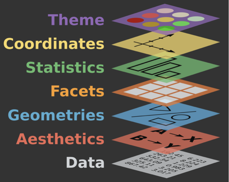
Deep dive: coordinates + facets
Lecture 6
February 5, 2026
Where did the school buses go?

- What is the story?
- How does the design account for the time gaps?
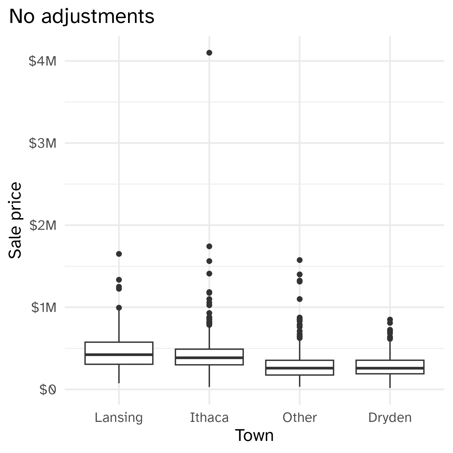
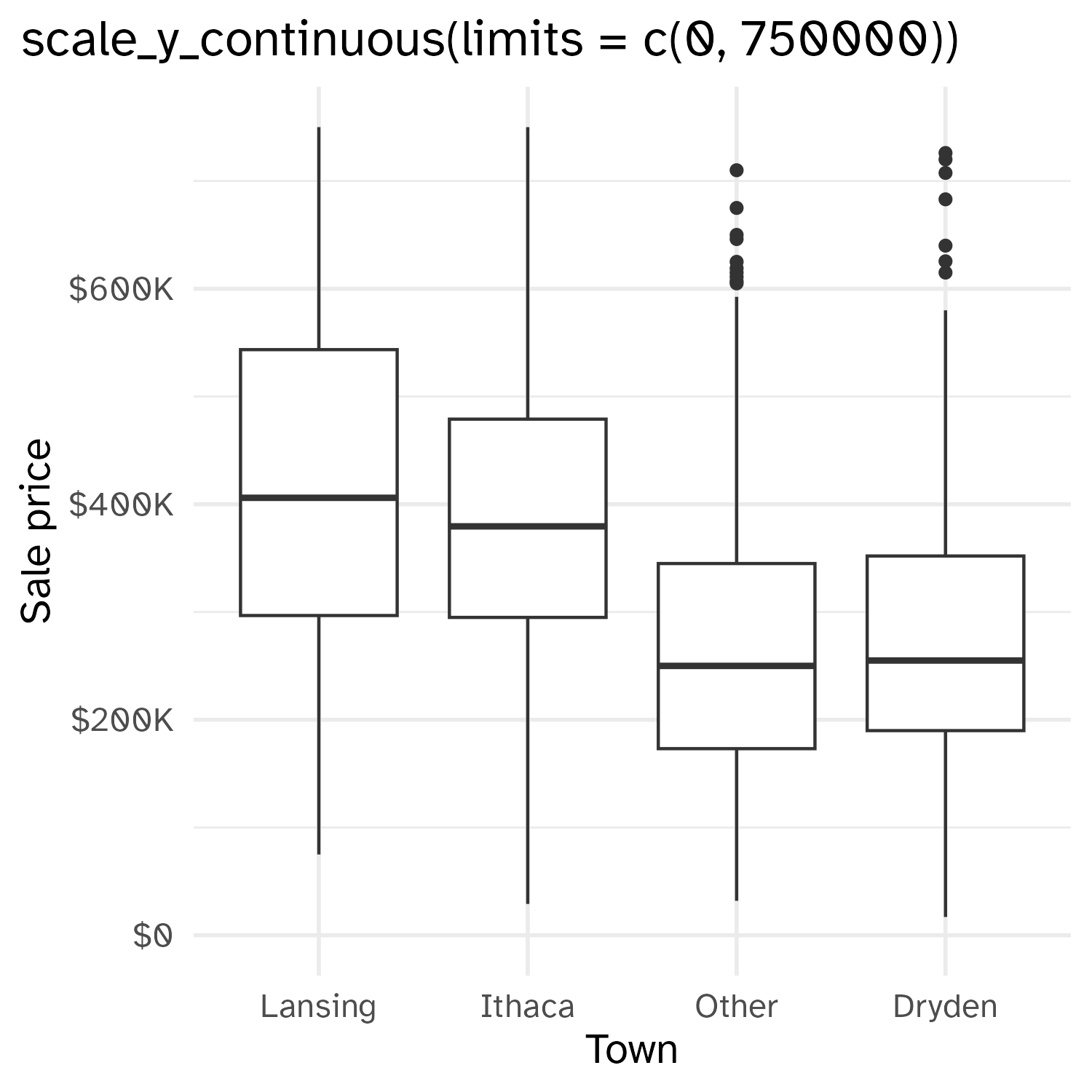
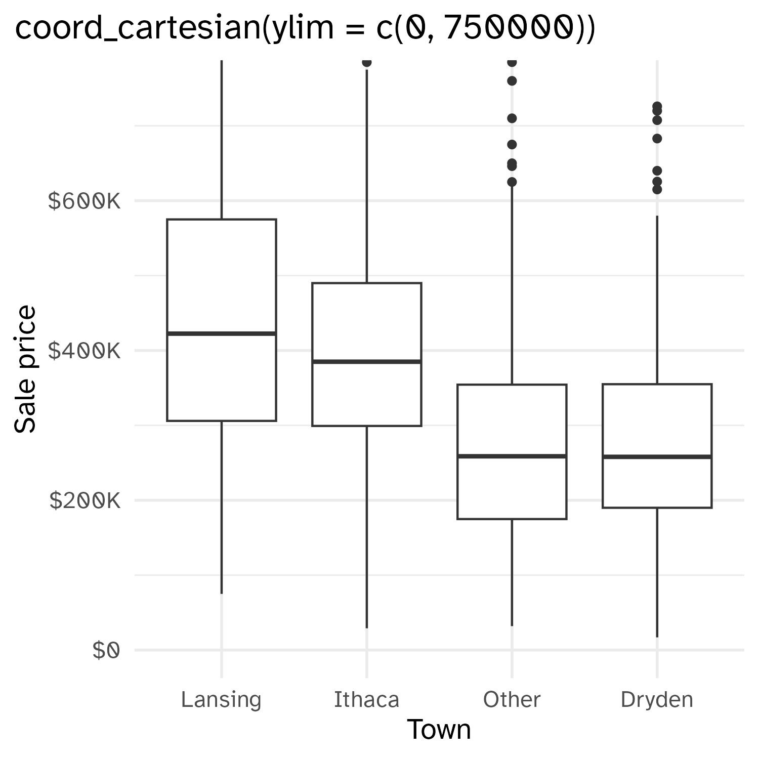
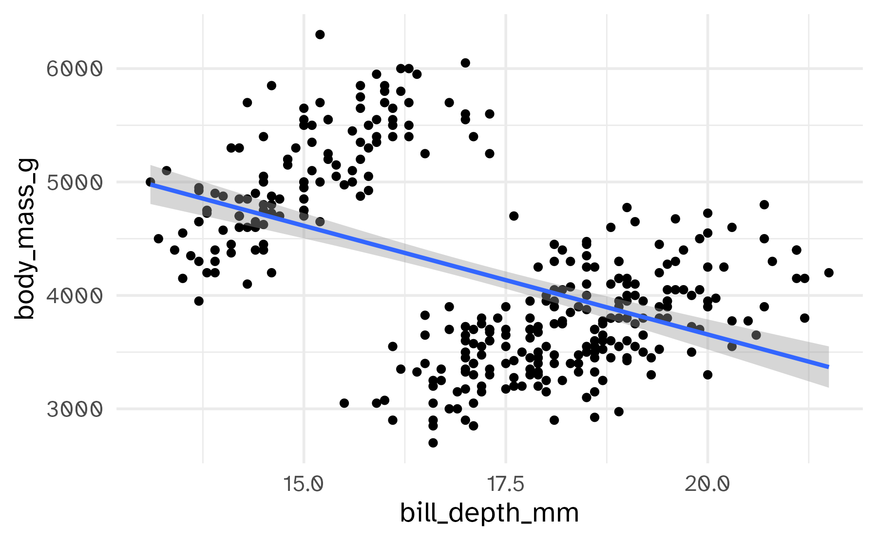
Setting limits: what the plots say
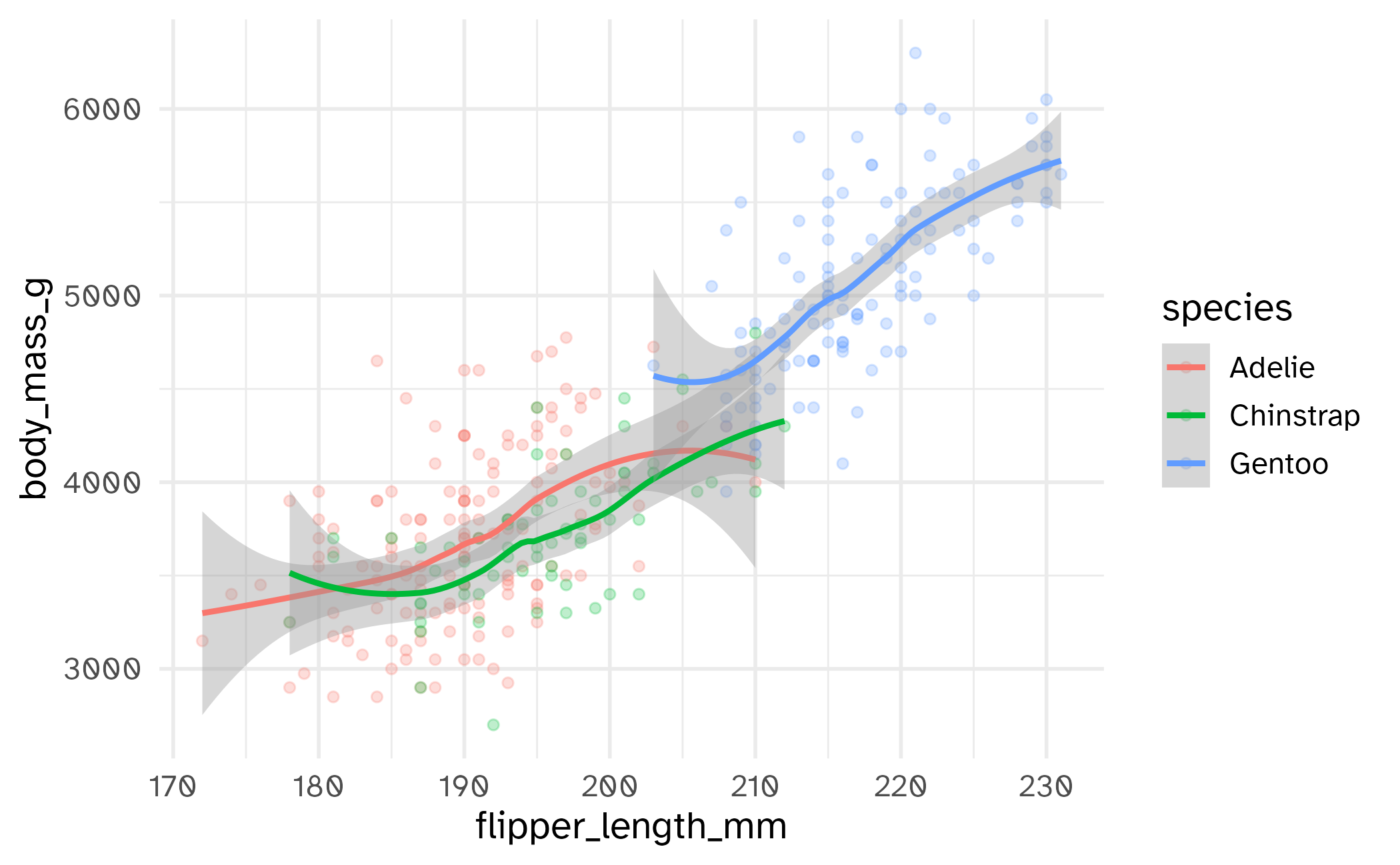
Setting limits: what the plots say
02:00
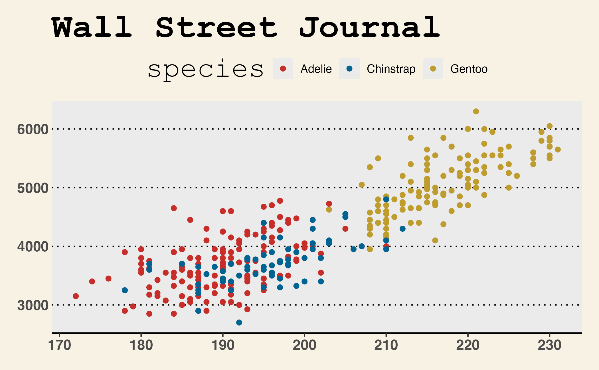
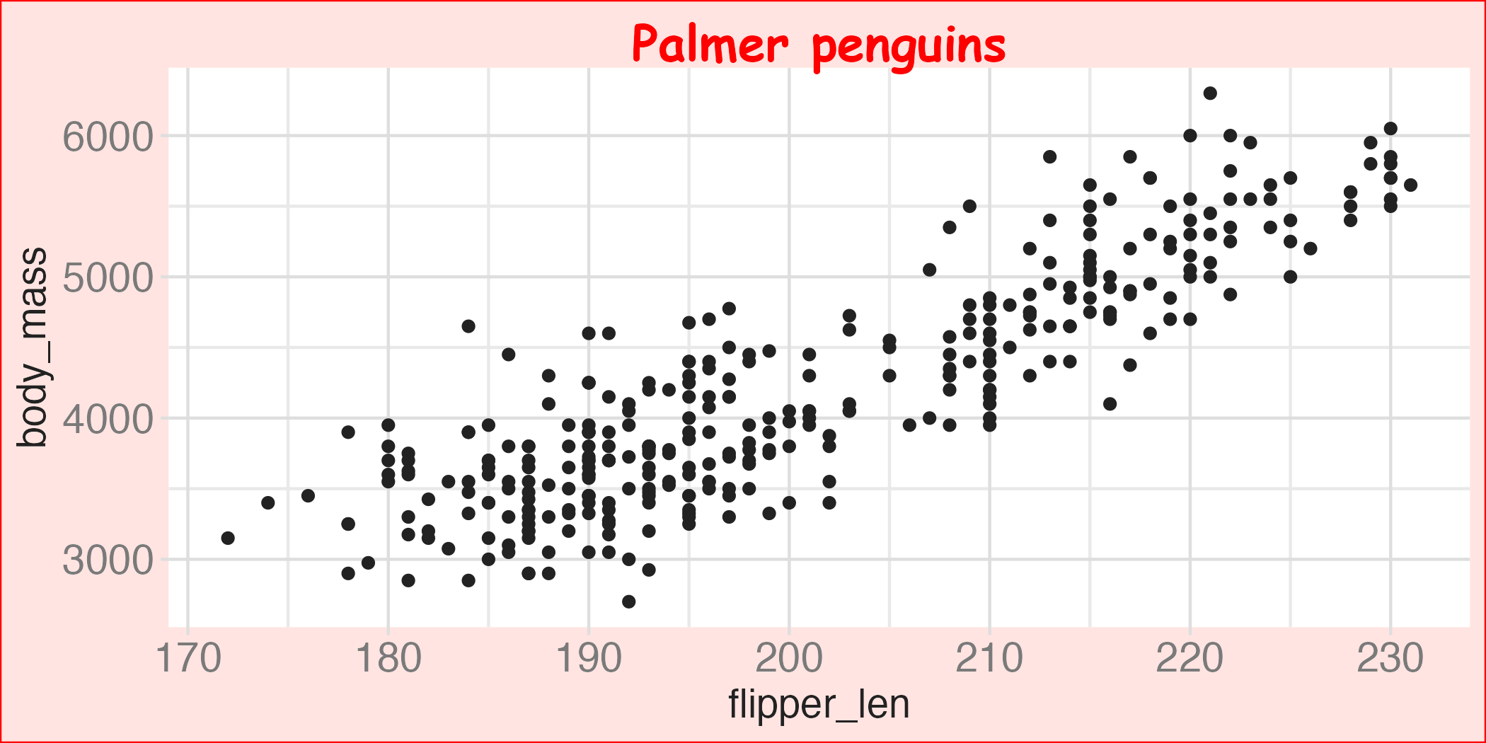
base_plot +
labs(title = "Plot 1")
base_plot +
scale_x_continuous(limits = c(190, 220)) +
scale_y_continuous(limits = c(4000, 5000)) +
labs(title = "Plot 2")
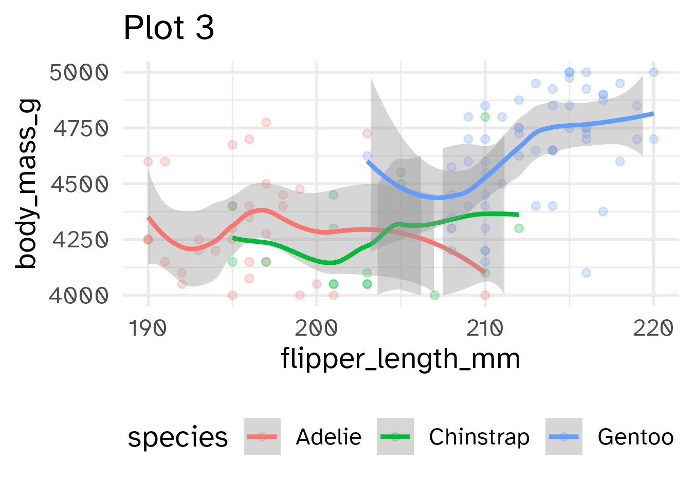
base_plot +
xlim(190, 220) +
ylim(4000, 5000) +
labs(title = "Plot 3")
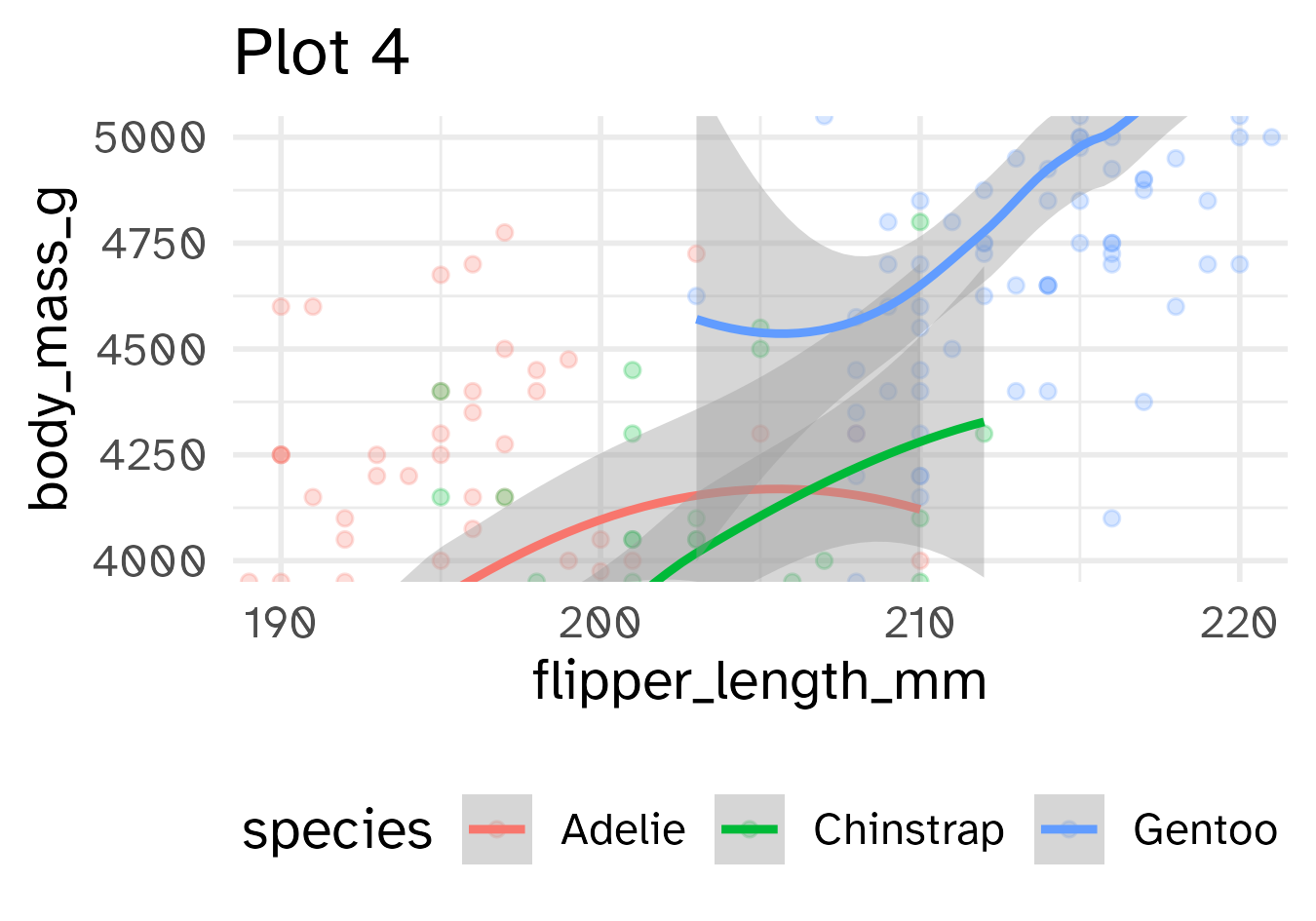
base_plot +
coord_cartesian(xlim = c(190, 220),
ylim = c(4000, 5000)) +
labs(title = "Plot 4")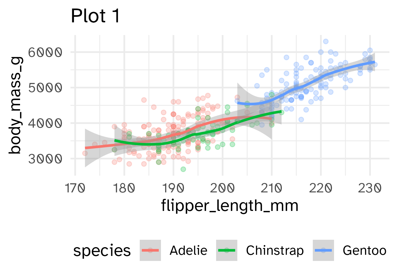

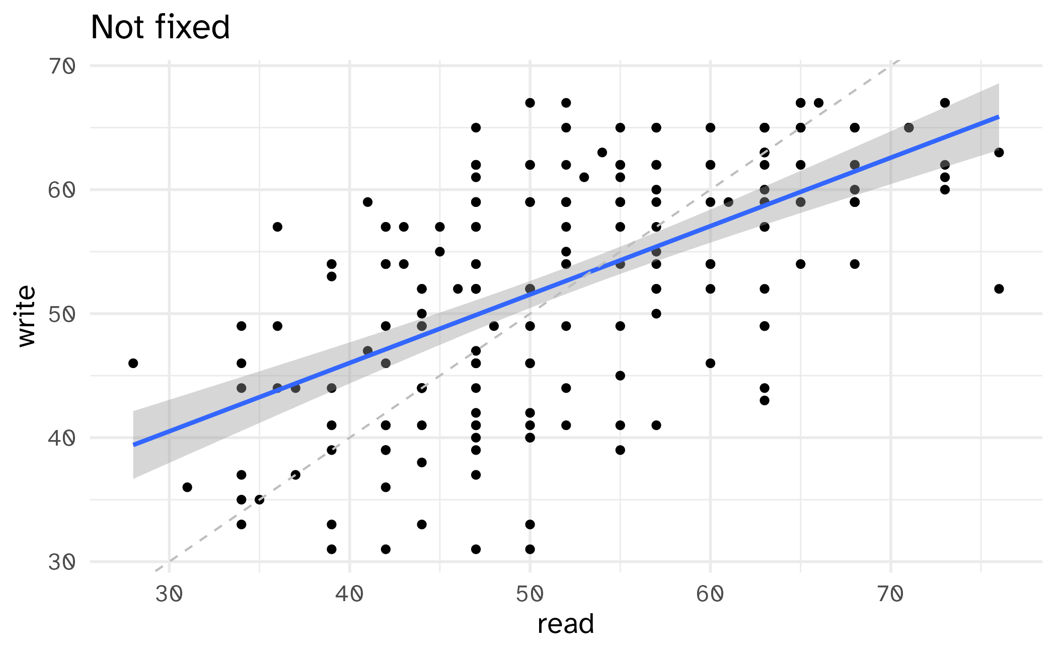
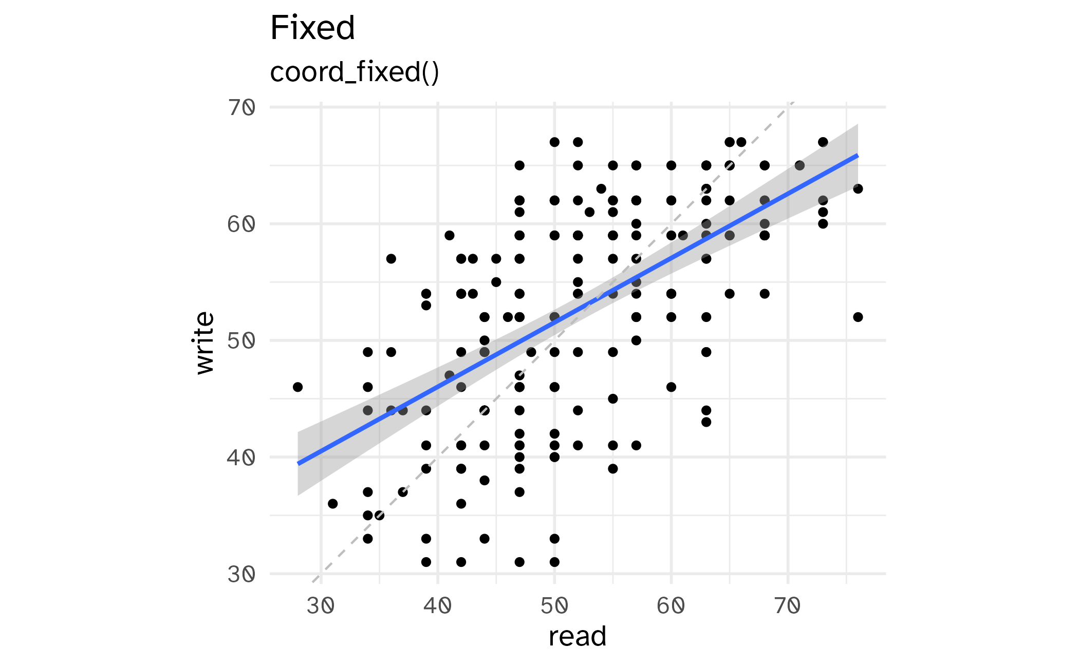
Cropping scatterplot
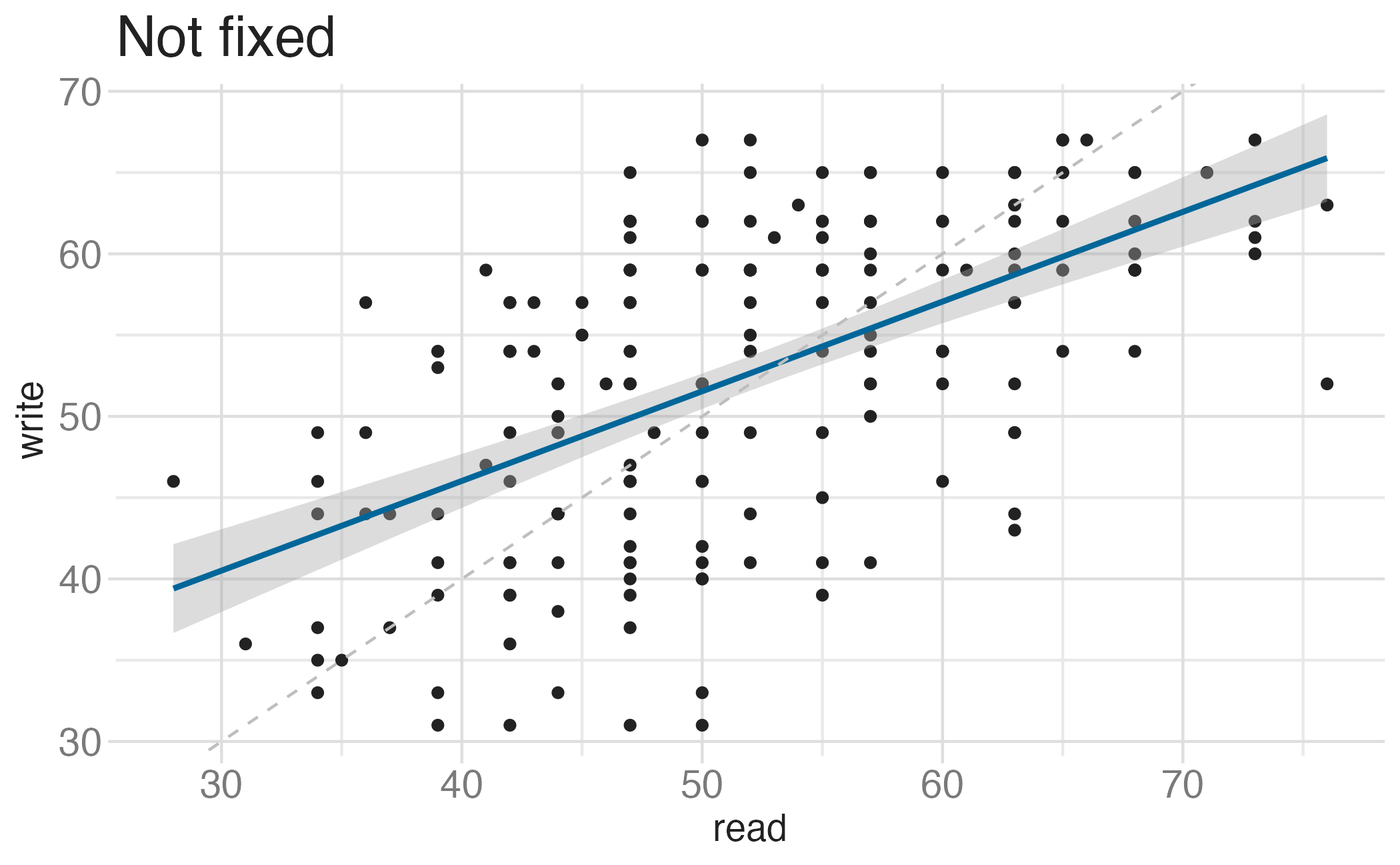
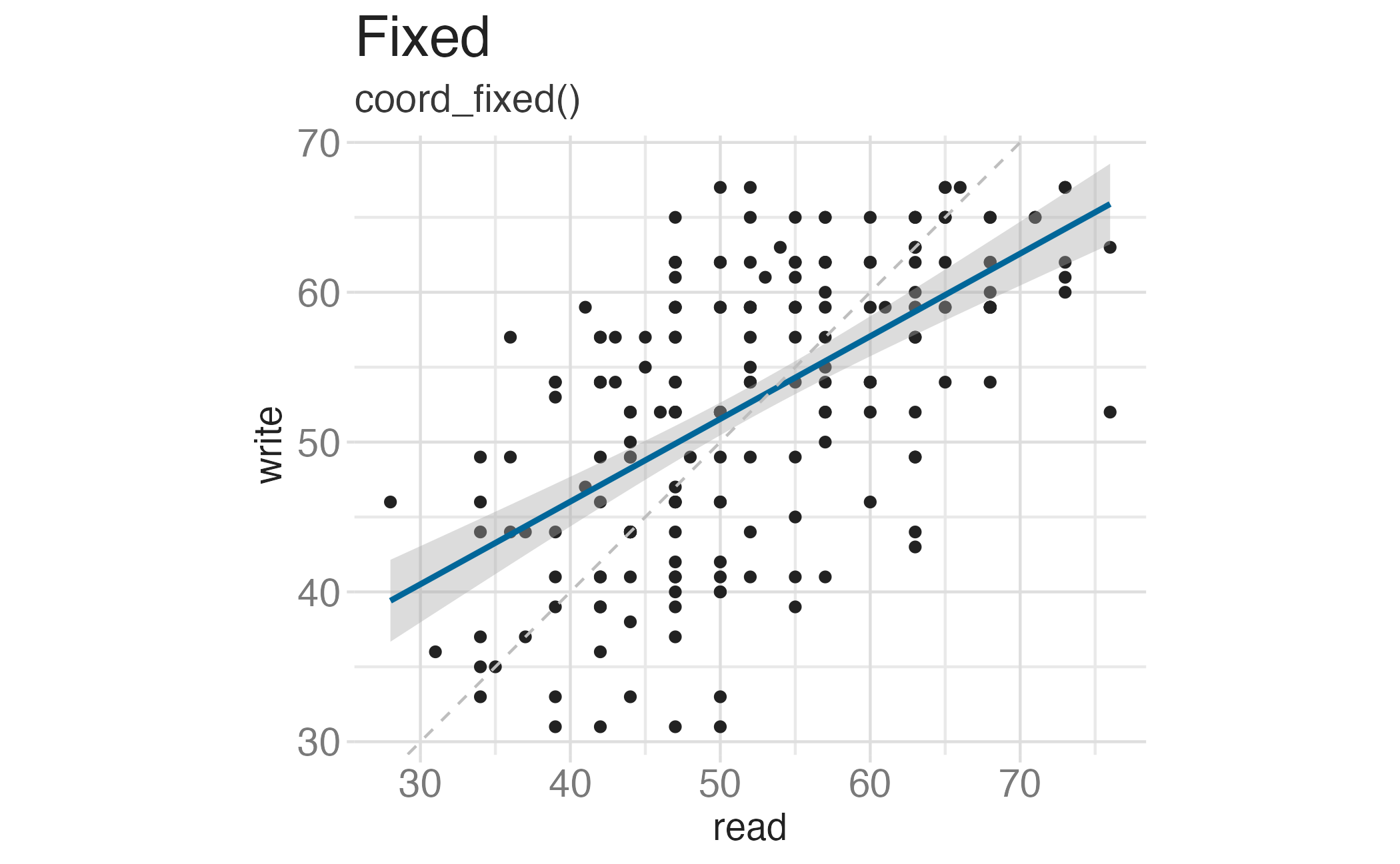
Fixing aspect ratio with coord_cartesian(ratio = X)
Useful when having a fixed aspect ratio makes sense, e.g. scores on two tests (reading and writing) on the same scale (0 to 100 points)
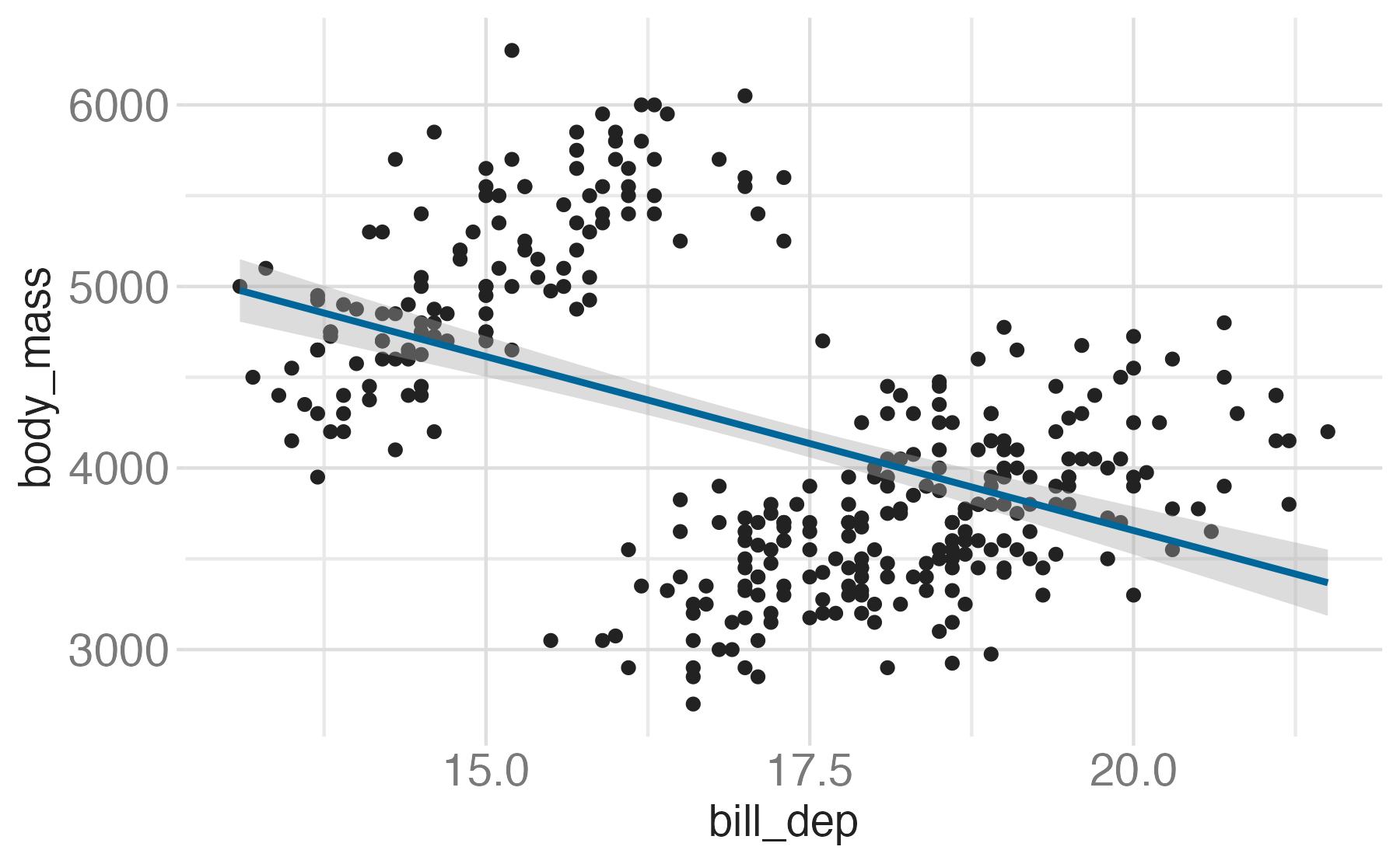
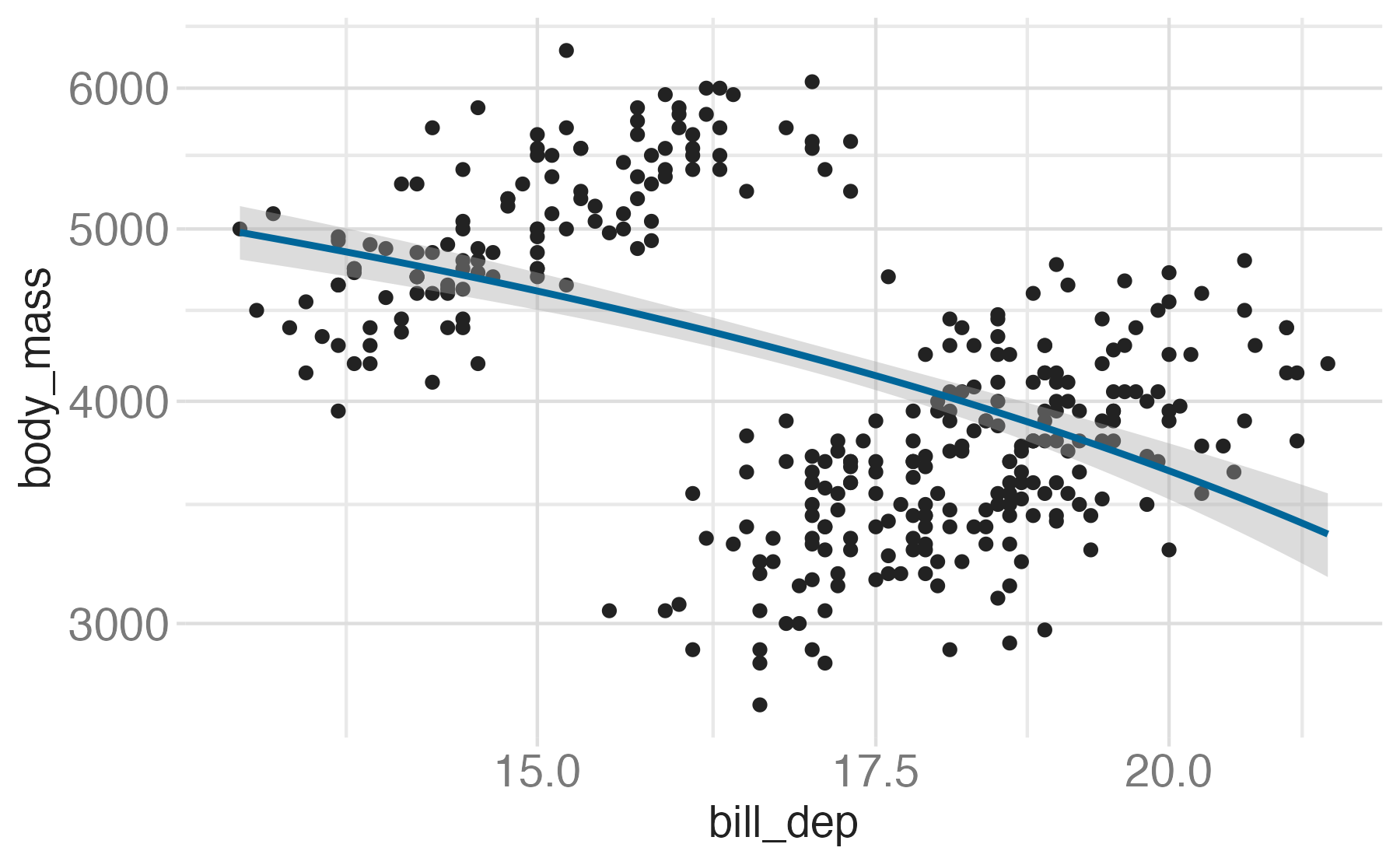
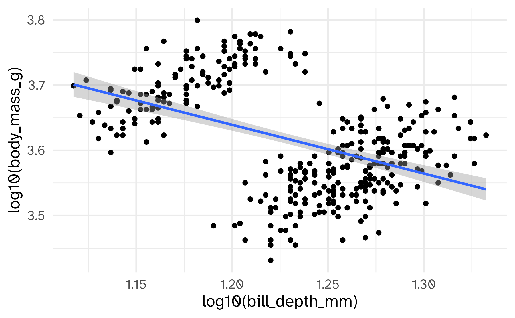
Transformations


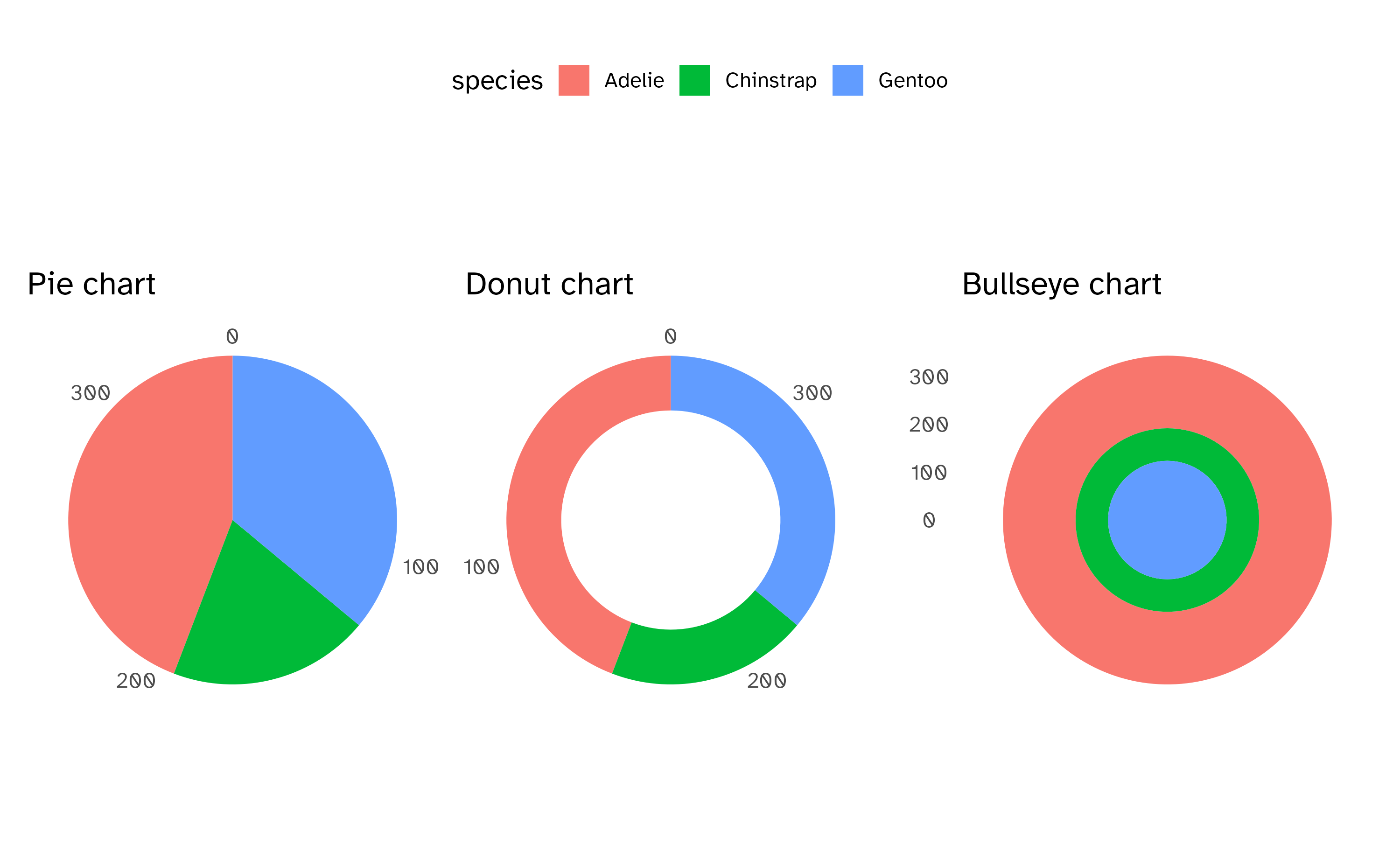
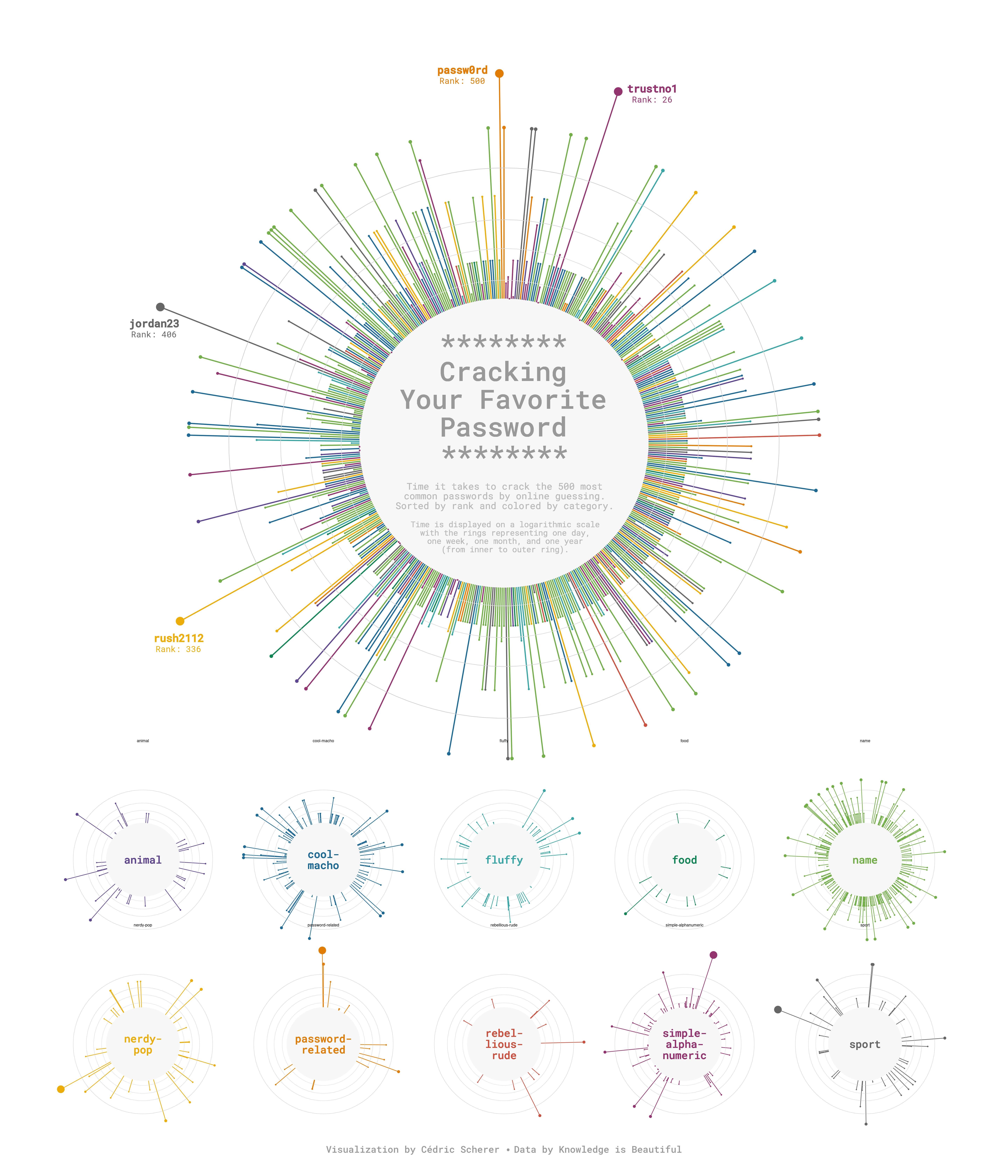
Radial charts with coord_radial()
Circular bar charts
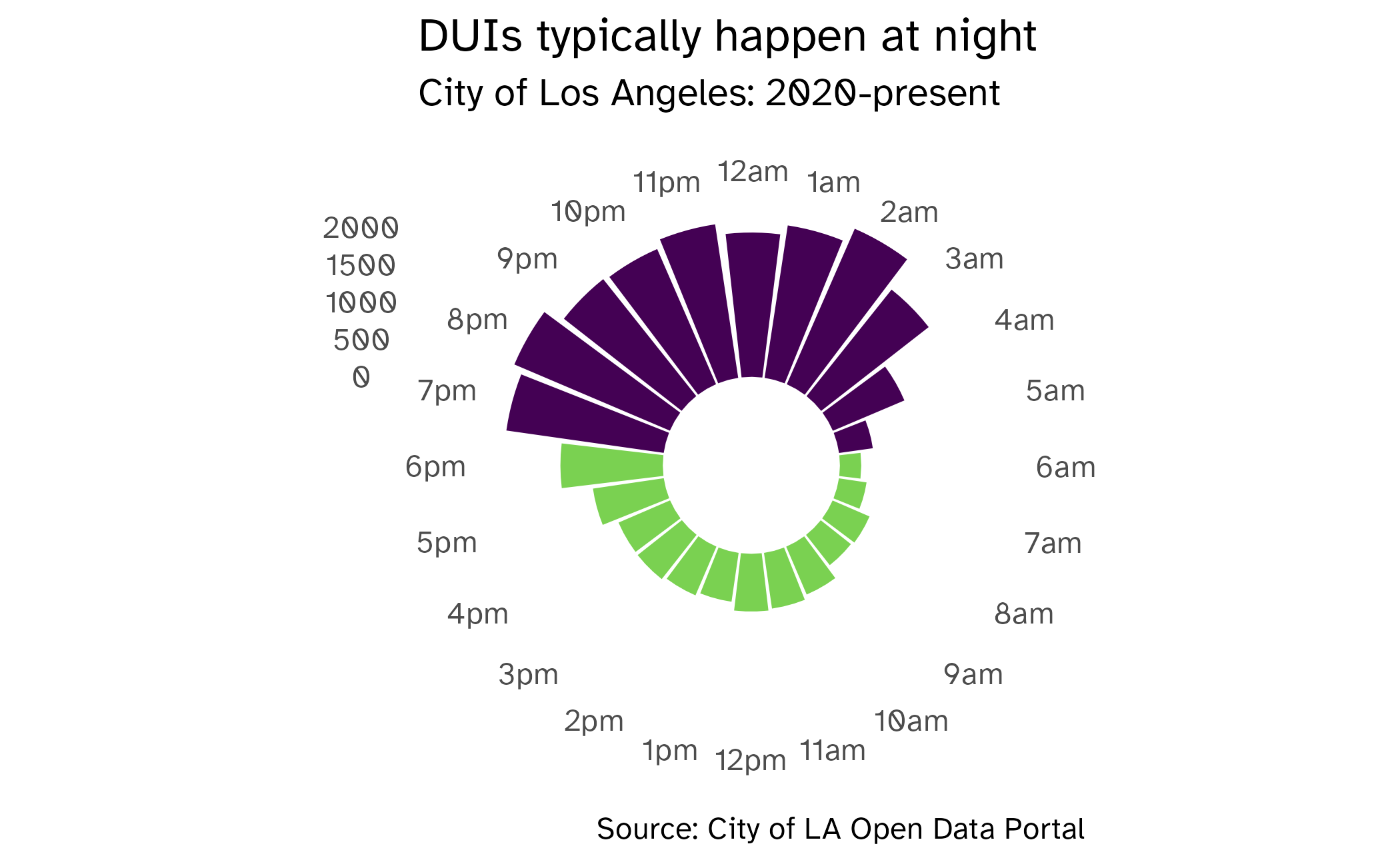
Circular lollipop charts
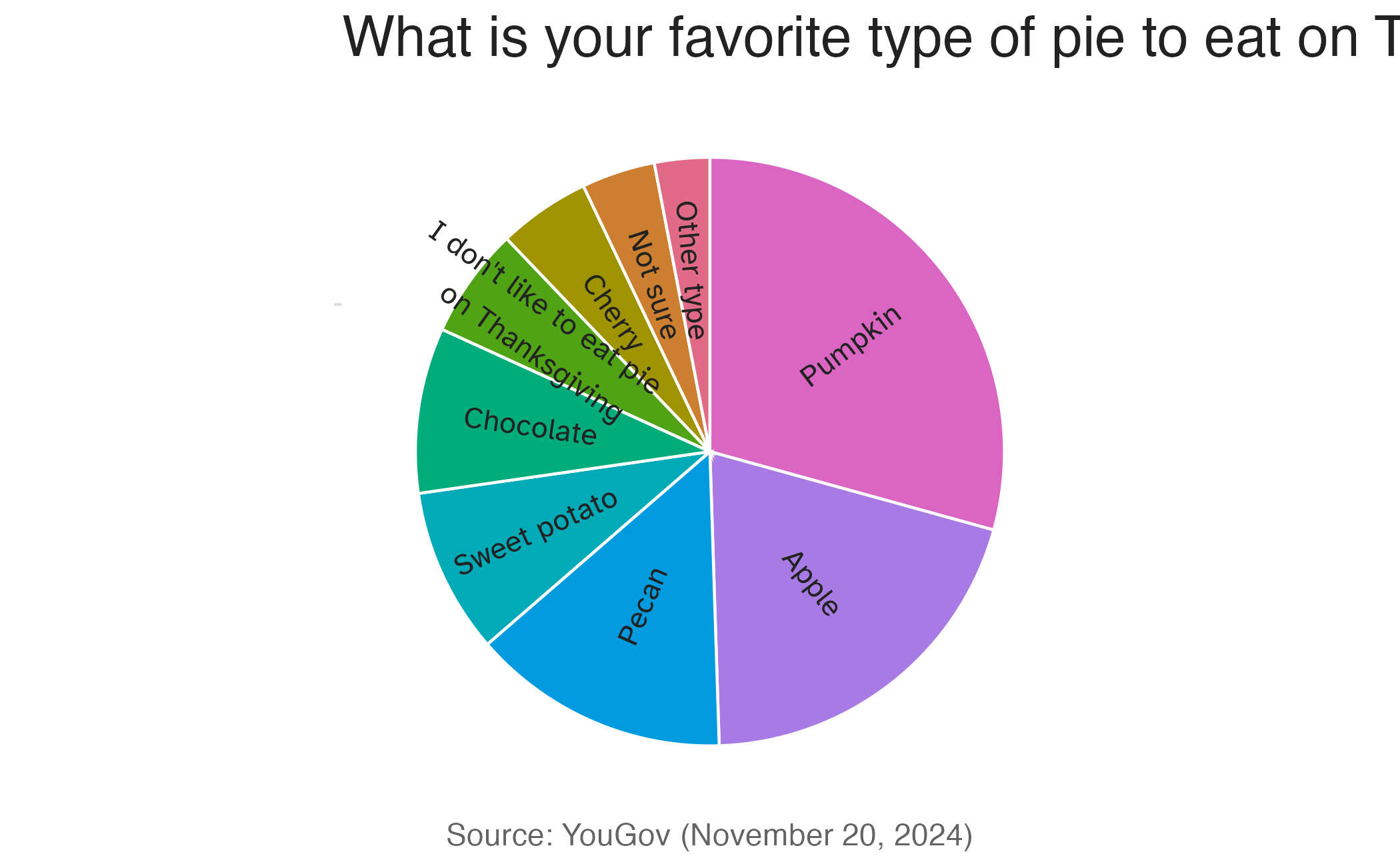
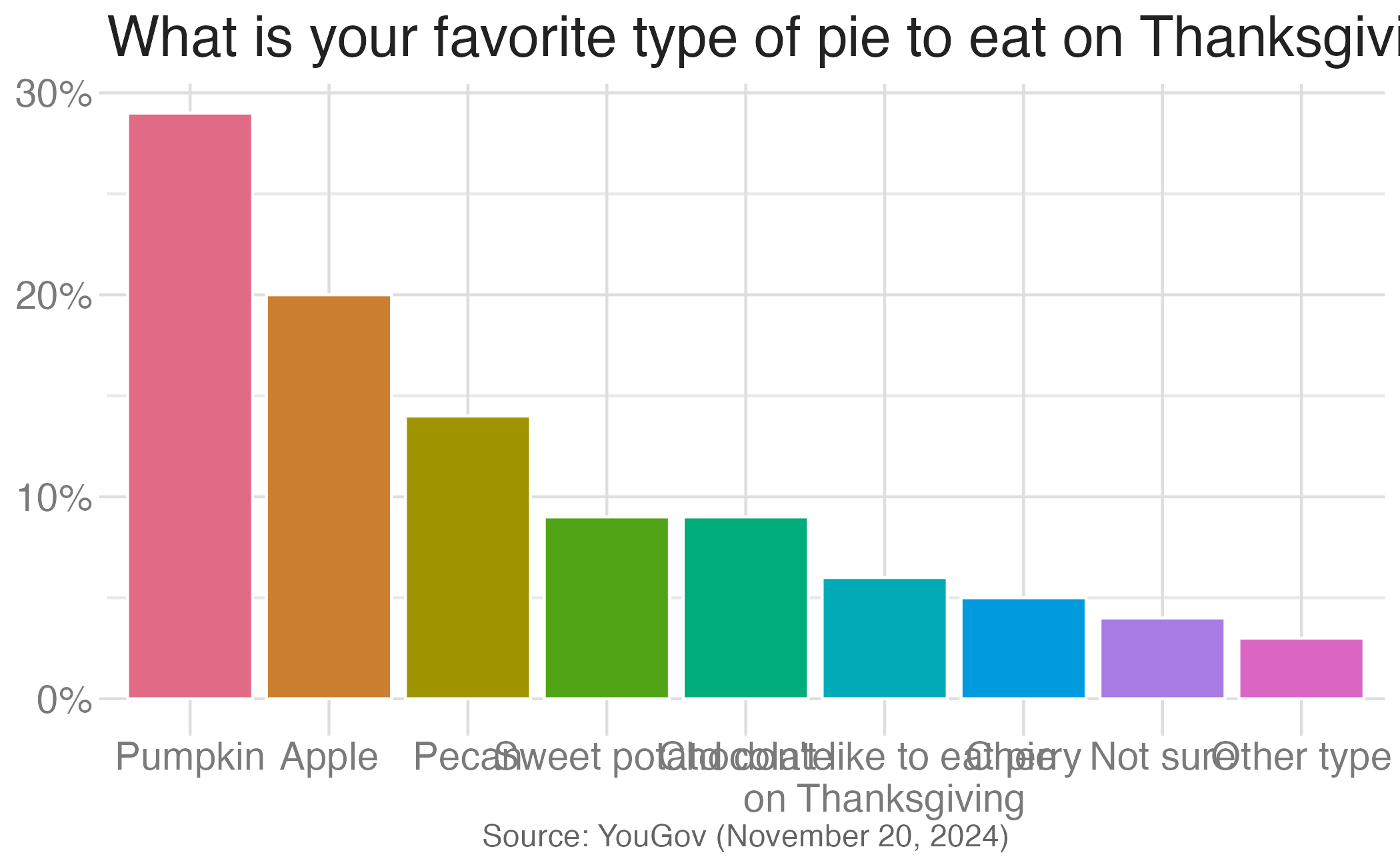
Authentic pie chart
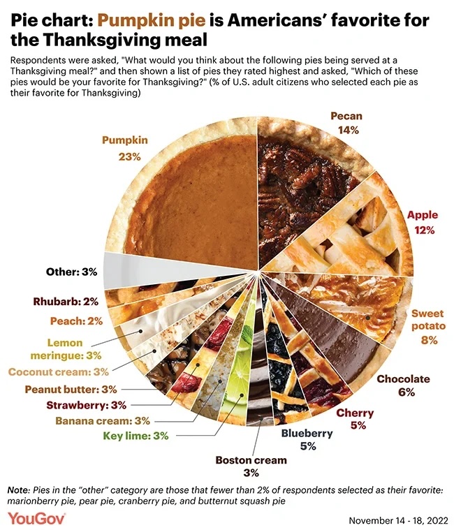
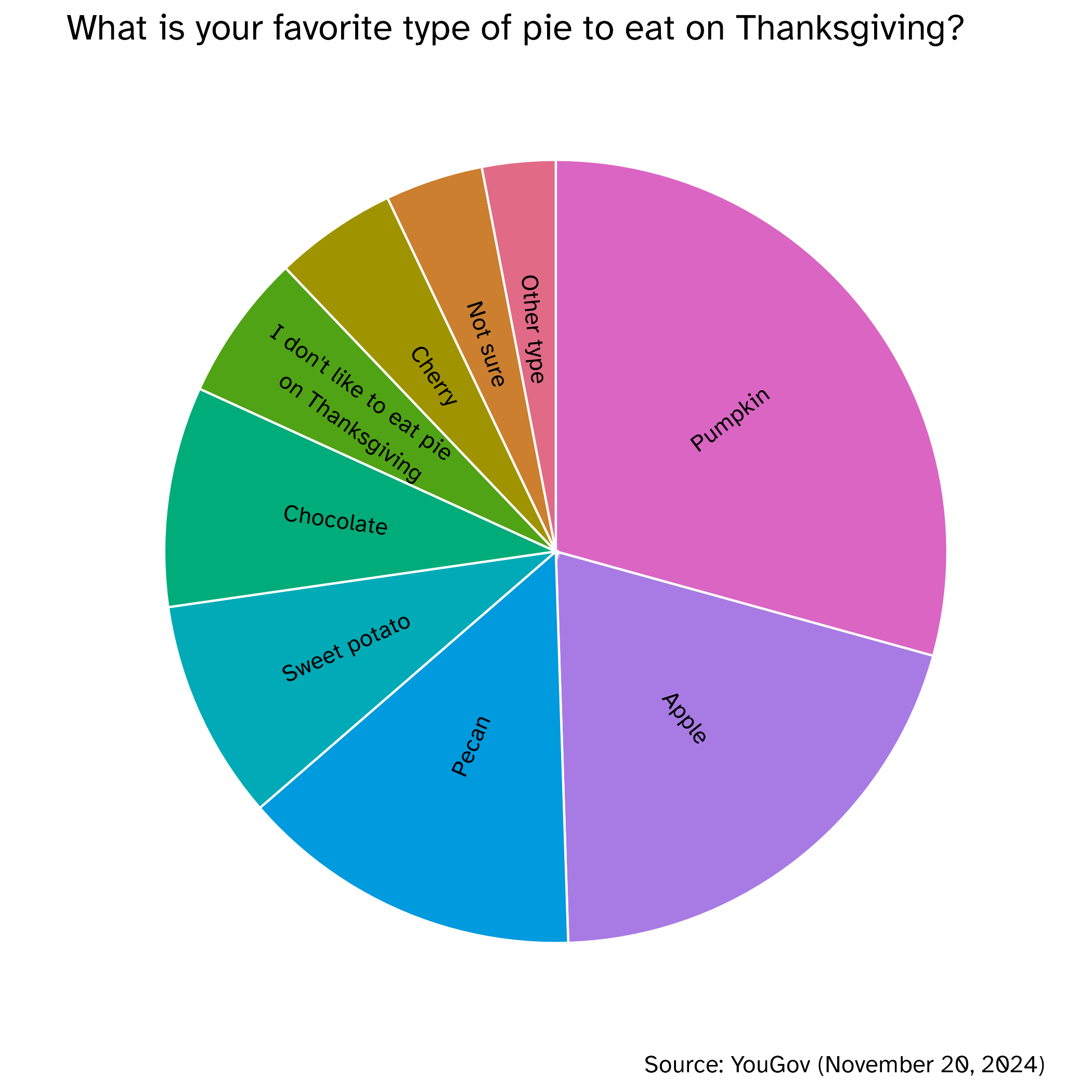
Pie charts
Pie charts
For categorical variables with few levels, pie charts can work well
For categorical variables with many levels, pie charts are difficult to read
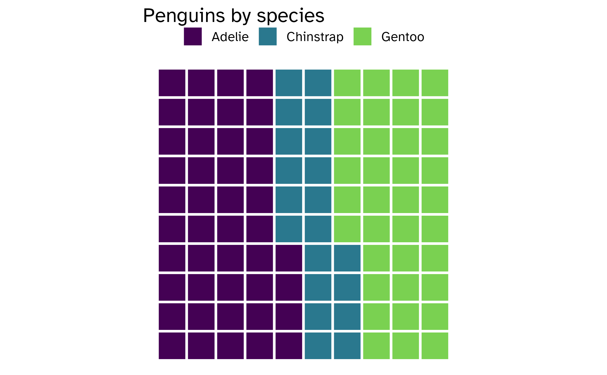
Waffle charts
- Like with pie charts, work best when the number of levels represented is low
- Unlike pie charts, easier to compare proportions that represent non-simple fractions
Application exercise
facet_*()
facet_wrap()- “wraps” a 1d ribbon of panels into 2d
- generally for faceting by a single variable
facet_grid()for faceting- produces a 2d grid of panels defined by variables which form the rows and columns
- generally for faceting by two variables
facet_null(): a single plot, the default
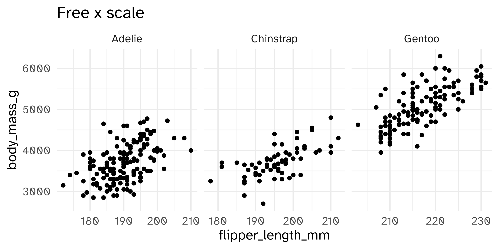
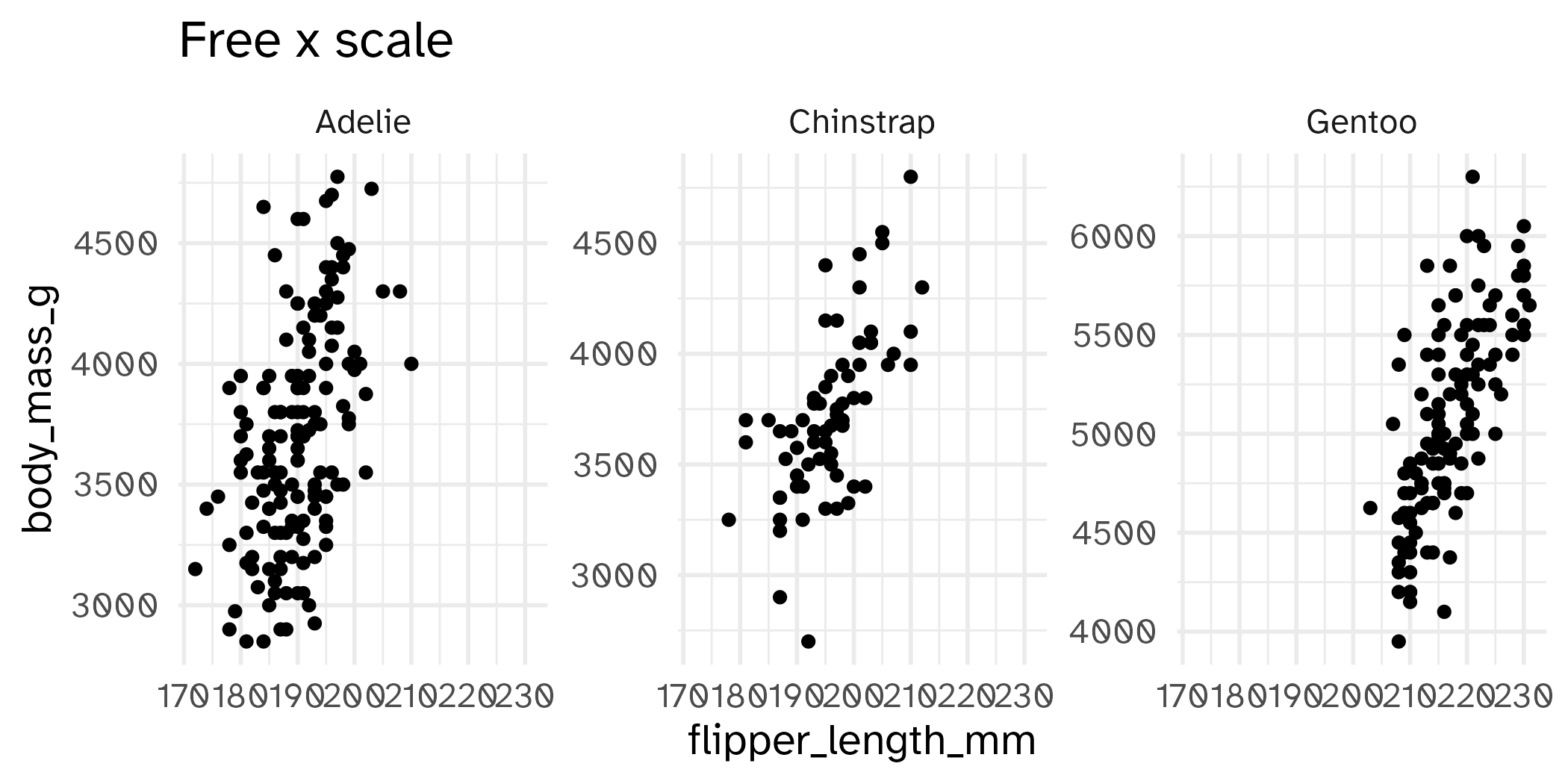
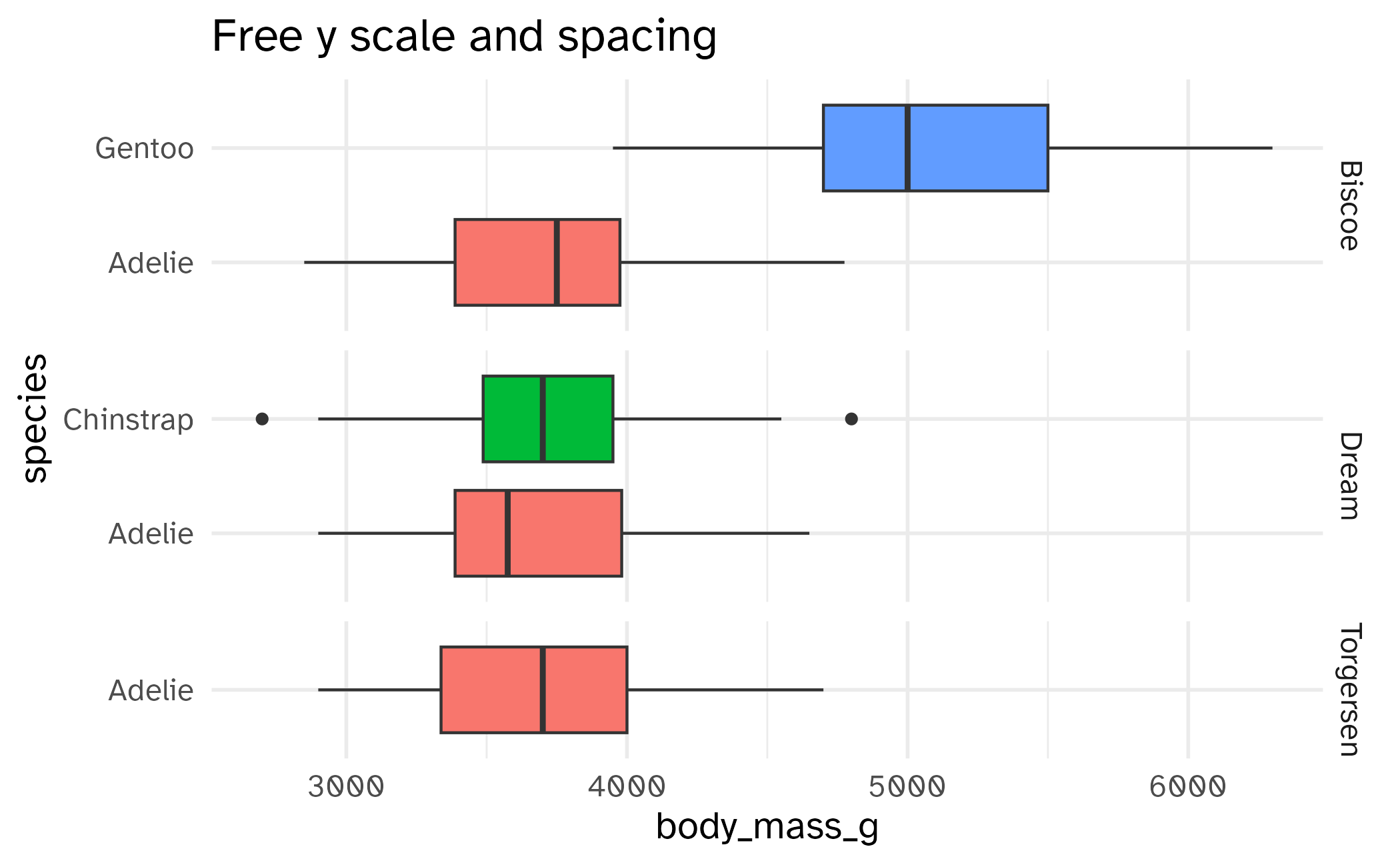
Free the scales!
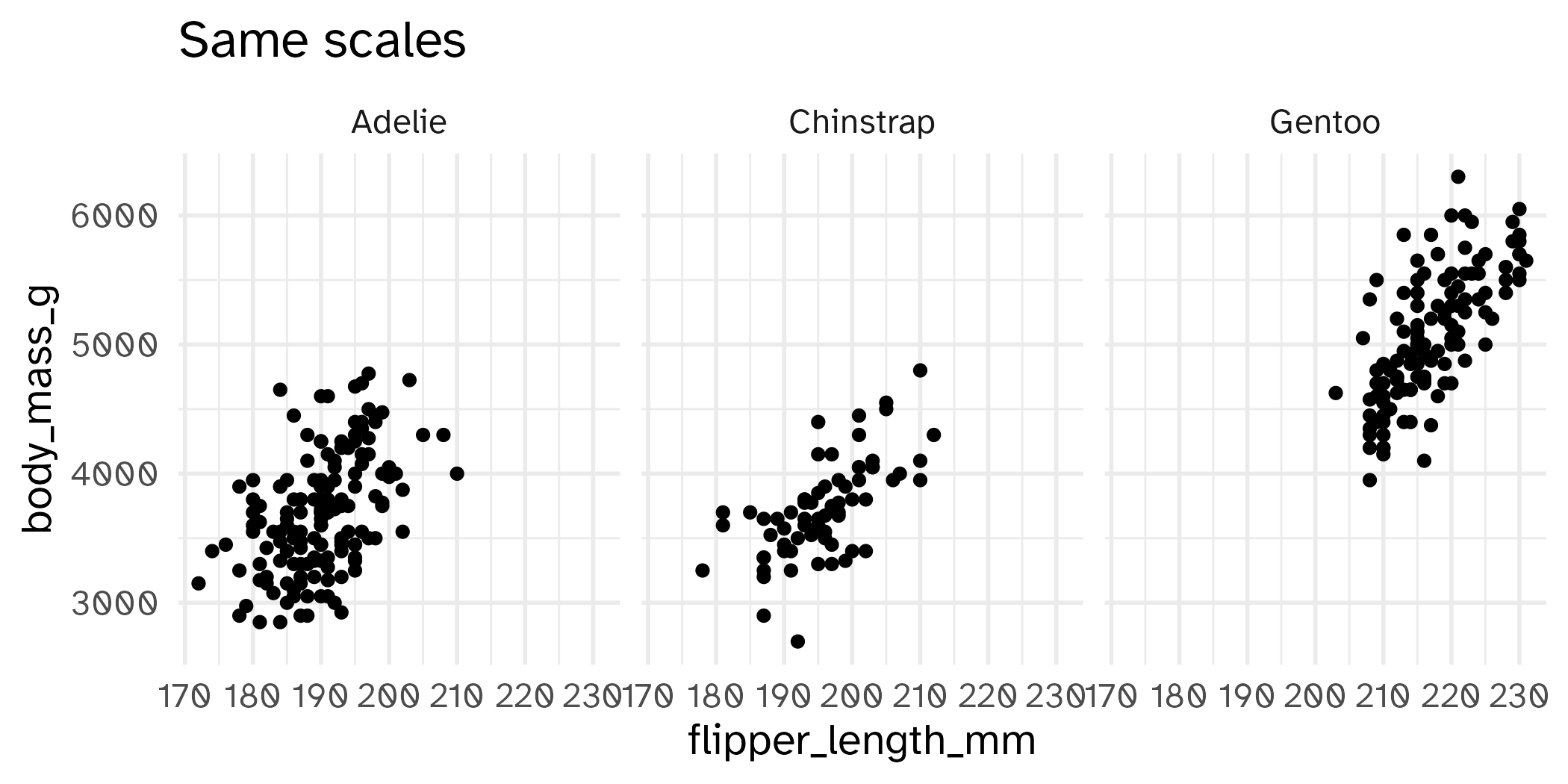
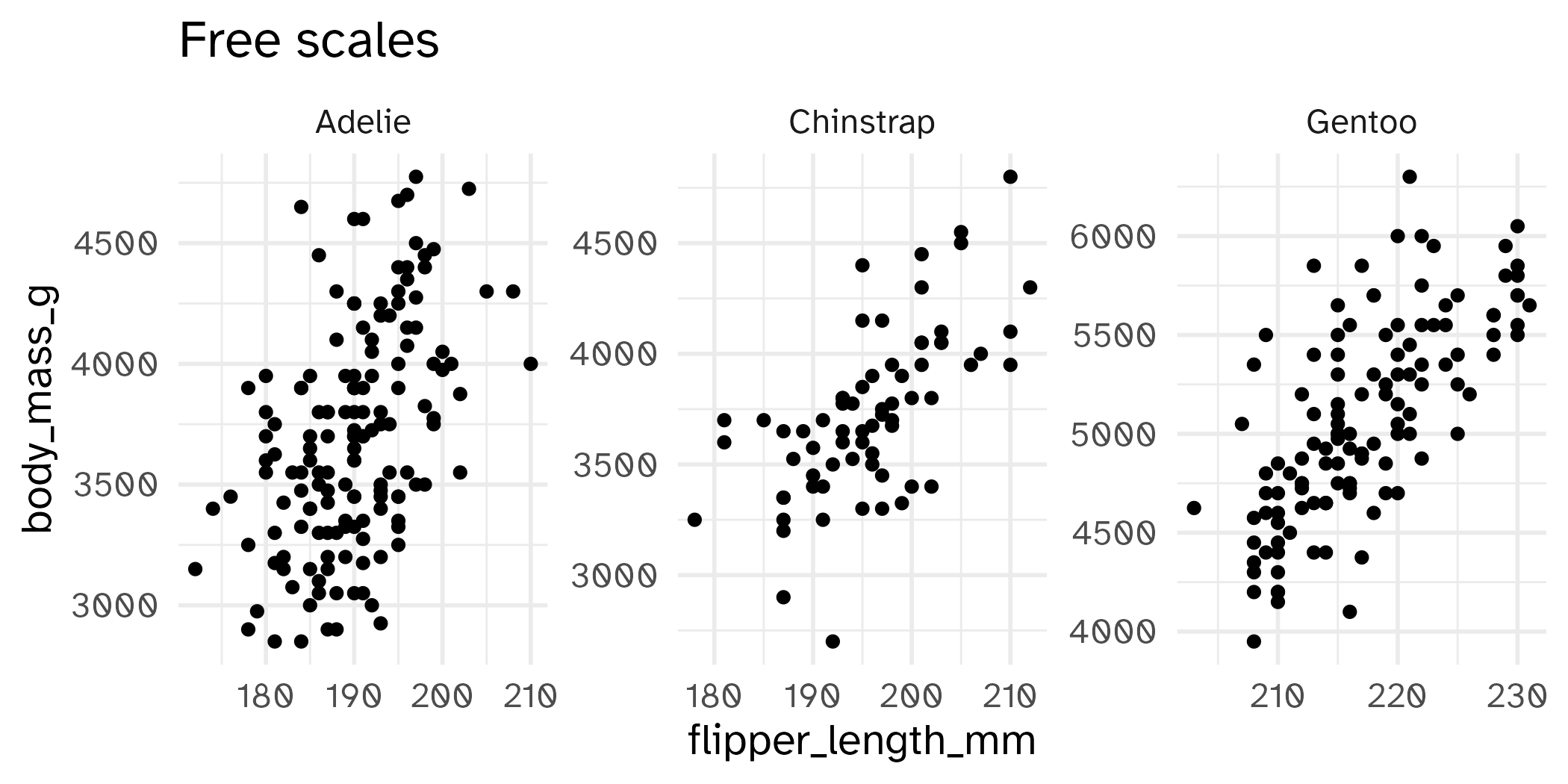
Free some scales
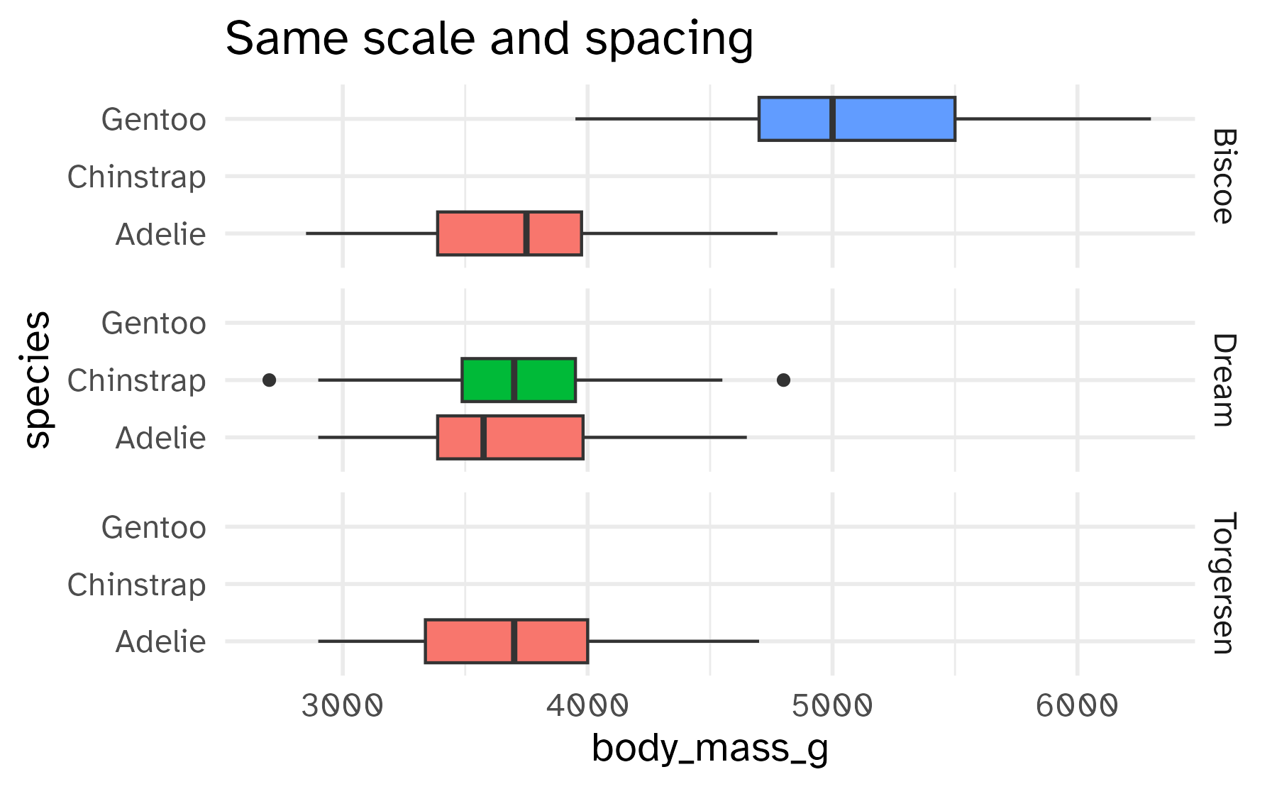
ggplot(penguins, aes(y = species, x = body_mass, fill = species)) +
geom_boxplot(show.legend = FALSE) +
facet_grid(rows = vars(island)) +
labs(title = "Same scale and spacing")
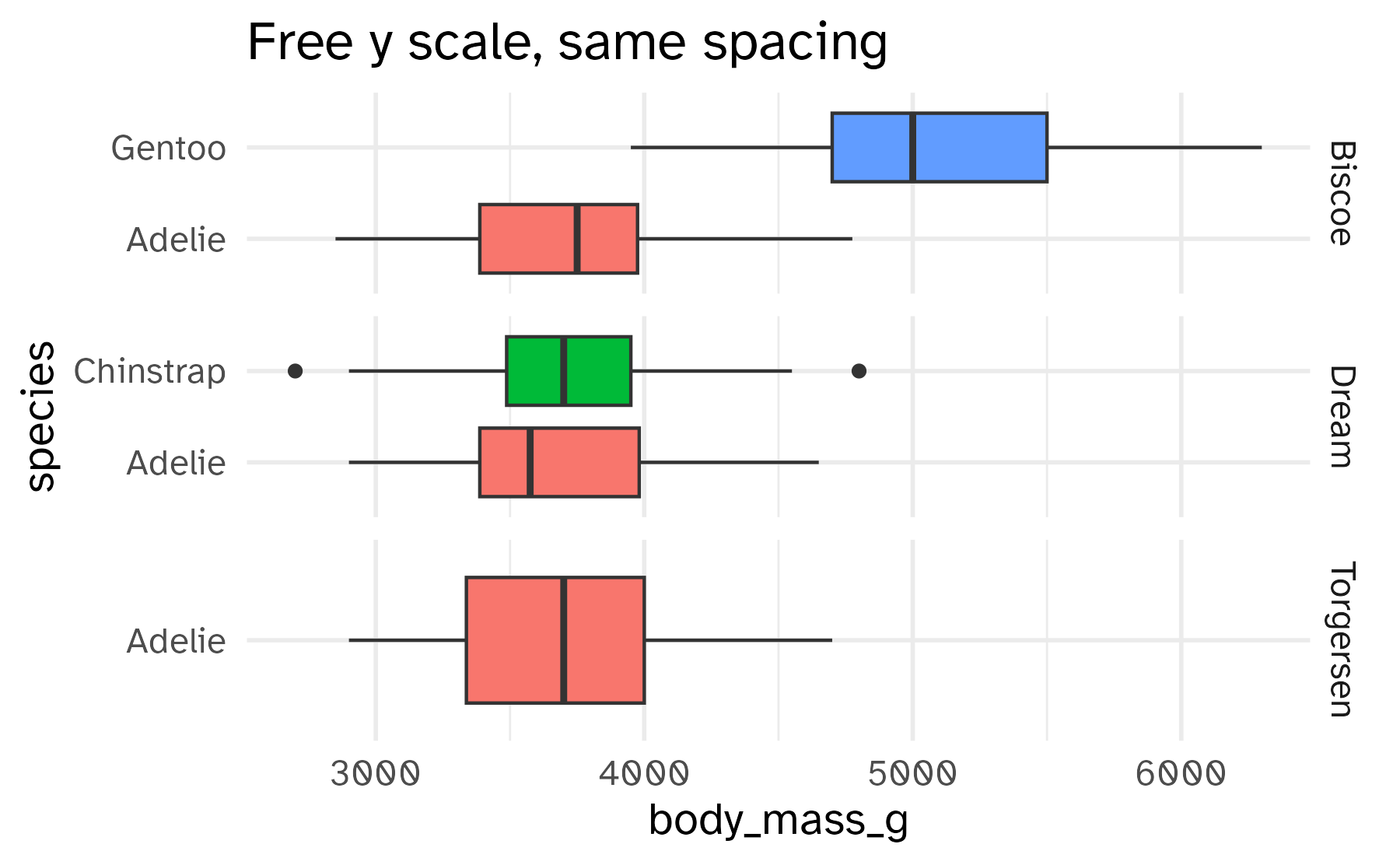
ggplot(penguins, aes(y = species, x = body_mass, fill = species)) +
geom_boxplot(show.legend = FALSE) +
facet_grid(rows = vars(island), scales = "free_y") +
labs(title = "Free y scale, same spacing")Free spaces
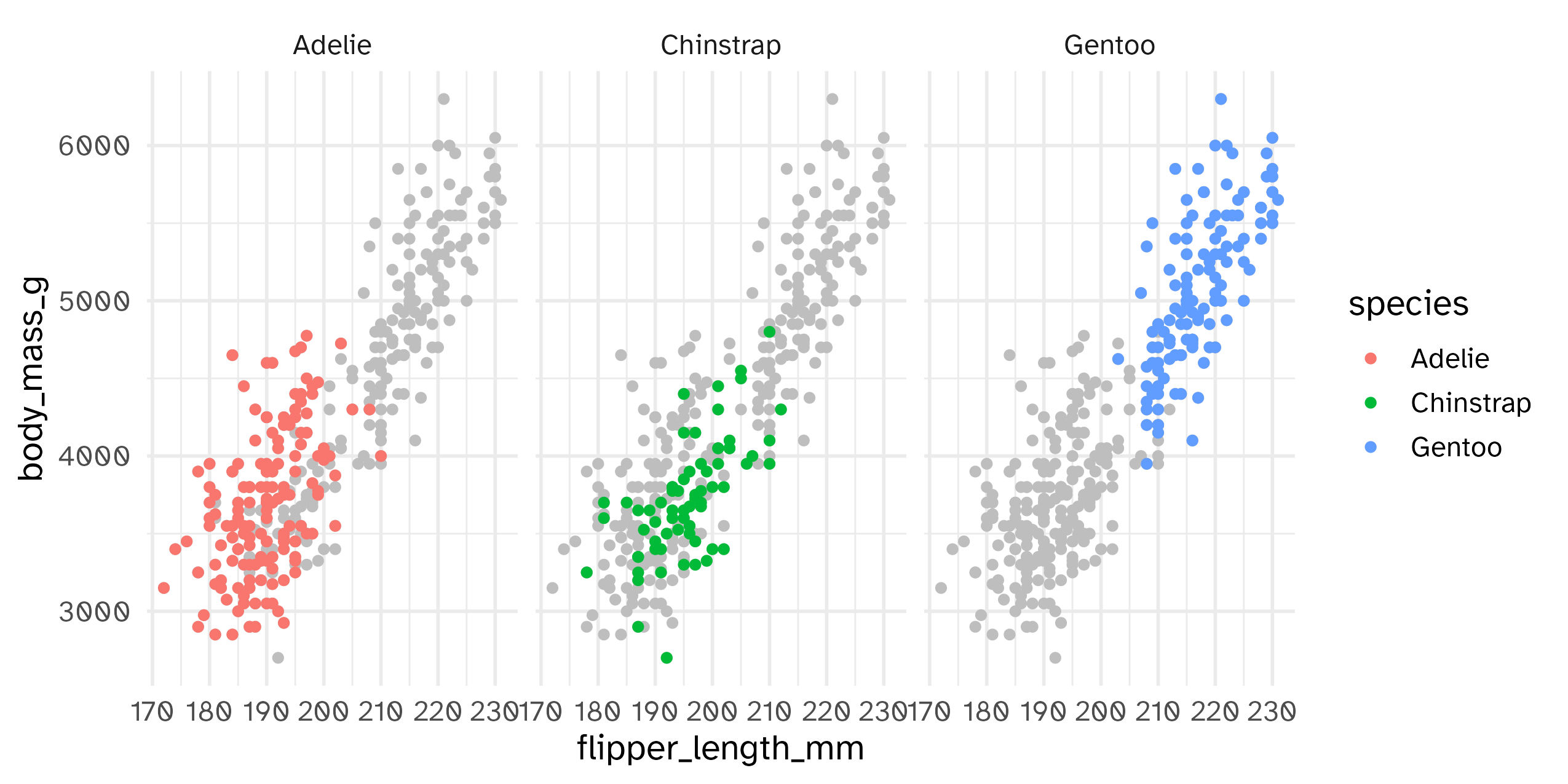
Highlighting across facets
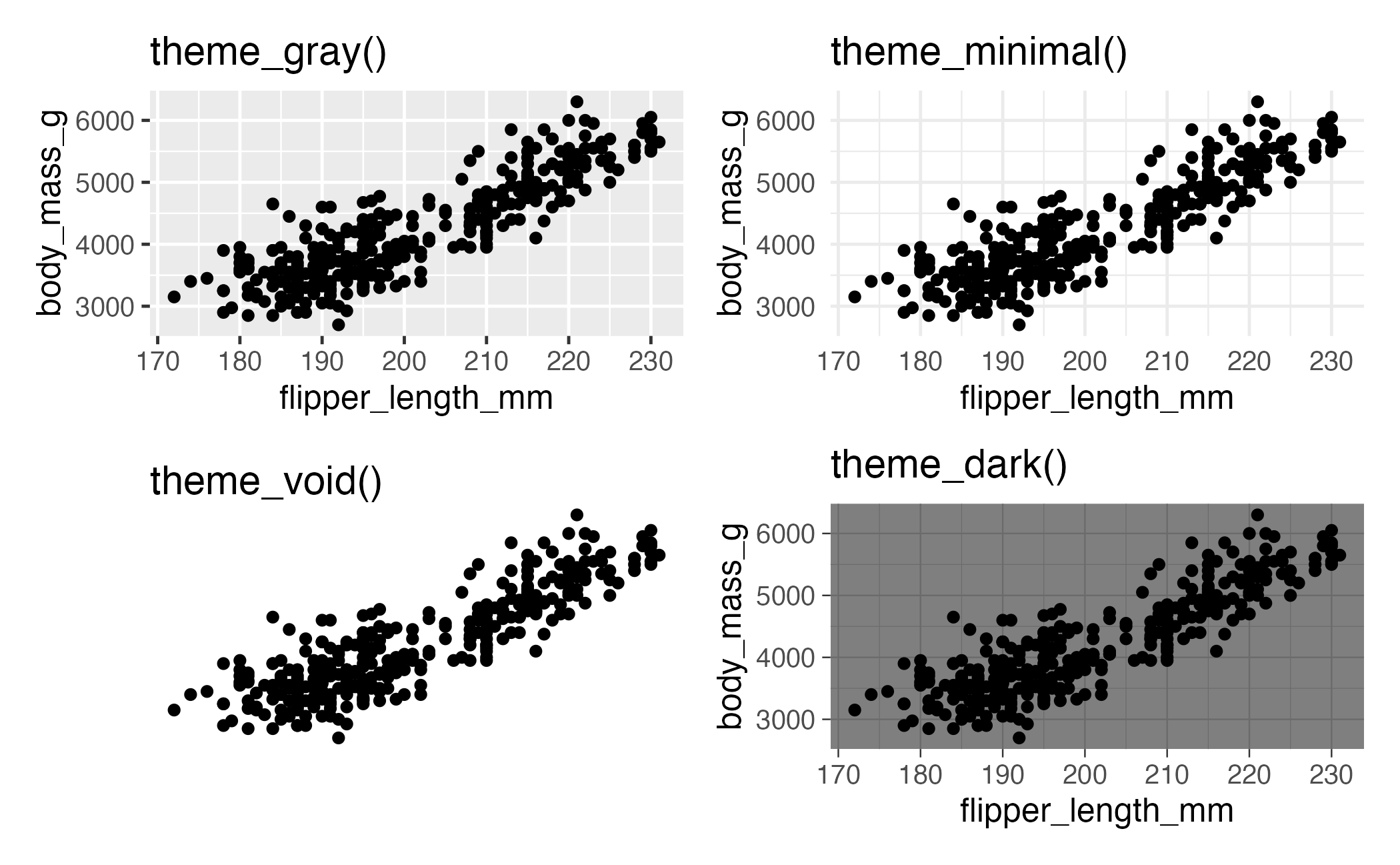
Complete themes
Themes from {ggthemes}
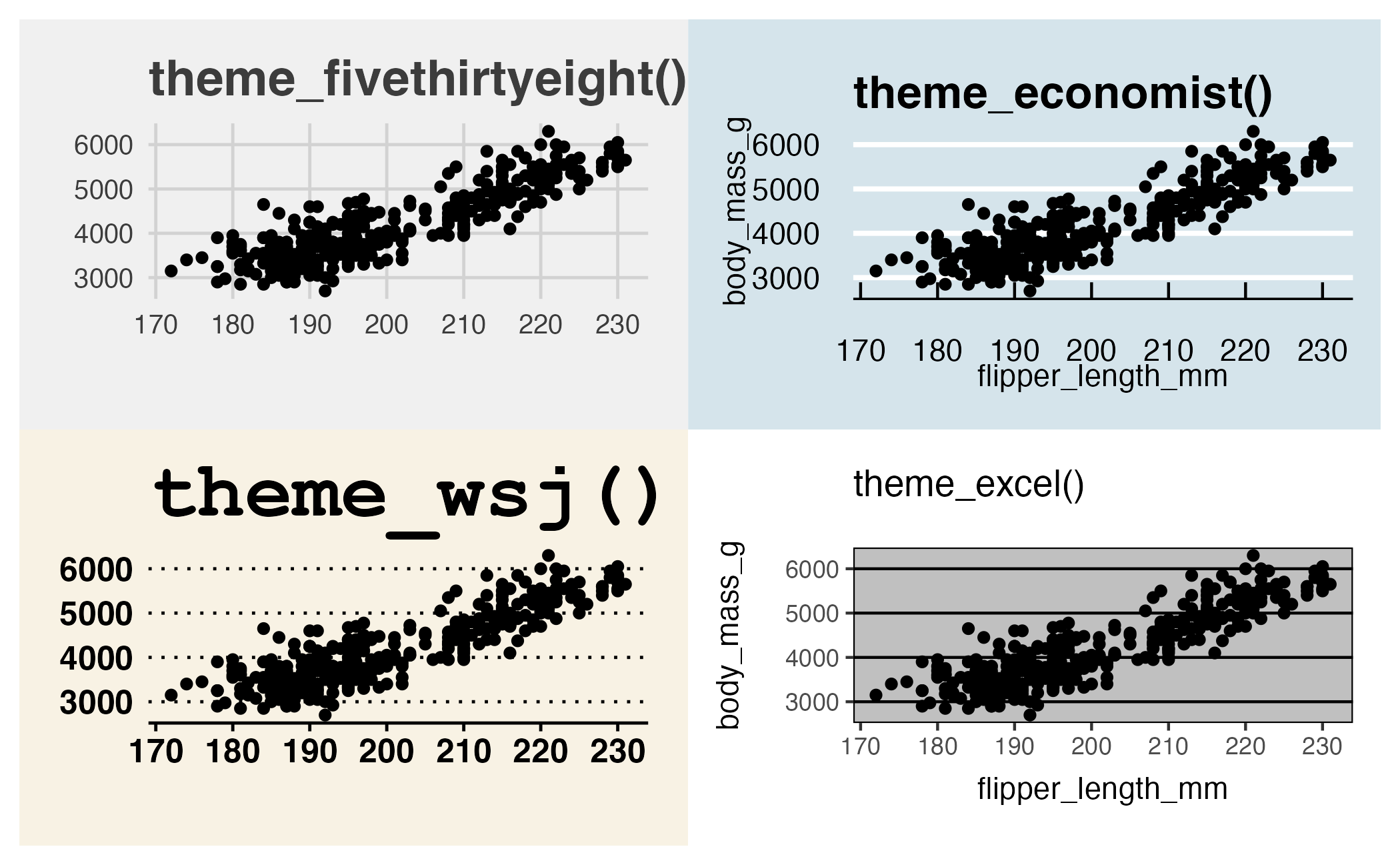
Themes and color scales from {ggthemes}
Modifying theme elements
Project 01
- Initial proposal
- Develop as a team
- Take chances, make mistakes, get messy!

