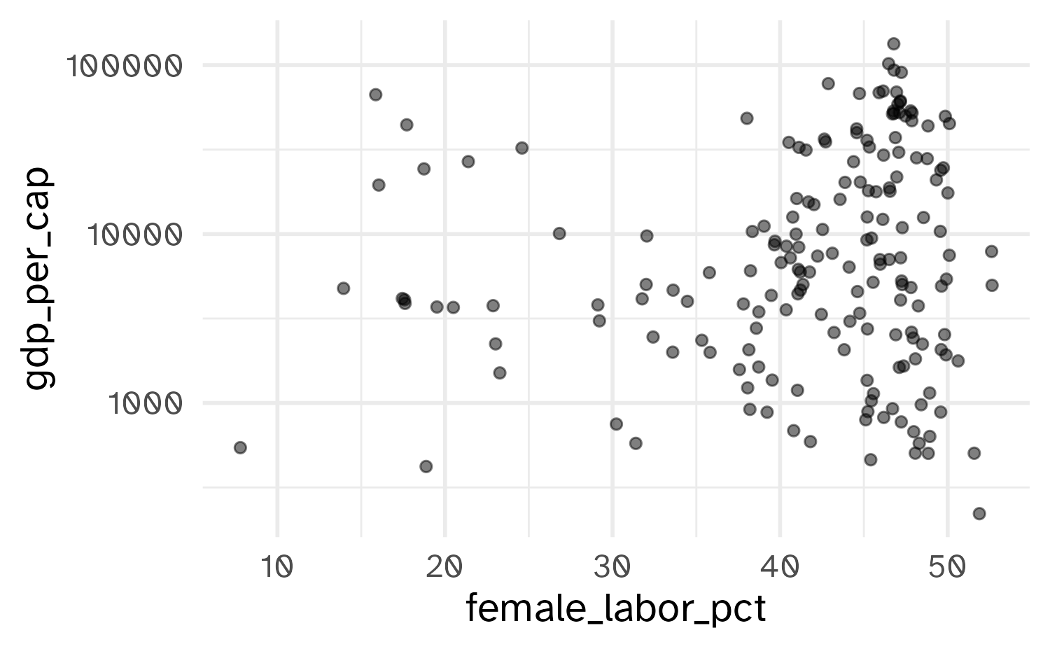
# A tibble: 174 × 8
   iso2c country               year gdp_per_cap female_labor_pct life_exp      pop income_level
   <chr> <chr>                <dbl>       <dbl>            <dbl>    <dbl>    <dbl> <fct>
 1 AF    Afghanistan           2023        414.             6.85     66.0 41454761 Low income
 2 AO    Angola                2023       2916.            49.4      64.6 36749906 Lower middle inc…
 3 AL    Albania               2023       9731.            46.4      79.6  2414095 Upper middle inc…
 4 AE    United Arab Emirates  2023      49851.            22.3      82.9 10483751 High income
 5 AR    Argentina             2023      14262.            43.2      77.4 45538401 Upper middle inc…
 6 AM    Armenia               2023       8159.            47.2      77.5  2964300 Upper middle inc…
 7 AU    Australia             2023      65058.            47.4      83.1 26659922 High income
 8 AT    Austria               2023      56580.            46.9      81.5  9131761 High income
 9 AZ    Azerbaijan            2023       7133.            49.9      74.4 10153958 Upper middle inc…
10 BI    Burundi               2023        251.            51.6      63.7 13689450 Low income
# ℹ 164 more rowsDeep dive: stats + scales + guides
Lecture 5
February 3, 2026
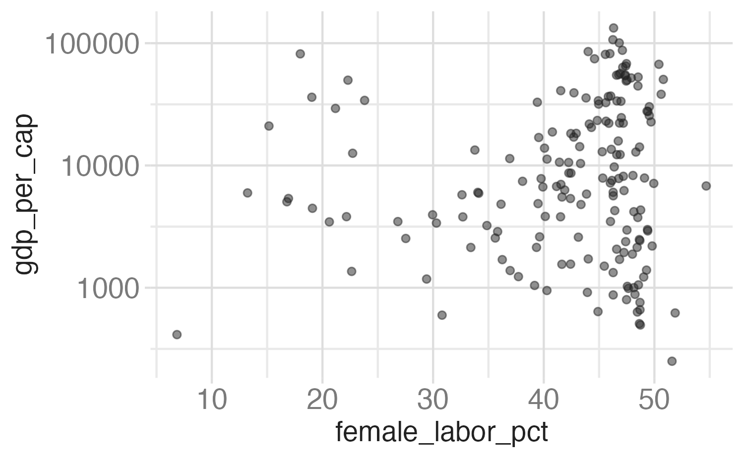
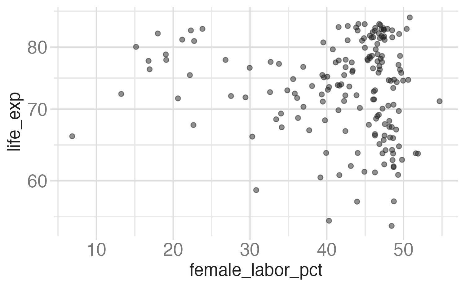
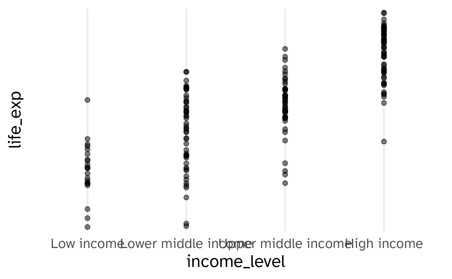
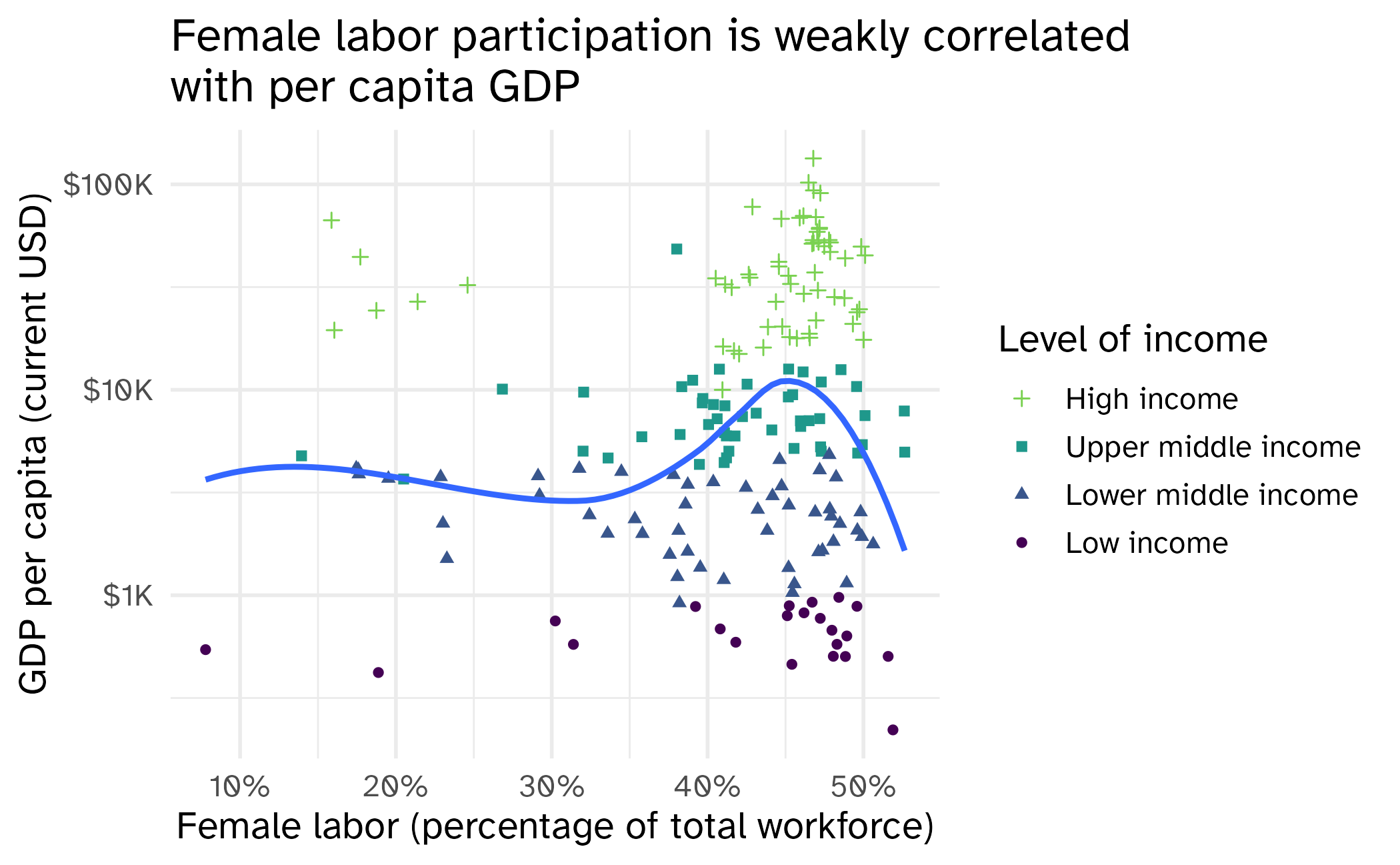
- What is the story?
- What challenges do you see with the design?
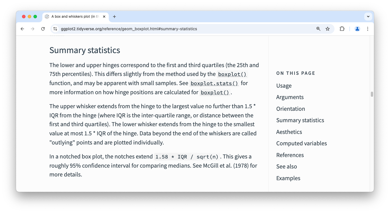
stat_boxplot()
Layering with stats
Alternate: layering with stats
Alternate alternate: do it with {dplyr}

Scale specification
Every aesthetic in your plot is associated with exactly one scale:
“Address” messages
Scale for x is already present.
Adding another scale for x, which will replace the existing scale.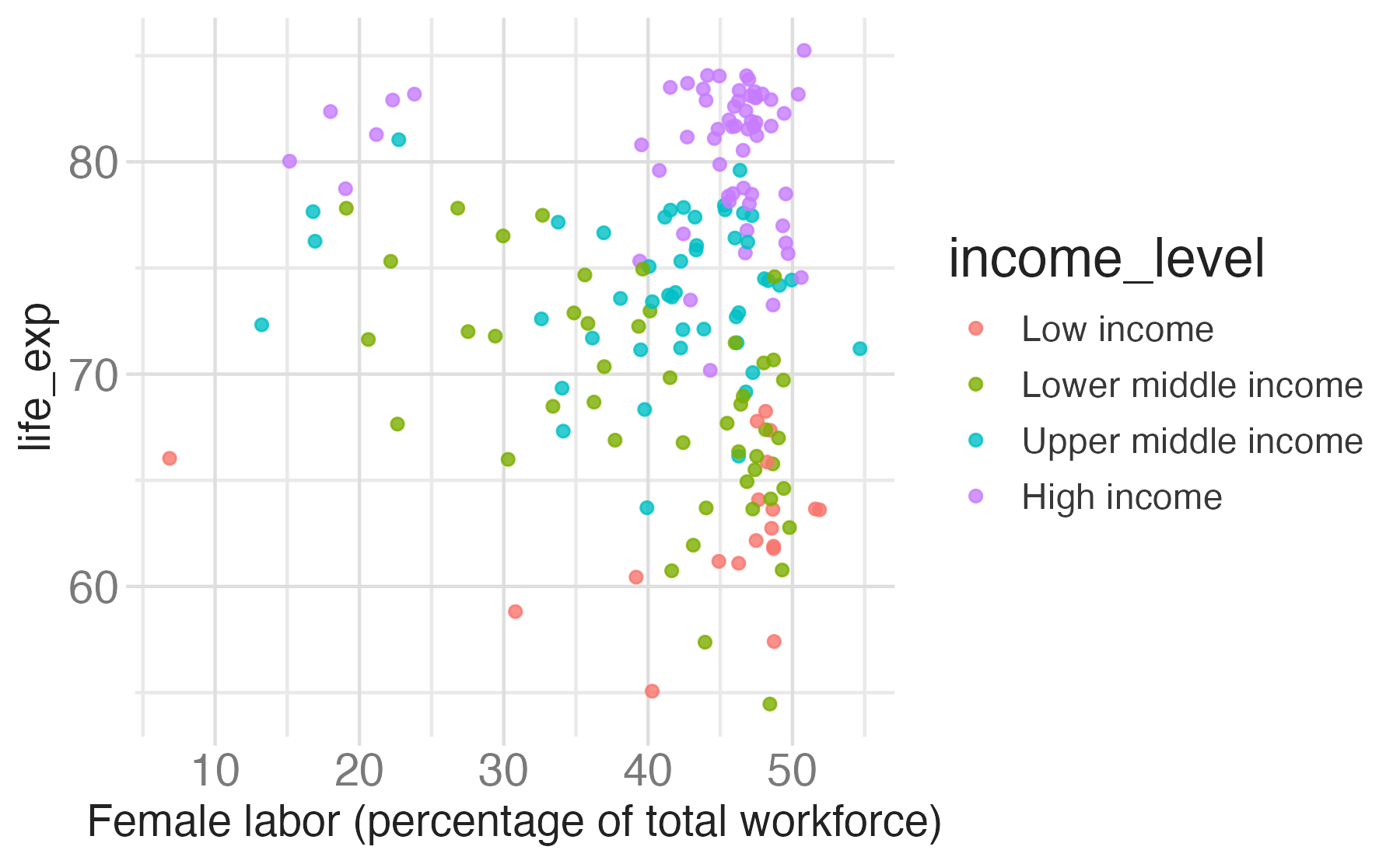
What happens if incorrect pairing?
Error in `scale_x_continuous()`:
! Discrete value supplied to a continuous scale.
ℹ Example values: Low income, Lower middle income, Upper middle income, and High income.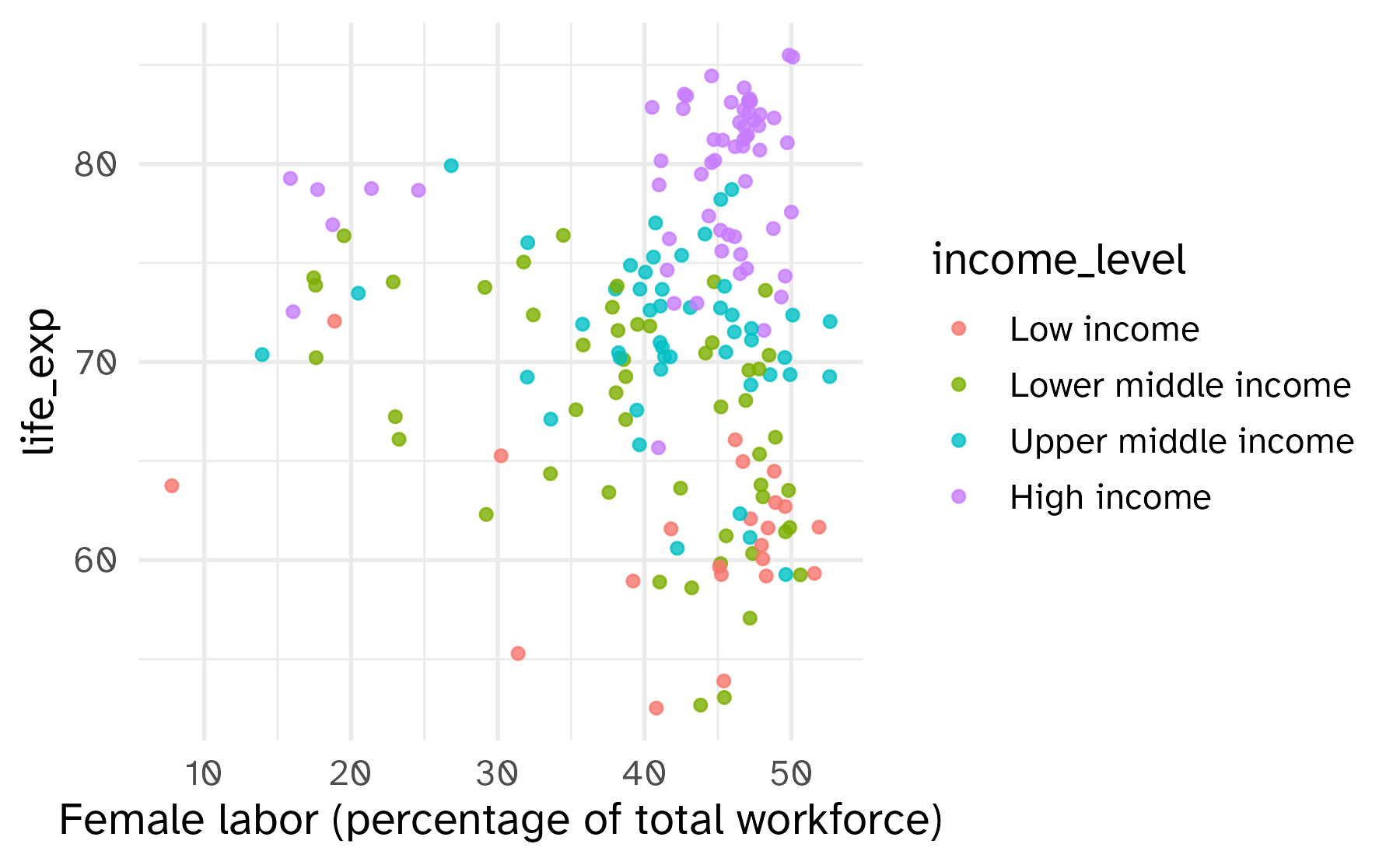
Transformations
When working with continuous data, the default is to map linearly from the data space onto the aesthetic space, but this scale can be transformed
Common scale transformations
Box-Cox scale transformations
Convenience functions for transformations
What is a guide?
Guides are axes and legends:
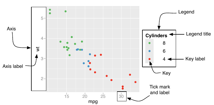
Customizing axes
Customizing axes
Customizing axes
Customizing axes
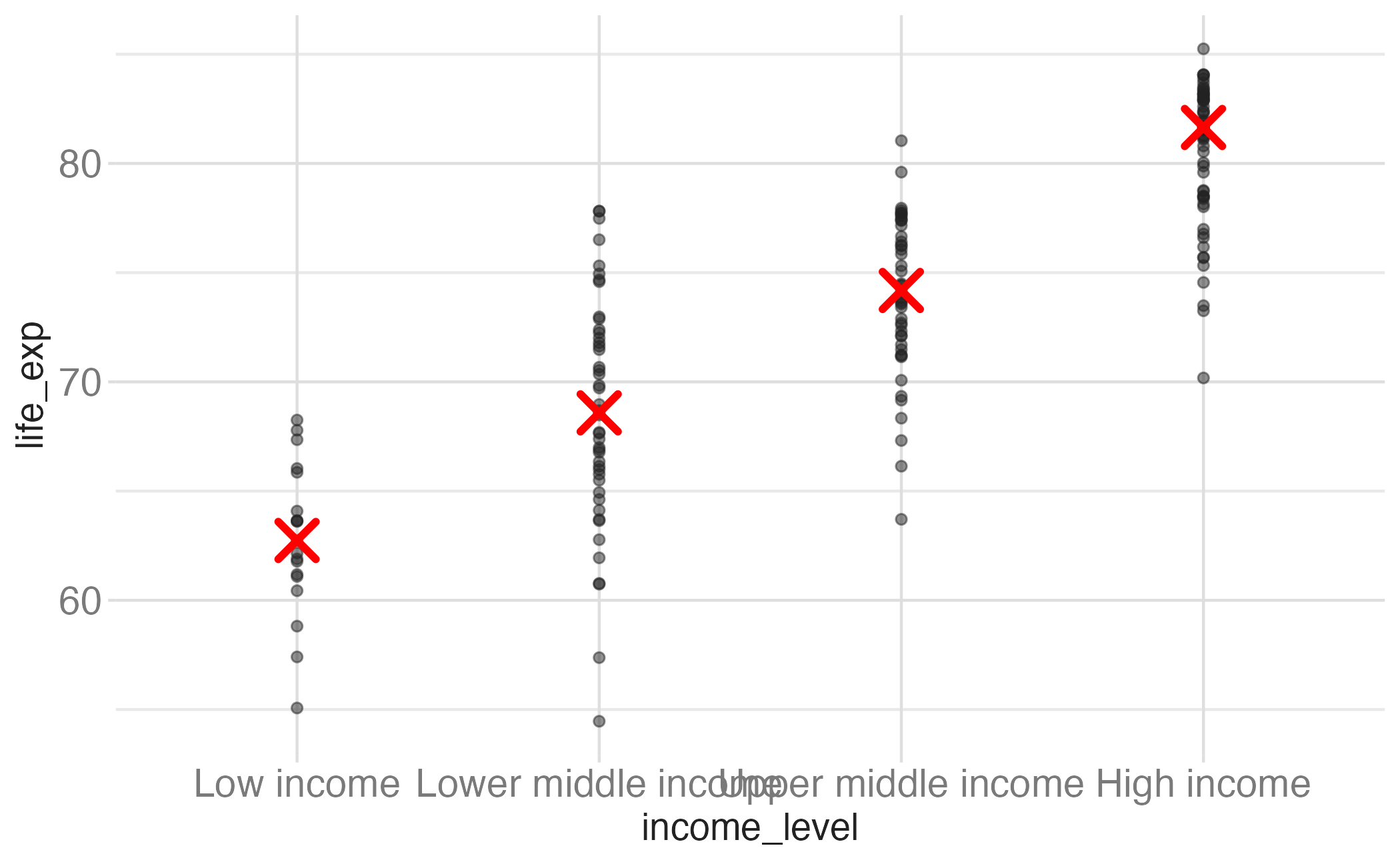
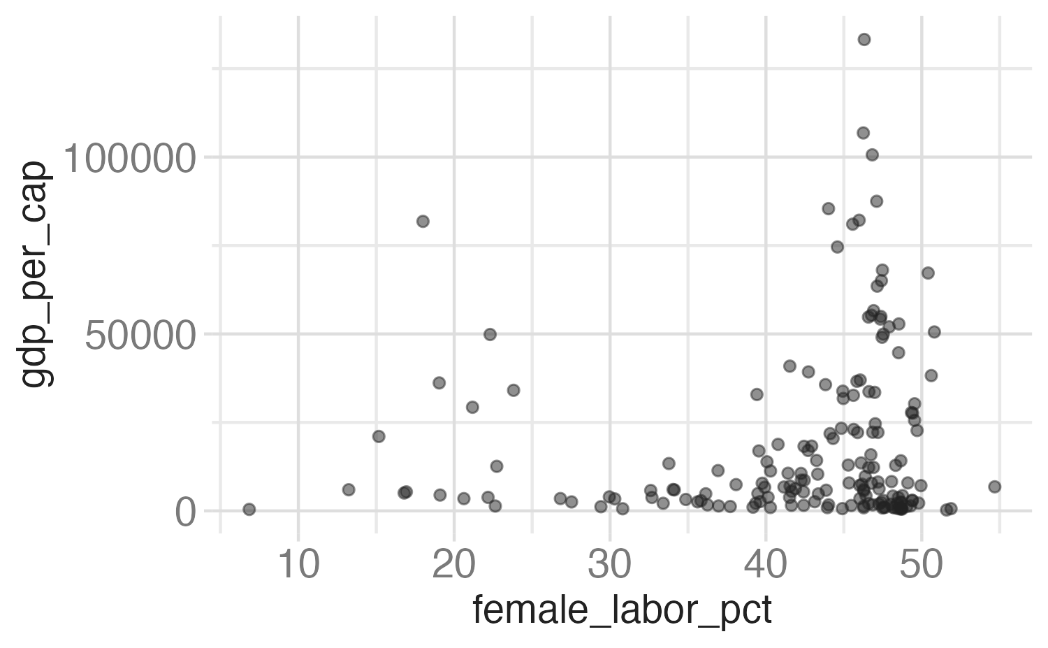
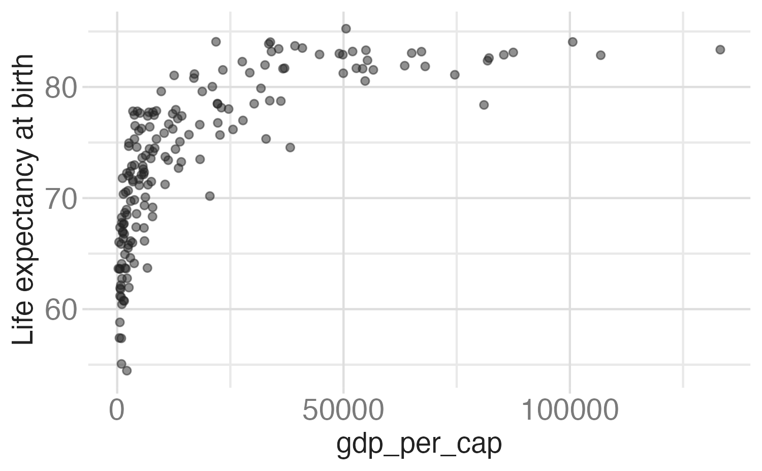
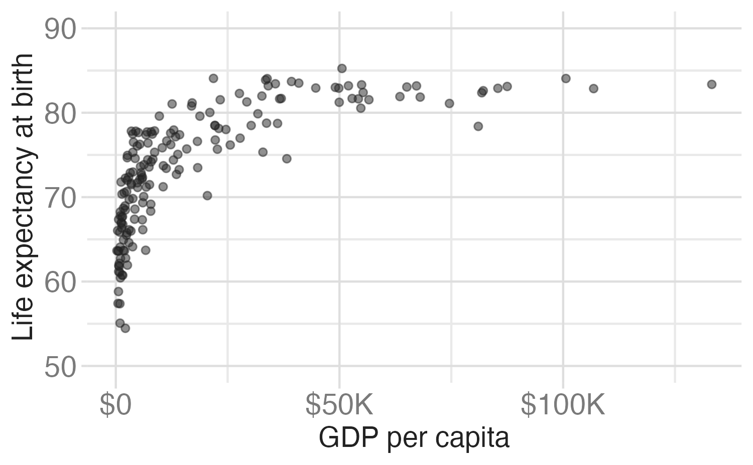
ggplot(world_bank, aes(x = gdp_per_cap, y = life_exp)) +
  geom_point(alpha = 0.5) +
  scale_y_continuous(
    name = "Life expectancy at birth",
    breaks = seq(from = 50, to = 90, by = 10),
    limits = c(50, 90)
) +
scale_x_continuous(
name = "GDP per capita",
breaks = c(0, 5e04, 1e05),
labels = c("$0", "$50,000", "$100,000")
)
Customizing axes
Customizing axes
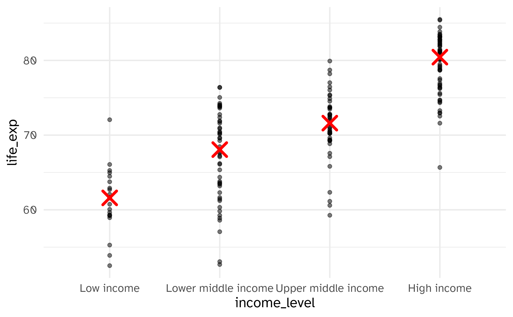
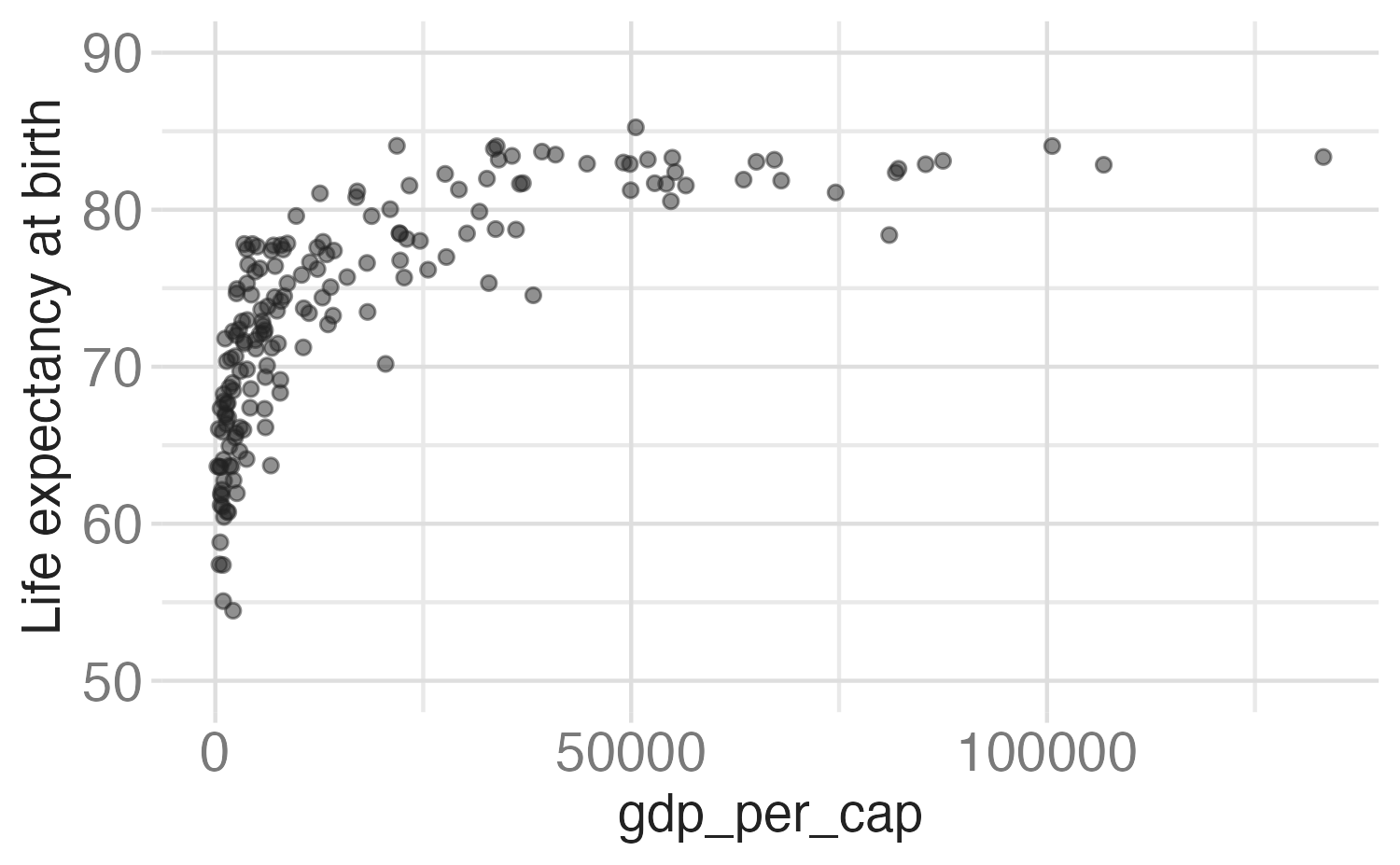
ggplot(world_bank, aes(x = gdp_per_cap, y = life_exp)) +
  geom_point(alpha = 0.5) +
  scale_y_continuous(
    name = "Life expectancy at birth",
    breaks = seq(from = 50, to = 90, by = 10),
    limits = c(50, 90)
  ) +
  scale_x_continuous(
    name = "GDP per capita",
    labels = label_currency(scale_cut = cut_short_scale())
  )
Scale guides
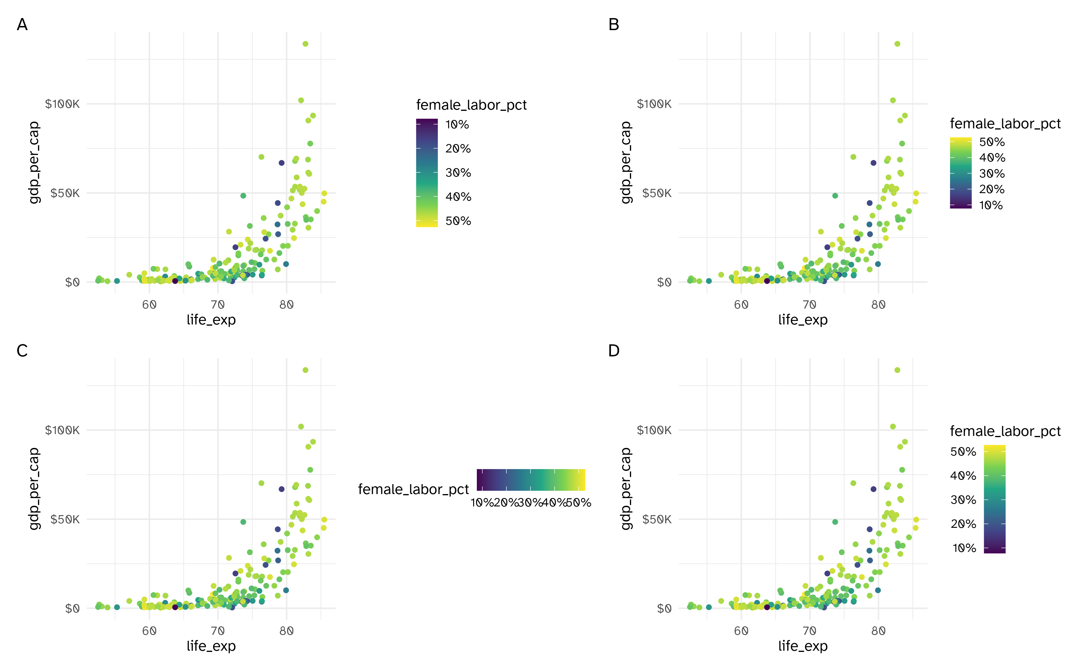
Example implementation
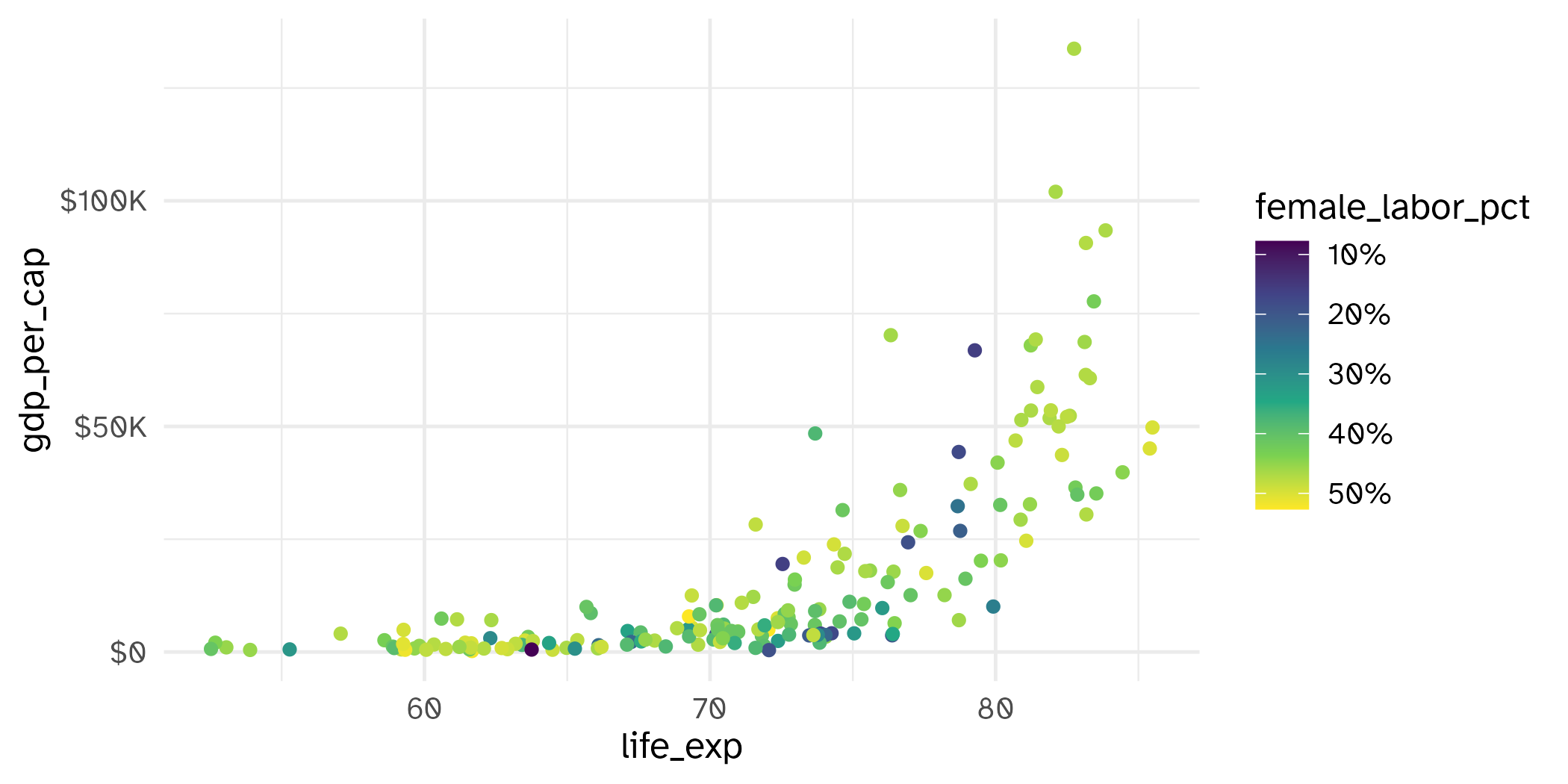
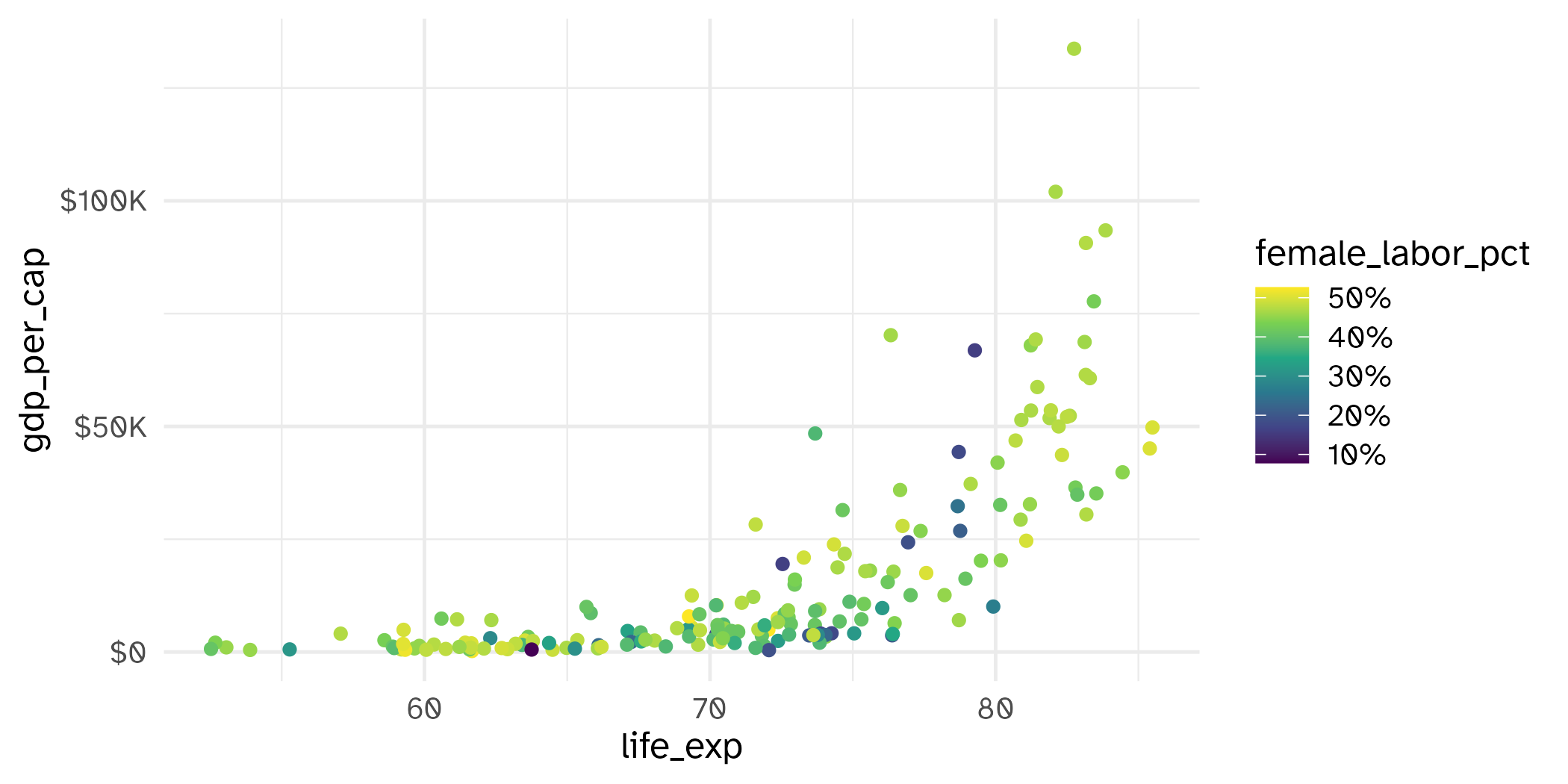
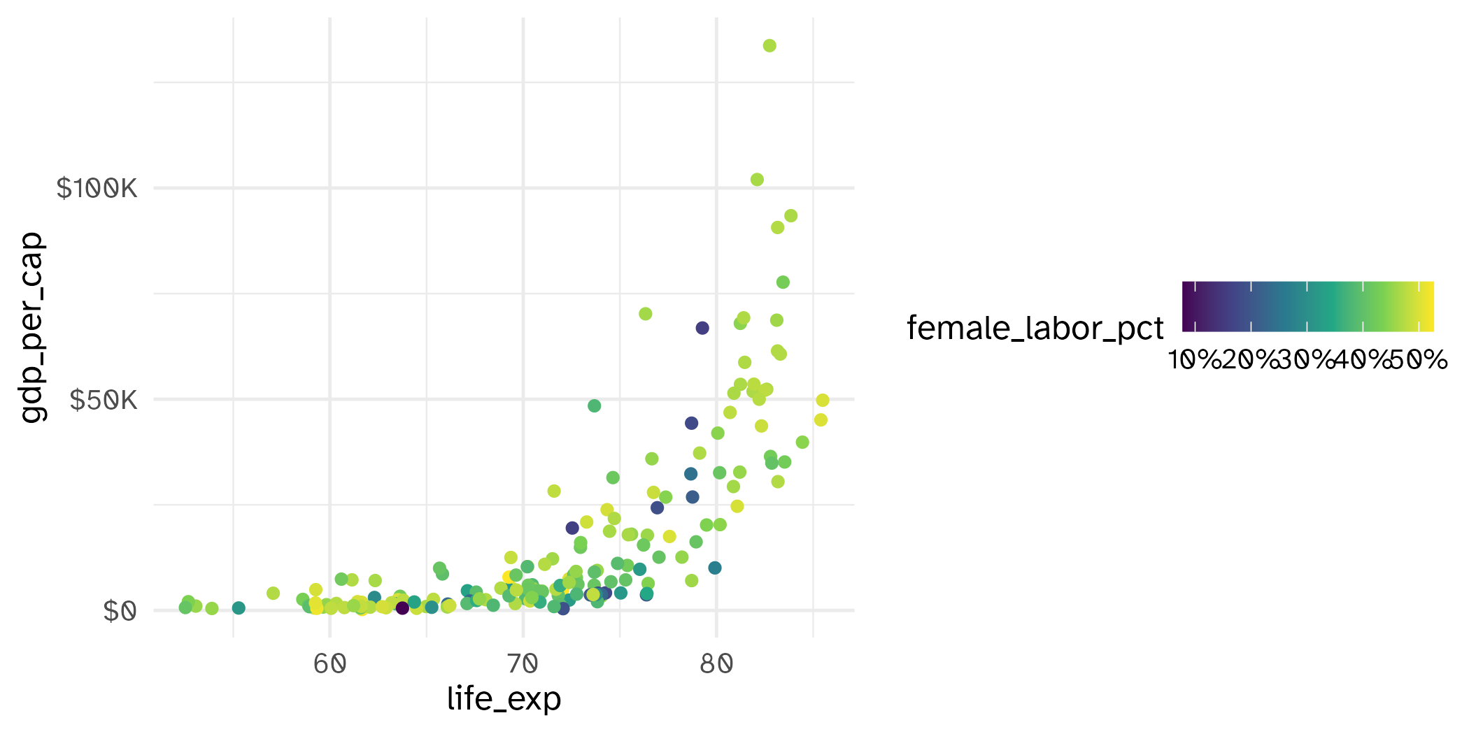
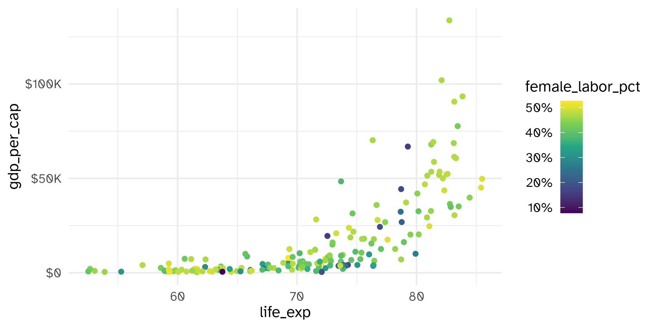
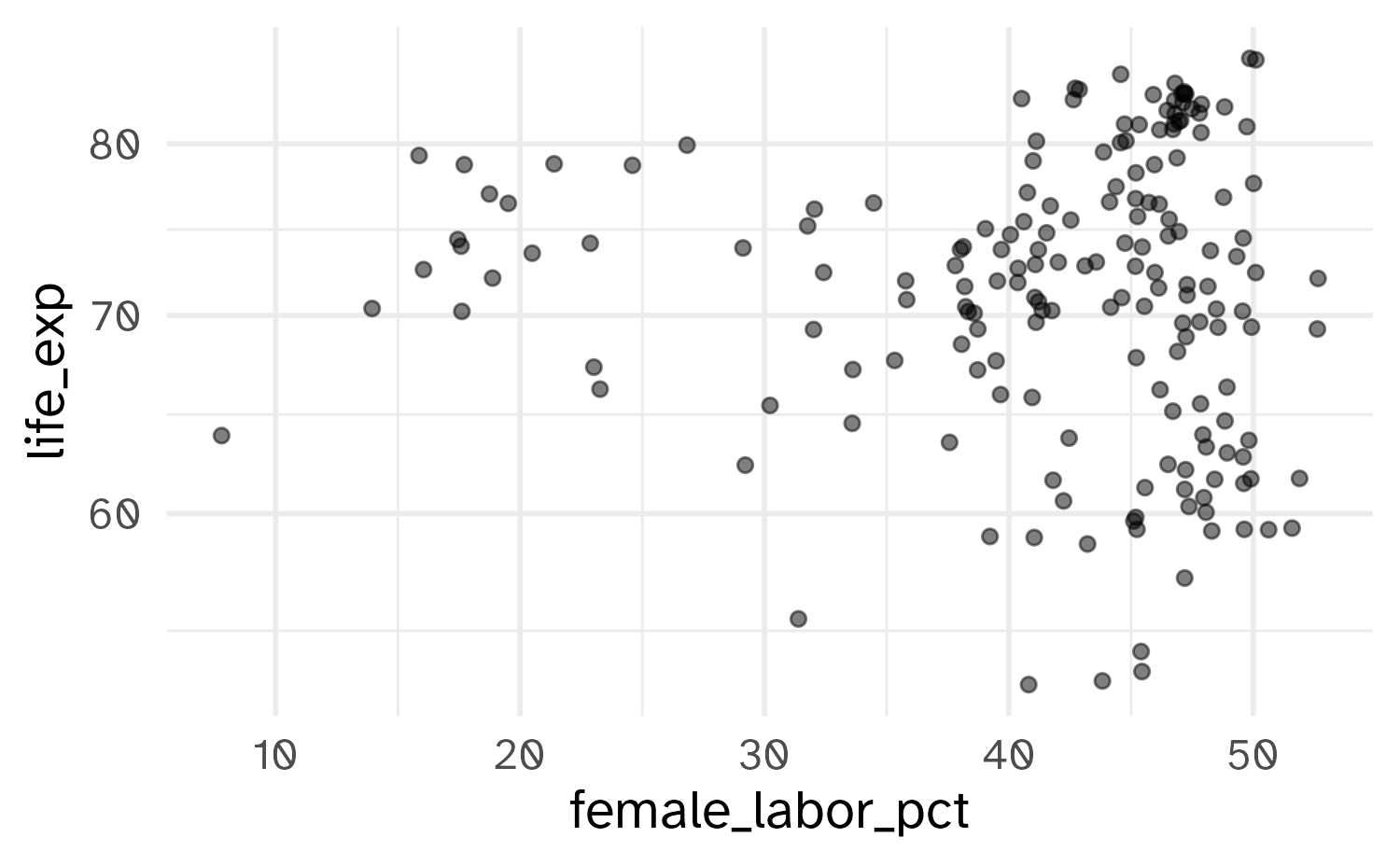
ae-04
Work through part 2
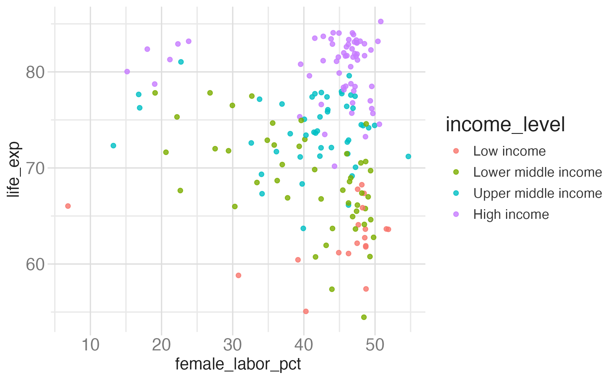
Recreate this plot.
10:00
