Graphical perception + layers

Lecture 04

Dr. Benjamin Soltoff

Cornell University
INFO 3312/5312 - Fall 2026

September 3, 2026

Announcements

Announcements

  • Register if you have not already
  • Homework 02

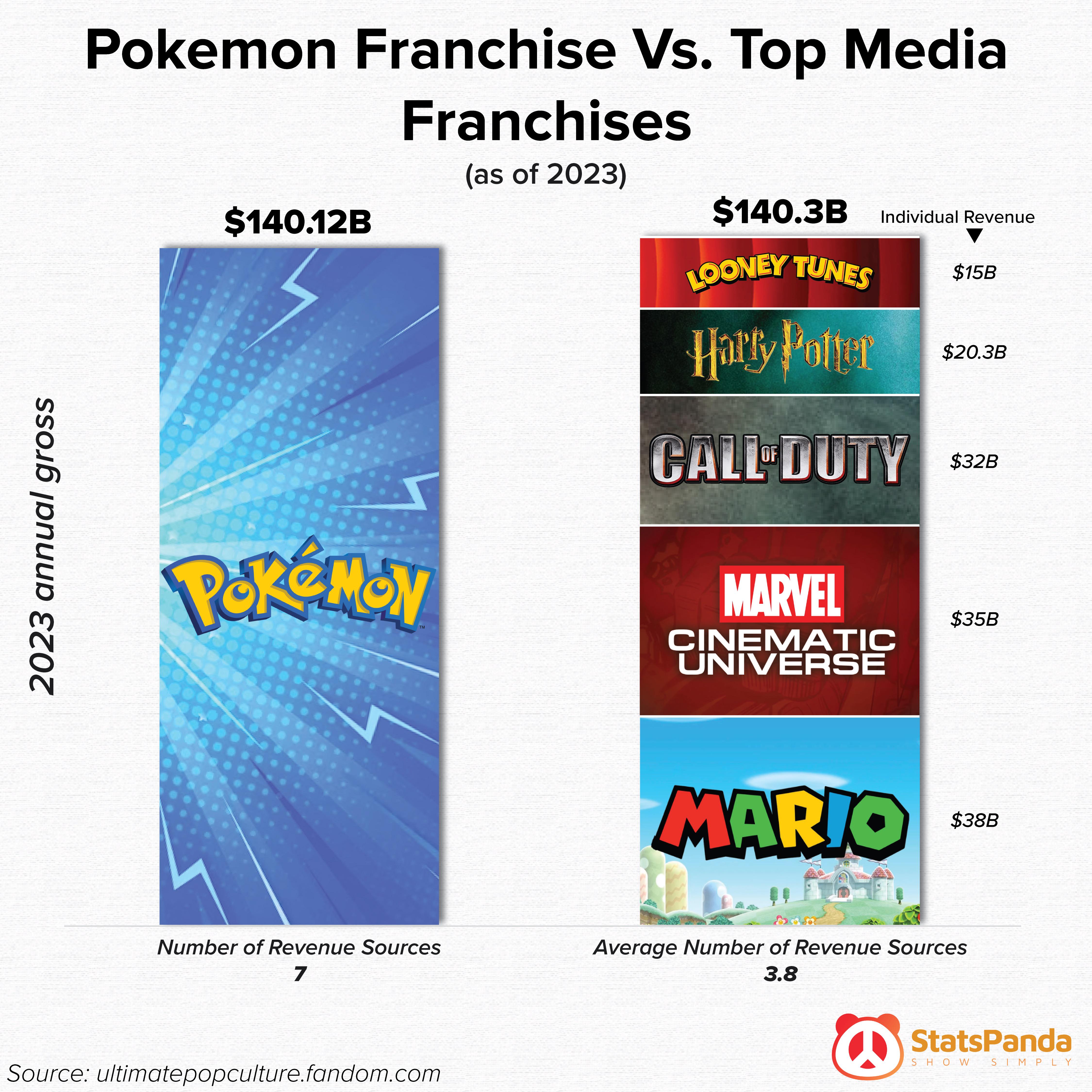
Gotta catch ’em all

  • What is the story?
  • Is the chart design effective?
  • Is the chart believeable?

Learning objectives

  • Identify reasons for what makes bad figures look “bad”
  • Introduce principles of visual perception
  • Evaluate the heirarchy of visual tasks
  • Assess competing graphs for their adherence to principles of visual perception
  • Review implementation of layers using {ggplot2}

A/B testing

Data: Sale prices of houses in Tompkins County

  • Data on houses that were sold in Tompkins County, NY from 2022-24

  • Scraped from Redfin

Import the data

library(tidyverse)

tompkins <- read_csv("data/tompkins-home-sales.csv")
glimpse(tompkins)
Rows: 1,270
Columns: 12
$ sold_date    <date> 2022-09-12, 2022-09-12, 2022-09-12, 2022-09-13, 2022-07-22, 2022-03-15, 2022…
$ price        <dbl> 340000, 390000, 625500, 246600, 172000, 205000, 230000, 246000, 350000, 44650…
$ beds         <dbl> 2, 4, 2, 2, NA, 2, 5, 5, 3, 5, 3, 2, 2, 4, 3, 5, 4, 3, 4, 3, 3, 3, 6, 2, 3, 3…
$ baths        <dbl> 3.0, 3.0, 3.0, 1.5, NA, 1.0, 2.0, 2.0, 2.5, 4.0, 1.0, 1.5, 2.0, 2.5, 2.5, 3.0…
$ area         <dbl> 1864, 3252, 1704, 1264, 2644, 820, 2900, 2364, 2016, 2882, 1246, 1134, 1720, …
$ lot_size     <dbl> 4.50000000, 0.33999082, 65.00000000, 0.21000918, 0.13000459, 0.23999082, 5.66…
$ year_built   <dbl> 1999, 1988, 1988, 1953, 1870, 1932, 1850, 1985, 1984, 2002, 1961, 2014, 1931,…
$ hoa_month    <dbl> NA, NA, NA, NA, NA, NA, NA, NA, NA, NA, NA, NA, NA, NA, NA, NA, NA, NA, NA, 2…
$ town         <chr> "Newfield", "Ithaca", "Dryden", "Ithaca", "Dryden", "Ithaca", "Lansing", "Dry…
$ municipality <chr> "Unincorporated", "Unincorporated", "Unincorporated", "Ithaca city", "Dryden …
$ long         <dbl> -76.59488, -76.45546, -76.35953, -76.52435, -76.29872, -76.48761, -76.59422, …
$ lat          <dbl> 42.38609, 42.47046, 42.43971, 42.45208, 42.49046, 42.42739, 42.61829, 42.4862…

A simple visualization

ggplot(data = tompkins, mapping = aes(x = area, y = price)) +
  geom_point(alpha = 0.7, size = 2) +
  geom_smooth(method = "lm", se = FALSE, linewidth = 0.7) +
  labs(
    x = "Area (square feet)",
    y = "Sale price (USD)",
    title = "Price and area of houses in Tompkins County"
  )

New variable: decade_built

tompkins <- tompkins |>
  mutate(decade_built = (year_built %/% 10) * 10)

tompkins |>
  select(year_built, decade_built)
# A tibble: 1,270 × 2
   year_built decade_built
        <dbl>        <dbl>
 1       1999         1990
 2       1988         1980
 3       1988         1980
 4       1953         1950
 5       1870         1870
 6       1932         1930
 7       1850         1850
 8       1985         1980
 9       1984         1980
10       2002         2000
# ℹ 1,260 more rows

New variable: decade_built_cat

tompkins <- tompkins |>
  mutate(
    decade_built_cat = case_when(
      decade_built <= 1940 ~ "1940 or before",
      decade_built >= 1990 ~ "1990 or after",
      .default = as.character(decade_built)
    )
  )

tompkins |>
  count(decade_built_cat)
# A tibble: 6 × 2
  decade_built_cat     n
  <chr>            <int>
1 1940 or before     443
2 1950               117
3 1960               120
4 1970               136
5 1980               143
6 1990 or after      311

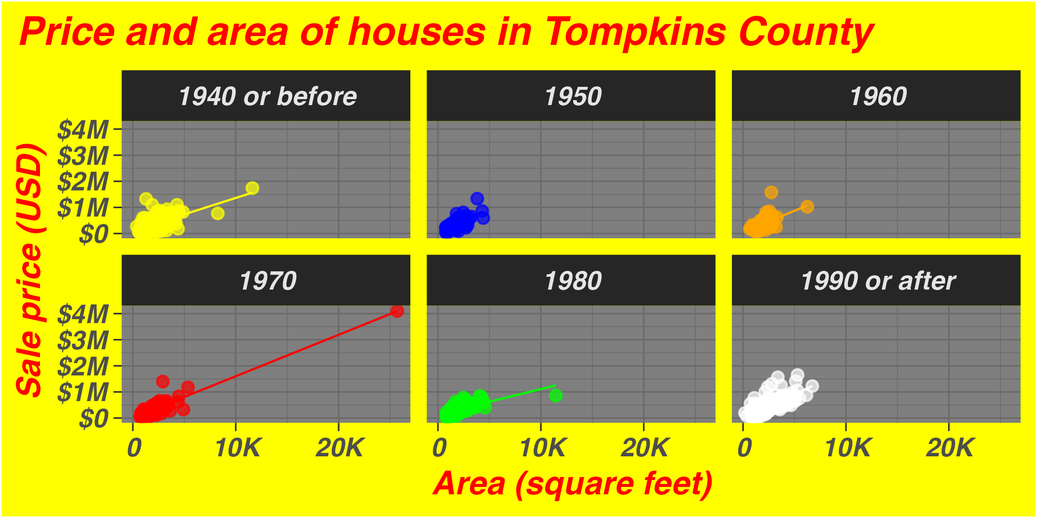
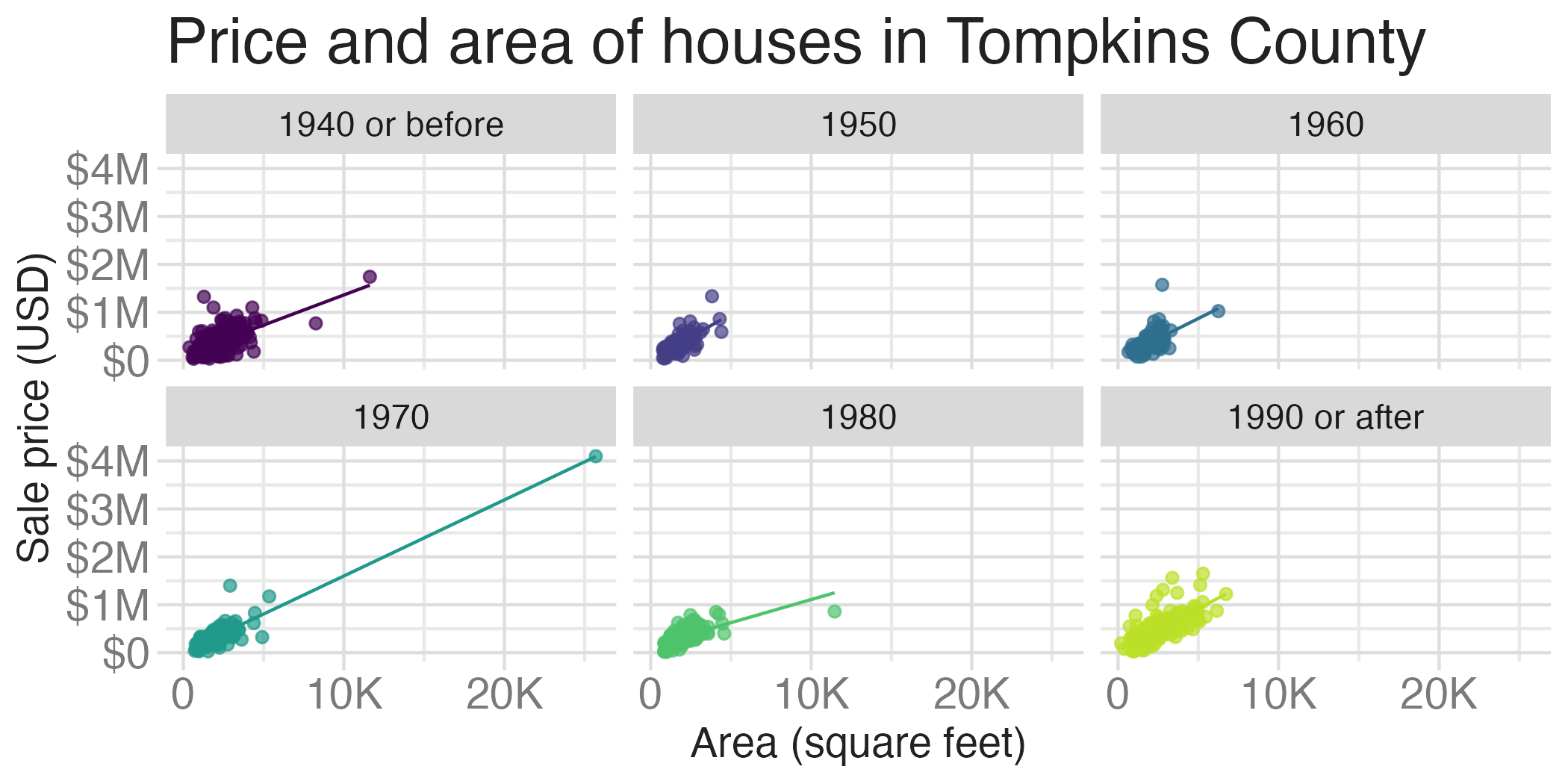
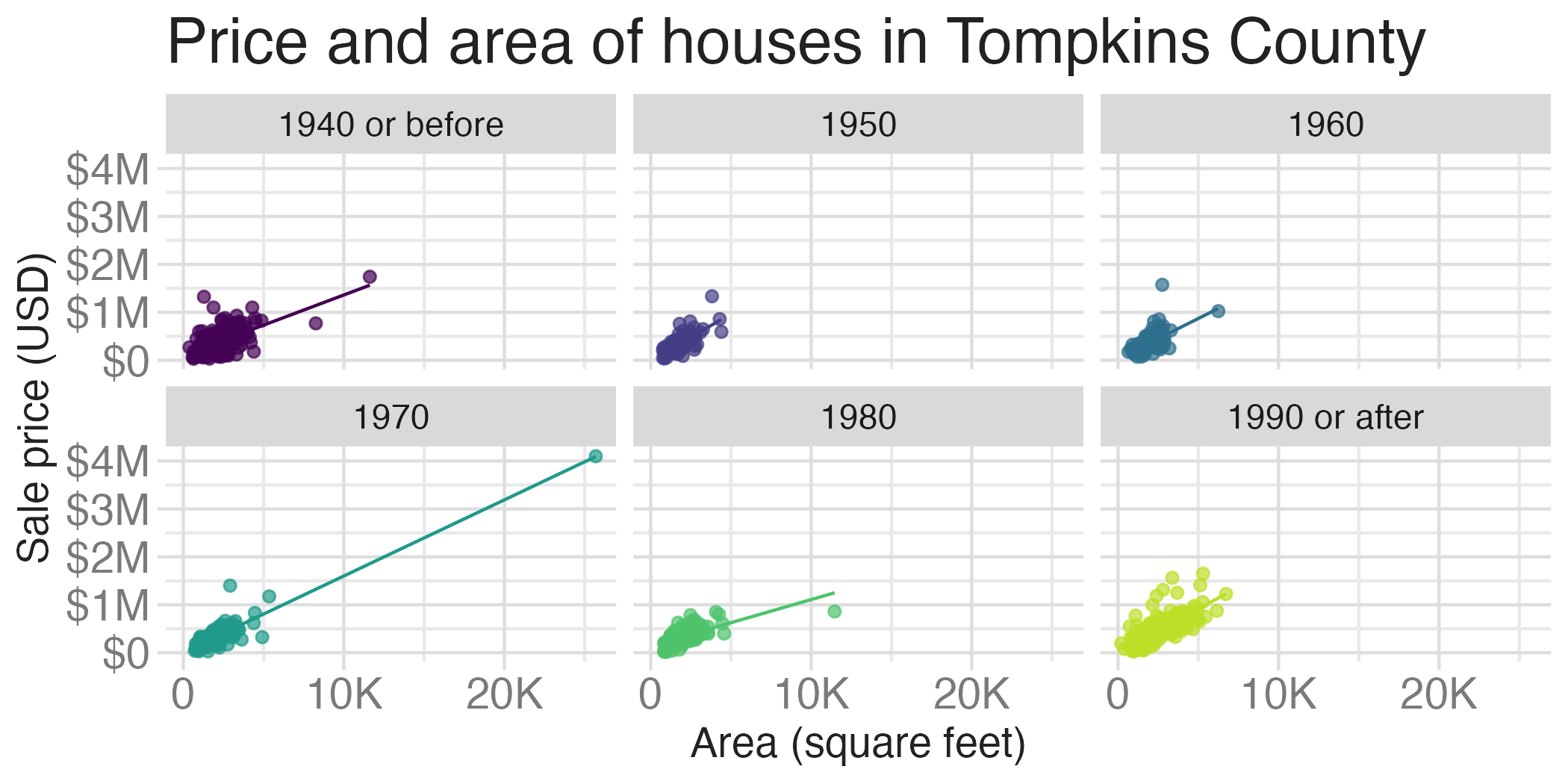
A slightly more complex visualization
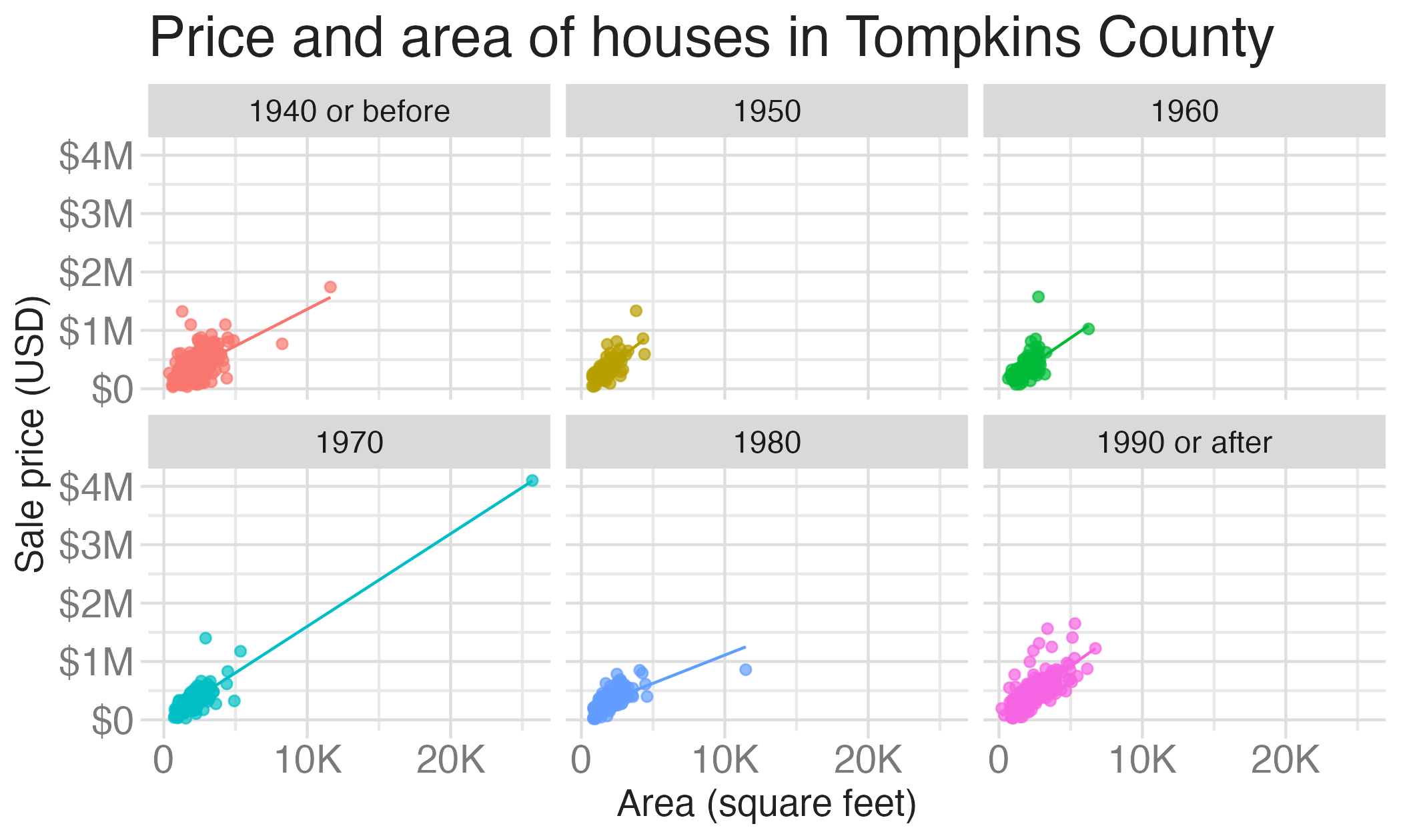
ggplot(
  data = tompkins,
  mapping = aes(x = area, y = price, color = decade_built_cat)
) +
  geom_point(alpha = 0.7, show.legend = FALSE) +
  geom_smooth(method = "lm", se = FALSE, linewidth = 0.5, show.legend = FALSE) +
  scale_x_continuous(labels = label_number(scale_cut = cut_short_scale())) +
  scale_y_continuous(labels = label_currency(scale_cut = cut_short_scale())) +
  facet_wrap(facets = vars(decade_built_cat)) +
  labs(
    x = "Area (square feet)",
    y = "Sale price (USD)",
    color = "Decade built",
    title = "Price and area of houses in Tompkins County"
  )

A/B testing

Activity

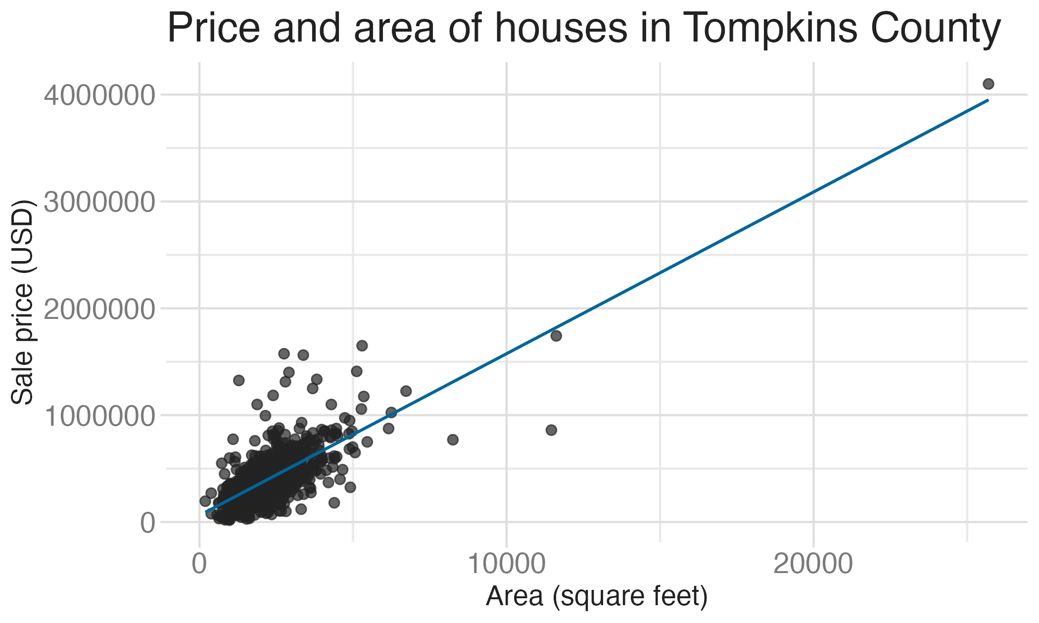
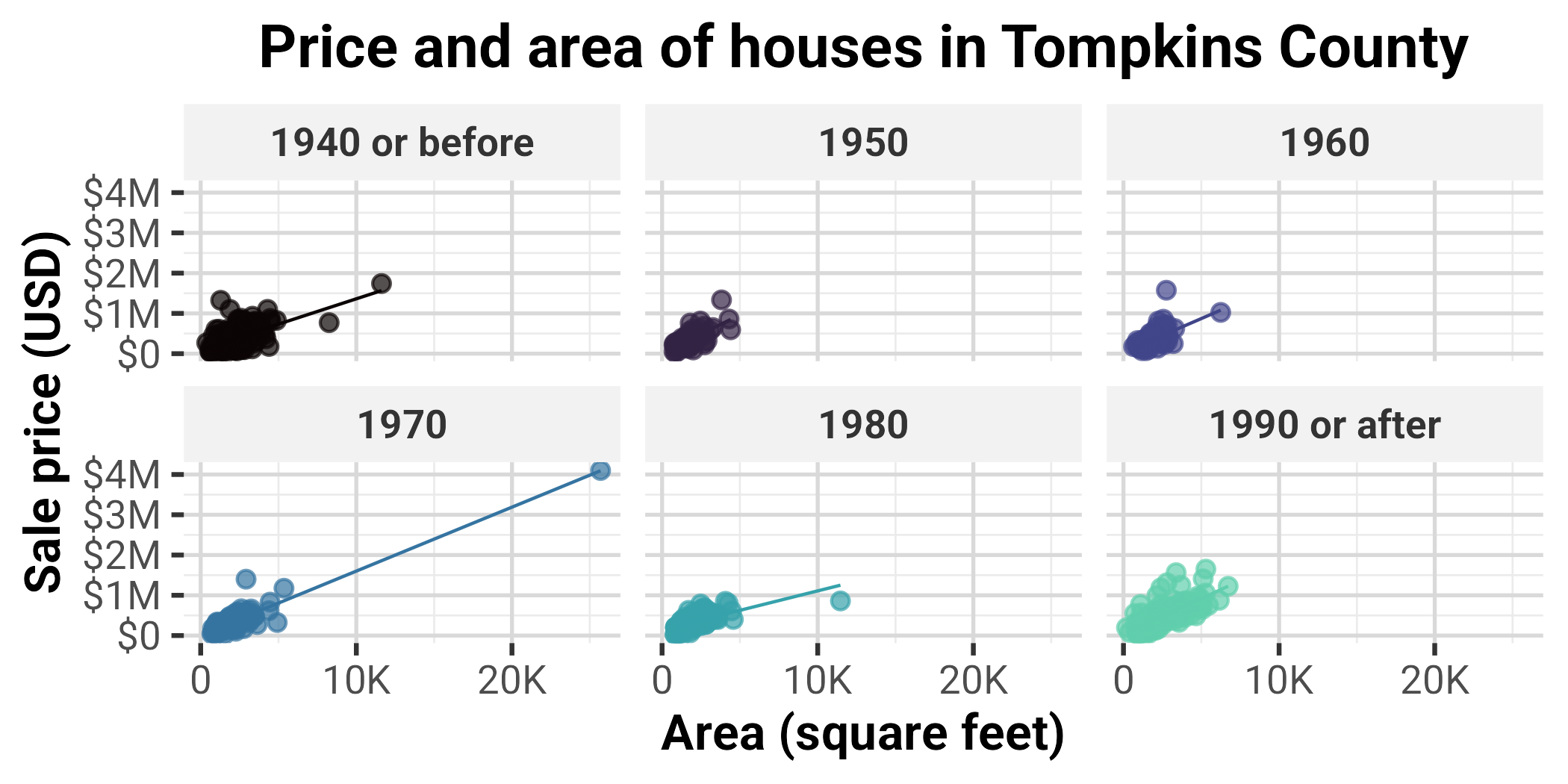
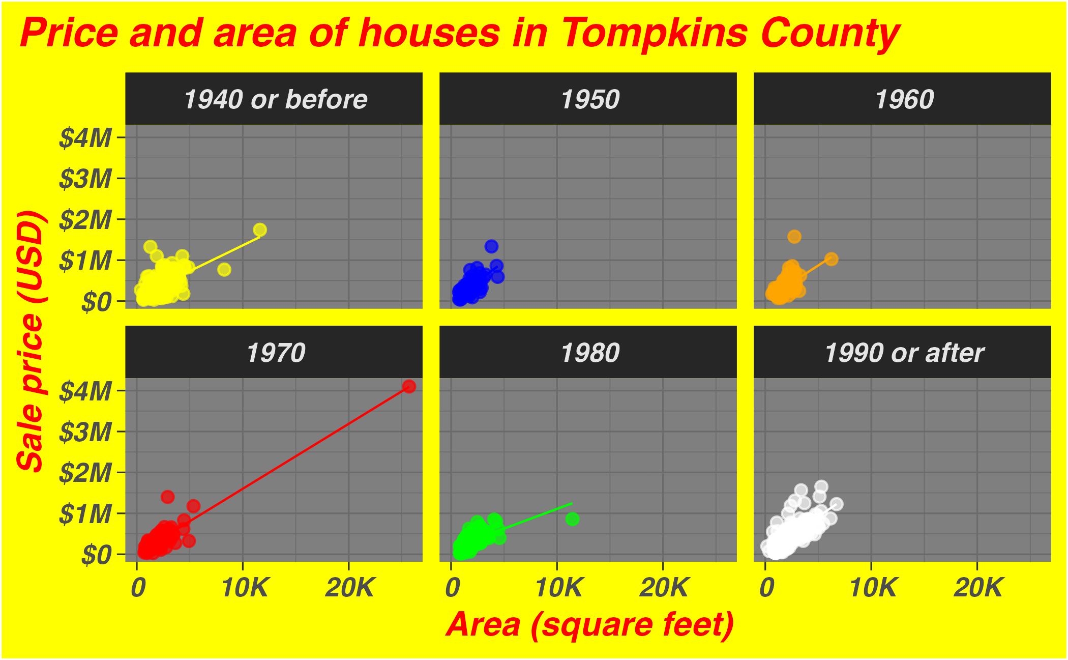
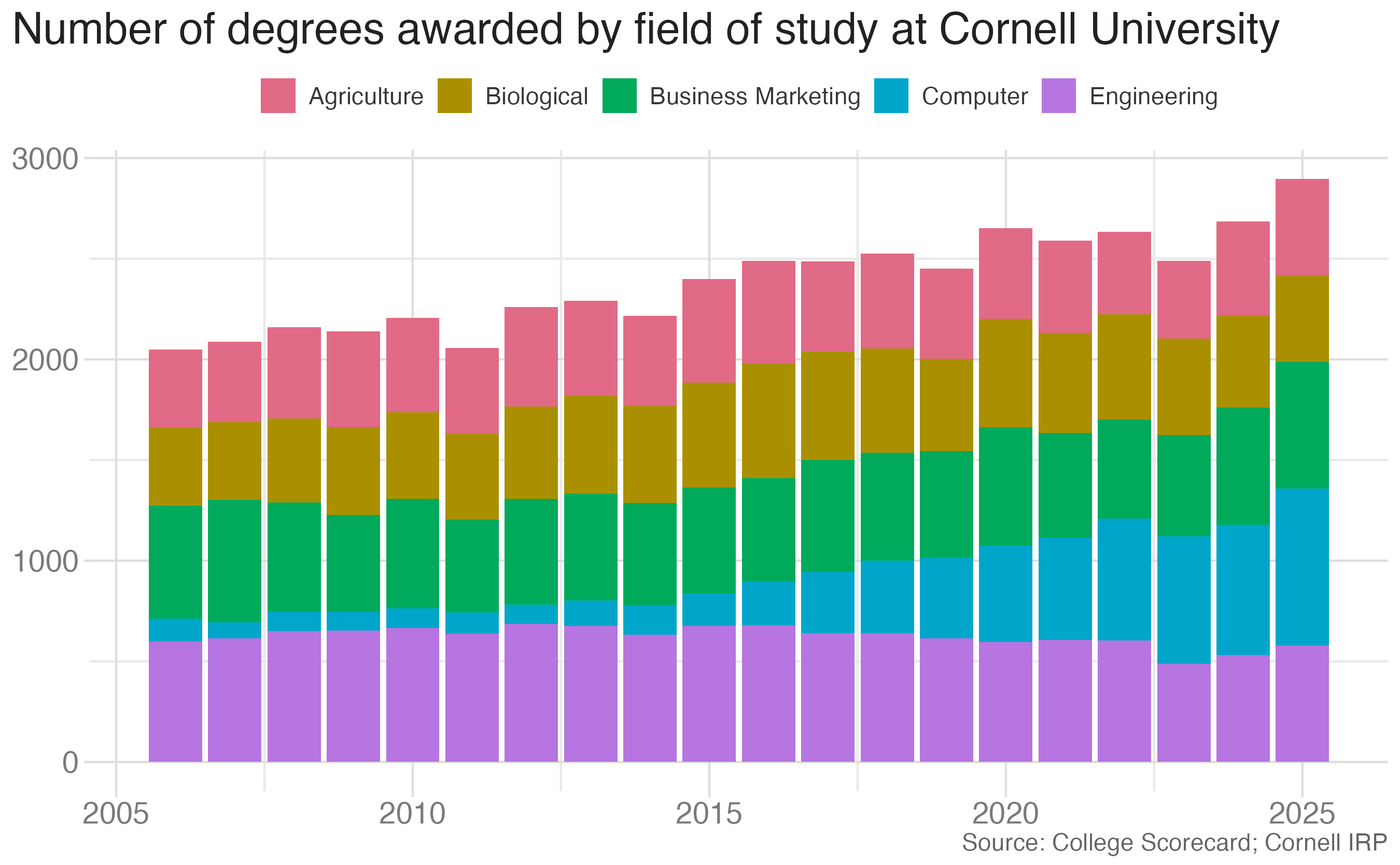
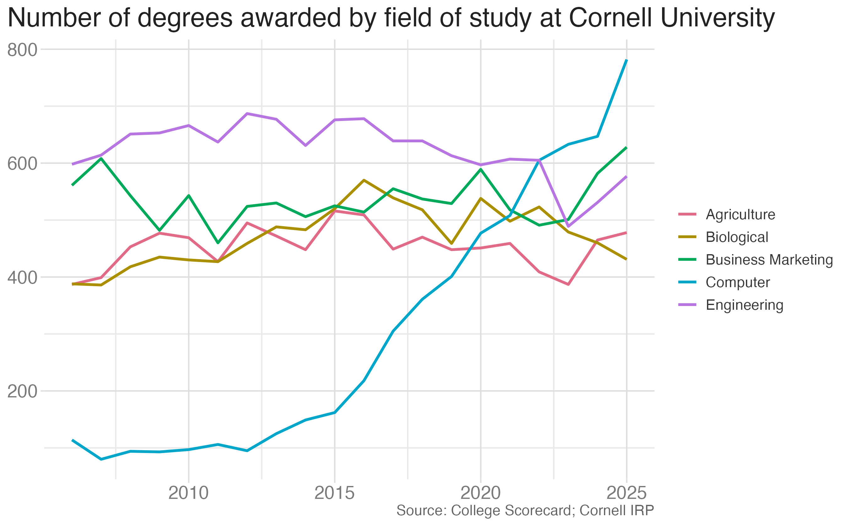
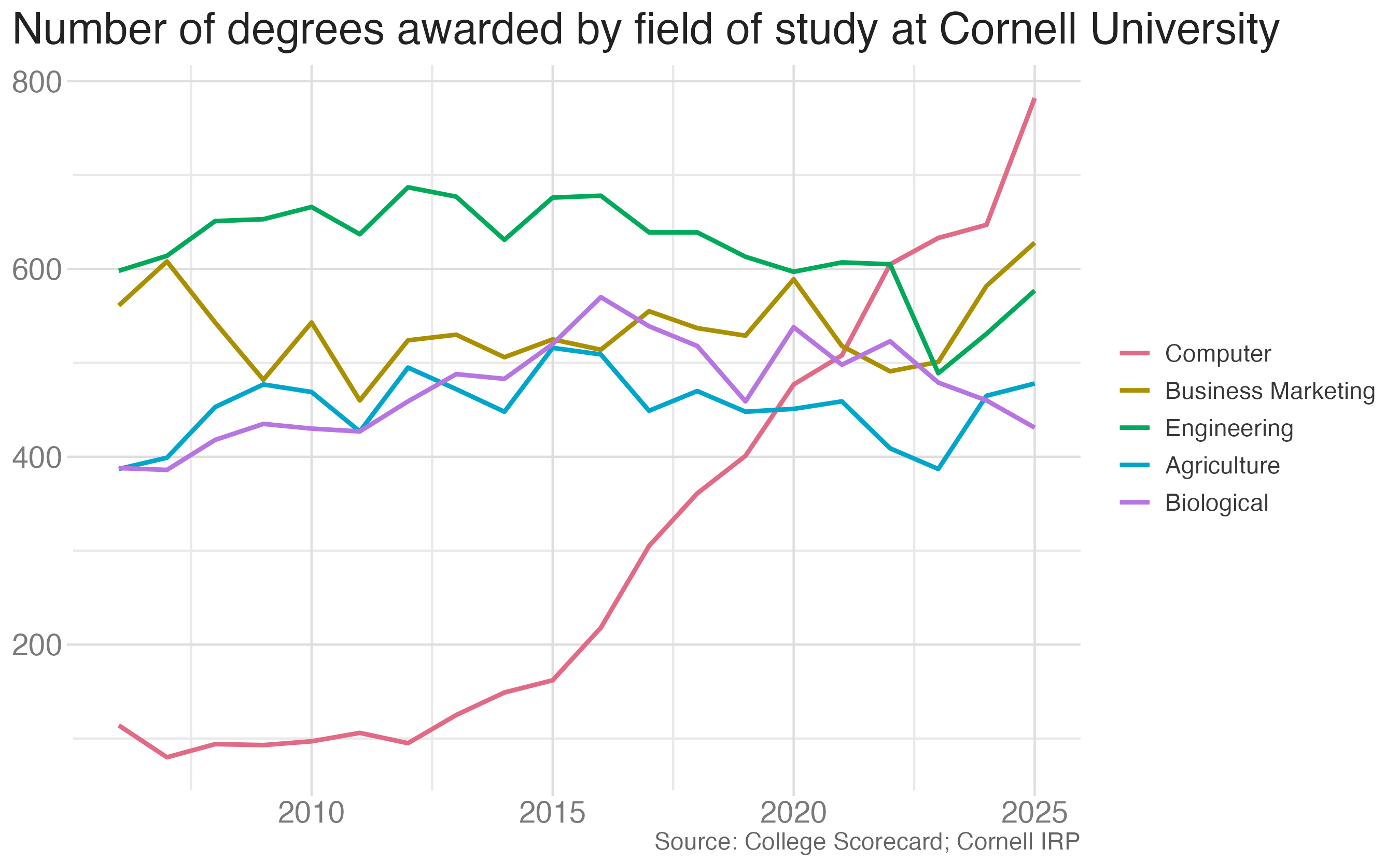
In the next two slides, the same plots are created with different “cosmetic” choices.

Test 1

Test 2

Bad taste

Bad taste

Data-to-ink ratio

Tufte strongly recommends maximizing the data-to-ink ratio this in the Visual Display of Quantitative Information (Tufte, 1983).

Graphical excellence is the well-designed presentation of interesting data—a matter of substance, of statistics, and of design … [It] consists of complex ideas communicated with clarity, precision, and efficiency. … [It] is that which gives to the viewer the greatest number of ideas in the shortest time with the least ink in the smallest space … [It] is nearly always multivariate … And graphical excellence requires telling the truth about the data. (Tufte, 1983, p. 51).
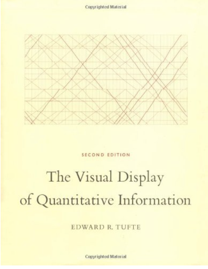
Cover of The Visual Display of Quantitative Information

Which of the plots has a higher data-to-ink ratio?

Summary statistics

mean_price_decade <- tompkins |>
  group_by(decade_built_cat) |>
  summarize(mean_price = mean(price))

mean_price_decade
# A tibble: 6 × 2
  decade_built_cat mean_price
  <chr>                 <dbl>
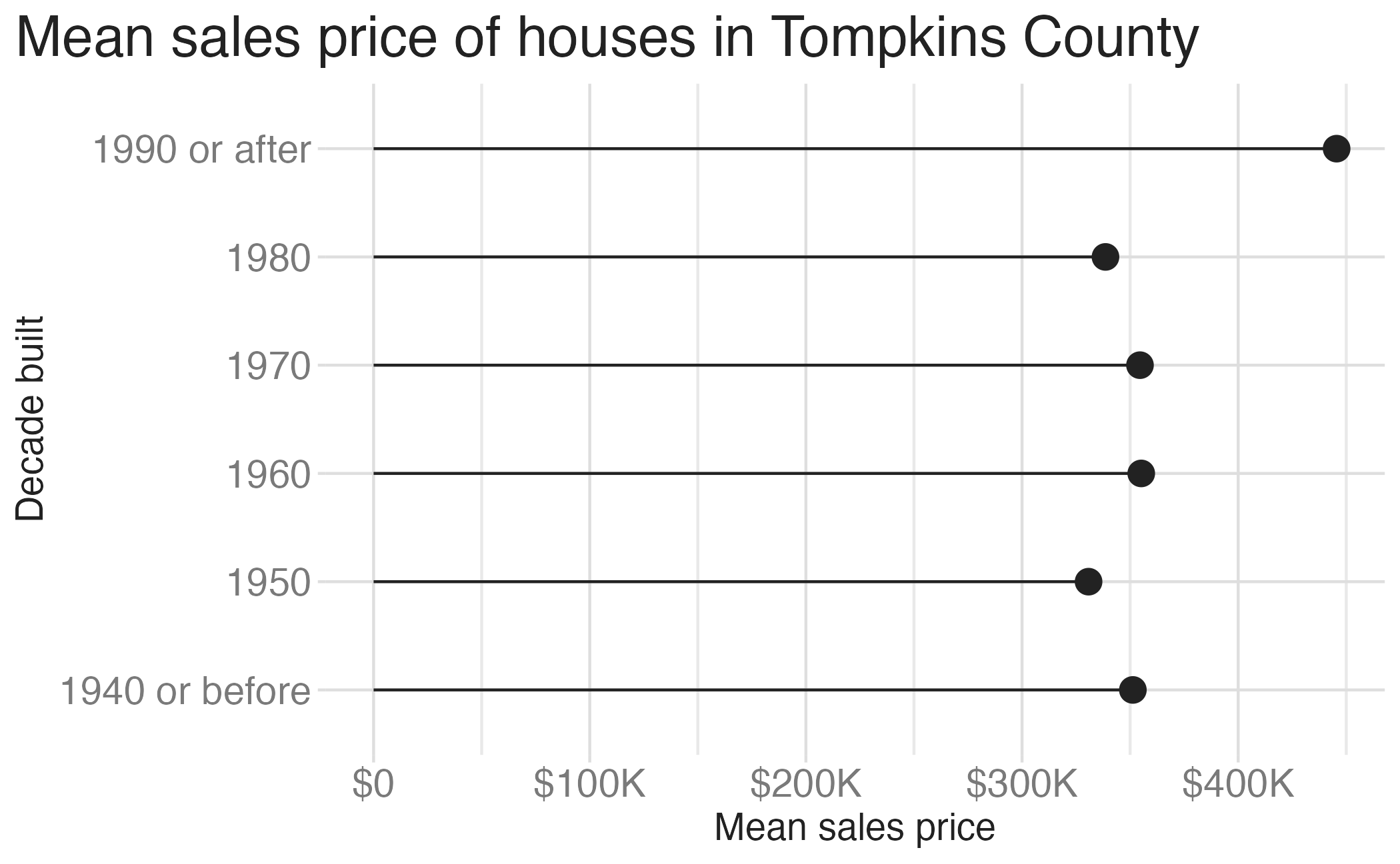
1 1940 or before      351273.
2 1950                330779.
3 1960                355146.
4 1970                354562.
5 1980                338600.
6 1990 or after       445540.

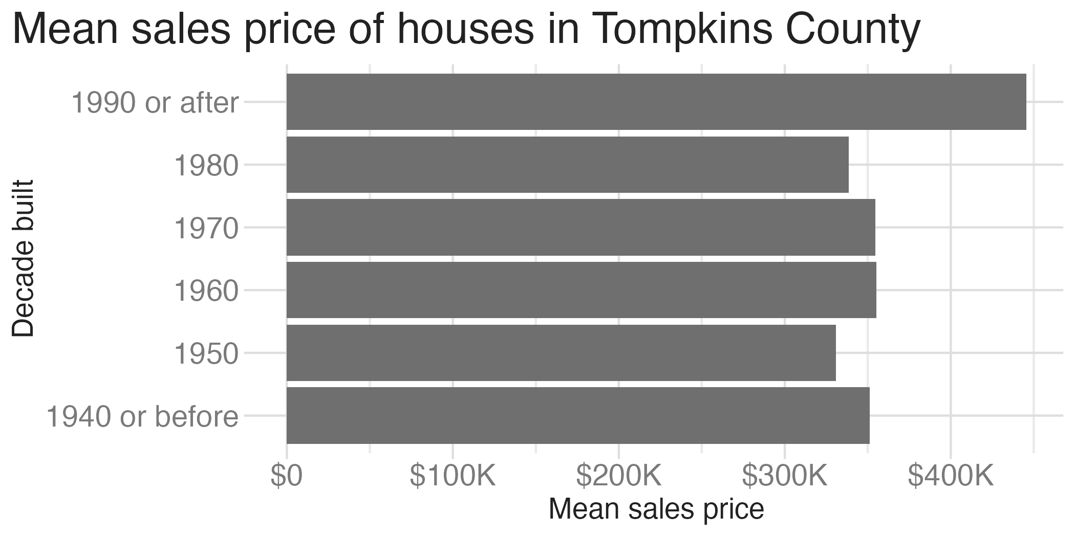
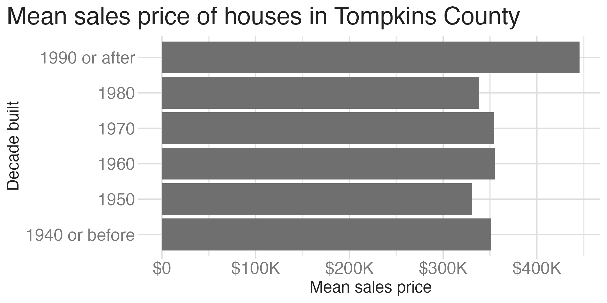
Barplot

ggplot(
  data = mean_price_decade,
  mapping = aes(y = decade_built_cat, x = mean_price)
) +
  geom_col() +
  scale_x_continuous(labels = label_currency(scale_cut = cut_short_scale())) +
  labs(
    x = "Mean sales price", y = "Decade built",
    title = "Mean sales price of houses in Tompkins County"
  ) +
  theme(plot.title.position = "plot")

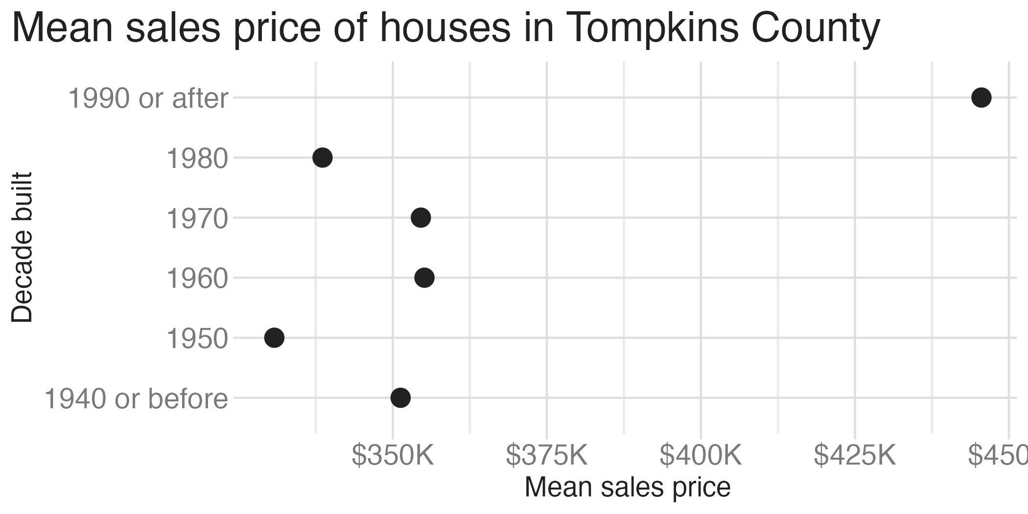
Scatterplot
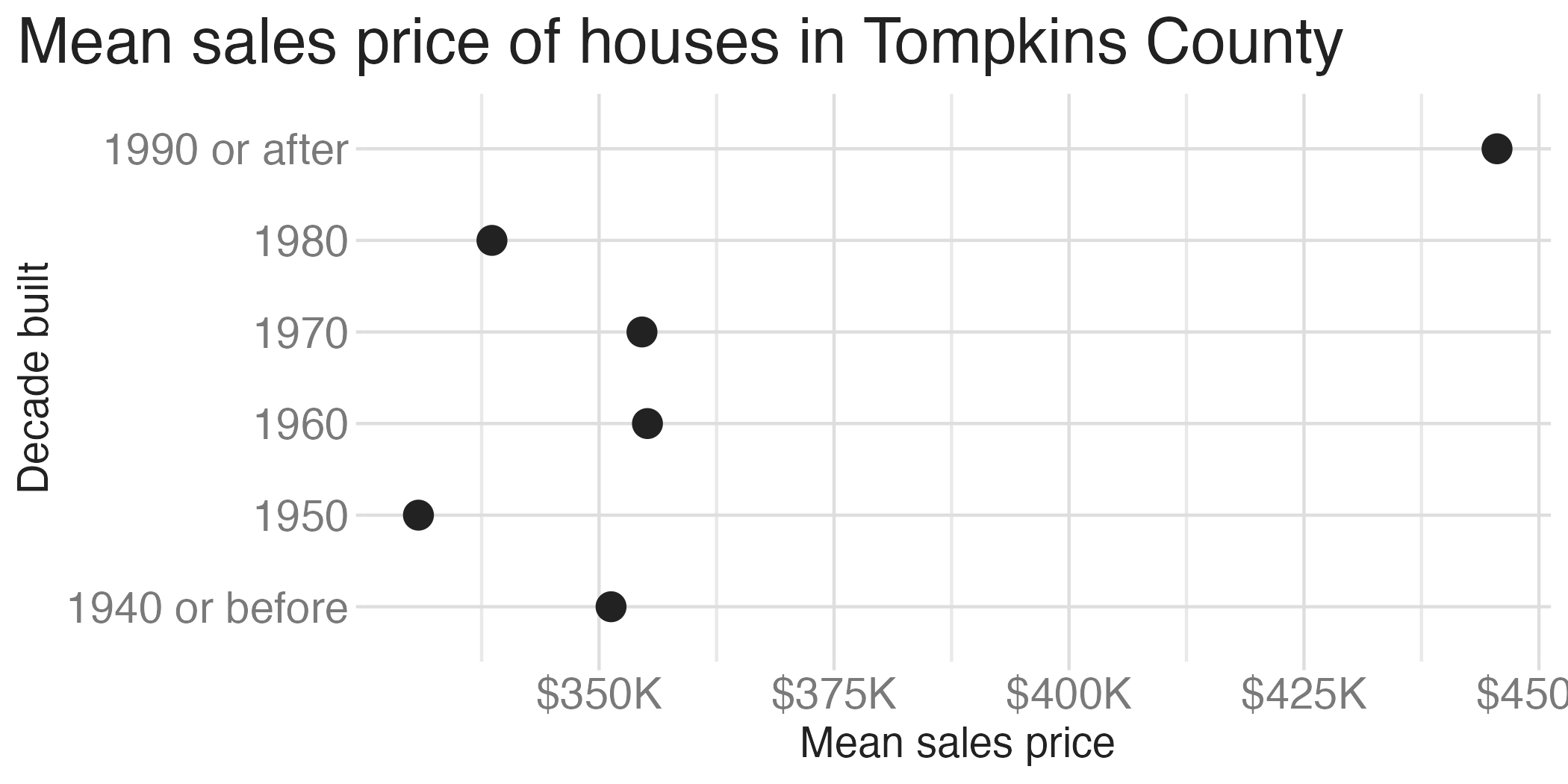
ggplot(
  data = mean_price_decade,
  mapping = aes(y = decade_built_cat, x = mean_price)
) +
  geom_point(size = 4) +
  scale_x_continuous(labels = label_currency(scale_cut = cut_short_scale())) +
  labs(
    x = "Mean sales price", y = "Decade built",
    title = "Mean sales price of houses in Tompkins County"
  ) +
  theme(plot.title.position = "plot")

A clip from the TV show 'Parks and Recreation'. Leslie Knope has a lollipop stuck to her sweater and tells Ron Swanson 'It's called lollipopping'.

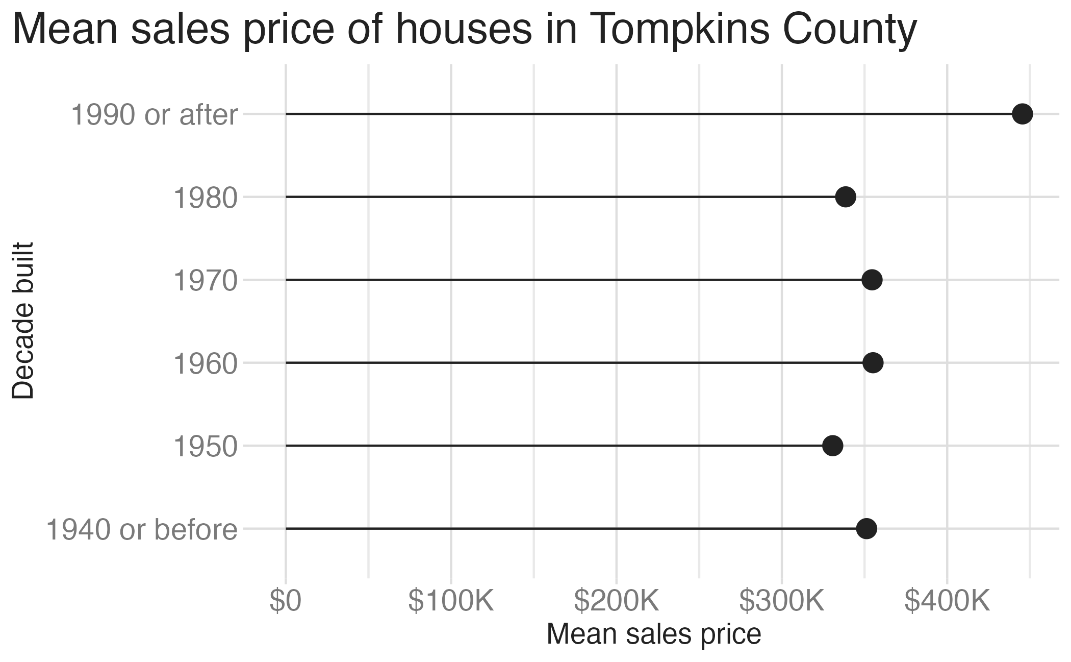
Lollipop chart – a happy medium?

Life in a bland world
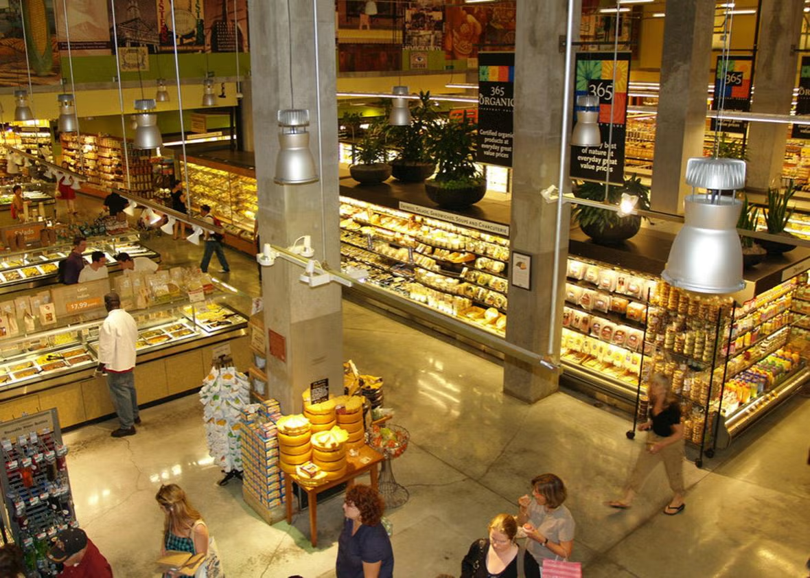
A photo of a grocery store aisle that is utilitarian and lacks visual appeal.

Three old women sitting at a table. One is screaming into a phone 'Where's the beef?'

Ease of interpretation

Bad data

Bad data

  • Inaccurate or incomplete data
  • Not the right measurement
  • Misleading presentation

Bad perception

  • Gap between data and aesthetics
  • How does the human mind decode and process the visual encodings on a chart?

Bad perception

What is graphical perception?

Graphical perception is the visual decoding of information encoded on graphs, i.e., the mental-visual tasks we perform to extract quantitative information:

  • Judging positions along a scale
  • Comparing lengths
  • Estimating angles
  • Perceiving areas
  • Distinguishing colors/shades

Cleveland & McGill (1984)

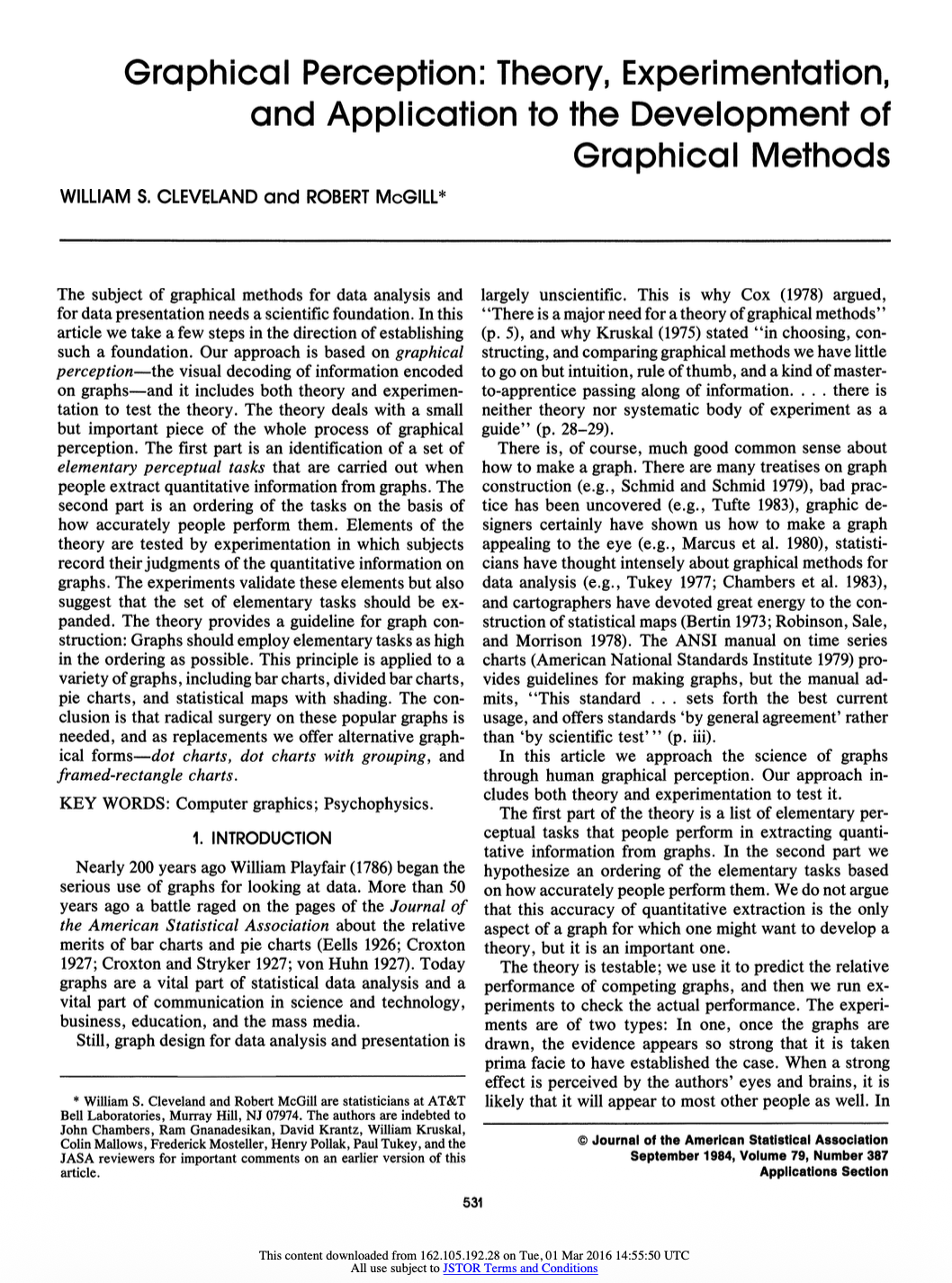
“Graphical Perception: Theory, Experimentation, and Application to the Development of Graphical Methods”

Journal of the American Statistical Association

  • William S. Cleveland and Robert McGill (AT&T Bell Labs)
  • One of the most influential papers in data visualization
  • Established empirical foundations for graph design
  • Over 2,800 citations

The central question

What makes some graphs easier to read than others?

Cleveland & McGill’s approach:

  1. Identify elementary perceptual tasks used when reading graphs
  2. Rank these tasks by accuracy of human judgment
  3. Test the ranking experimentally
  4. Apply findings to redesign common graph types

Elementary perceptual tasks

Elementary perceptual tasks

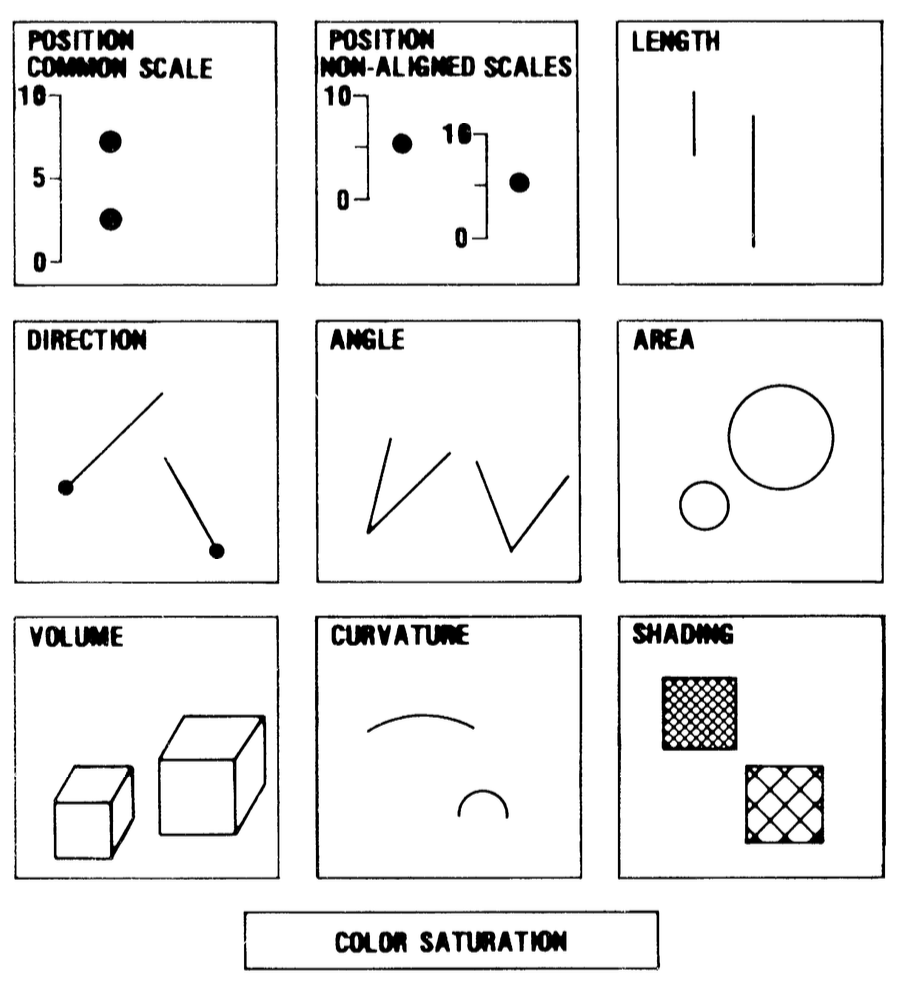
Cleveland & McGill identified 10 basic visual tasks people use to extract quantitative information from graphs
The accuracy hierarchy

Cleveland & McGill hypothesized a ranking from most accurate to least accurate

Rank Elementary Perceptual Task
1 Position along a common scale
2 Position along non-aligned scales
3 Length, direction, angle
4 Area
5 Volume, curvature
6 Shading, color saturation

Important

Design principle: Use elementary perceptual tasks as high in the hierarchy as possible.

Common graphs and their tasks

Graph Type Primary Perceptual Task
Bar chart (simple) Position on common scale
Grouped bar chart Position on common scale
Stacked bar chart Length (for non-baseline segments)
Pie chart Angle
Bubble chart Area
Choropleth map Shading/color
Treemap Area

Example: Bar chart vs. Pie chart

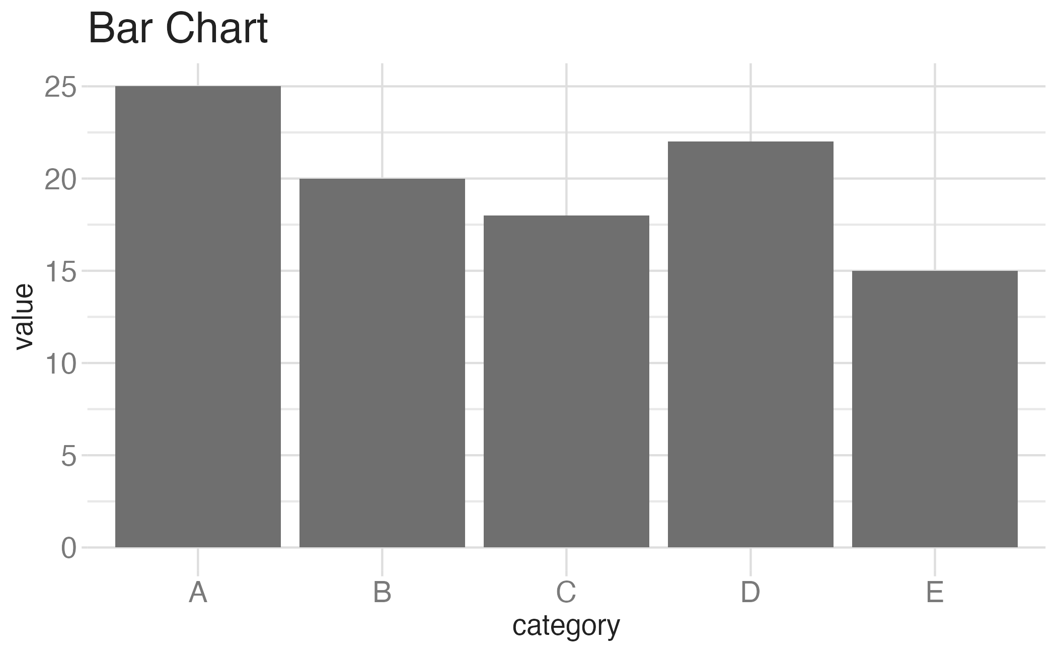
Bar chart
  • Primary task: Position along common scale
  • High accuracy
  • Easy to compare values

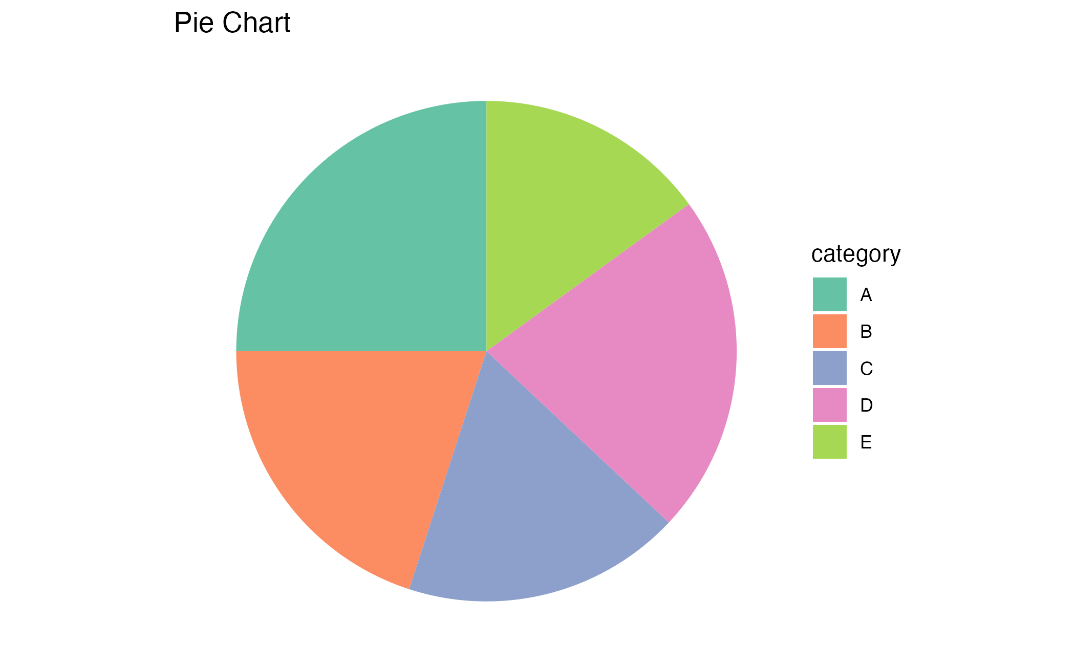
Pie chart
  • Primary task: Angle judgment
  • Lower accuracy
  • Harder to compare non-adjacent slices

The experiments

Experimental design

Cleveland & McGill ran two main experiments.

  • Experiment 1: Position-length judgments using bar charts

  • Experiment 2: Position-angle judgments comparing bar charts and pie charts

Extended by Heer and Bostock (2010) to include area judgments using bubble charts and treemaps

Experiment 1: Position-length

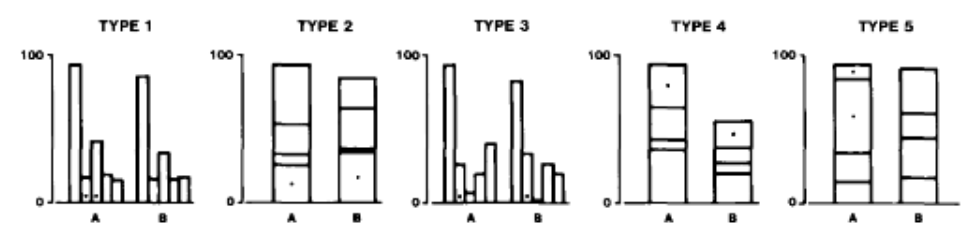
  • 55 subjects judged divided bar charts
  • 5 types of bar chart configurations
  • Tasks:
    • Which of the two indicated (with a dot) bars or two segments is smaller?
    • What percentage is the smaller of the larger?
Experiment 2: Position-angle

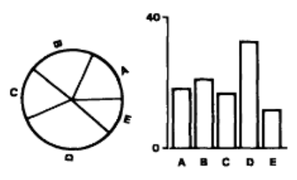
  • 54 subjects judged pie charts vs. bar charts
  • 10 sets of values, each shown as pie and bar
  • Tasks:
    • Which bar or segment is largest?
    • What percentage each of the other four values is of the largest bar or segment?
Measuring accuracy

They used log absolute error:

\[ \text{Error} = \log_2\left(|\text{judged percent} - \text{true percent}| + \frac{1}{8}\right) \]

Why log scale?

  • Measures relative error (a 5% error on 10% is worse than 5% error on 80%)
  • The \(\frac{1}{8}\) prevents \(\log(0)\) issues
  • Robust to outliers

Experiment results

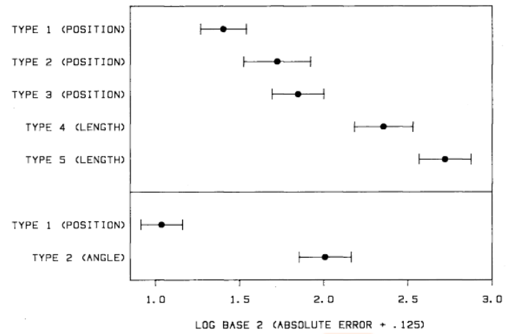
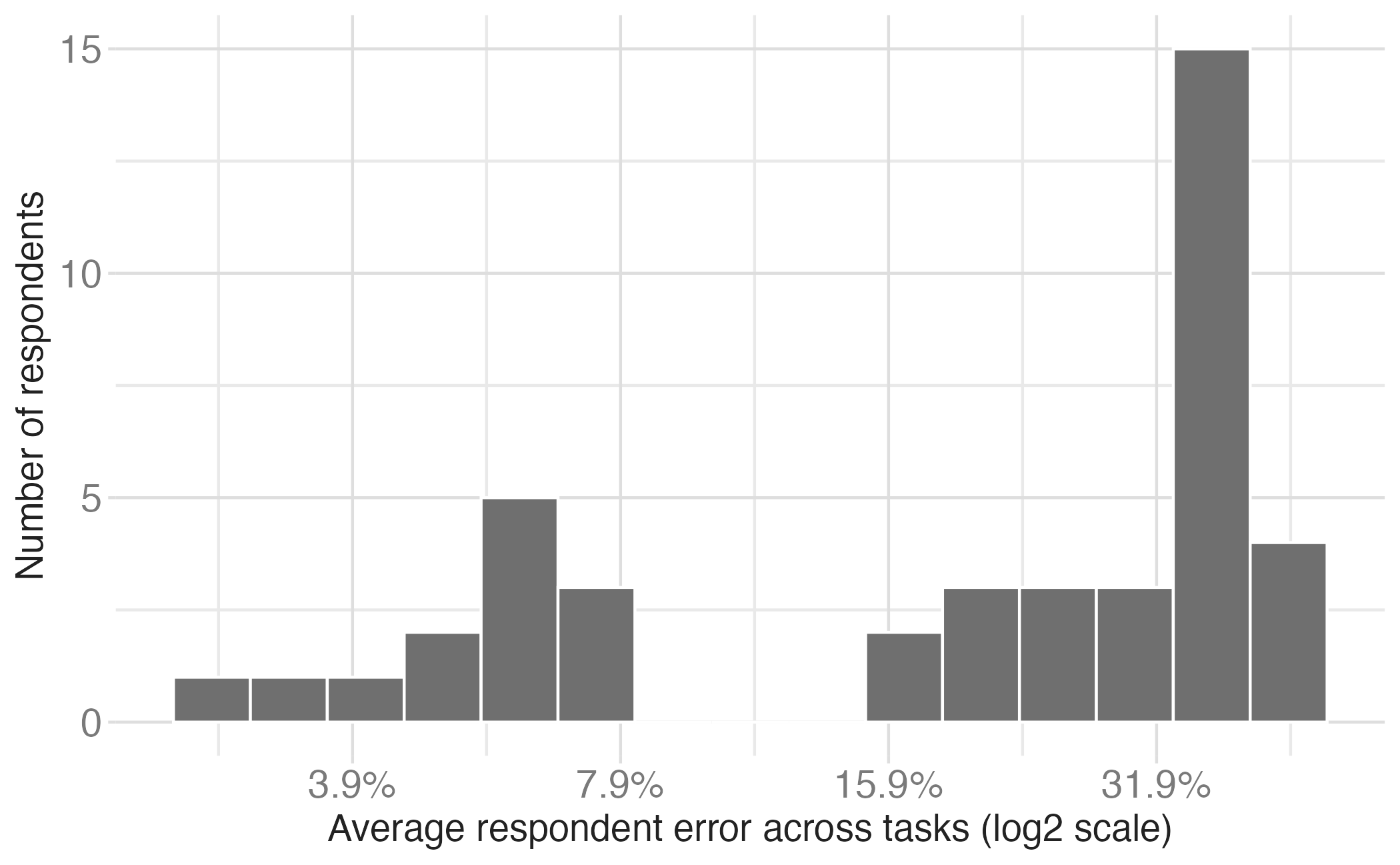
Log absolute error means and 95% confidence intervals for judgment types in position-length experiment (top) and position-angle experiment (bottom).

Position-length: Average errors for length judgments are considerably larger than those for position judgments.

Position-angle: Average errors for angle judgments is considerably larger than for position judgments.

Application exercise

Replicating Cleveland & McGill

Instructions

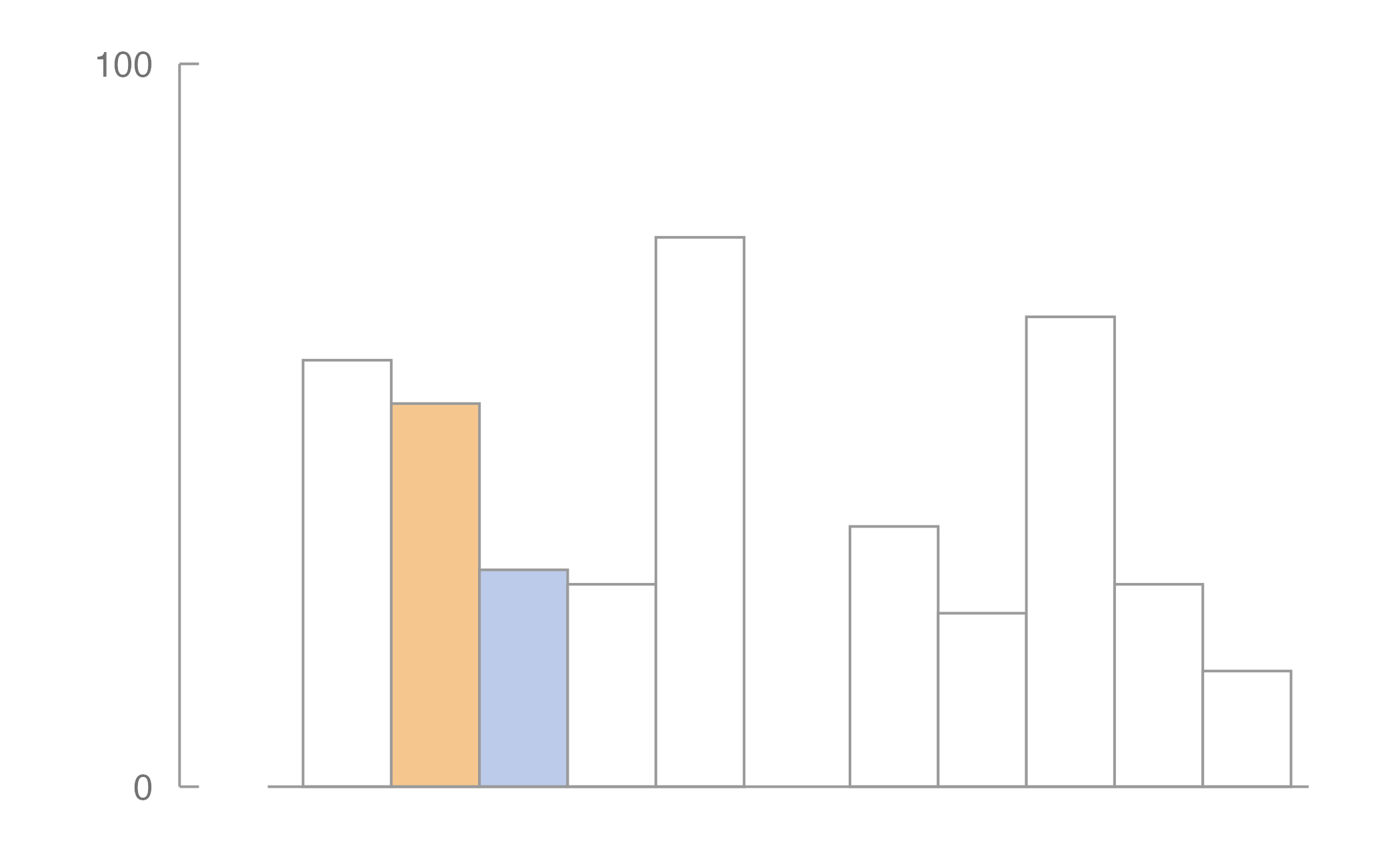
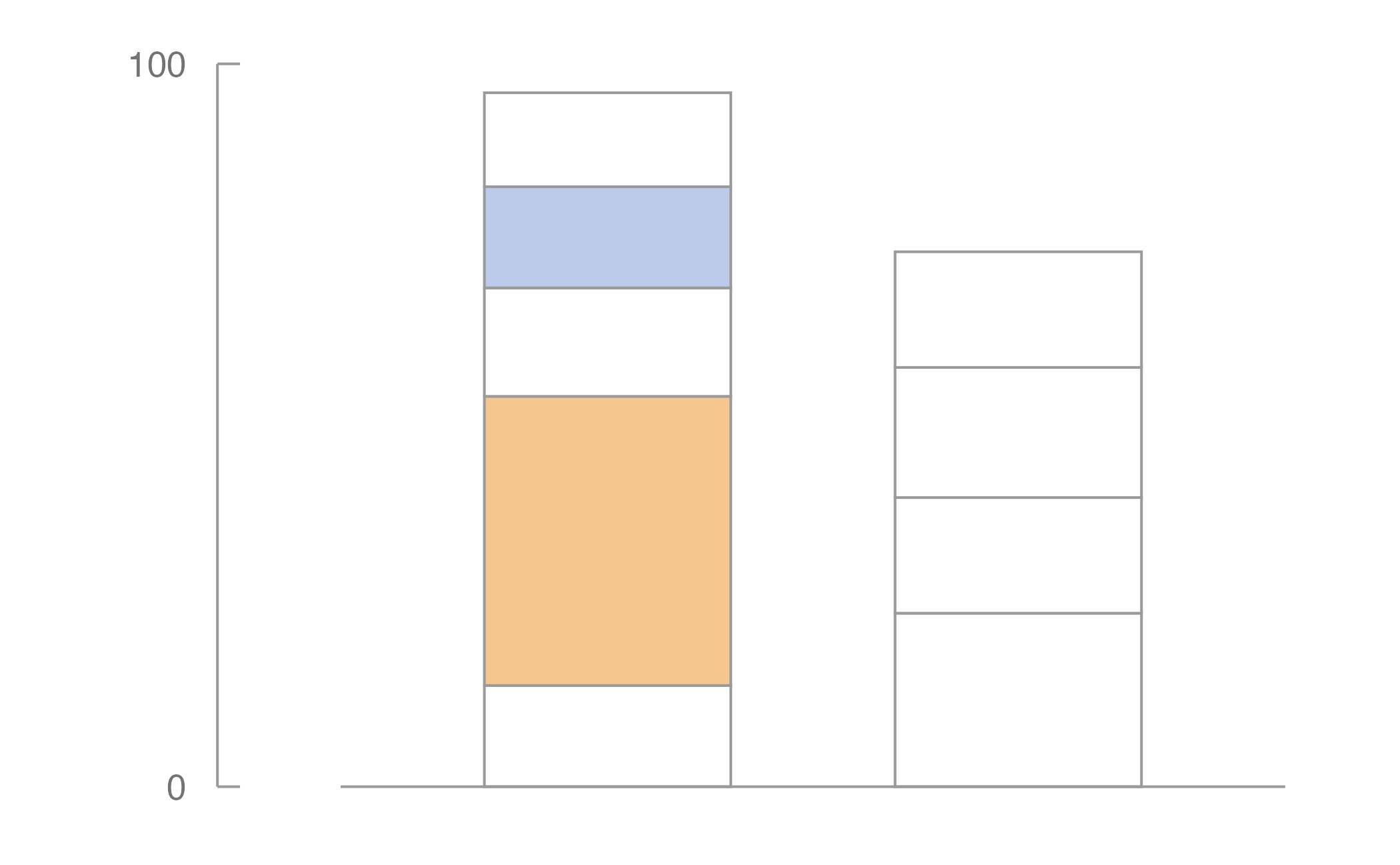
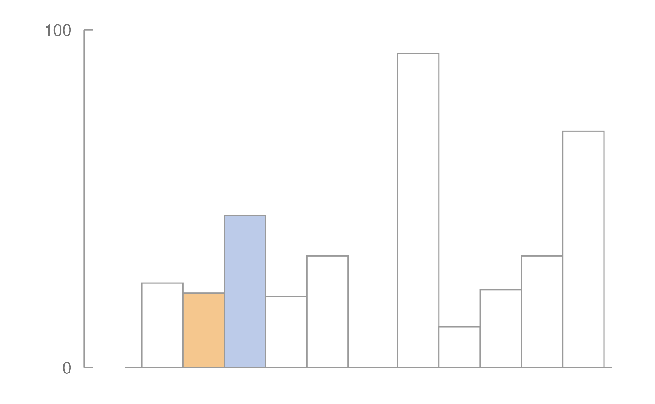
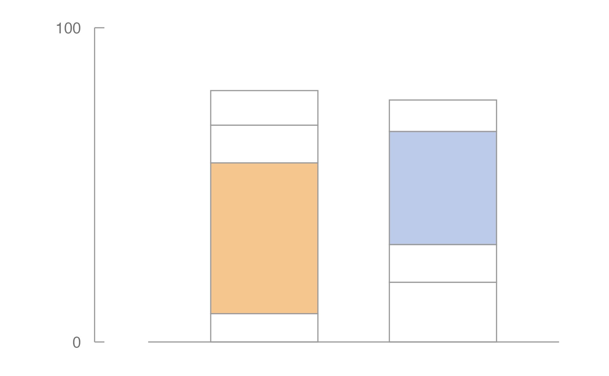
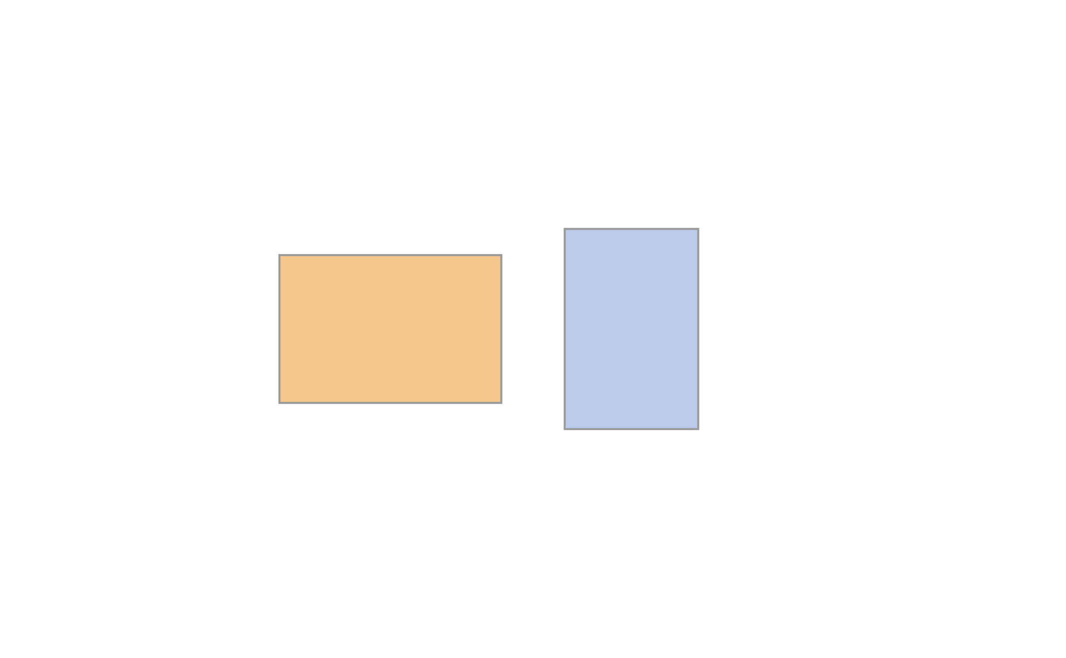
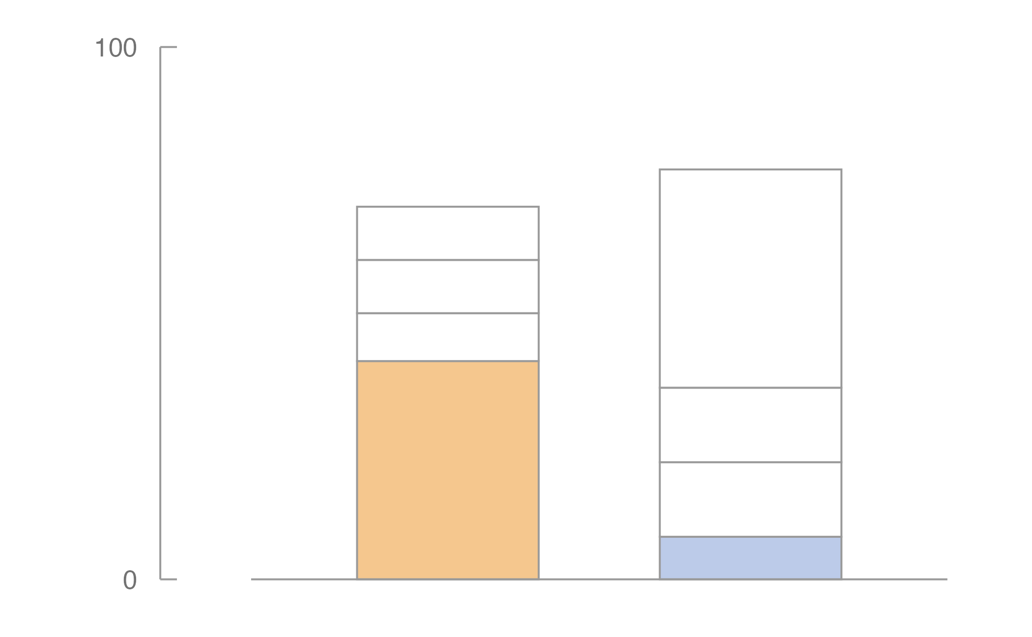
For each chart shown, identify the smaller of two highlighted values (Blue or Orange), then estimate what percentage the smaller is of the larger.

  • Make a quick visual judgment
  • Do NOT measure or calculate
  • Record your answer

Practice: Bar chart

Which is smaller? What % is it of the larger?

Practice answer

Orange = 53, Blue = 30

Blue is smaller.

True percentage: 30 / 53 ≈ 57%

How close was your estimate?

Chart 1

Chart 2

Chart 3

Chart 4

Chart 5
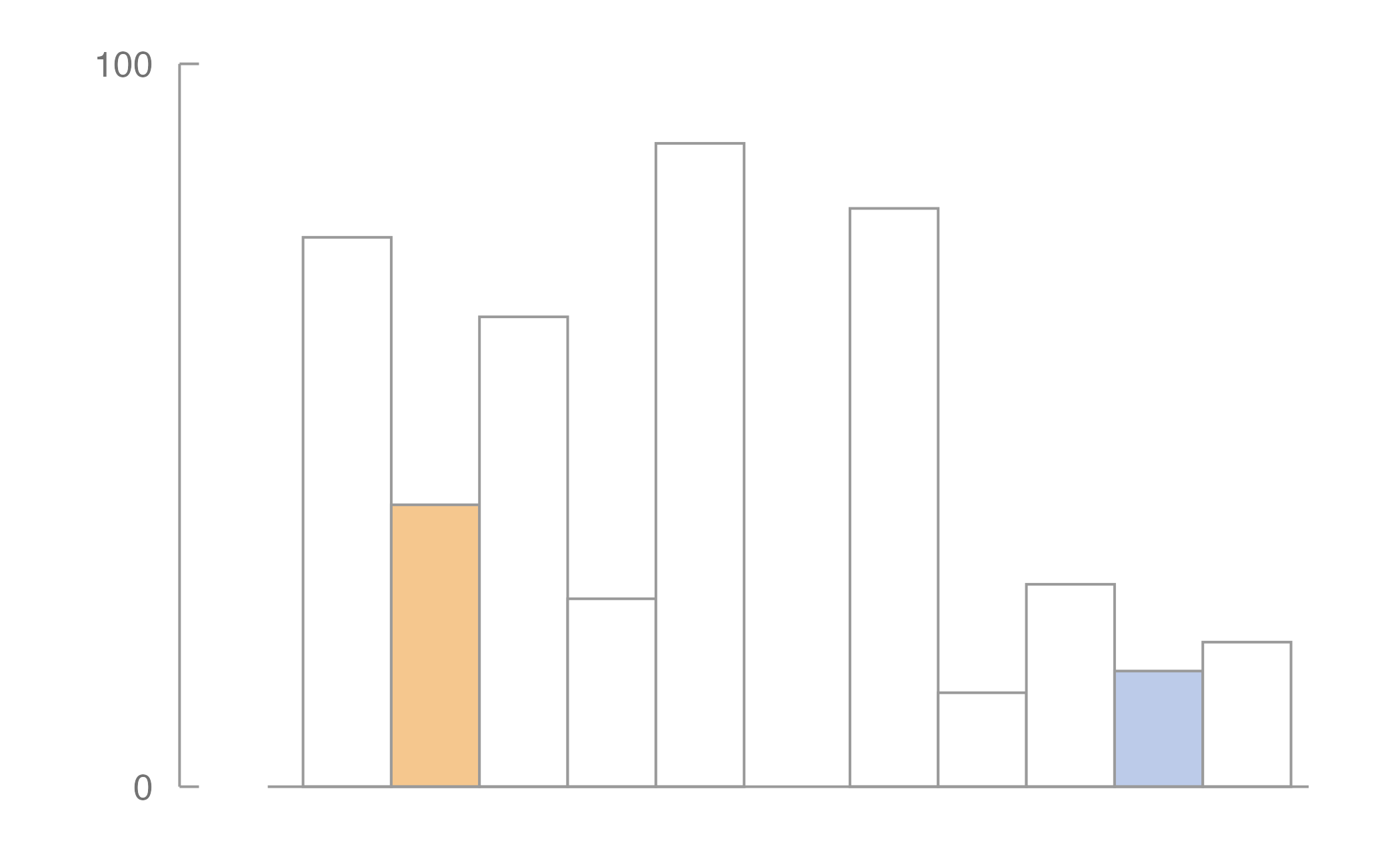
Chart 6
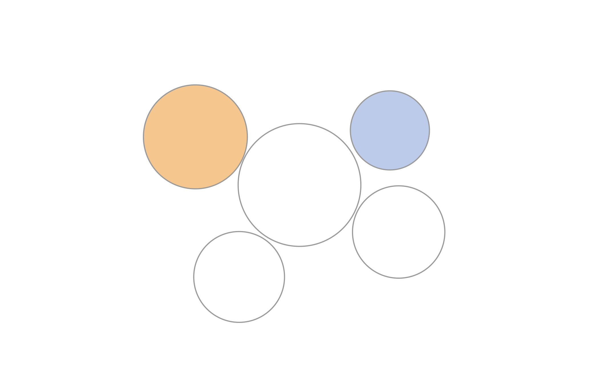
Chart 7
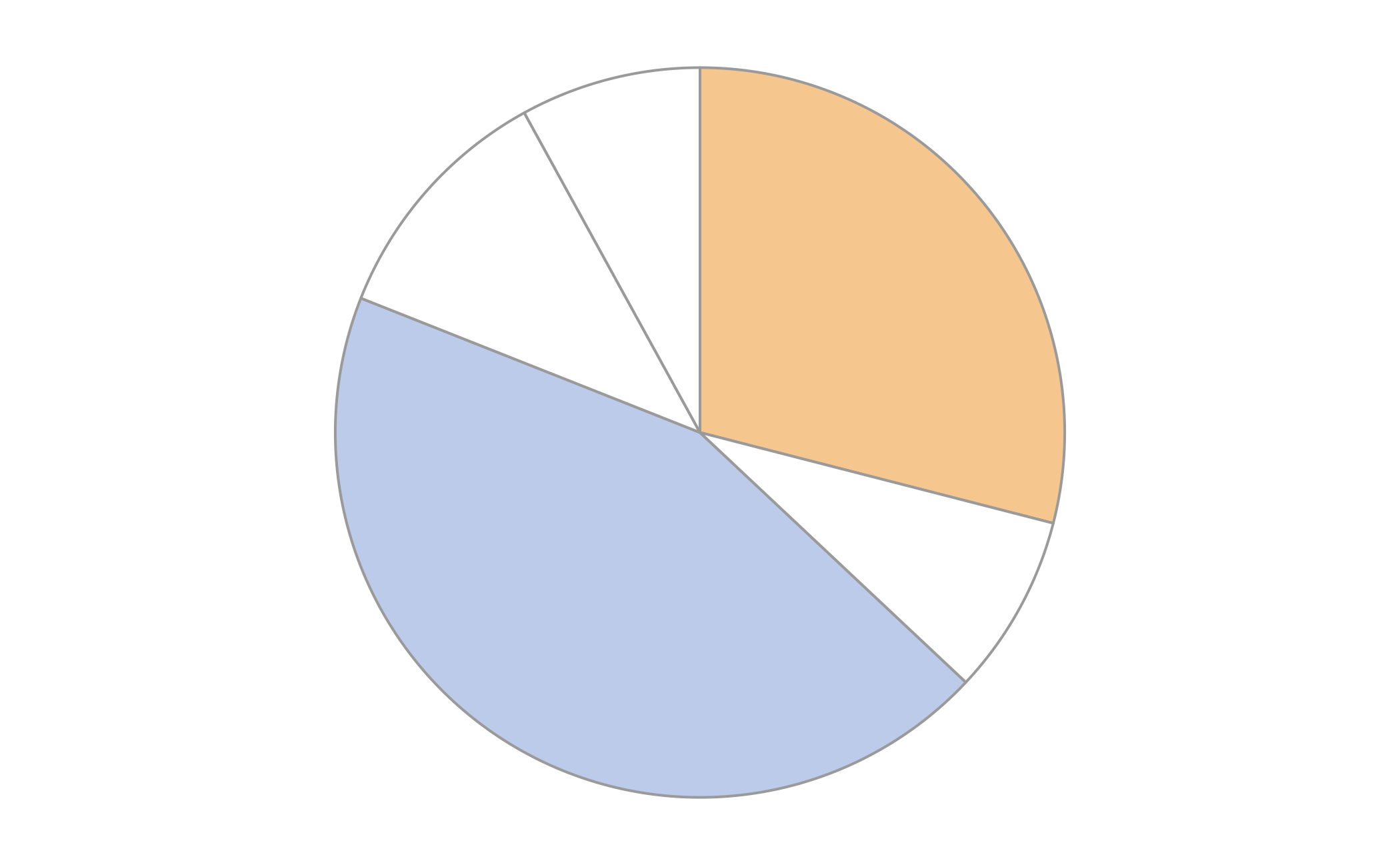
Chart 8
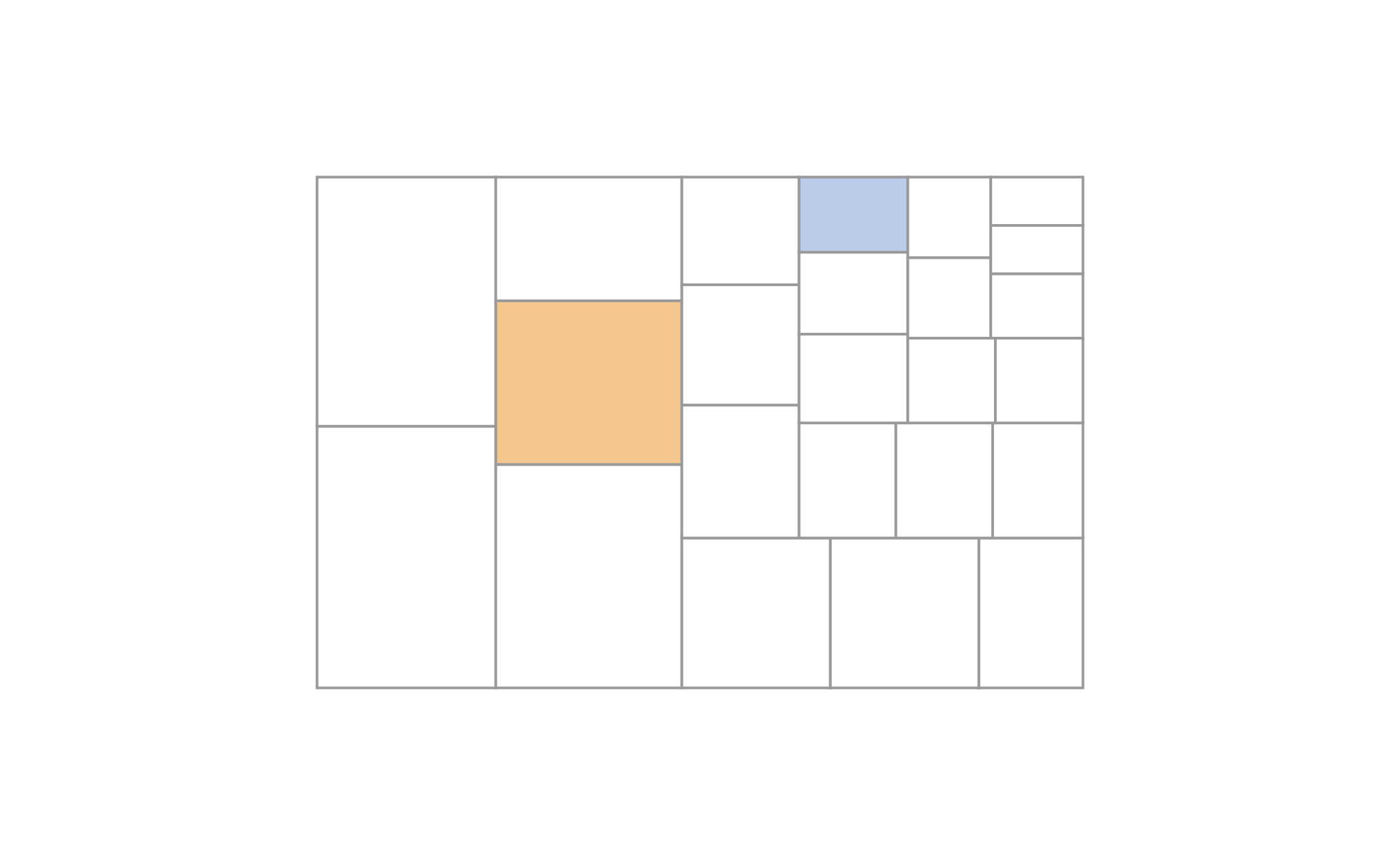
Chart 9
Answer key

Chart Task Encoding Orange Blue Smaller Percent
T1 Position, common scale (adjacent) 22 45 orange 48.9
T2 Position, non-aligned scales 41 8 blue 19.5
T3 Position, common scale (separated) 39 16 blue 41.0
T4 Length, different bars 48 36 blue 75.0
T5 Length, same bar 40 14 blue 35.0
Chart Task Encoding Orange Blue Smaller Percent
T6 Angle 29 44 orange 65.9
T7 Circular area 38 22 blue 57.9
T8 Rectangular area 54 44 blue 81.5
T9 Rectangular area (treemap) 41 11 blue 26.8

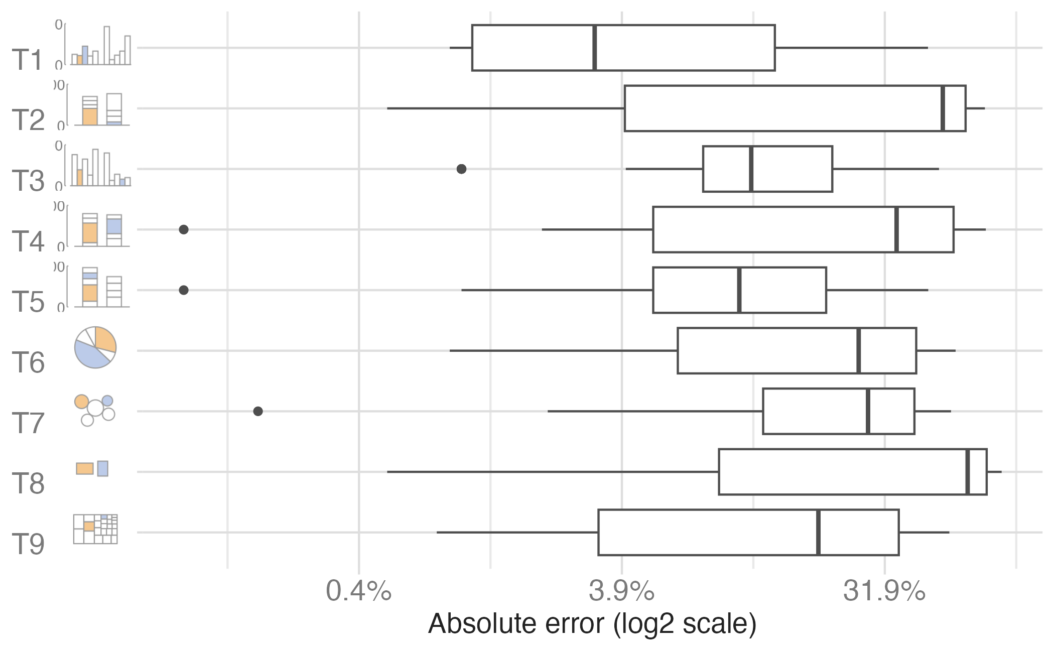
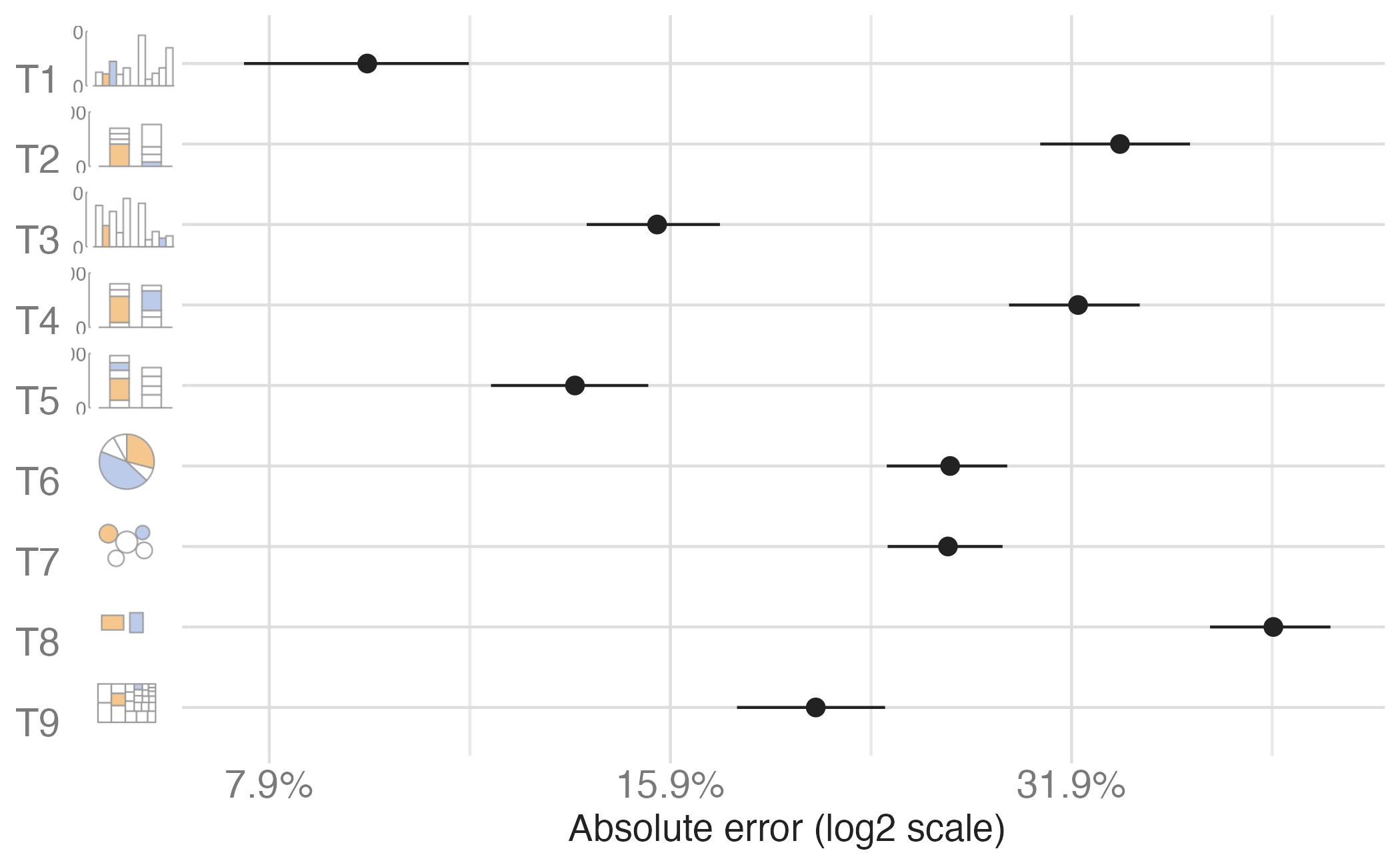
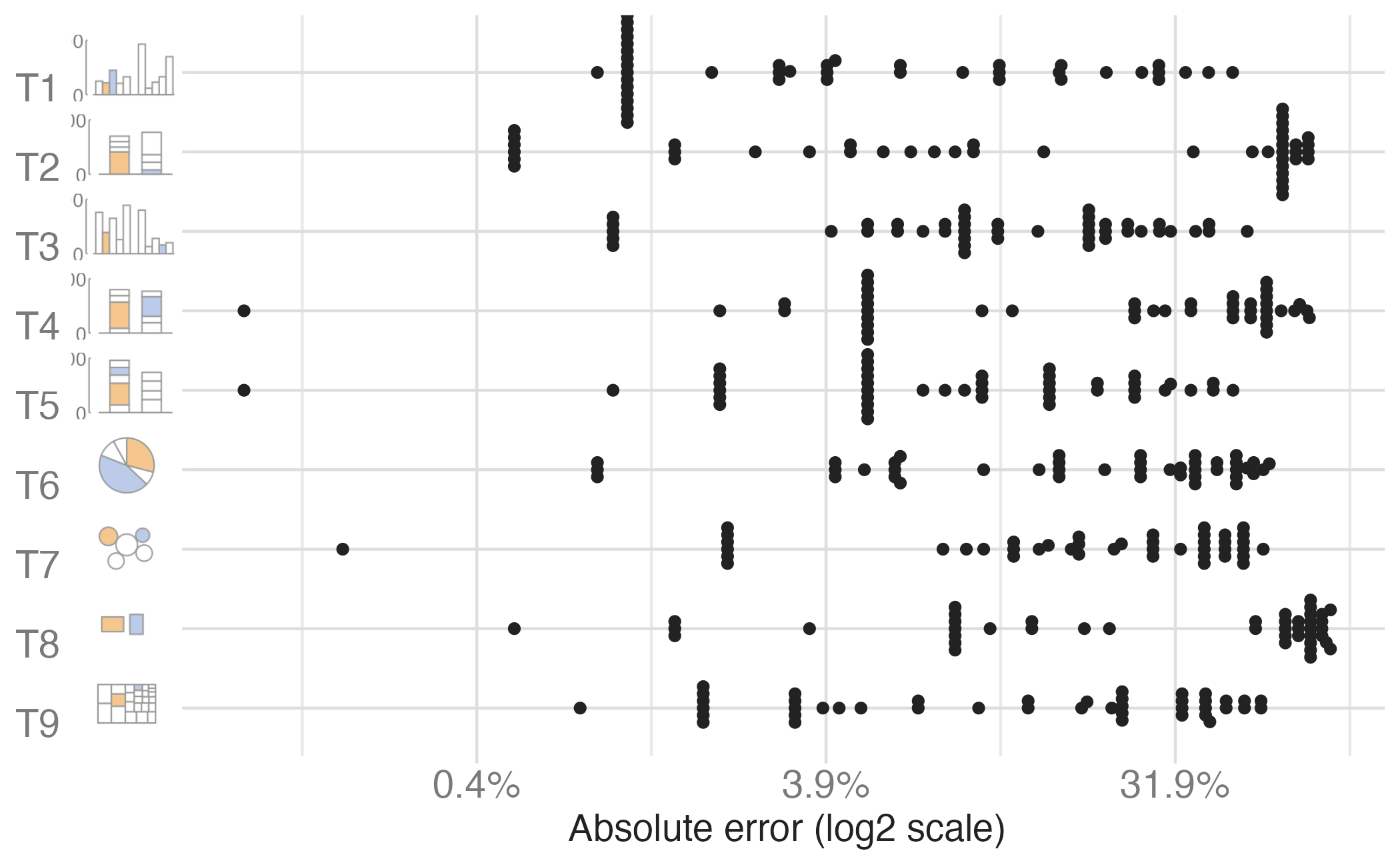
Class results

Expected pattern

Bar chart error < Pie chart error < Bubble chart error

(Position < Angle < Area)

Did the class results follow the Cleveland & McGill hierarchy?

Debrief

Discuss with a peer

  1. Which chart type gave you the most trouble? Why?

  2. Were there any trials where you felt confident but were actually far off?

  3. How might these findings change how you design visualizations?

  4. When might you still choose a “less accurate” encoding?

06:00

Extended hierarchy

Based on combined evidence with Heer and Bostock (2010), the updated ranking:

Rank Perceptual Task Chart Examples
1 Position (common scale) Bar chart, dot plot
2 Position (non-aligned) Small multiples
3 Length Stacked bar (non-baseline)
4 Angle Pie chart
5 Circular area Bubble chart
6 Rectangular area Treemap

Implications for design

Redesigning common graphs

Cleveland & McGill suggested replacements:

Instead of… Use…
Pie chart Dot chart or bar chart
Divided bar chart Grouped dot chart
Stacked area chart Multiple line charts
Choropleth map Framed rectangle chart

Dot (lollipop) chart: A Cleveland favorite
Limitations to keep in mind

The hierarchy applies to extracting precise quantitative values, but:

  • Part-to-whole relationships - pie charts can show “roughly half” well
  • Patterns and trends - position isn’t always the goal
  • Memorability - some “worse” encodings may be more memorable
  • Engagement - aesthetic appeal matters for communication

The “best” chart depends on the task and audience. Cleveland & McGill’s hierarchy is a guide, not a rule.

Starting points for selecting appropriate charts

Wrap up

Recap

  • Visualizations can fail due to bad taste, bad data, or bad perception
  • Maximizing the data-to-ink ratio means using ink purposefully — each mark should carry information
  • Cleveland & McGill’s hierarchy of elementary perceptual tasks provides an empirical basis for choosing visual encodings that maximize accuracy in quantitative judgments

Acknowledgements