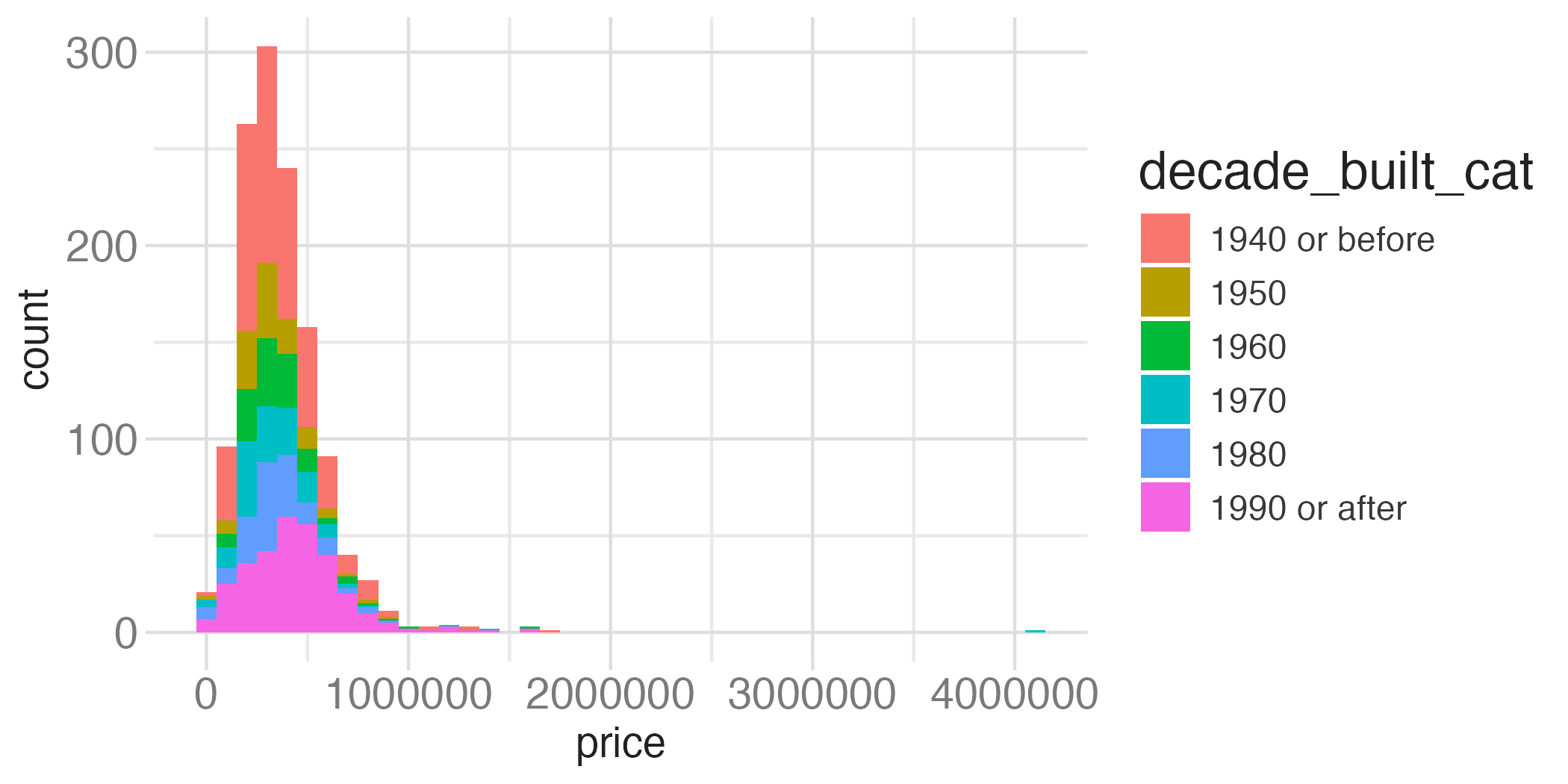
tompkins <- read_csv("data/tompkins-home-sales.csv") |>
  mutate(decade_built = (year_built %/% 10) * 10) |>
  mutate(
    decade_built_cat = case_when(
      decade_built <= 1940 ~ "1940 or before",
      decade_built >= 1990 ~ "1990 or after",
      .default = as.character(decade_built)
    )
  )

mean_price_decade <- tompkins |>
  group_by(decade_built_cat) |>
summarize(mean_price = mean(price))Deep dive: layers (II)
Lecture 4
January 29, 2026

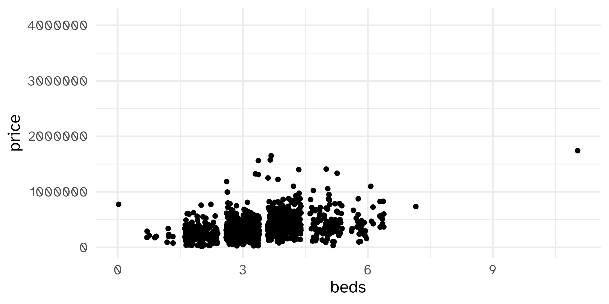
- What do you notice?
- What do you wonder?
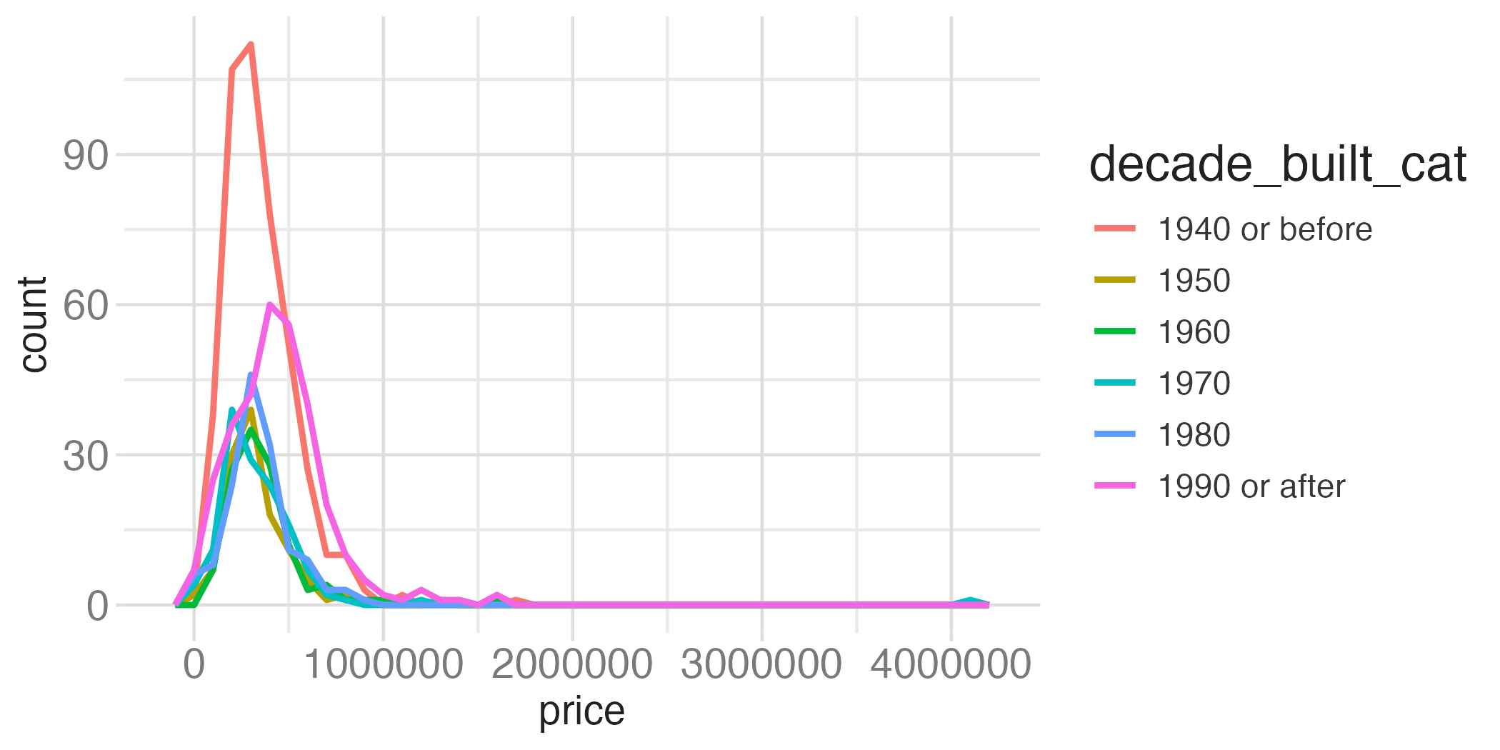
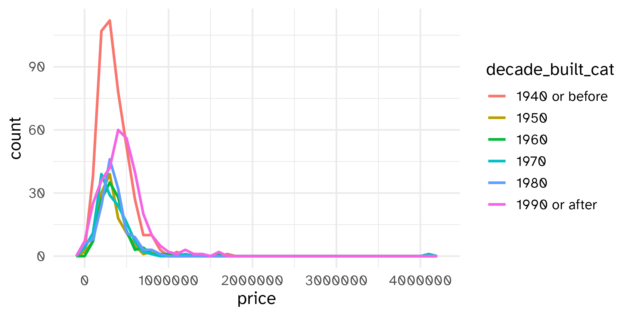
Comparing across groups
geom_hex()
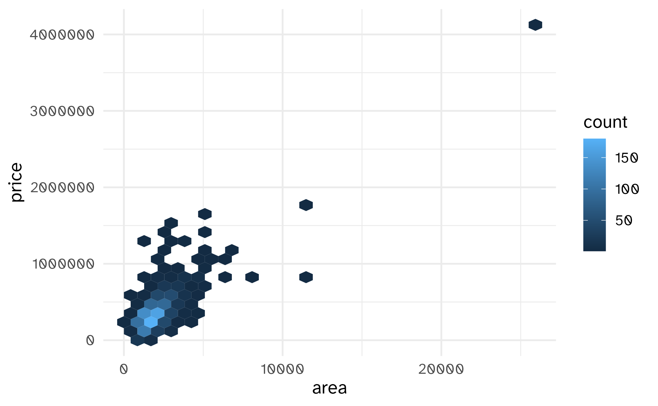
Not so helpful for 38 observations:
geom_hex()
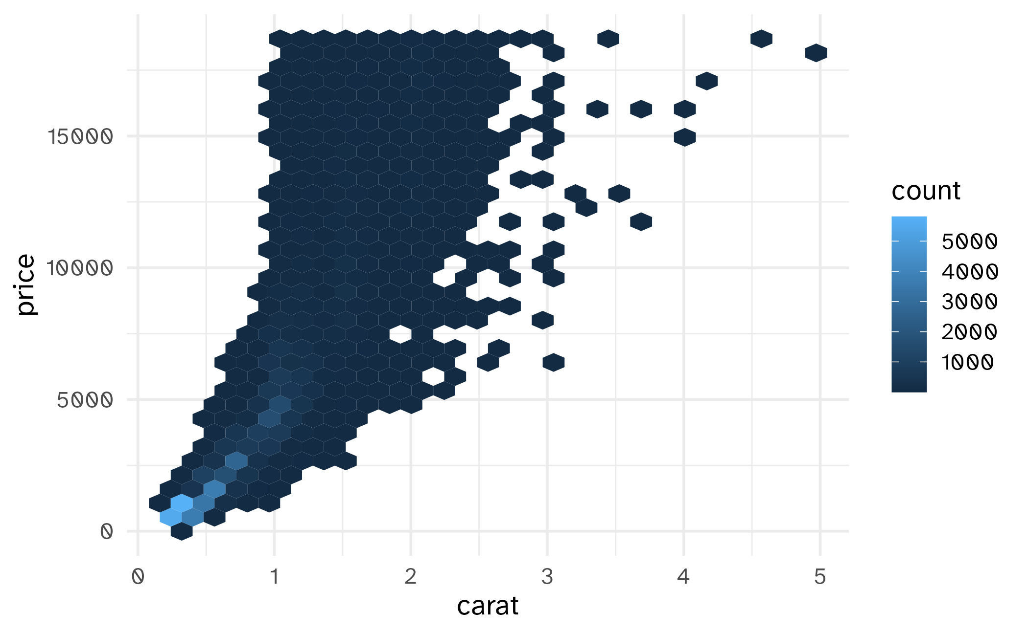
More helpful for 1270 observations:

geom_hex()
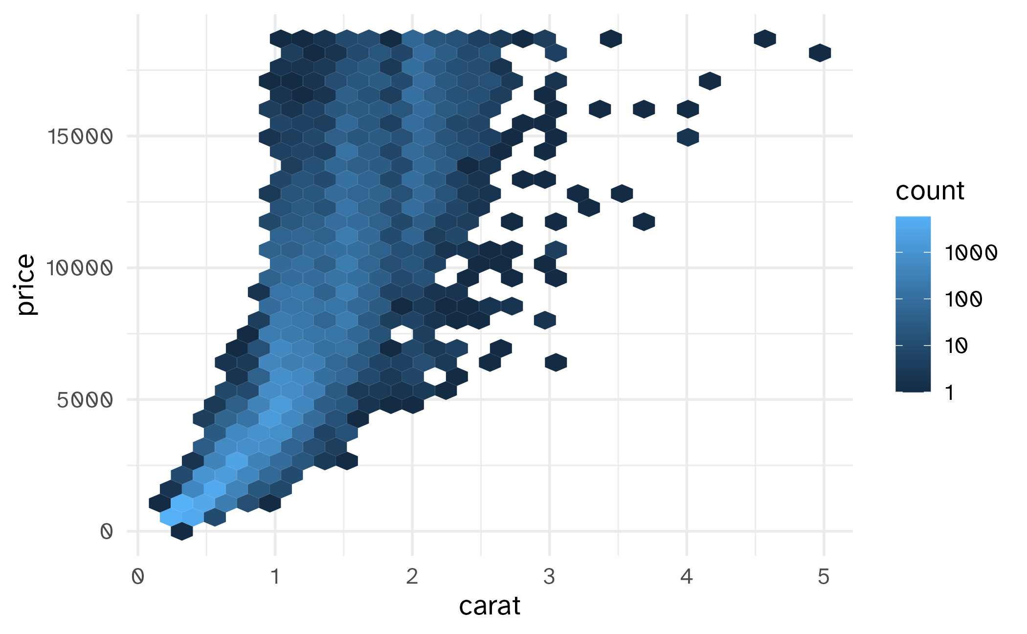
Even more helpful for 53940 observations:
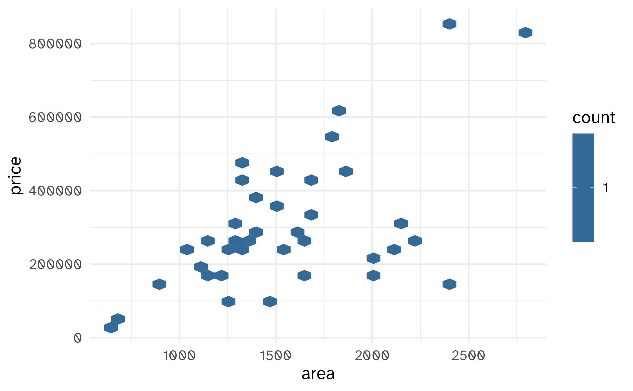
geom_hex()
(Maybe) even more helpful on the log scale:
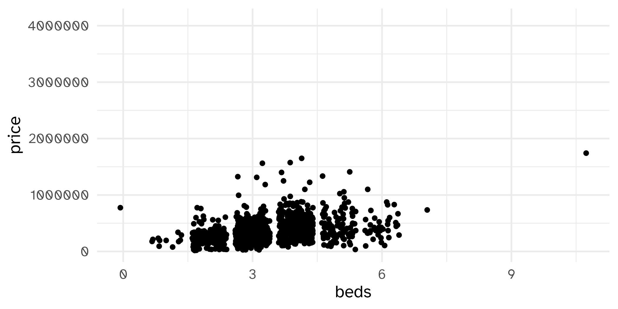
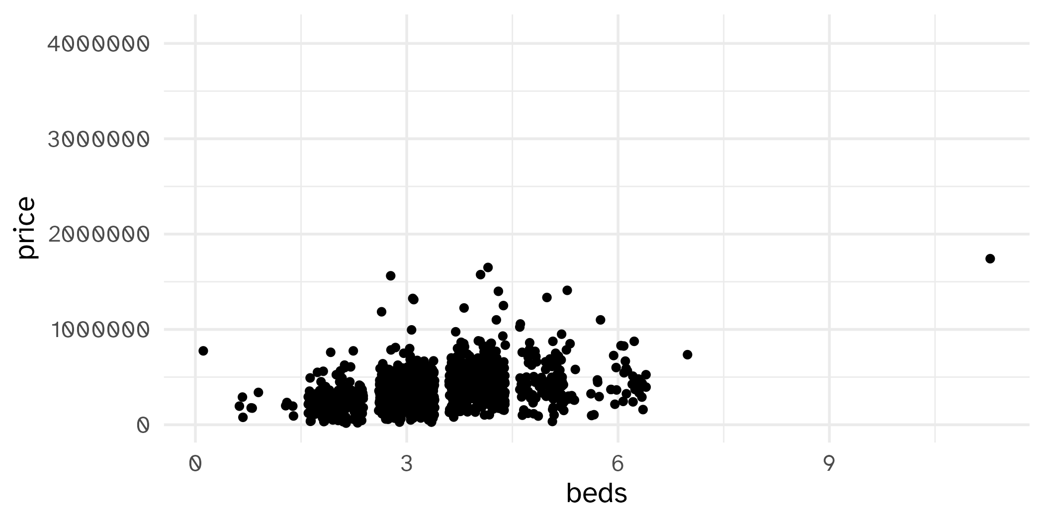
geom_jitter()
How are the following three plots different?
geom_jitter() and set.seed()
Not geom_point()
geom_line()
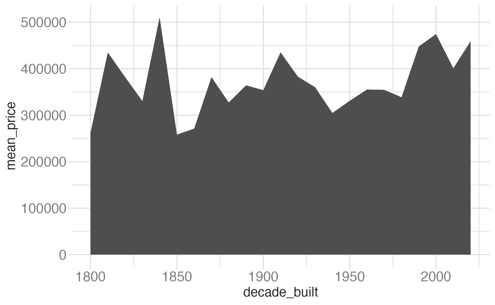
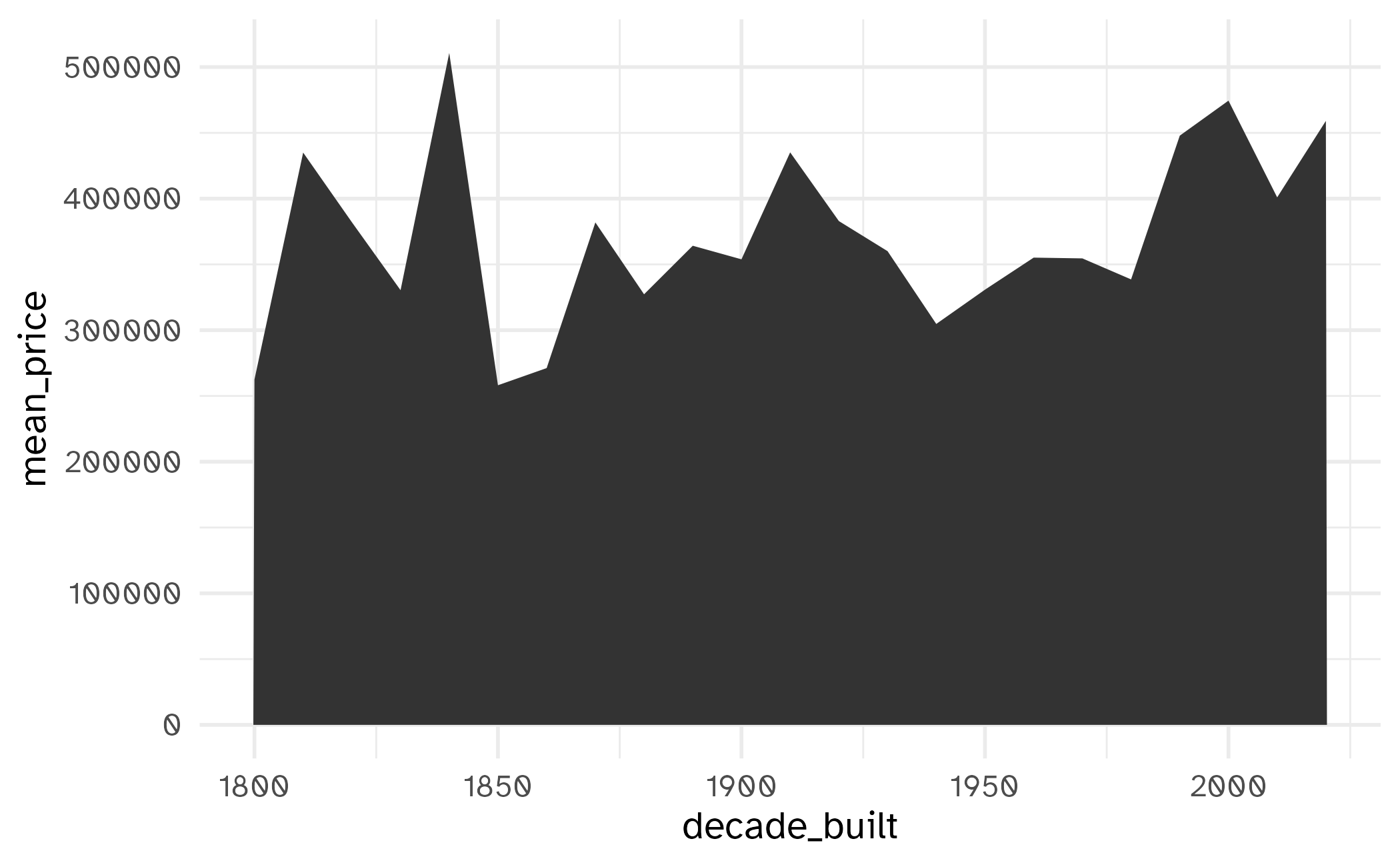
geom_area()

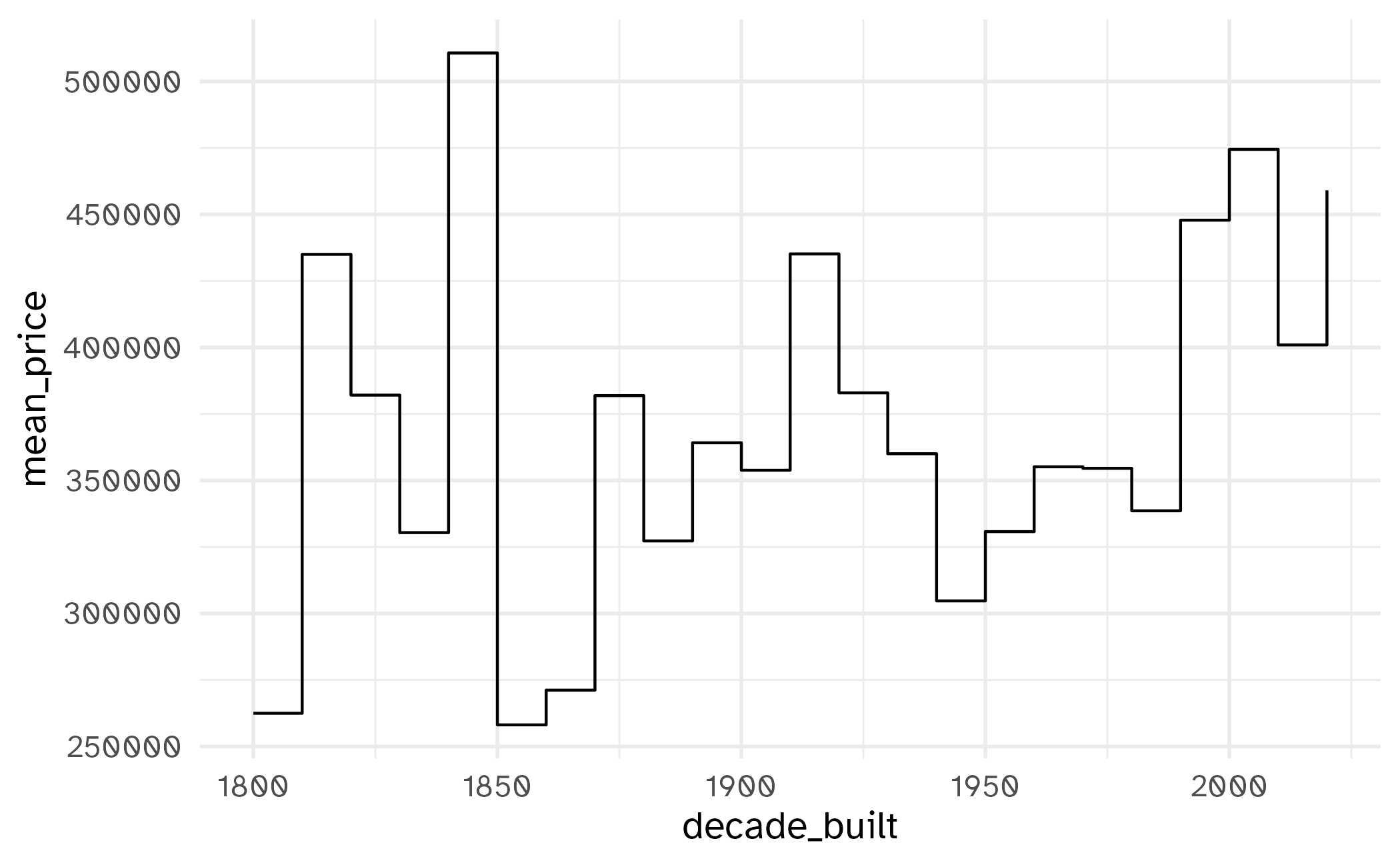
geom_step()
Let’s clean things up a bit!
ggplot(tompkins, aes(x = area, y = price)) +
  geom_point(alpha = 0.2, size = 2, color = "#B31B1B") +
  scale_x_continuous(labels = label_comma()) +
  scale_y_continuous(labels = label_currency(scale_cut = cut_short_scale())) +
  labs(
    x = "Area (square feet)",
    y = "Sale price (USD)",
    title = "Sale prices of homes in Tompkins County, NY",
    subtitle = "2022-24",
    caption = "Source: Redfin.com"
  )