Rows: 333
Columns: 8
$ species     <fct> Adelie, Adelie, Adelie, Adelie, Adelie…
$ island      <fct> Torgersen, Torgersen, Torgersen, Torge…
$ bill_len    <dbl> 39.1, 39.5, 40.3, 36.7, 39.3, 38.9, 39…
$ bill_dep    <dbl> 18.7, 17.4, 18.0, 19.3, 20.6, 17.8, 19…
$ flipper_len <int> 181, 186, 195, 193, 190, 181, 195, 182…
$ body_mass   <int> 3750, 3800, 3250, 3450, 3650, 3625, 46…
$ sex         <fct> male, female, female, female, male, fe…
$ year <int> 2007, 2007, 2007, 2007, 2007, 2007, 20…The grammar of graphics
Lecture 03
September 1, 2026
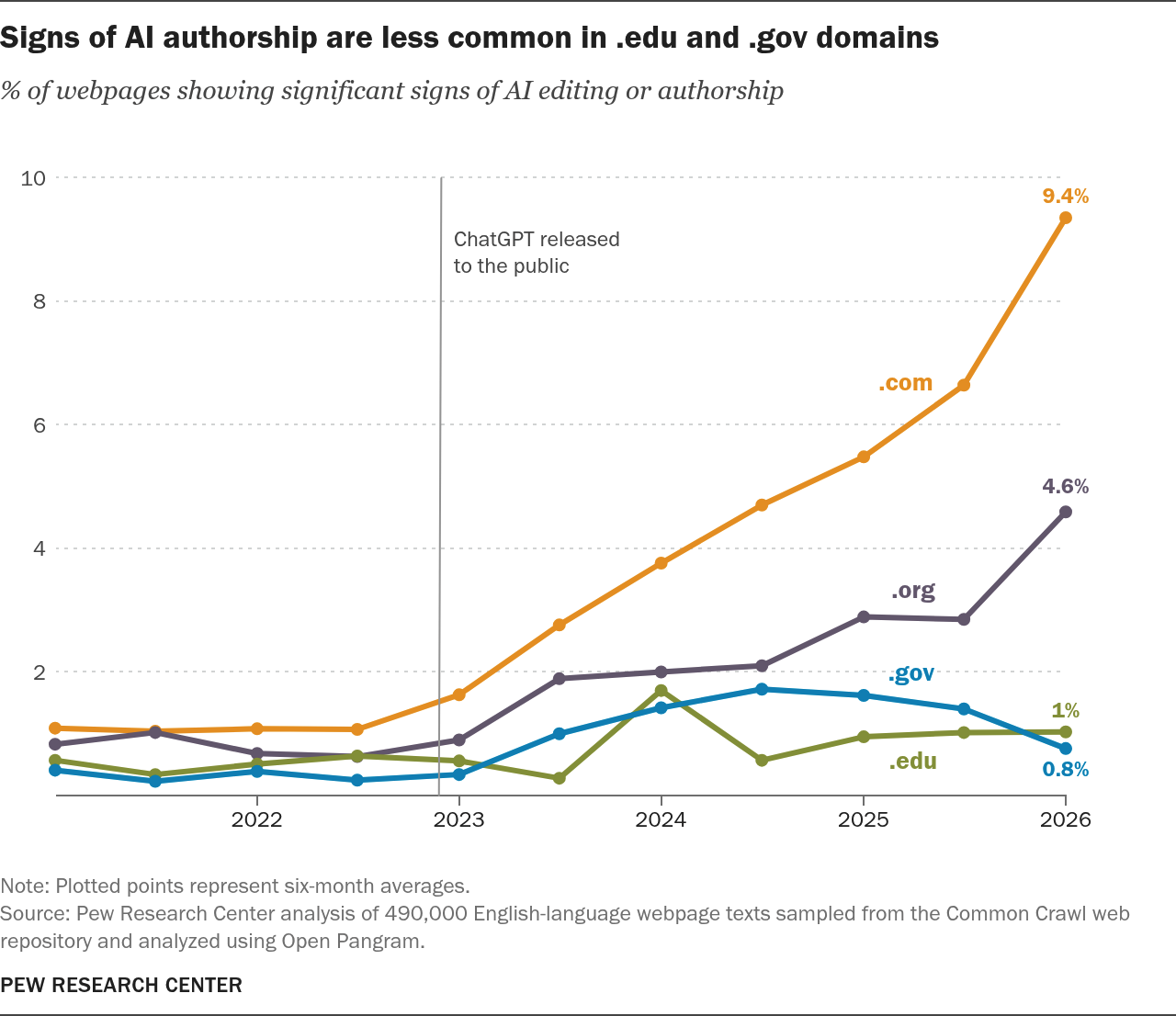
- What is the basic structure of the chart?
- How does the structure make this chart effective?
{ggplot2} \(\in\) {tidyverse}
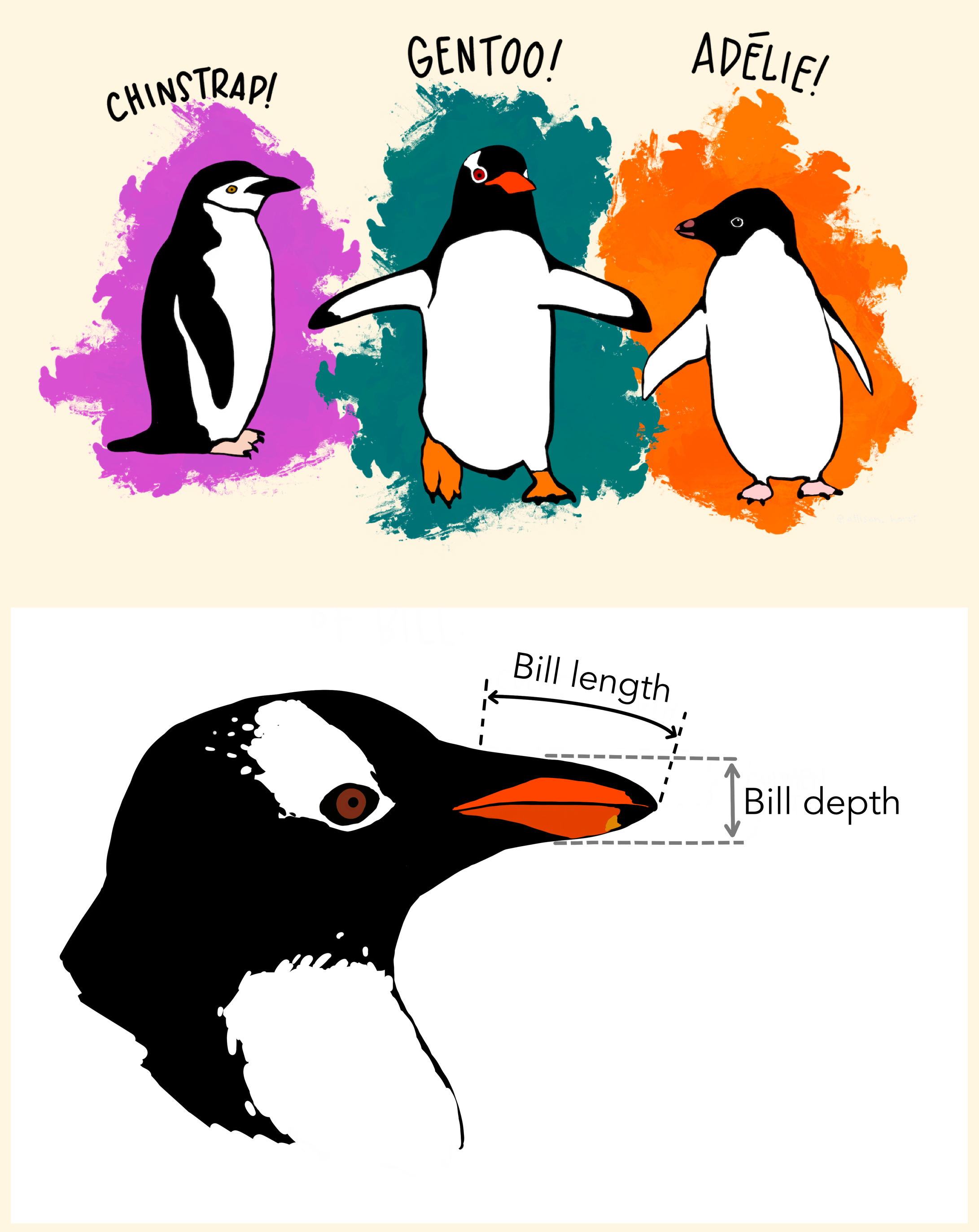
Data: Palmer Penguins
Measurements for penguin species, island in Palmer Archipelago, size (flipper length, body mass, bill dimensions), and sex.

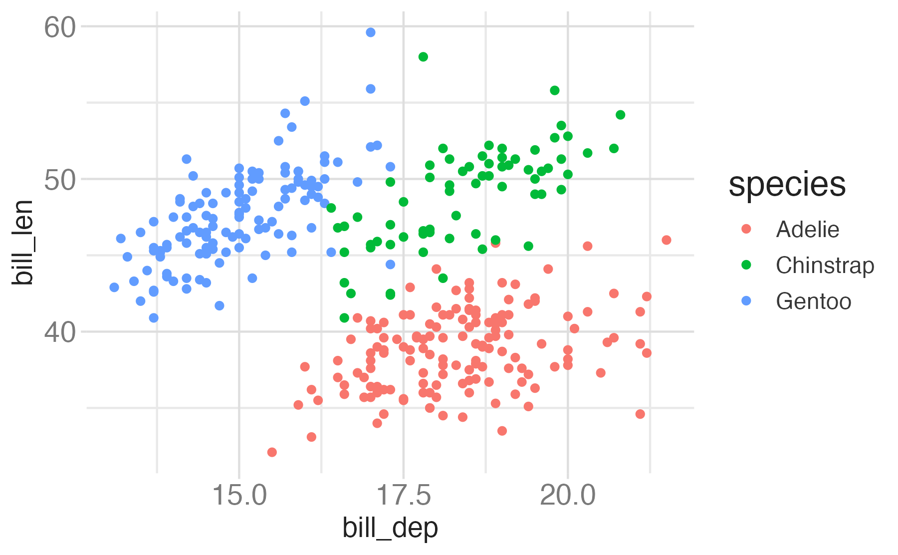
Start with the
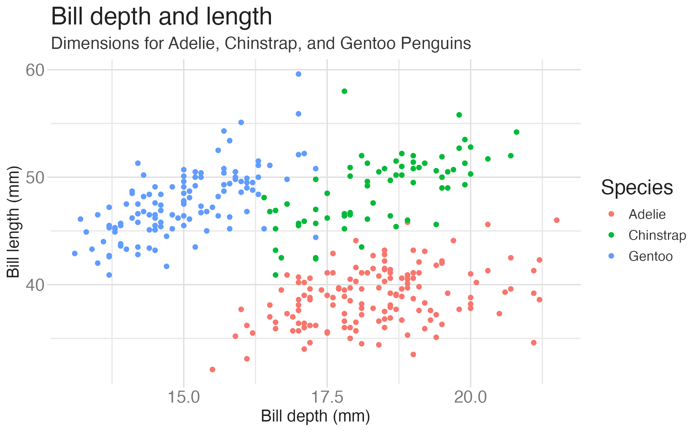
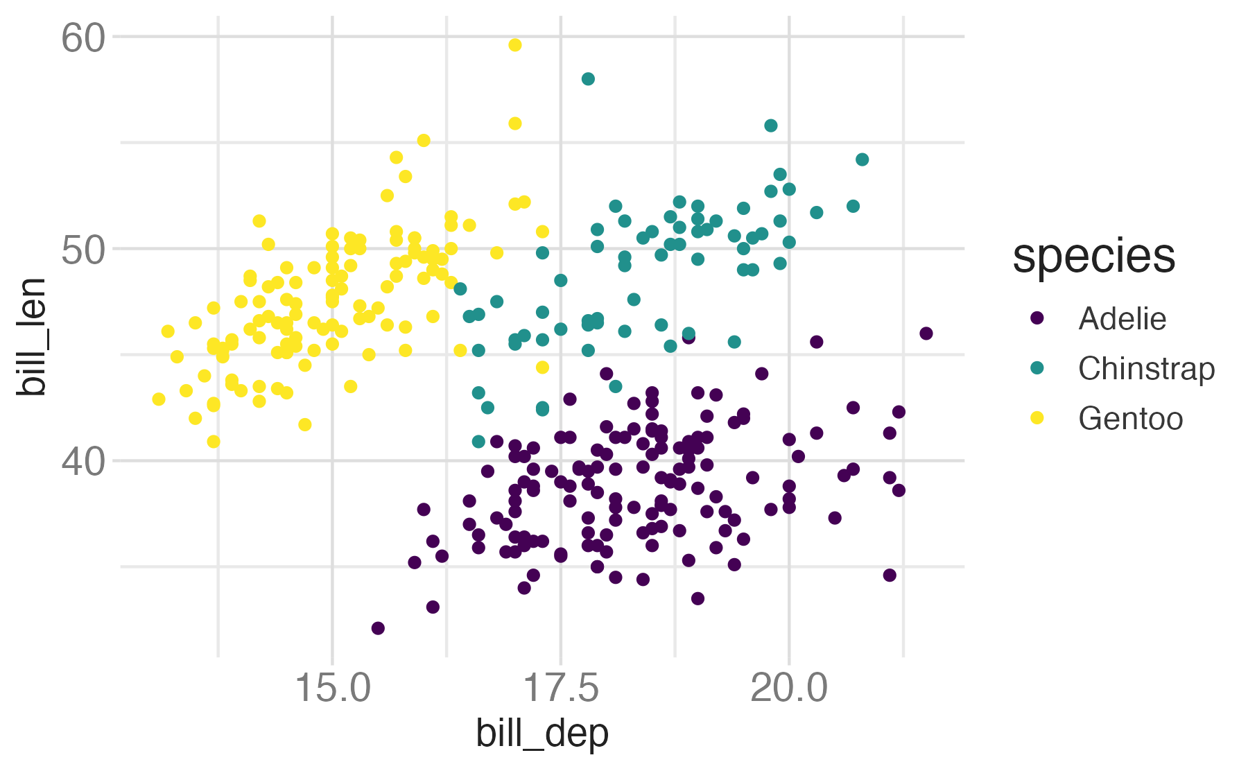
penguinsdata frame, map bill depth to the x-axis and map bill length to the y-axis. Represent each observation with a point and map species to the color of each point. Title the plot “Bill depth and length”
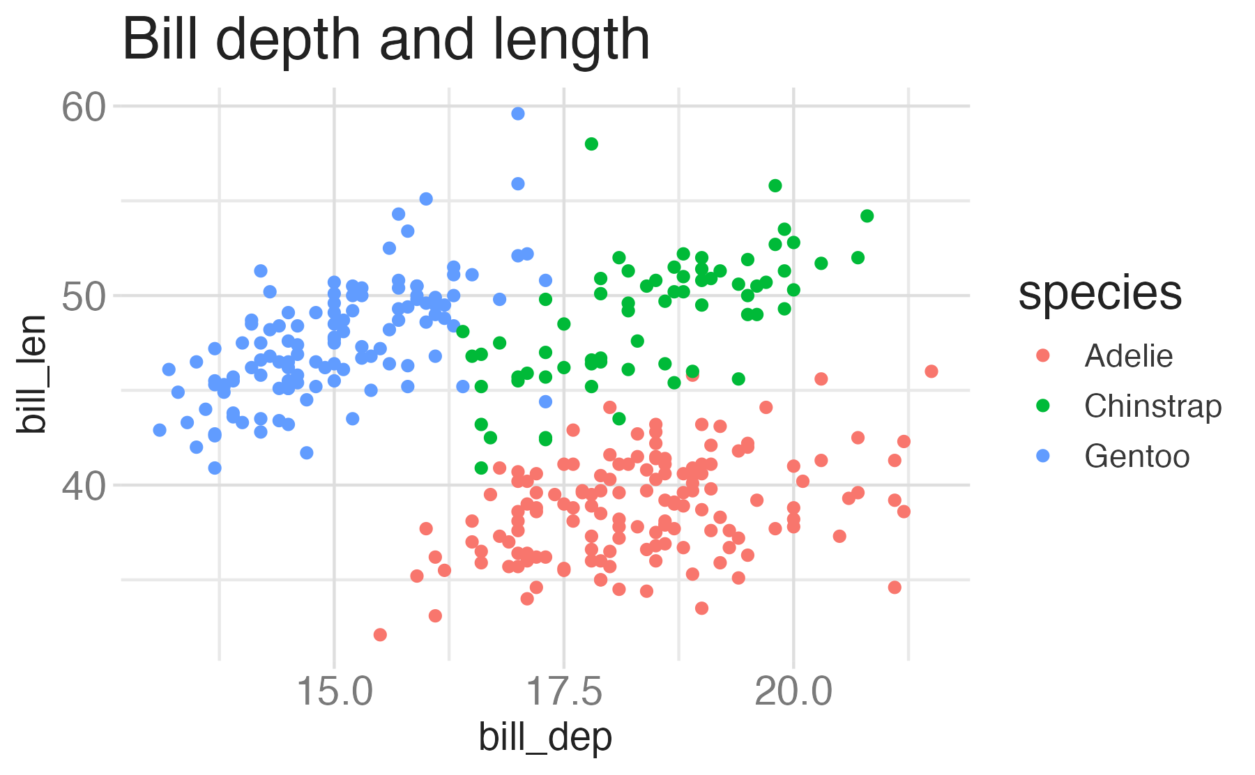
Start with the
penguinsdata frame, map bill depth to the x-axis and map bill length to the y-axis. Represent each observation with a point and map species to the color of each point. Title the plot “Bill depth and length”, add the subtitle “Dimensions for Adelie, Chinstrap, and Gentoo Penguins”
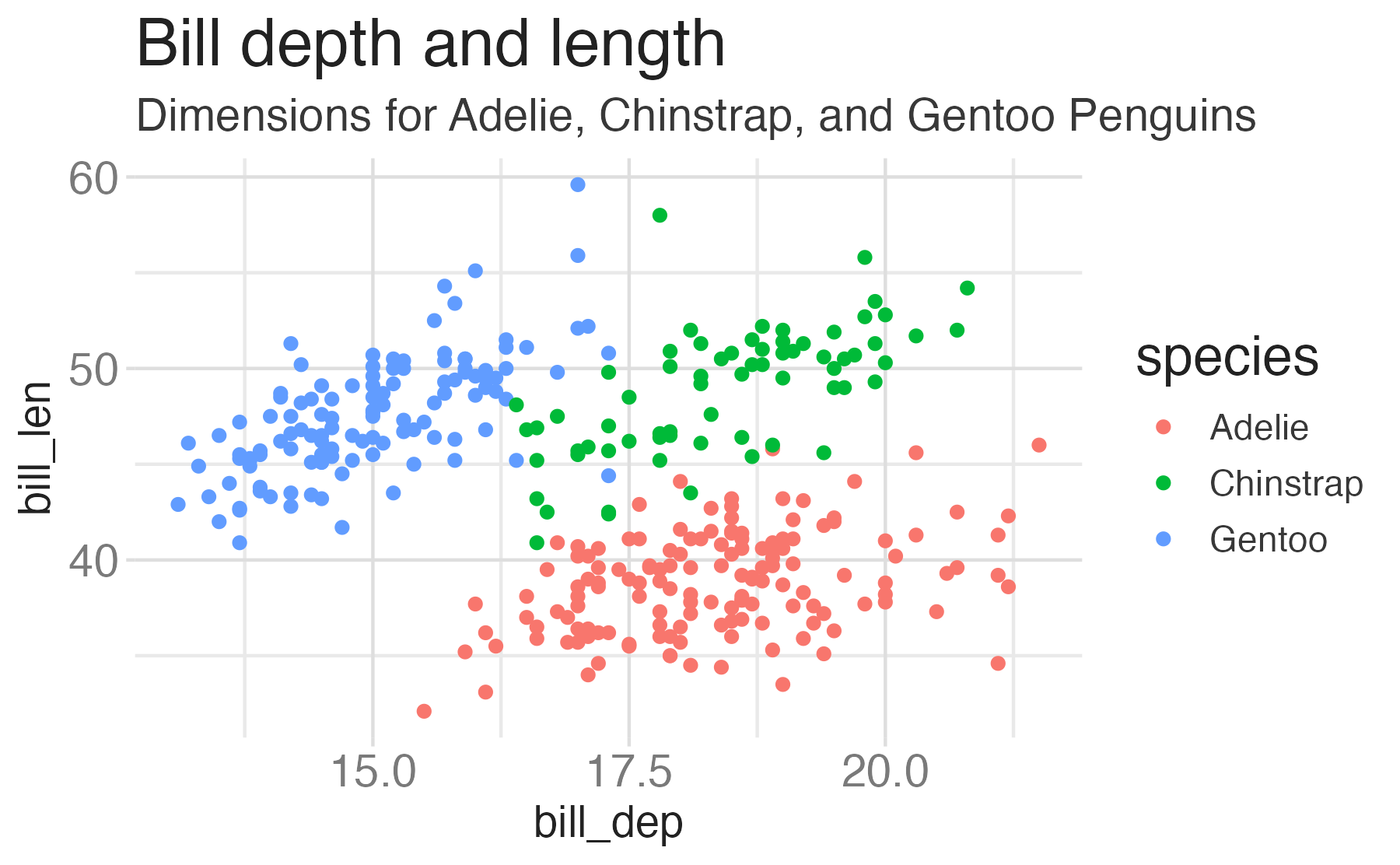
Start with the
penguinsdata frame, map bill depth to the x-axis and map bill length to the y-axis. Represent each observation with a point and map species to the color of each point. Title the plot “Bill depth and length”, add the subtitle “Dimensions for Adelie, Chinstrap, and Gentoo Penguins”, label the x and y axes as “Bill depth (mm)” and “Bill length (mm)”, respectively
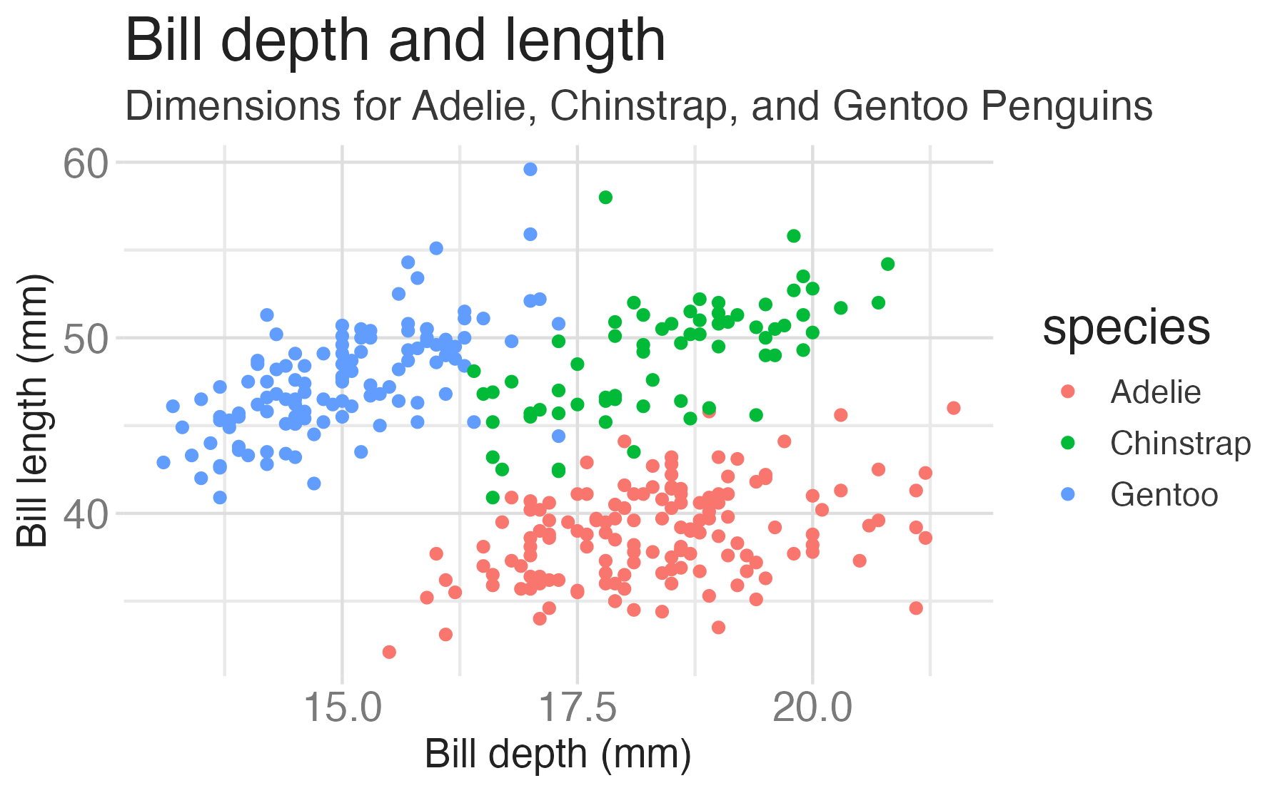
Start with the
penguinsdata frame, map bill depth to the x-axis and map bill length to the y-axis. Represent each observation with a point and map species to the color of each point. Title the plot “Bill depth and length”, add the subtitle “Dimensions for Adelie, Chinstrap, and Gentoo Penguins”, label the x and y axes as “Bill depth (mm)” and “Bill length (mm)”, respectively, label the legend “Species”
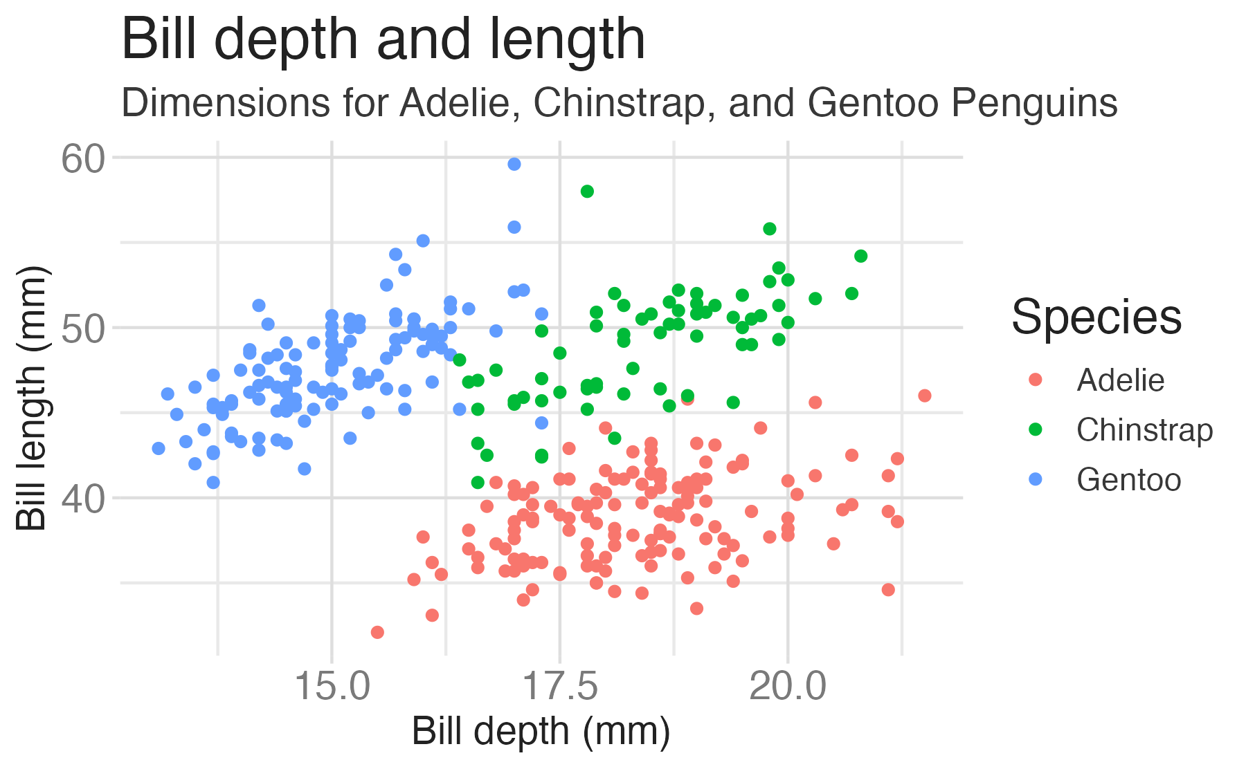
Start with the
penguinsdata frame, map bill depth to the x-axis and map bill length to the y-axis. Represent each observation with a point and map species to the color of each point. Title the plot “Bill depth and length”, add the subtitle “Dimensions for Adelie, Chinstrap, and Gentoo Penguins”, label the x and y axes as “Bill depth (mm)” and “Bill length (mm)”, respectively, label the legend “Species”, and add a caption for the data source.
ggplot(data = penguins,
       mapping = aes(x = bill_dep,
                     y = bill_len,
                     color = species)) +
geom_point() +
labs(title = "Bill depth and length",
subtitle = "Dimensions for Adelie, Chinstrap, and Gentoo Penguins",
x = "Bill depth (mm)", y = "Bill length (mm)",
color = "Species",
caption = "Source: Palmer Station LTER / palmerpenguins package")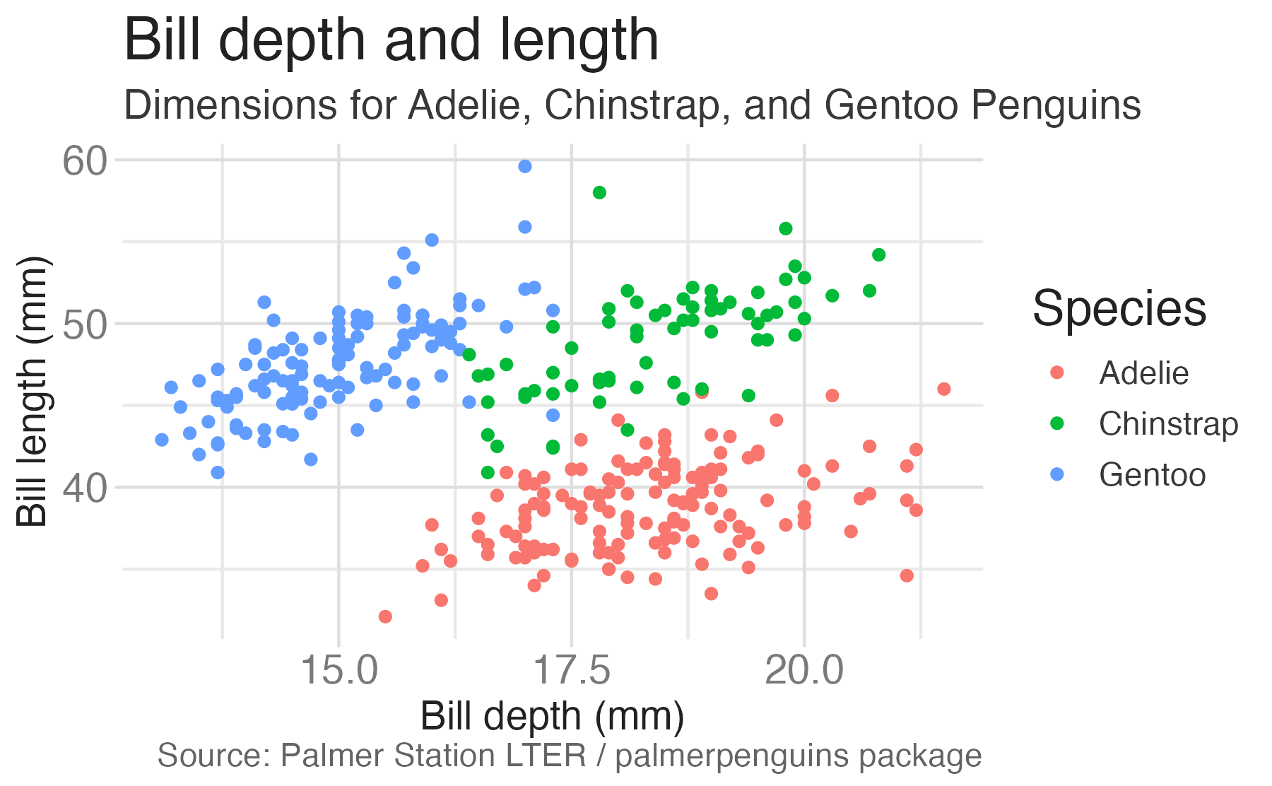
Start with the
penguinsdata frame, map bill depth to the x-axis and map bill length to the y-axis. Represent each observation with a point and map species to the color of each point. Title the plot “Bill depth and length”, add the subtitle “Dimensions for Adelie, Chinstrap, and Gentoo Penguins”, label the x and y axes as “Bill depth (mm)” and “Bill length (mm)”, respectively, label the legend “Species”, and add a caption for the data source. Finally, use a discrete color scale that is designed to be perceived by viewers with common forms of color blindness.
ggplot(data = penguins,
       mapping = aes(x = bill_dep,
                     y = bill_len,
                     color = species)) +
  geom_point() +
  labs(title = "Bill depth and length",
       subtitle = "Dimensions for Adelie, Chinstrap, and Gentoo Penguins",
       x = "Bill depth (mm)", y = "Bill length (mm)",
       color = "Species",
caption = "Source: Palmer Station LTER / palmerpenguins package") +
scale_color_viridis_d()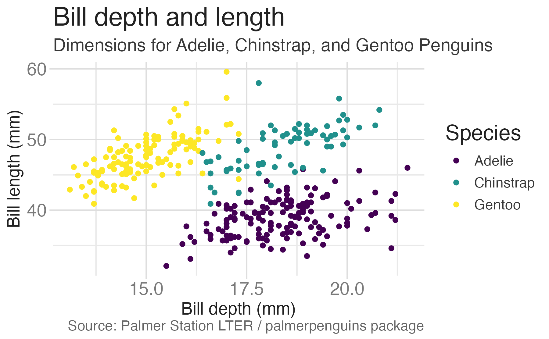
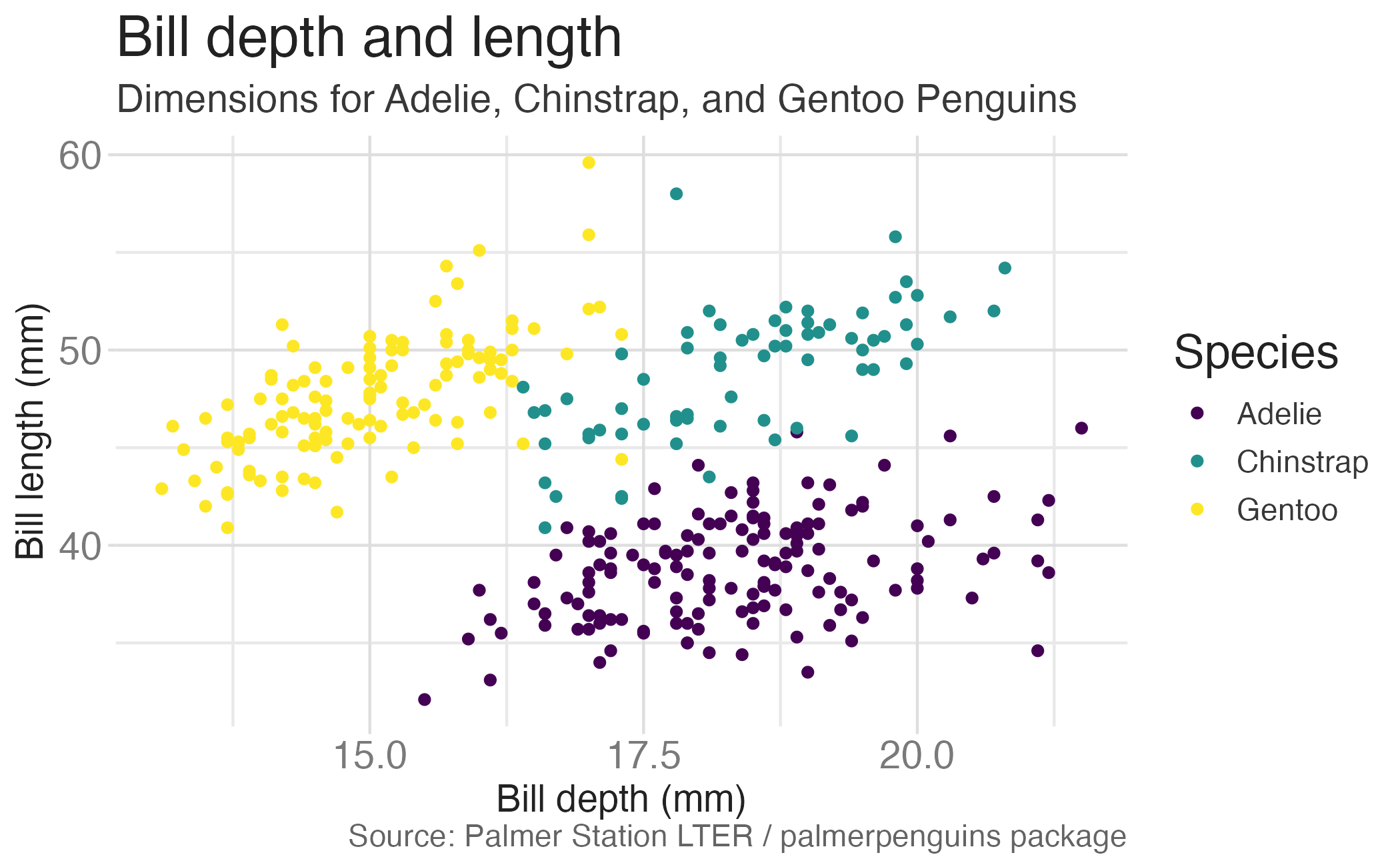
ggplot(data = penguins,
       mapping = aes(x = bill_dep,
                     y = bill_len,
                     color = species)) +
  geom_point() +
  labs(title = "Bill depth and length",
       subtitle = "Dimensions for Adelie, Chinstrap, and Gentoo Penguins",
       x = "Bill depth (mm)", y = "Bill length (mm)",
       color = "Species",
       caption = "Source: Palmer Station LTER / palmerpenguins package") +
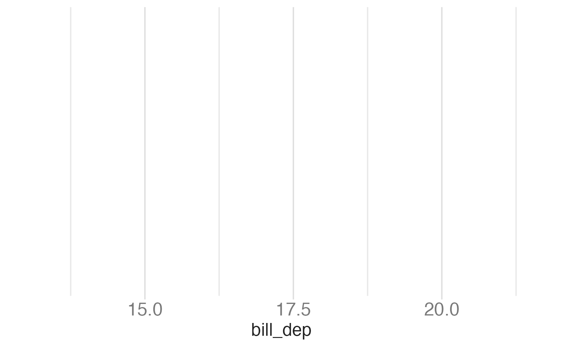
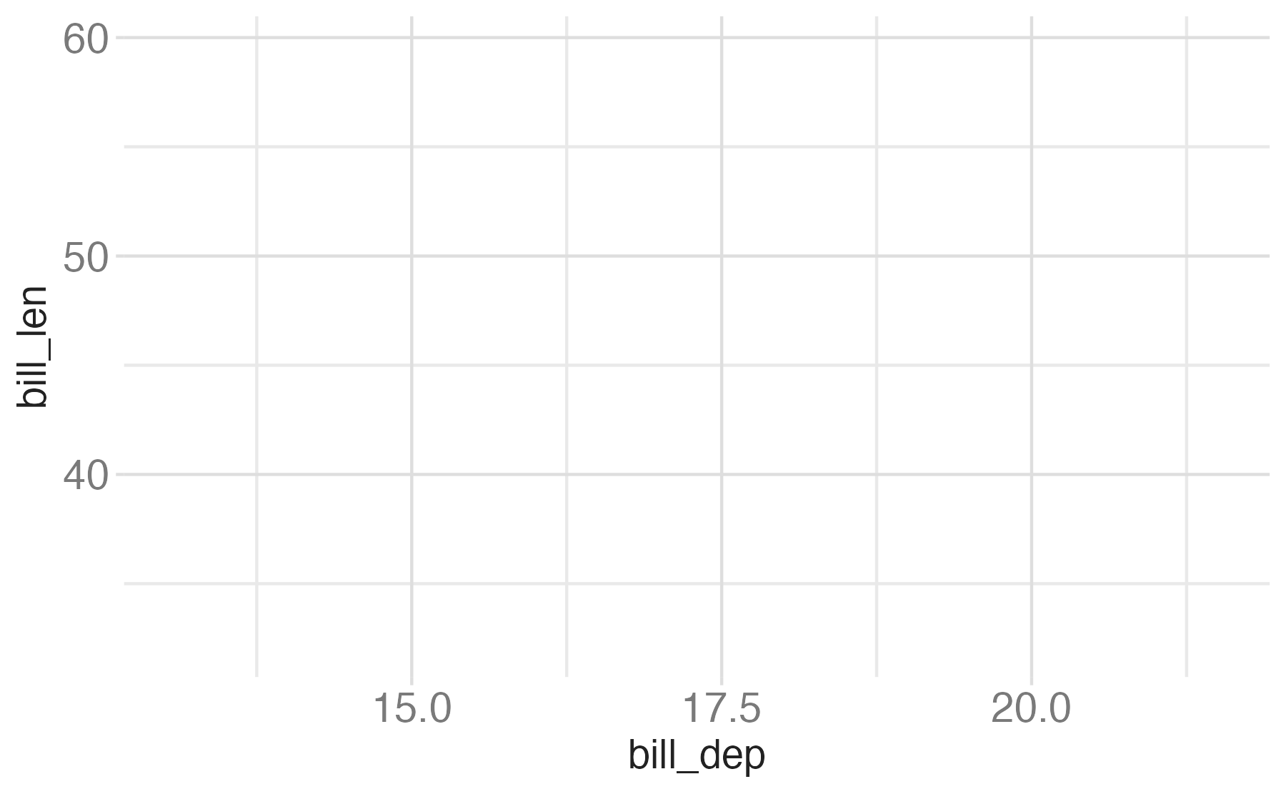
scale_color_viridis_d()Start with the penguins data frame, map bill depth to the x-axis and map bill length to the y-axis.
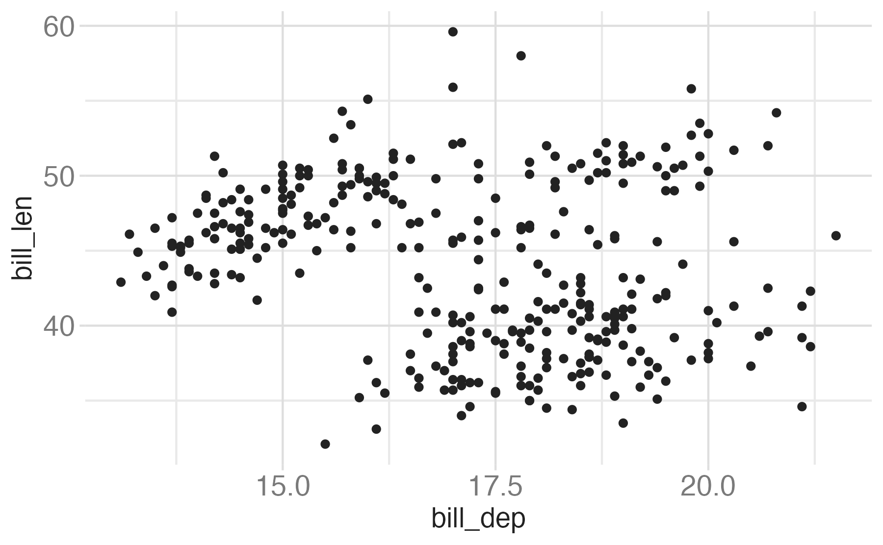
Represent each observation with a point and map species to the color of each point.
Title the plot “Bill depth and length”, add the subtitle “Dimensions for Adelie, Chinstrap, and Gentoo Penguins”, label the x and y axes as “Bill depth (mm)” and “Bill length (mm)”, respectively, label the legend “Species”, and add a caption for the data source.
Finally, use a discrete color scale that is designed to be perceived by viewers with common forms of color blindness.
Alternative implementations
# Map species to viridis colors
species <- factor(penguins$species)
cols <- viridisLite::viridis(nlevels(species))

# Extra bottom margin for the caption, extra top for title + subtitle
par(mar = c(6, 4, 4, 2) + 0.1)

plot(penguins$bill_dep, penguins$bill_len,
     col = cols[species],
     pch = 19,
     xlab = "Bill depth (mm)",
     ylab = "Bill length (mm)",
     main = "")   # title added separately so we can add a subtitle

# Title and subtitle
title(main = "Bill depth and length", adj = 0)
mtext("Dimensions for Adelie, Chinstrap, and Gentoo Penguins",
      side = 3, line = 0.3, adj = 0, cex = 0.9)

# Legend
legend("topright",
       legend = levels(species),
       col = cols,
       pch = 19,
       title = "Species")

# Caption
mtext("Source: Palmer Station LTER / palmerpenguins package",
      side = 1, line = 4.5, adj = 1, cex = 0.7, col = "gray40")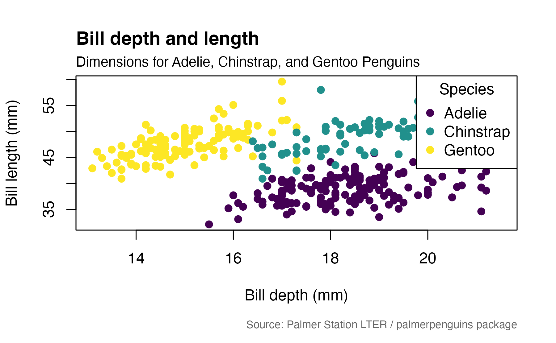
import matplotlib.pyplot as plt
import matplotlib.cm as cm
import numpy as np
from palmerpenguins import load_penguins

# Load the dataset (returns a pandas DataFrame)
penguins = load_penguins()

# The real column names in the package are the full versions,
# not the abbreviated bill_dep / bill_len from the original R snippet
x_col, y_col = "bill_depth_mm", "bill_length_mm"

# Drop rows with missing bill measurements or species
penguins = penguins.dropna(subset=[x_col, y_col, "species"])

fig, ax = plt.subplots(figsize=(8, 6))

# Assign each species a color from viridis (discrete)
species_list = penguins["species"].unique()
colors = cm.viridis(np.linspace(0, 1, len(species_list)))

for sp, color in zip(species_list, colors):
    subset = penguins[penguins["species"] == sp]
    ax.scatter(subset[x_col], subset[y_col], color=color, label=sp)

# Axis labels and legend
ax.set_xlabel("Bill depth (mm)")
ax.set_ylabel("Bill length (mm)")
ax.legend(title="Species")

# Title + subtitle (matplotlib has no native subtitle)
fig.suptitle(
    "Bill depth and length", fontsize=14, fontweight="bold", x=0.125, ha="left"
)
ax.set_title(
    "Dimensions for Adelie, Chinstrap, and Gentoo Penguins", fontsize=10, loc="left"
)

# Caption
fig.text(
    0.98,
    0.01,
    "Source: Palmer Station LTER / palmerpenguins package",
    ha="right",
    va="bottom",
    fontsize=8,
    color="gray",
)

plt.tight_layout()
plt.show()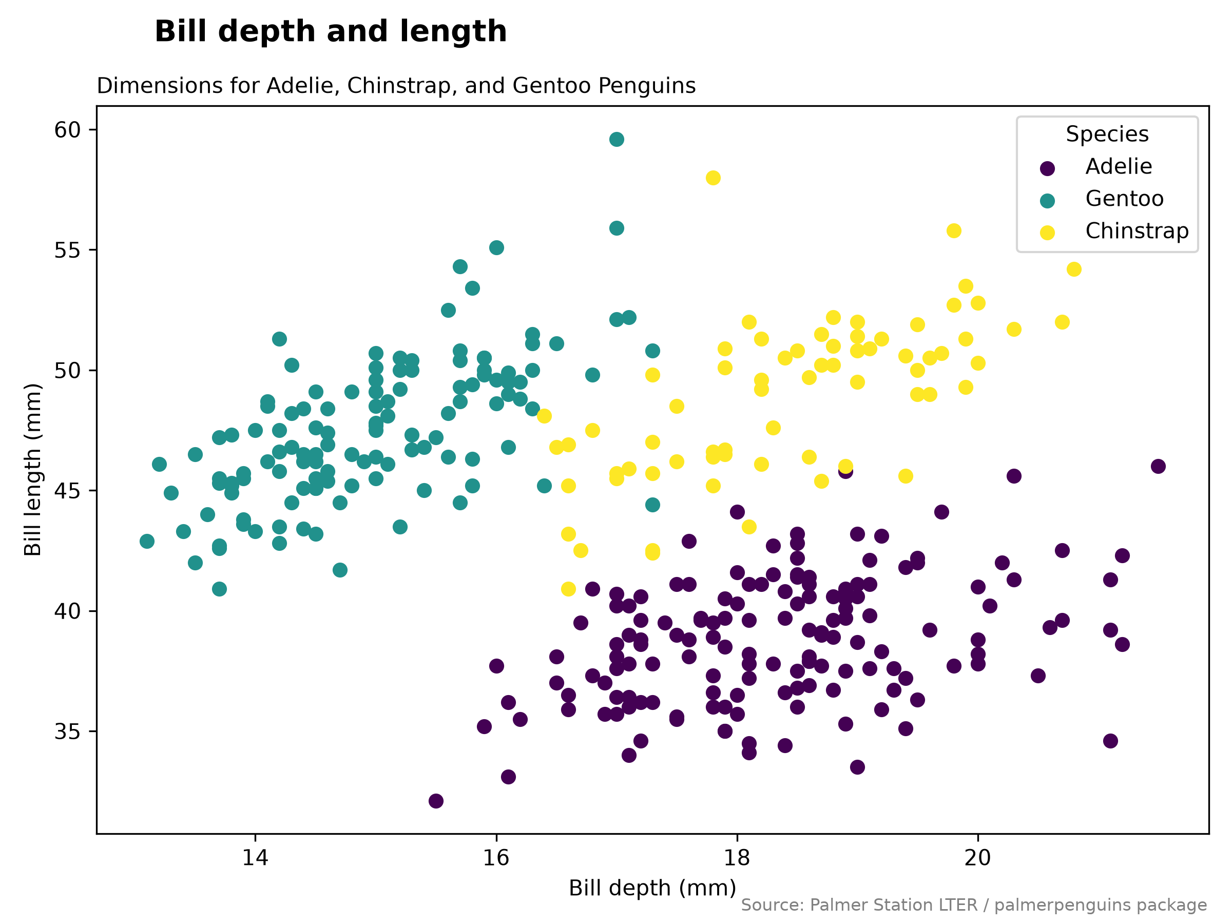
import matplotlib.pyplot as plt
import seaborn as sns
from palmerpenguins import load_penguins

# Load the dataset (returns a pandas DataFrame)
penguins = load_penguins()

# The palmerpenguins package uses full column names
x_col, y_col = "bill_depth_mm", "bill_length_mm"

# Drop rows with missing bill measurements or species
penguins = penguins.dropna(subset=[x_col, y_col, "species"])

fig, ax = plt.subplots(figsize=(8, 6))

# seaborn handles the per-species coloring and legend via hue
sns.scatterplot(data=penguins, x=x_col, y=y_col,
                hue="species", palette="viridis", ax=ax)

# Axis labels and legend title
ax.set_xlabel("Bill depth (mm)")
ax.set_ylabel("Bill length (mm)")
ax.legend(title="Species")

# Title + subtitle (matplotlib has no native subtitle)
fig.suptitle("Bill depth and length", fontsize=14, fontweight="bold",
             x=0.125, ha="left")
ax.set_title("Dimensions for Adelie, Chinstrap, and Gentoo Penguins",
             fontsize=10, loc="left")

# Caption
fig.text(0.98, 0.01,
         "Source: Palmer Station LTER / palmerpenguins package",
         ha="right", va="bottom", fontsize=8, color="gray")

plt.tight_layout()
plt.show()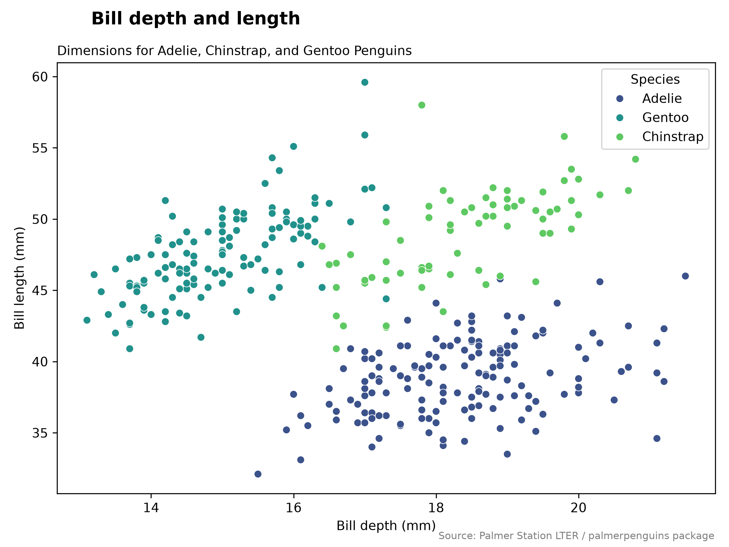
from palmerpenguins import load_penguins
from plotnine import ggplot, aes, geom_point, labs, scale_color_cmap_d

# Load the dataset (returns a pandas DataFrame)
penguins = load_penguins()

# The palmerpenguins package uses full column names
x_col, y_col = "bill_depth_mm", "bill_length_mm"

# Drop rows with missing bill measurements or species
penguins = penguins.dropna(subset=[x_col, y_col, "species"])

plot = (
    ggplot(penguins, aes(x=x_col, y=y_col, color="species"))
    + geom_point()
    + labs(
        title="Bill depth and length",
        subtitle="Dimensions for Adelie, Chinstrap, and Gentoo Penguins",
        x="Bill depth (mm)",
        y="Bill length (mm)",
        color="Species",
        caption="Source: Palmer Station LTER / palmerpenguins package",
    )
    + scale_color_cmap_d(cmap_name="viridis")
)

plot.show()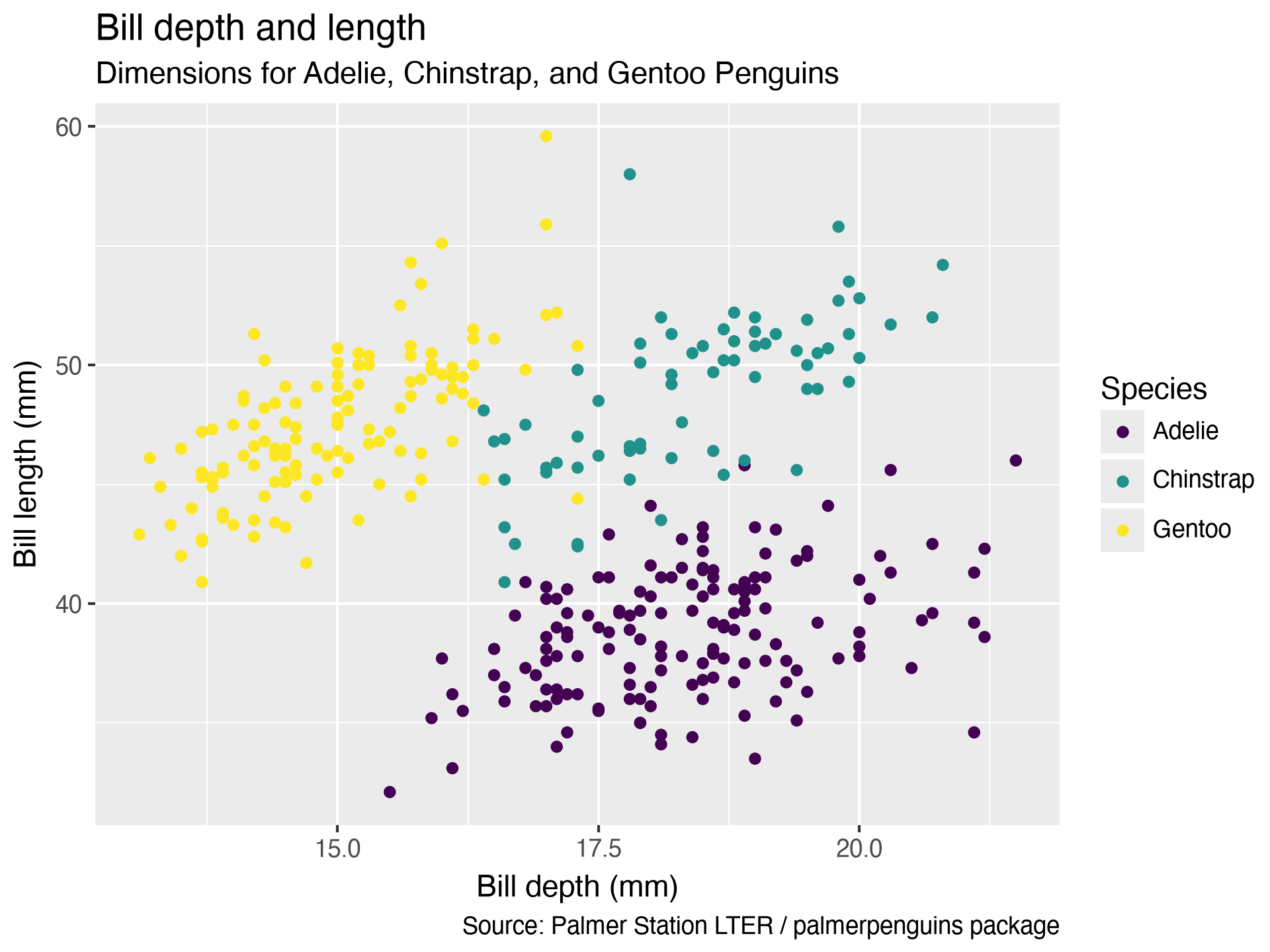
Color
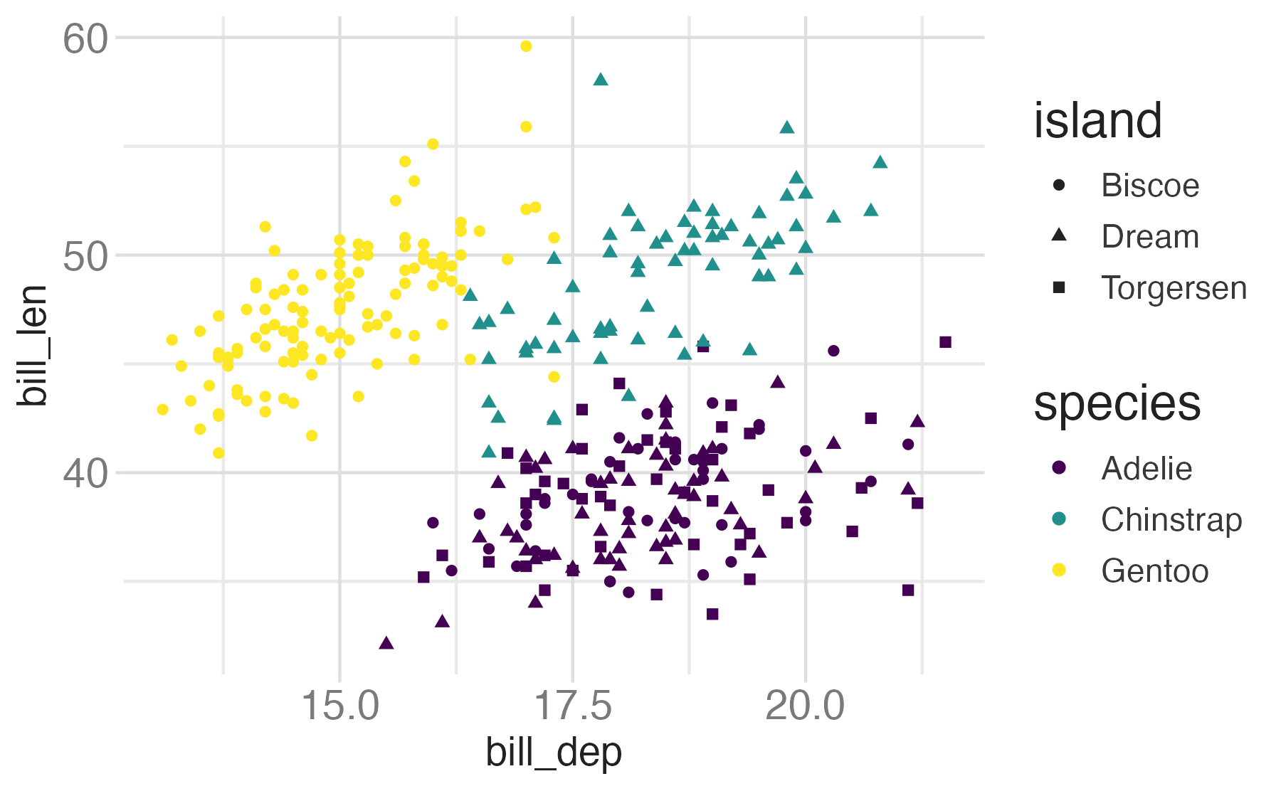
Shape
Mapped to a different variable than color
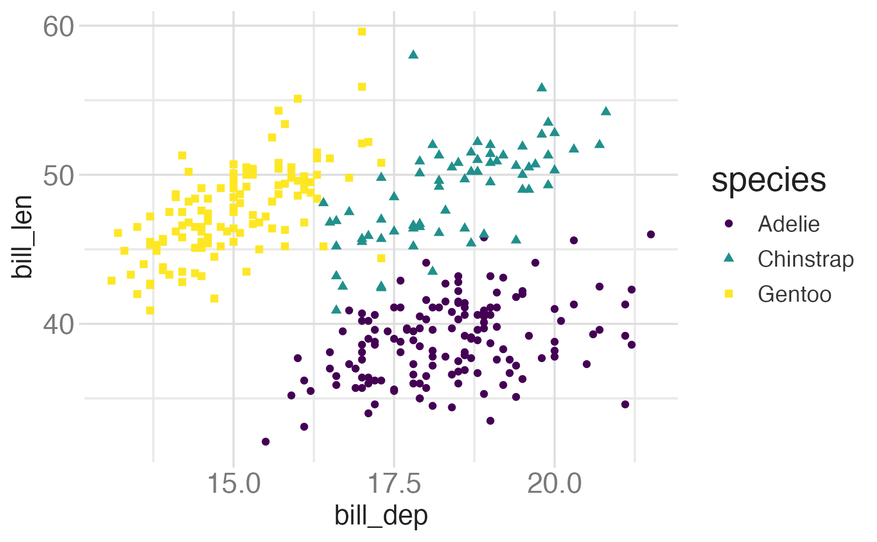
Shape
Mapped to same variable as color
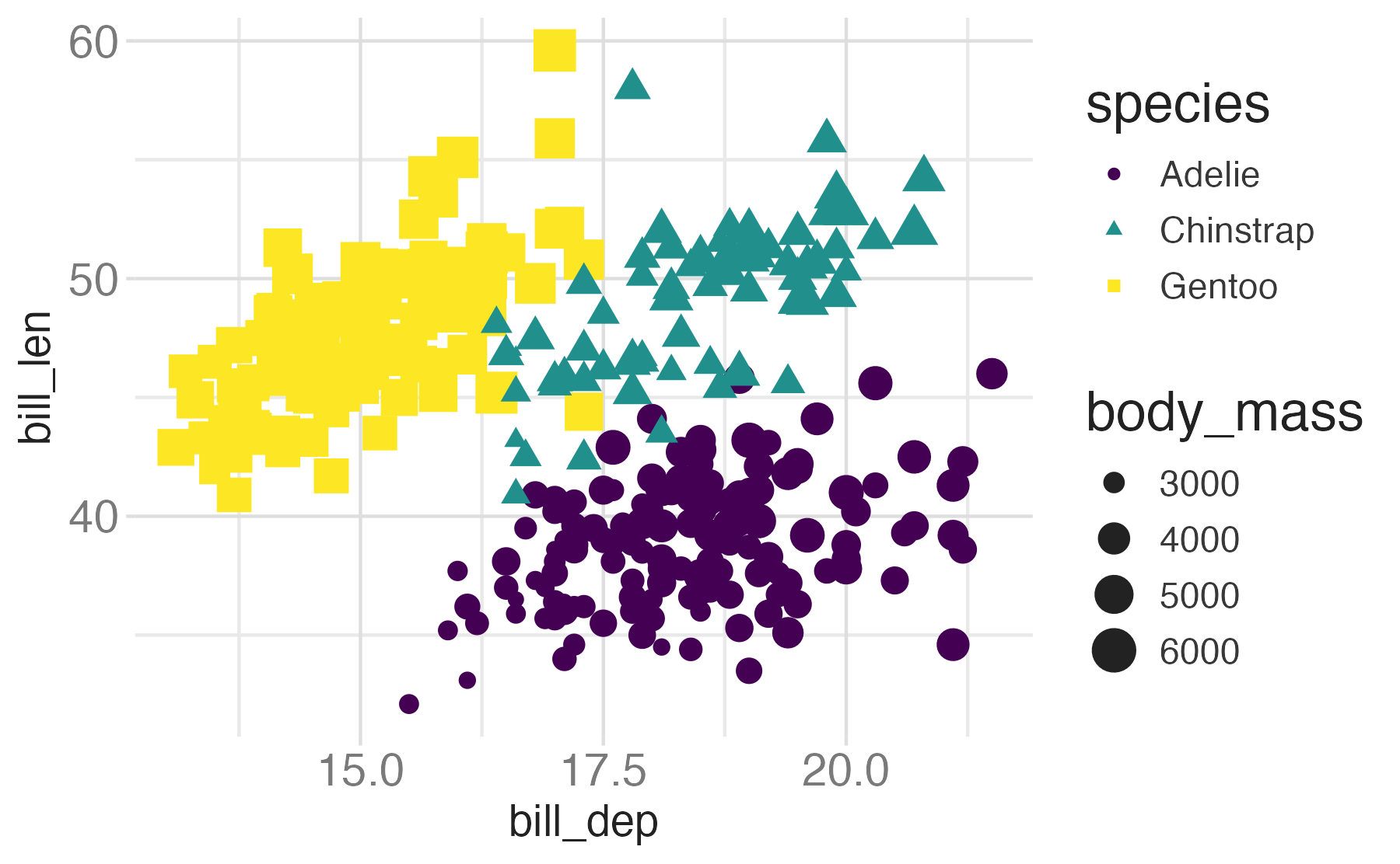
Size
Alpha
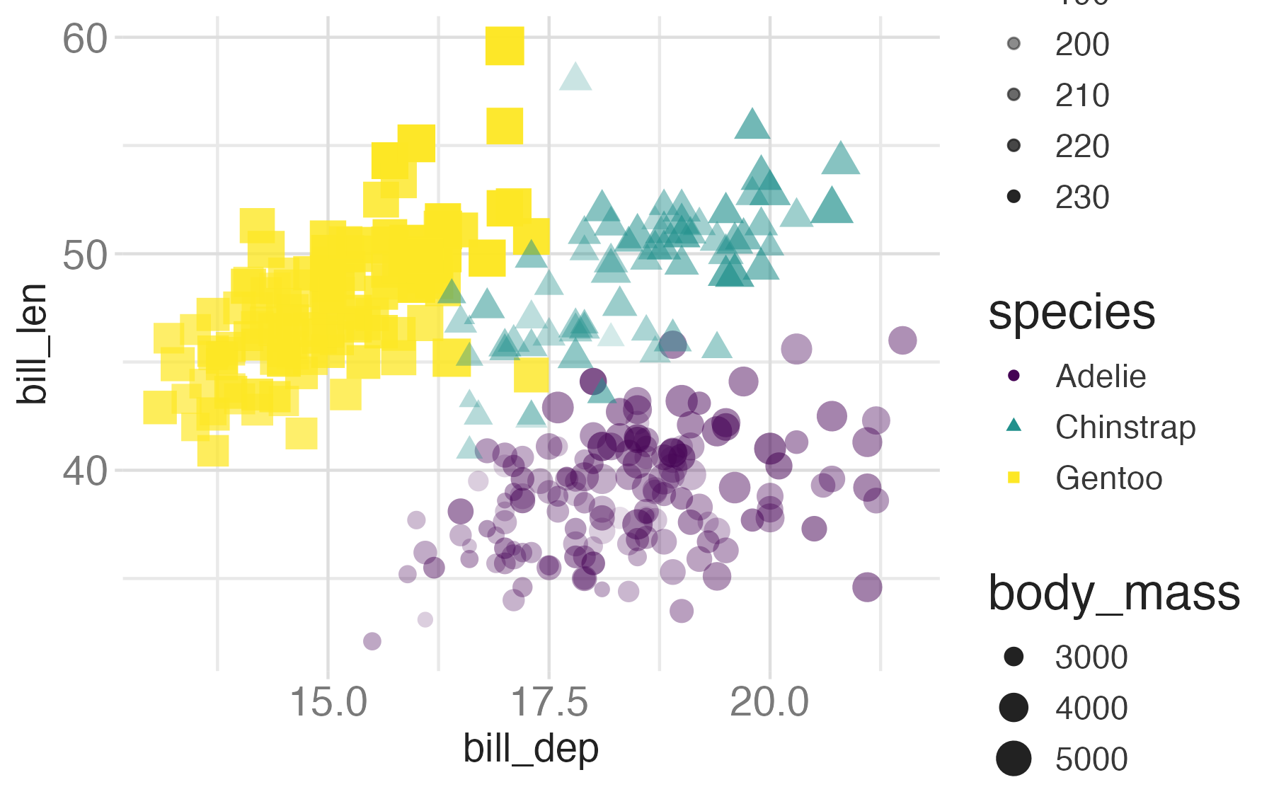
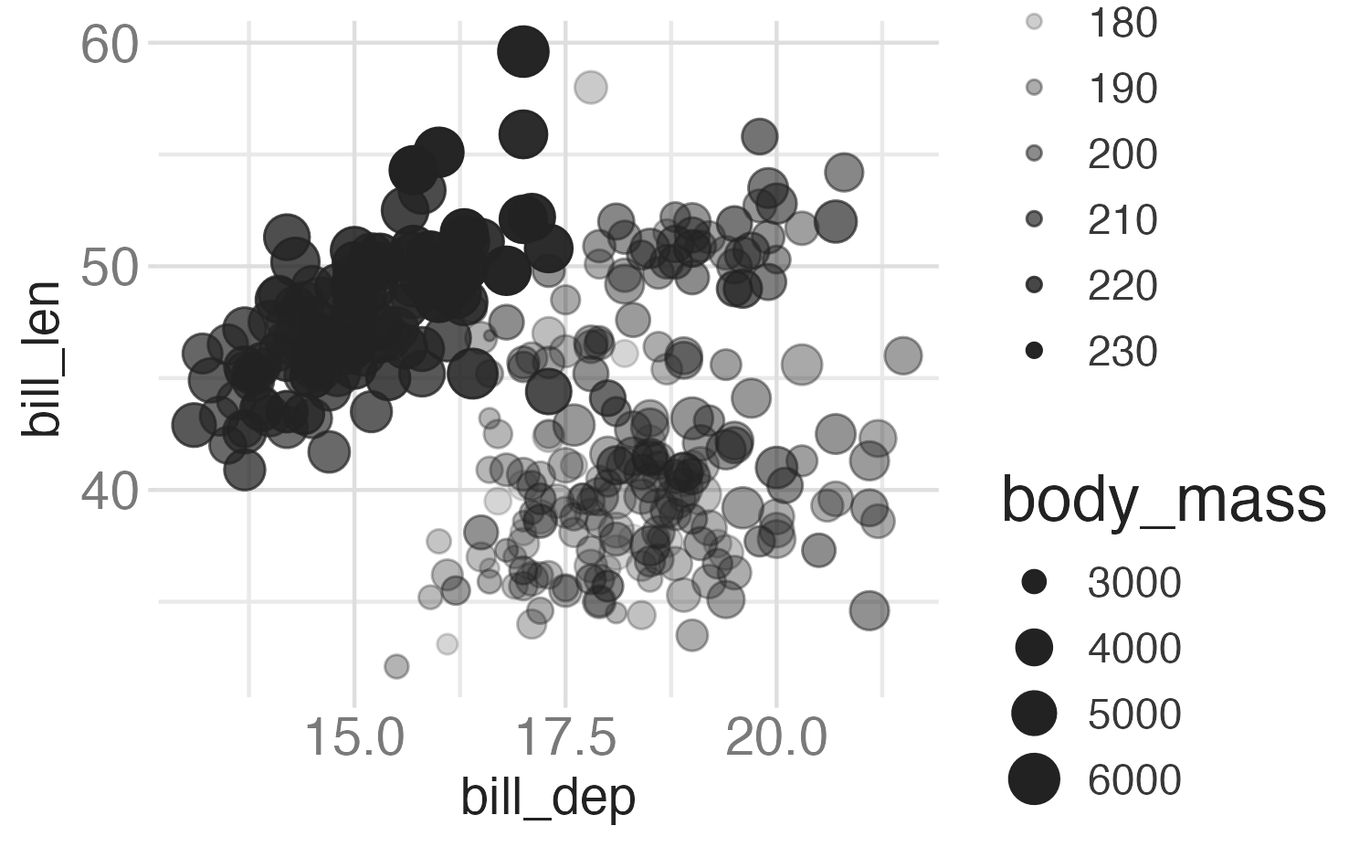
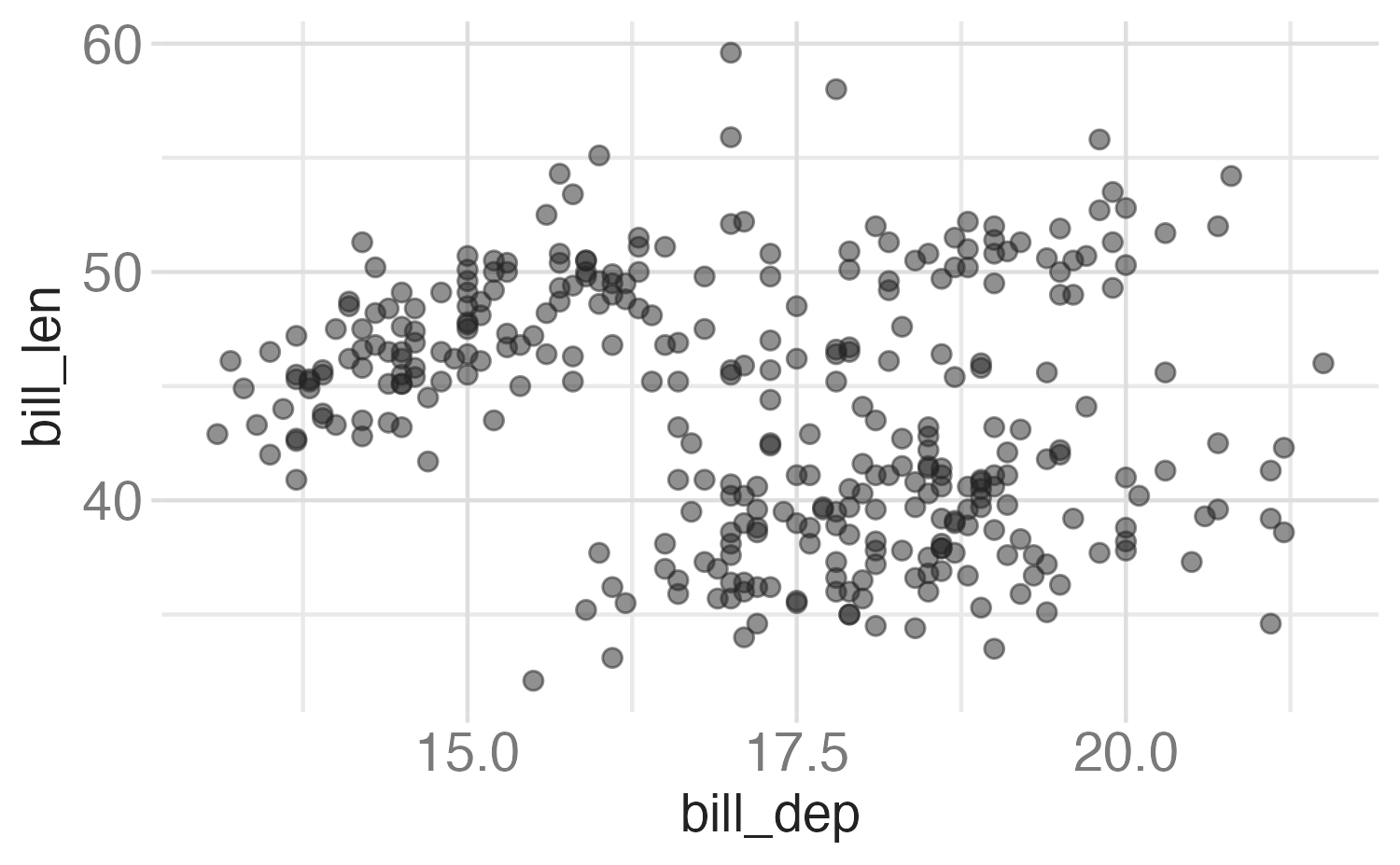
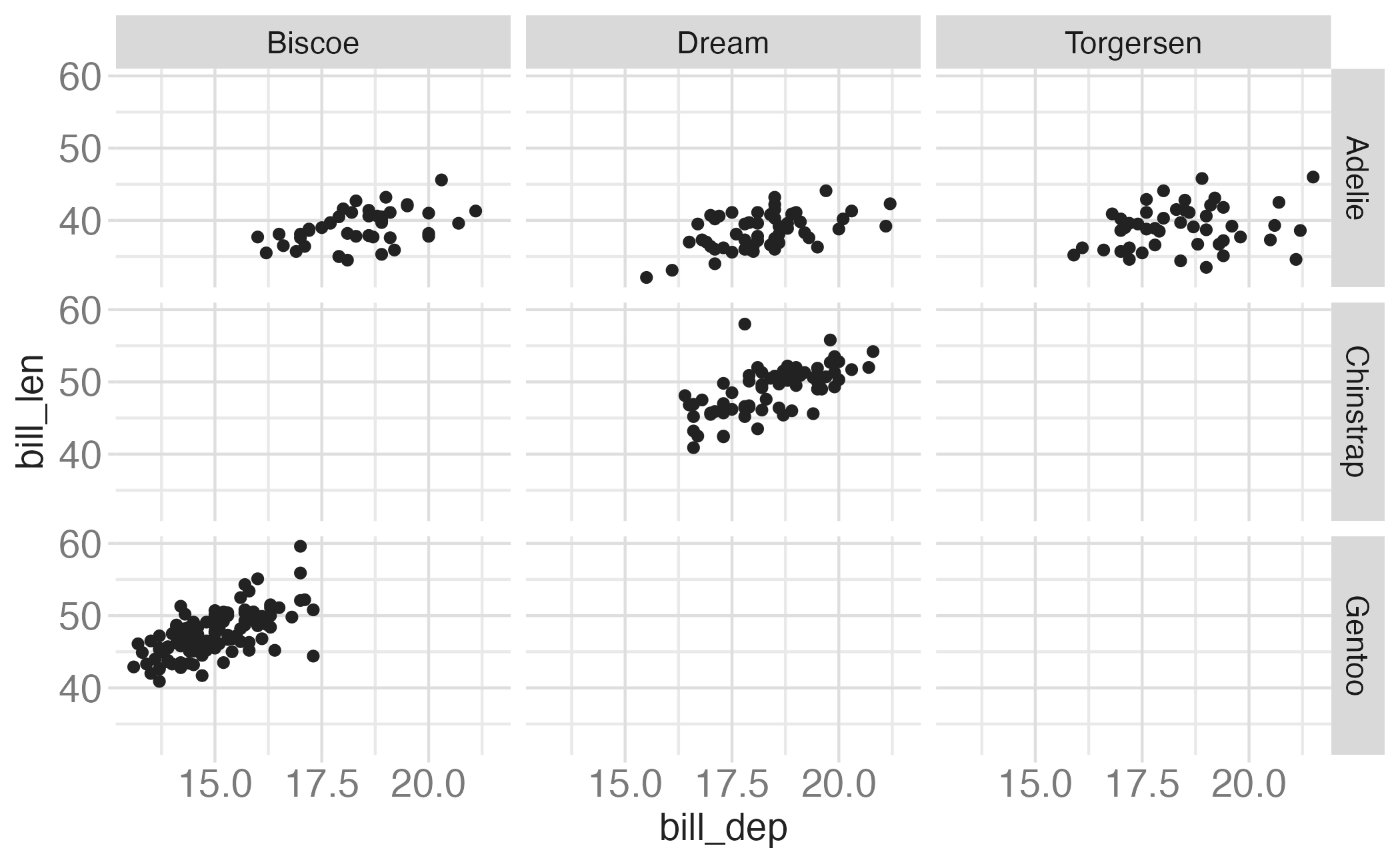
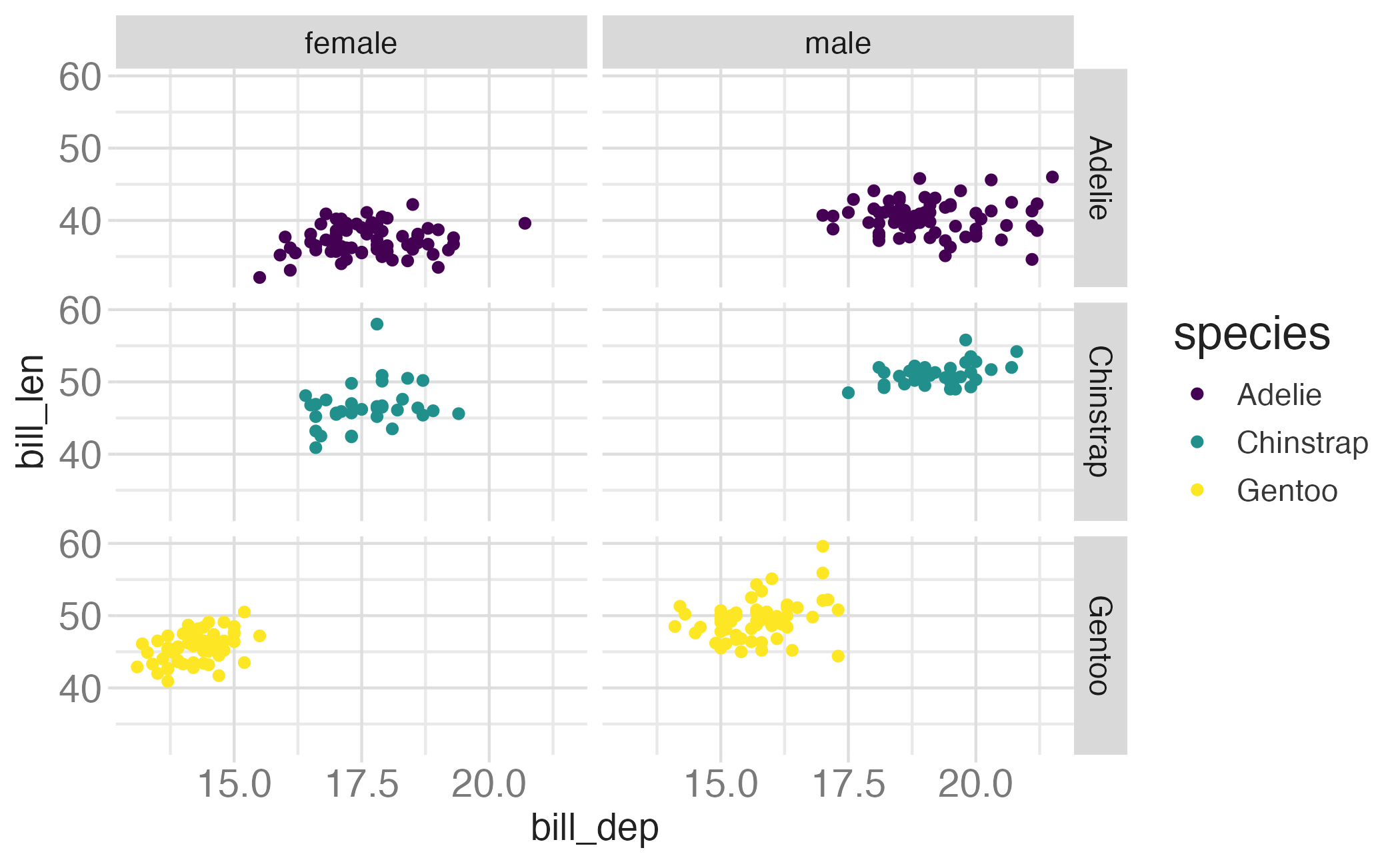
Facet and color
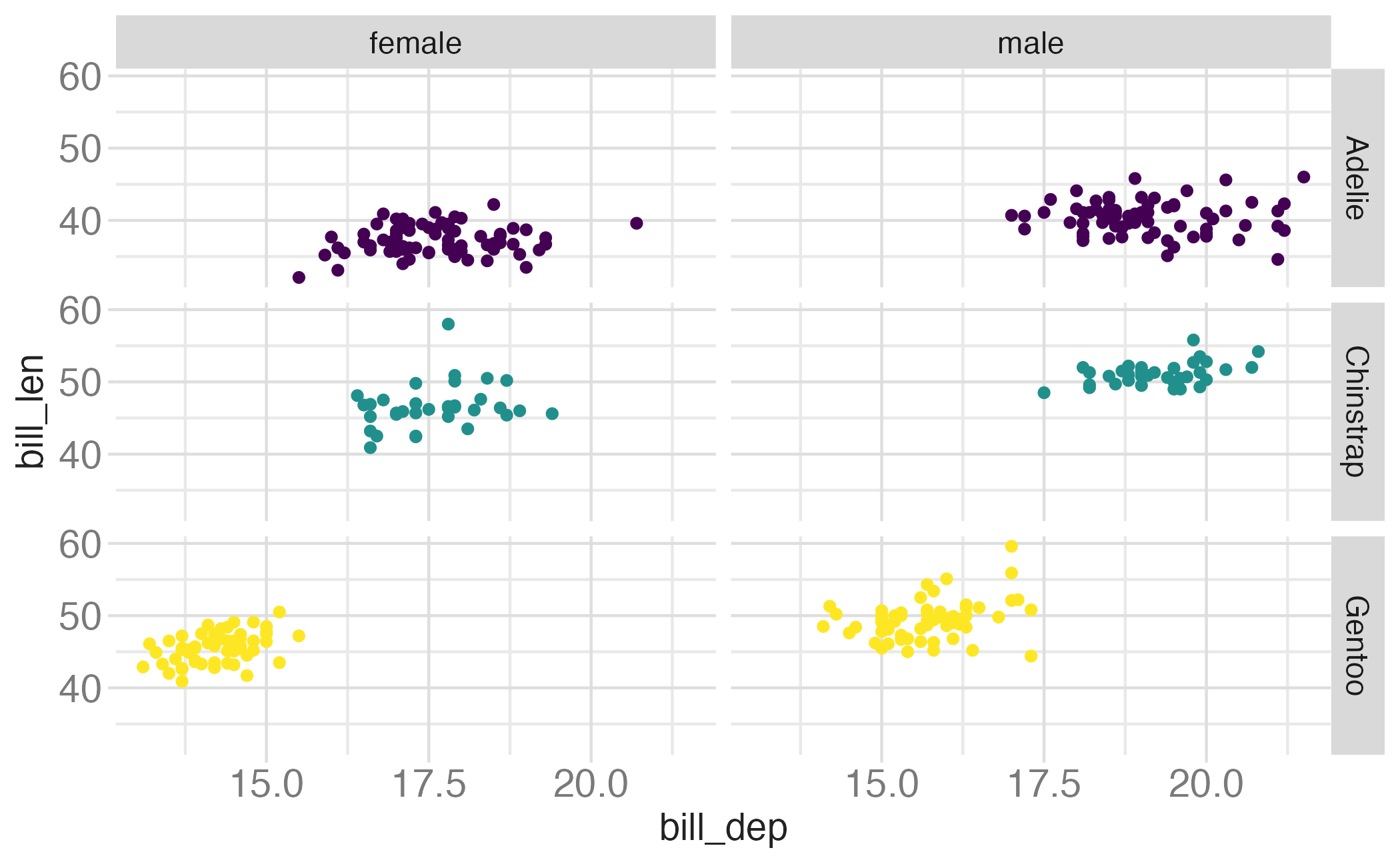
Facet and color, no legend
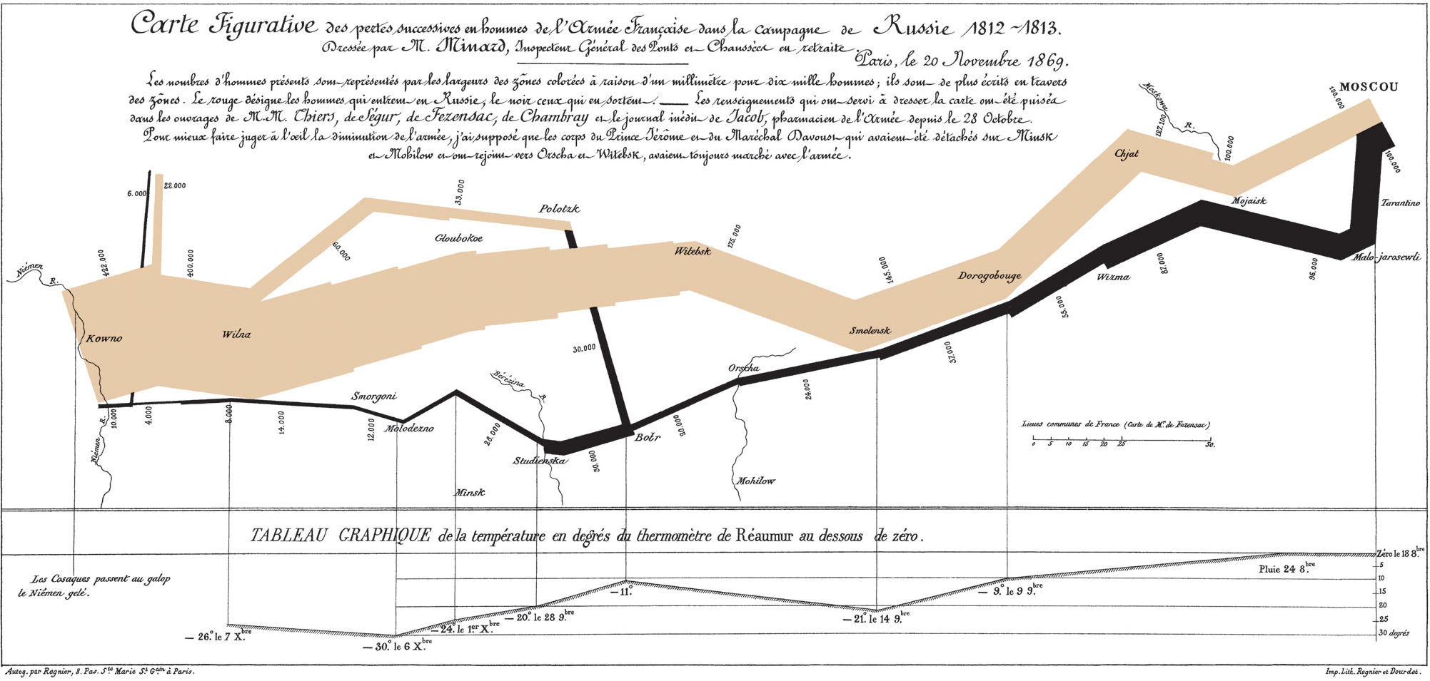
Define the conceptual grammar of graphics for Minard’s visualization
Instructions
Data
- Troops
- Latitude
- Longitude
- Survivors
- Advance/retreat
- Cities
- Latitude
- Longitude
- City name

