Rows: 1,270
Columns: 12
$ sold_date    <date> 2022-09-12, 2022-09-12, 2022-09-12, 2022-09-13, 2022-07-22, 2022-03-15, 2022…
$ price        <dbl> 340000, 390000, 625500, 246600, 172000, 205000, 230000, 246000, 350000, 44650…
$ beds         <dbl> 2, 4, 2, 2, NA, 2, 5, 5, 3, 5, 3, 2, 2, 4, 3, 5, 4, 3, 4, 3, 3, 3, 6, 2, 3, 3…
$ baths        <dbl> 3.0, 3.0, 3.0, 1.5, NA, 1.0, 2.0, 2.0, 2.5, 4.0, 1.0, 1.5, 2.0, 2.5, 2.5, 3.0…
$ area         <dbl> 1864, 3252, 1704, 1264, 2644, 820, 2900, 2364, 2016, 2882, 1246, 1134, 1720, …
$ lot_size     <dbl> 4.50000000, 0.33999082, 65.00000000, 0.21000918, 0.13000459, 0.23999082, 5.66…
$ year_built   <dbl> 1999, 1988, 1988, 1953, 1870, 1932, 1850, 1985, 1984, 2002, 1961, 2014, 1931,…
$ hoa_month    <dbl> NA, NA, NA, NA, NA, NA, NA, NA, NA, NA, NA, NA, NA, NA, NA, NA, NA, NA, NA, 2…
$ town         <chr> "Newfield", "Ithaca", "Dryden", "Ithaca", "Dryden", "Ithaca", "Lansing", "Dry…
$ municipality <chr> "Unincorporated", "Unincorporated", "Unincorporated", "Ithaca city", "Dryden …
$ long         <dbl> -76.59488, -76.45546, -76.35953, -76.52435, -76.29872, -76.48761, -76.59422, …
$ lat <dbl> 42.38609, 42.47046, 42.43971, 42.45208, 42.49046, 42.42739, 42.61829, 42.4862…Deep dive: layers (I)
Lecture 3
January 27, 2026
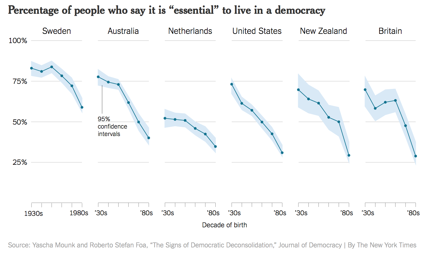
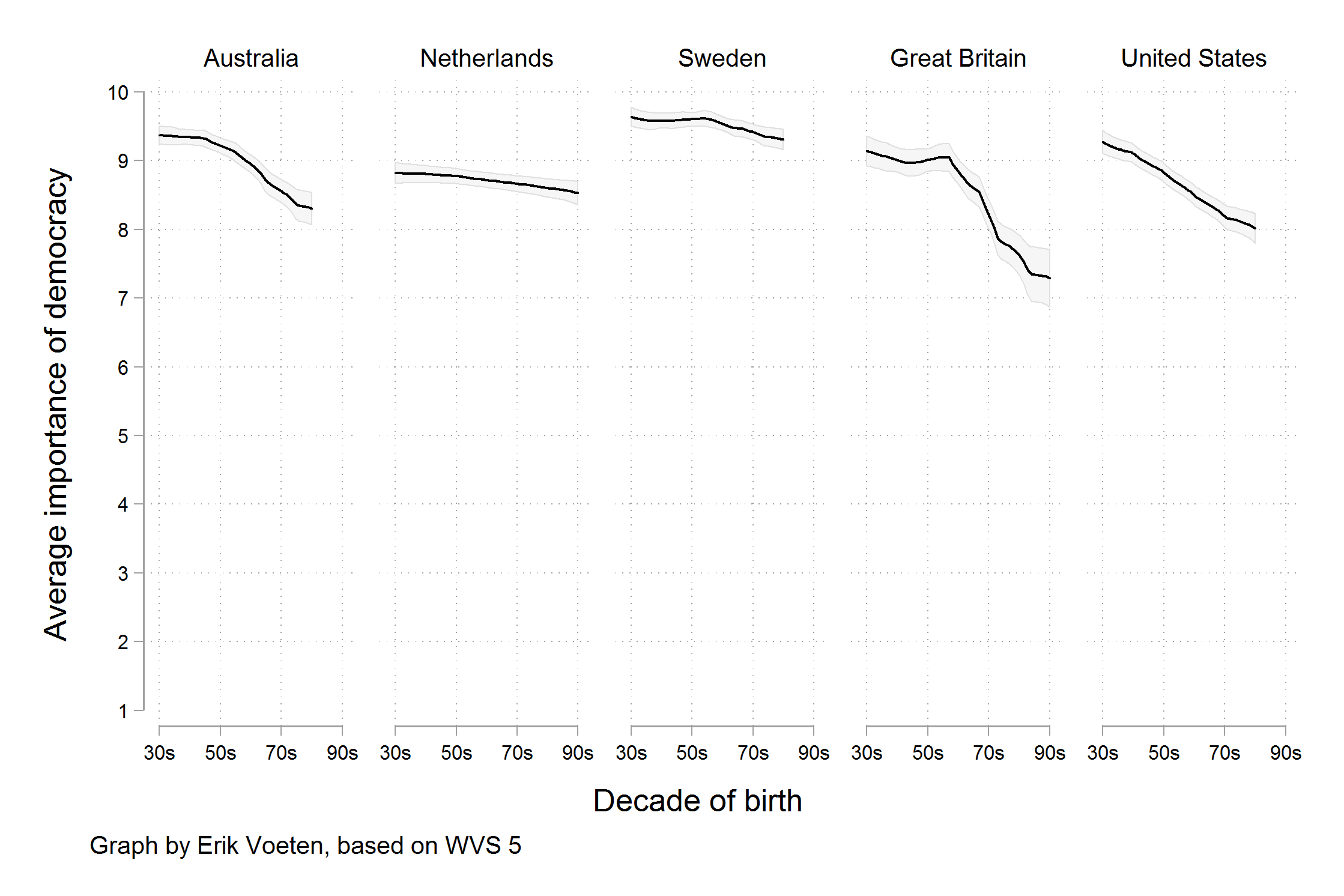
Gotta catch ’em all
- What is the story?
- Is the chart design effective?
- Is the chart believeable?
A simple visualization
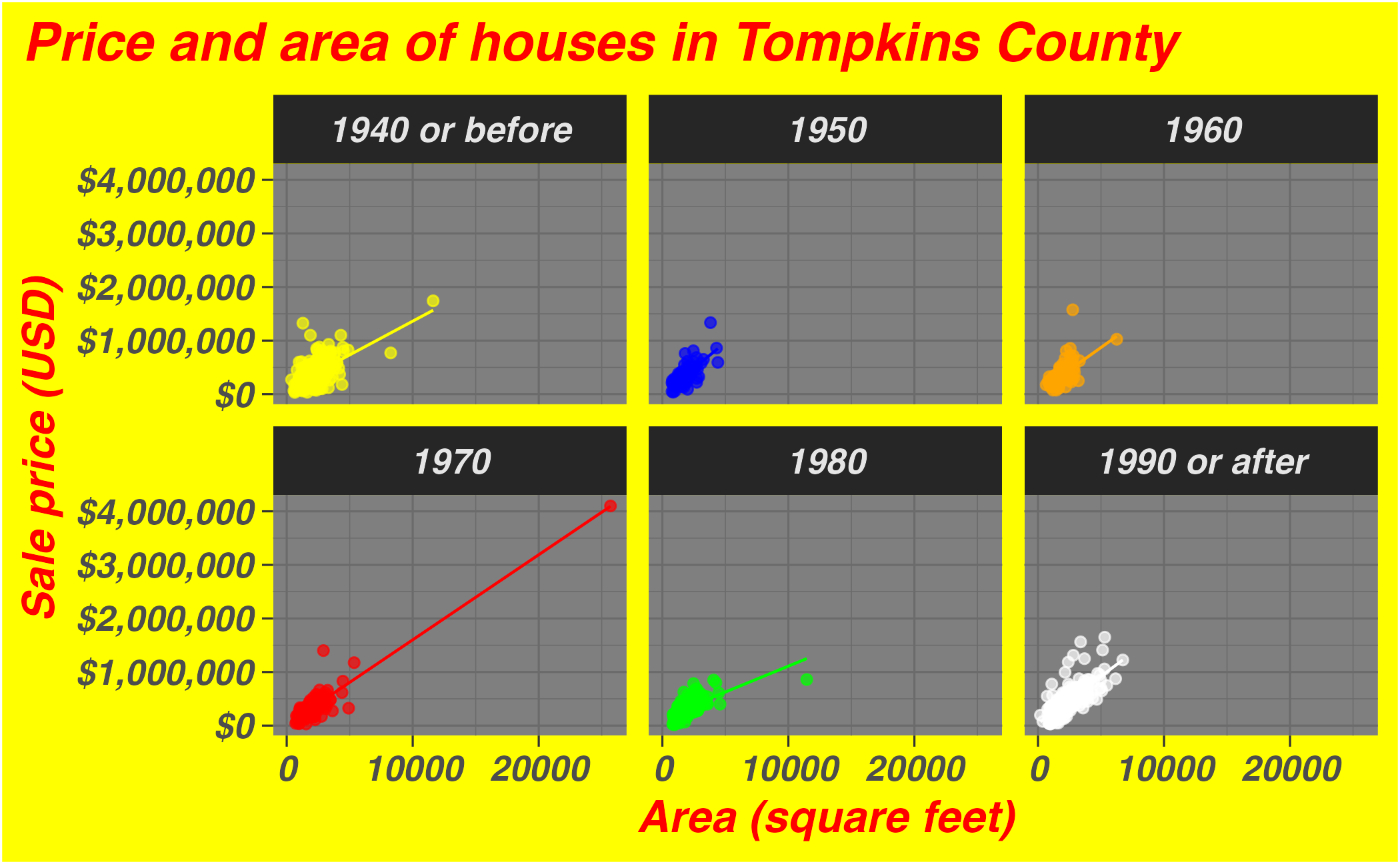
A slightly more complex visualization
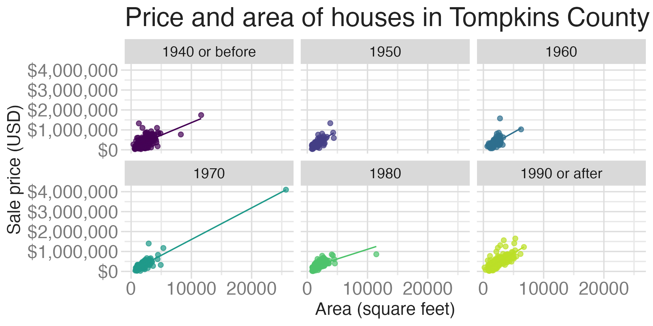
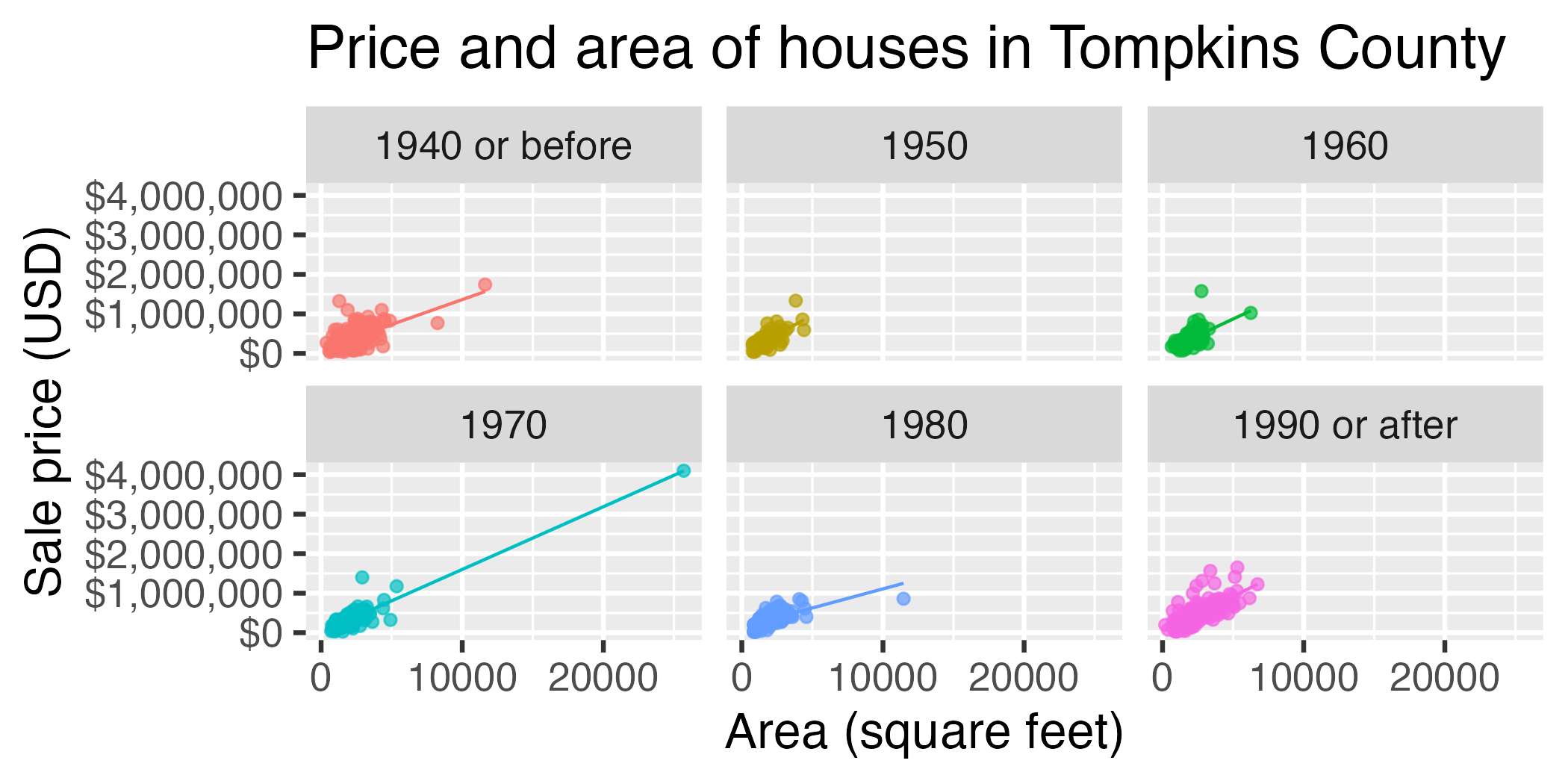
ggplot(
  data = tompkins,
  mapping = aes(x = area, y = price, color = decade_built_cat)
) +
  geom_point(alpha = 0.7, show.legend = FALSE) +
  geom_smooth(method = "lm", se = FALSE, linewidth = 0.5, show.legend = FALSE) +
  scale_x_continuous(labels = label_number(scale_cut = cut_short_scale())) +
  scale_y_continuous(labels = label_currency(scale_cut = cut_short_scale())) +
  facet_wrap(facets = vars(decade_built_cat)) +
  labs(
    x = "Area (square feet)",
    y = "Sale price (USD)",
    color = "Decade built",
    title = "Price and area of houses in Tompkins County"
  )
Test 1

Test 2
Bad taste
Data-to-ink ratio
Tufte strongly recommends maximizing the data-to-ink ratio this in the Visual Display of Quantitative Information (Tufte, 1983).
Graphical excellence is the well-designed presentation of interesting data—a matter of substance, of statistics, and of design … [It] consists of complex ideas communicated with clarity, precision, and efficiency. … [It] is that which gives to the viewer the greatest number of ideas in the shortest time with the least ink in the smallest space … [It] is nearly always multivariate … And graphical excellence requires telling the truth about the data. (Tufte, 1983, p. 51).

Barplot
ggplot(
  data = mean_price_decade,
  mapping = aes(y = decade_built_cat, x = mean_price)
) +
  geom_col() +
  scale_x_continuous(labels = label_currency(scale_cut = cut_short_scale())) +
  labs(
    x = "Mean sales price", y = "Decade built",
    title = "Mean sales price of houses in Tompkins County"
  ) +
  theme(plot.title.position = "plot")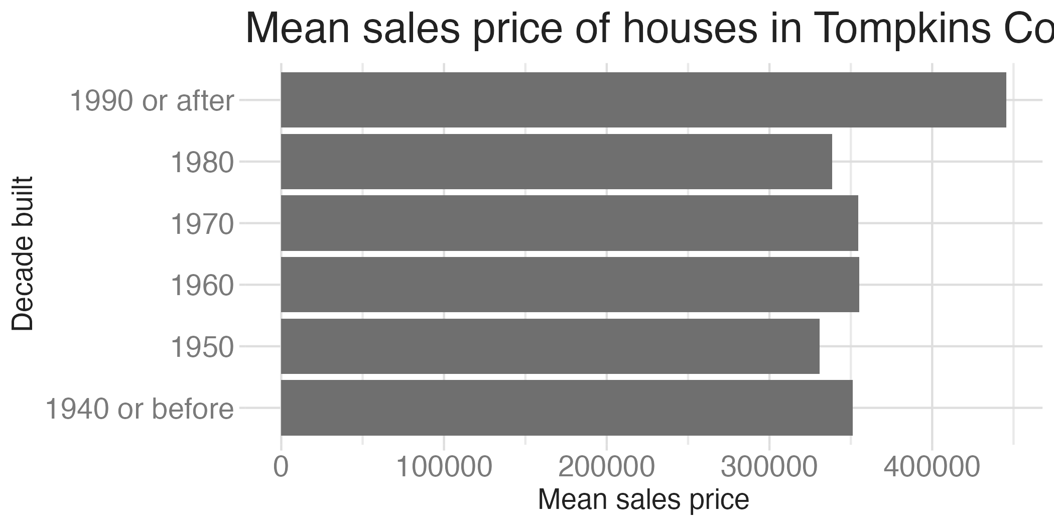
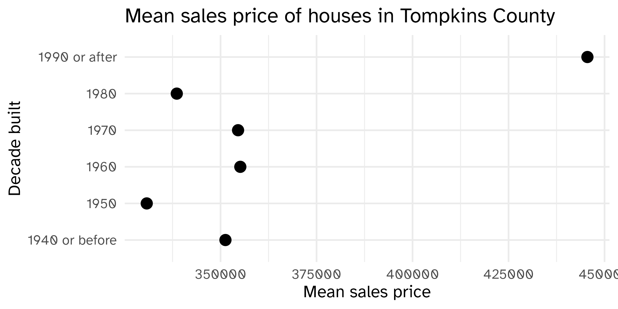
Scatterplot
ggplot(
  data = mean_price_decade,
  mapping = aes(y = decade_built_cat, x = mean_price)
) +
  geom_point(size = 4) +
  scale_x_continuous(labels = label_currency(scale_cut = cut_short_scale())) +
  labs(
    x = "Mean sales price", y = "Decade built",
    title = "Mean sales price of houses in Tompkins County"
  ) +
  theme(plot.title.position = "plot")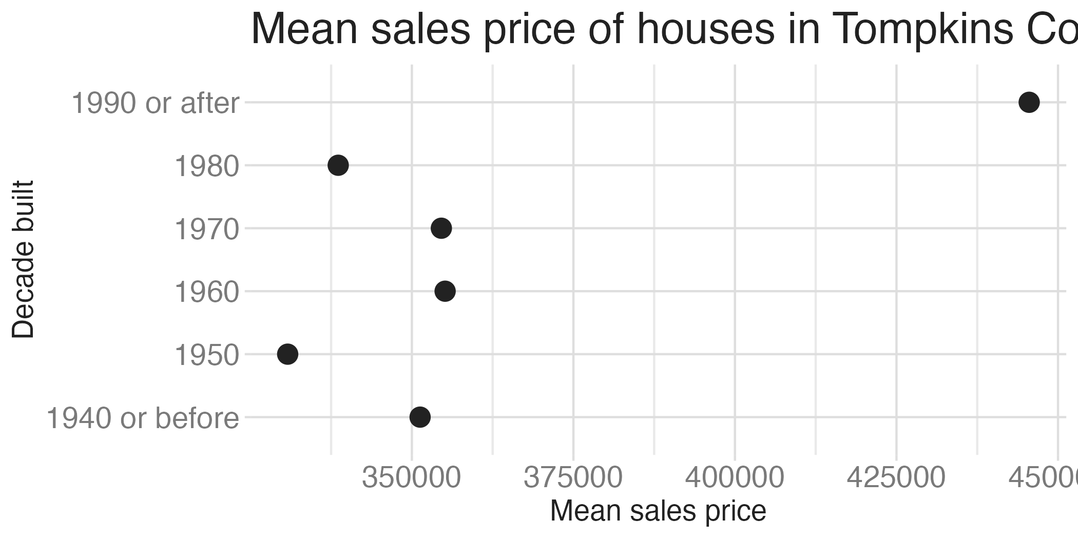

Lollipop chart – a happy medium?
Bad data
Bad perception
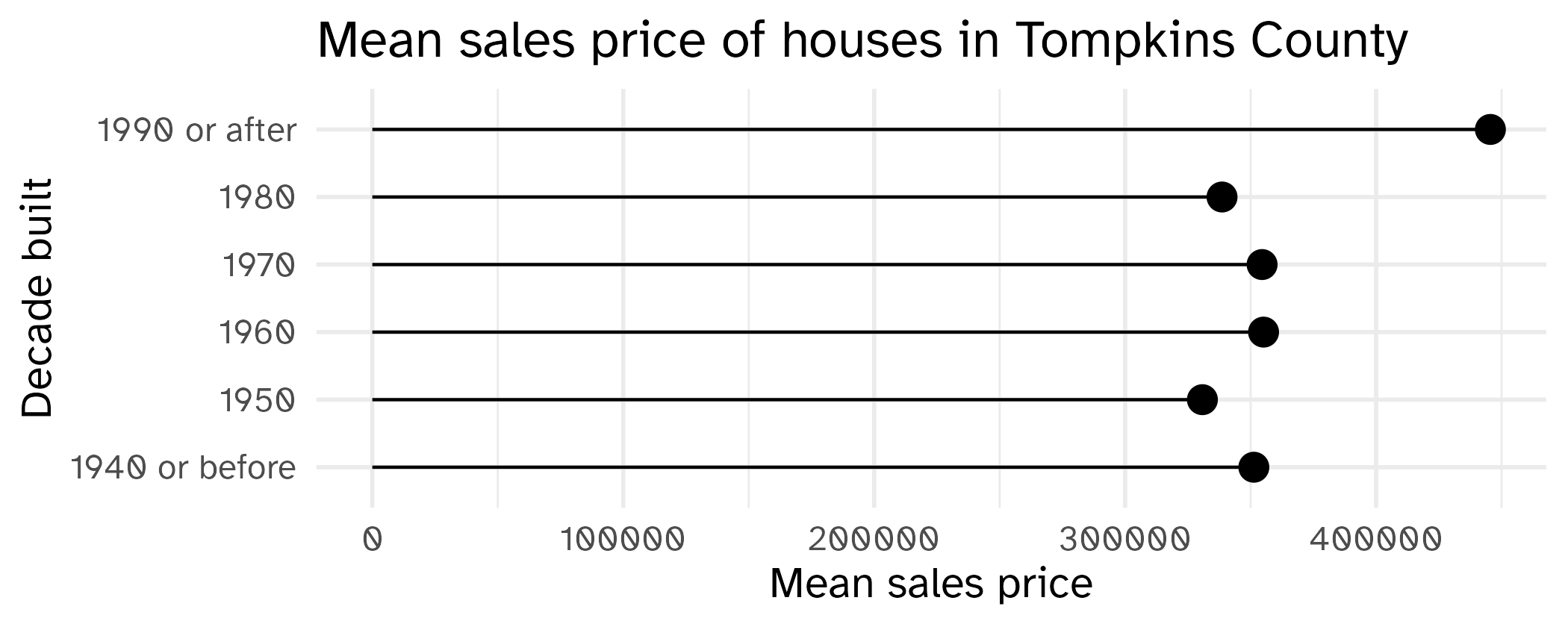
A second look: lollipop chart
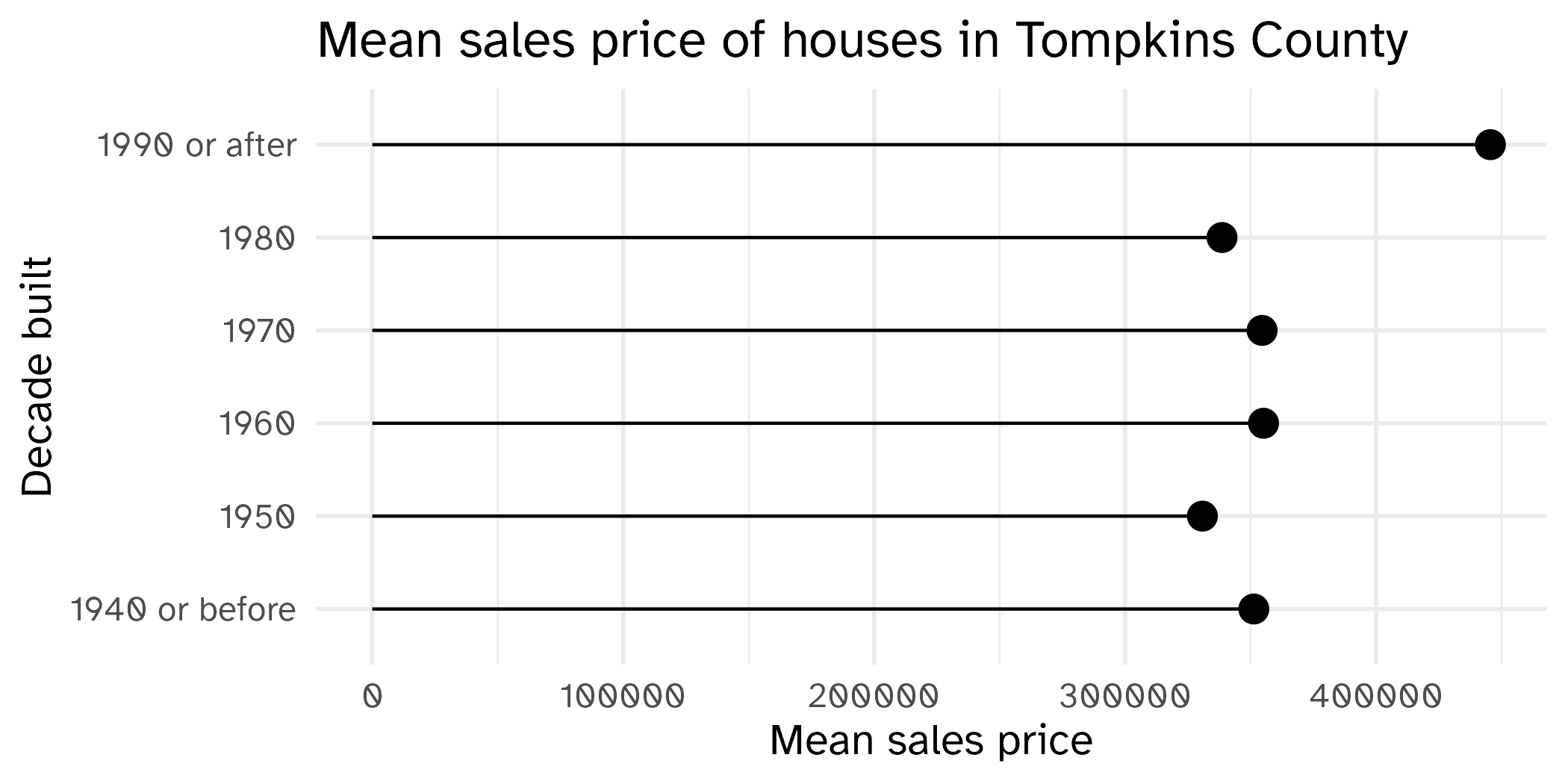
ggplot(
  data = mean_price_decade,
  mapping = aes(y = decade_built_cat, x = mean_price)
) +
  geom_point(size = 4) +
  geom_segment(
    mapping = aes(
      x = 0, xend = mean_price,
      y = decade_built_cat, yend = decade_built_cat
    )
  ) +
  scale_x_continuous(labels = label_currency(scale_cut = cut_short_scale())) +
  labs(
    x = "Mean sales price", y = "Decade built",
    title = "Mean sales price of houses in Tompkins County"
  ) +
  theme(plot.title.position = "plot")
Activity: Spot the differences I
ggplot(
  data = mean_price_decade,
  mapping = aes(y = decade_built_cat, x = mean_price)
) +
  geom_point(size = 4) +
  geom_segment(
    mapping = aes(
      xend = 0,
      yend = decade_built_cat
    )
  ) +
  scale_x_continuous(labels = label_currency(scale_cut = cut_short_scale())) +
  labs(
    x = "Mean sales price", y = "Decade built",
    title = "Mean sales price of houses in Tompkins County"
  ) +
theme(plot.title.position = "plot")01:00
