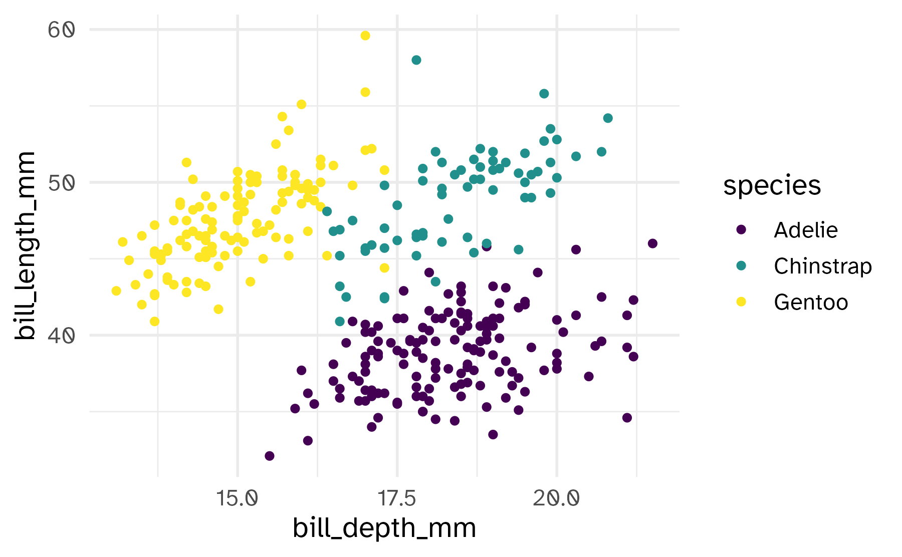
# A tibble: 51 × 4
    long   lat survivors direction
   <dbl> <dbl>     <dbl> <chr>
 1  24    54.9    340000 A
 2  24.5  55      340000 A
 3  25.5  54.5    340000 A
 4  26    54.7    320000 A
 5  27    54.8    300000 A
 6  28    54.9    280000 A
 7  28.5  55      240000 A
 8  29    55.1    210000 A
 9  30    55.2    180000 A
10  30.3  55.3    175000 A
# ℹ 41 more rowsThe grammar of graphics
Lecture 2
January 22, 2026
Number of restaurants by cuisine type
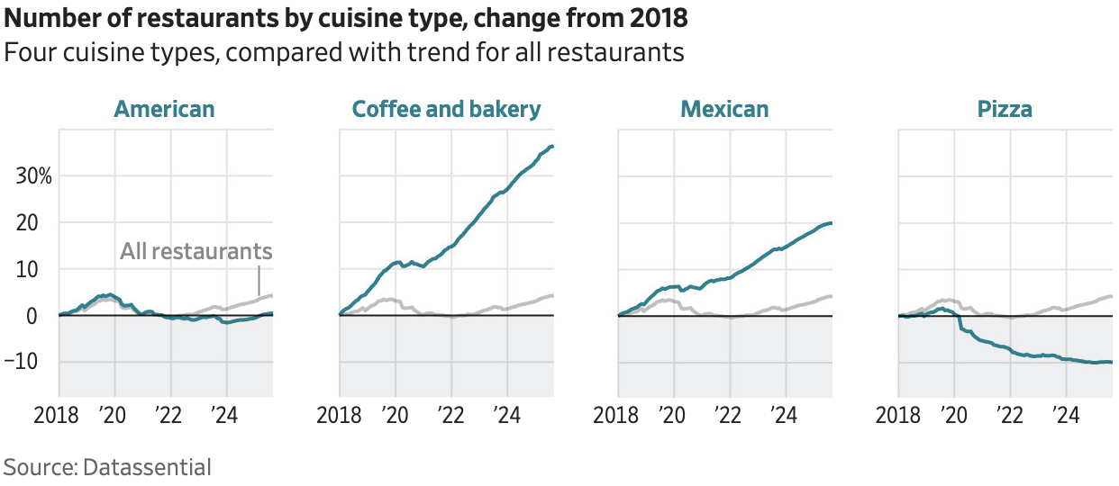
- What is the story?
- How does the design of the chart make you think that is the story?
ae-01
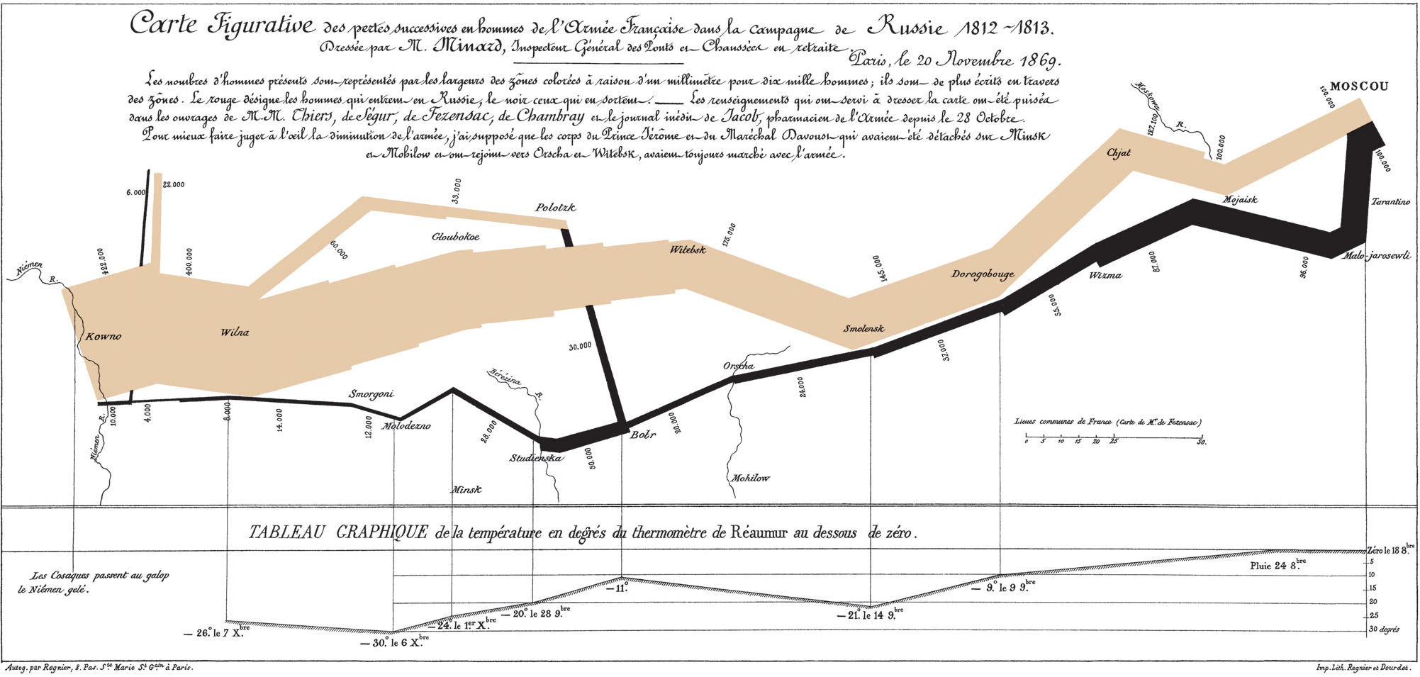
Define the conceptual grammar of graphics for Minard’s visualization
Data
- Troops
- Latitude
- Longitude
- Survivors
- Advance/retreat
- Cities
- Latitude
- Longitude
- City name
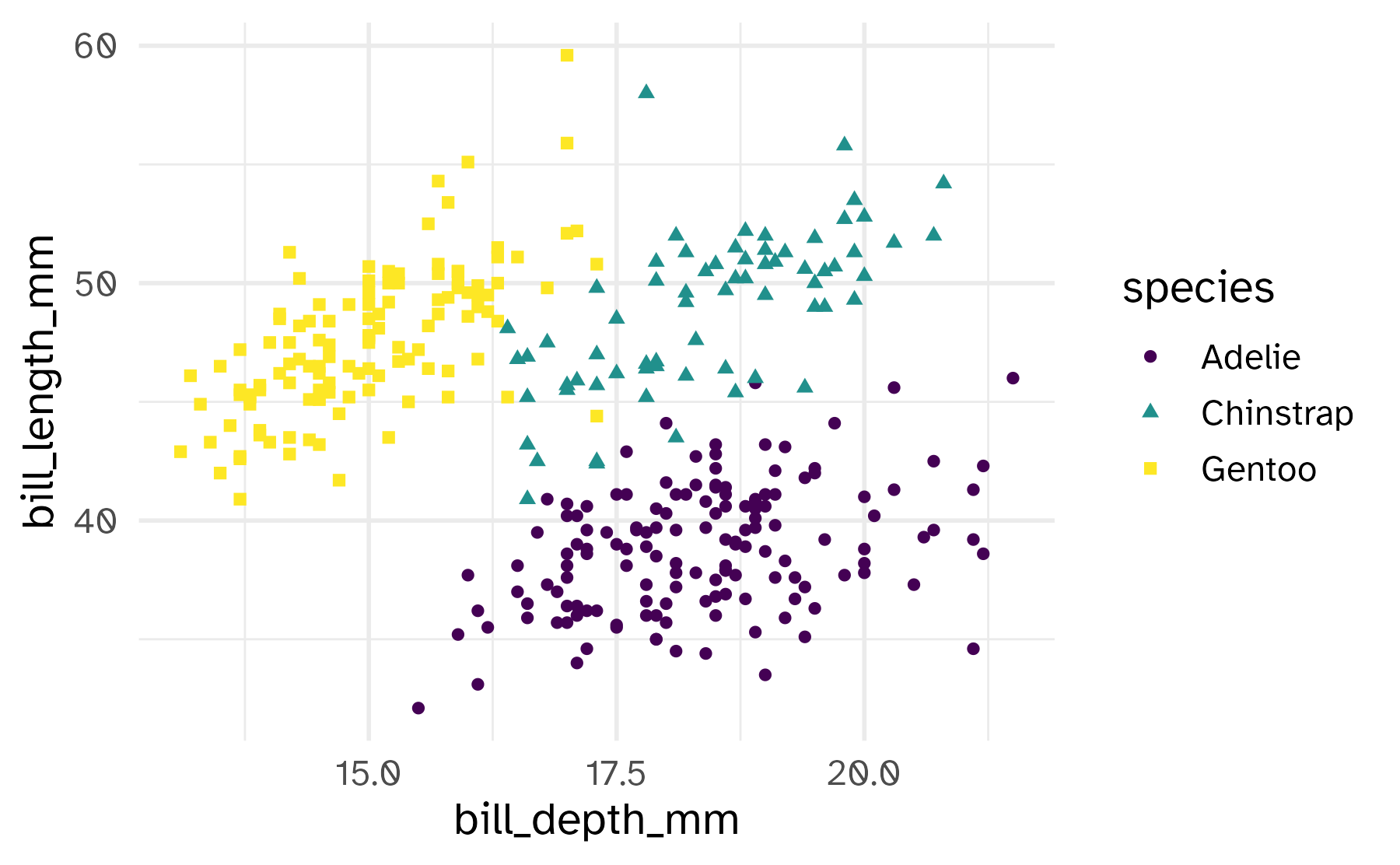
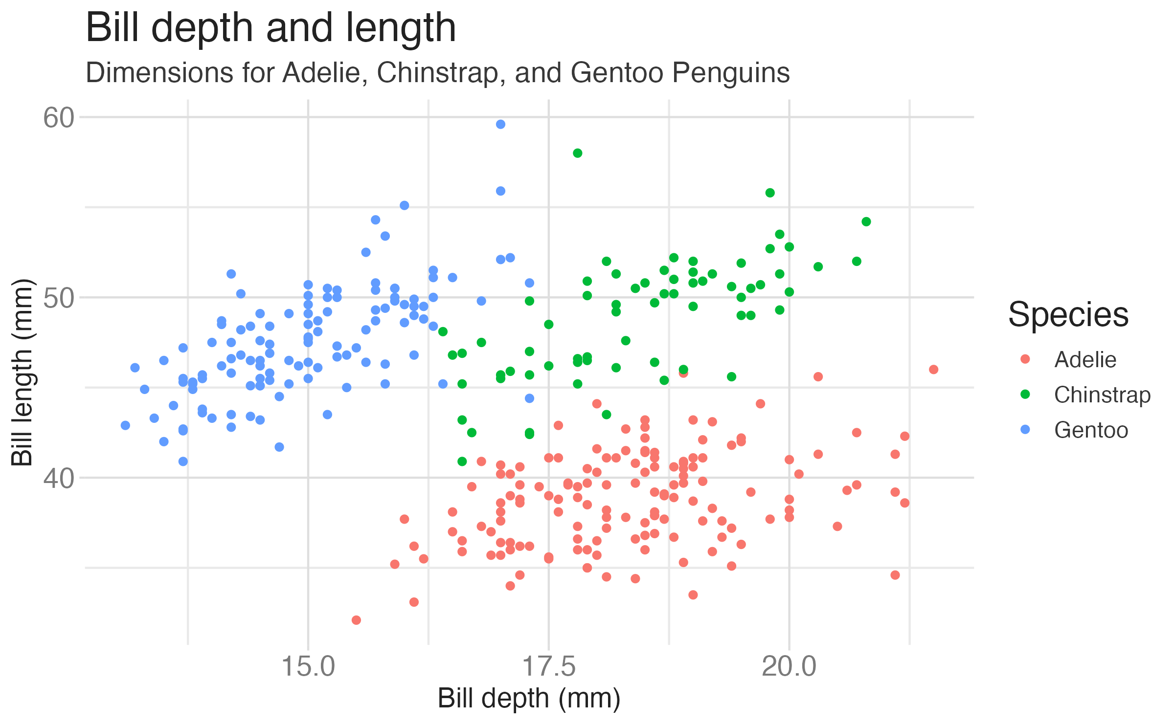
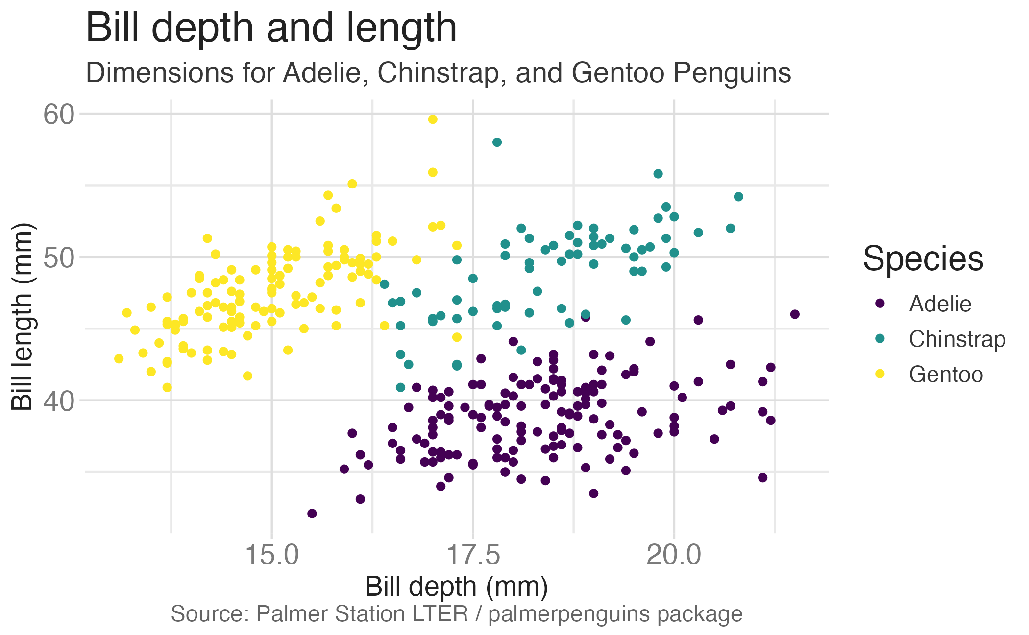
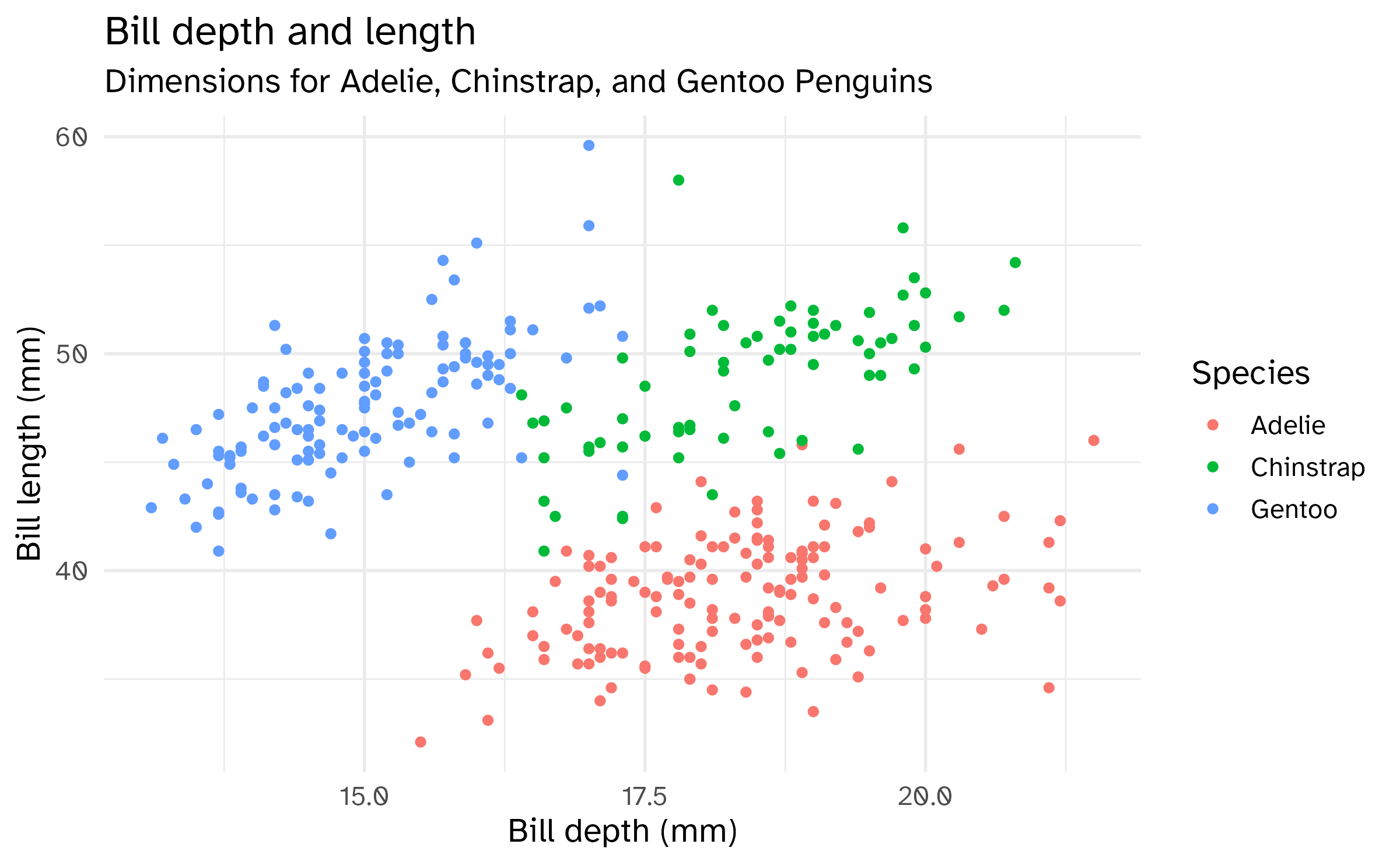
Color
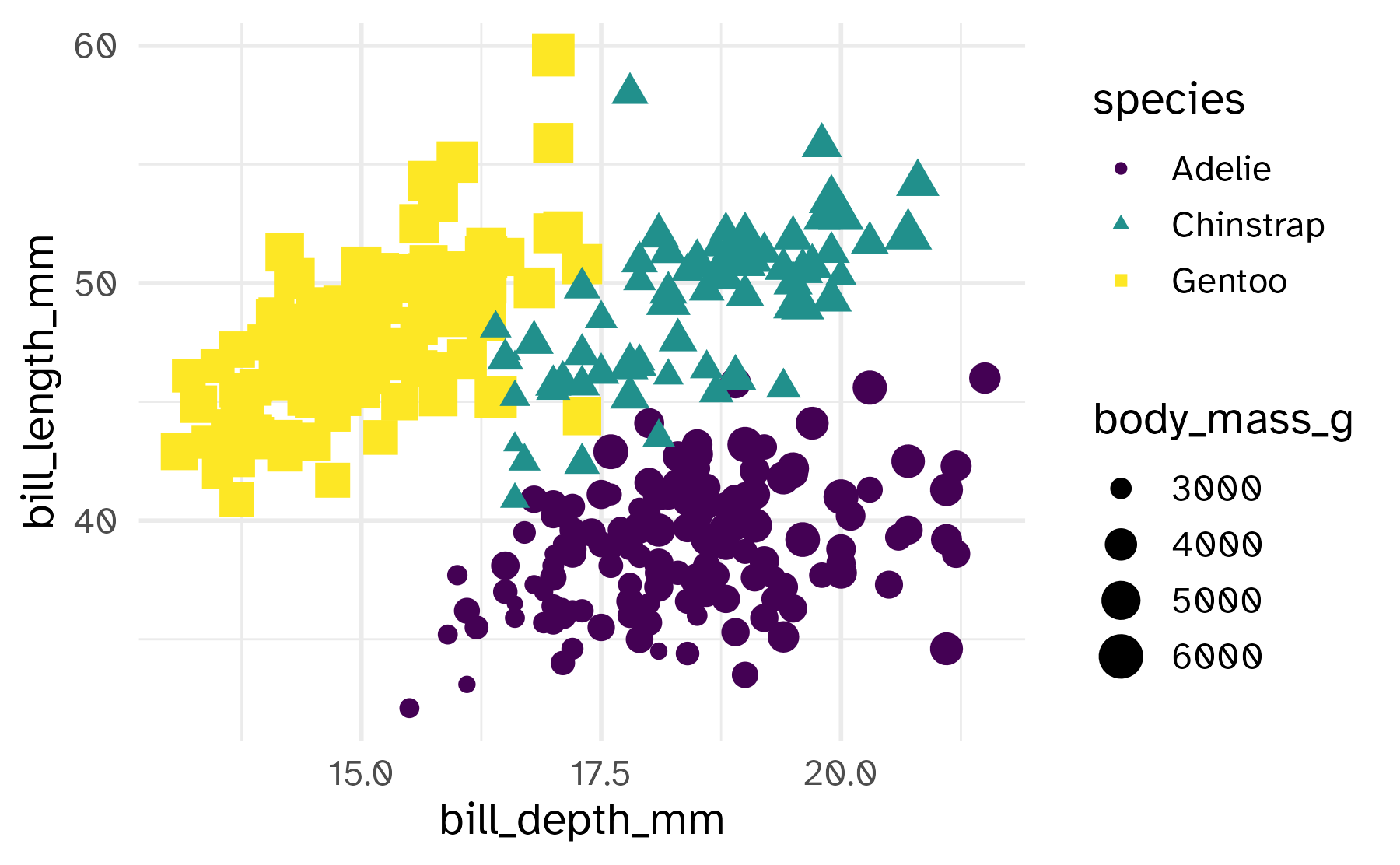
Shape
Mapped to a different variable than color
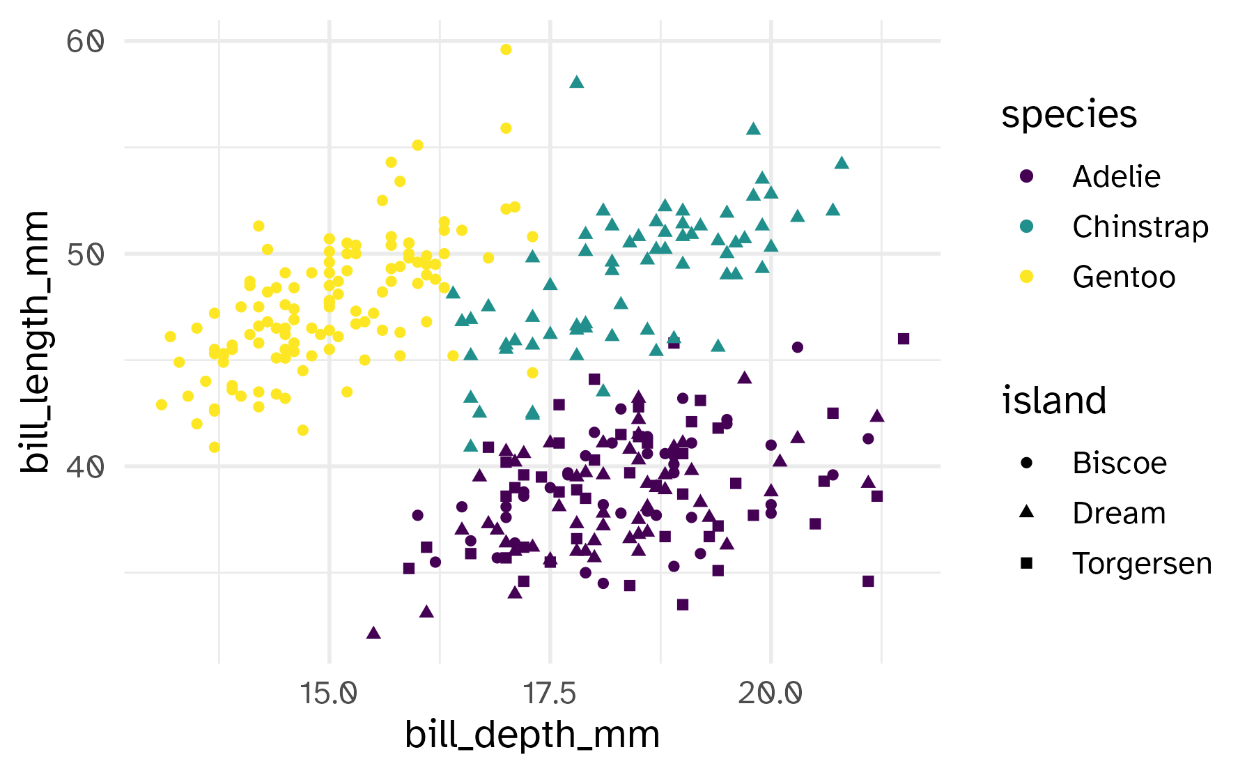
Shape
Mapped to same variable as color
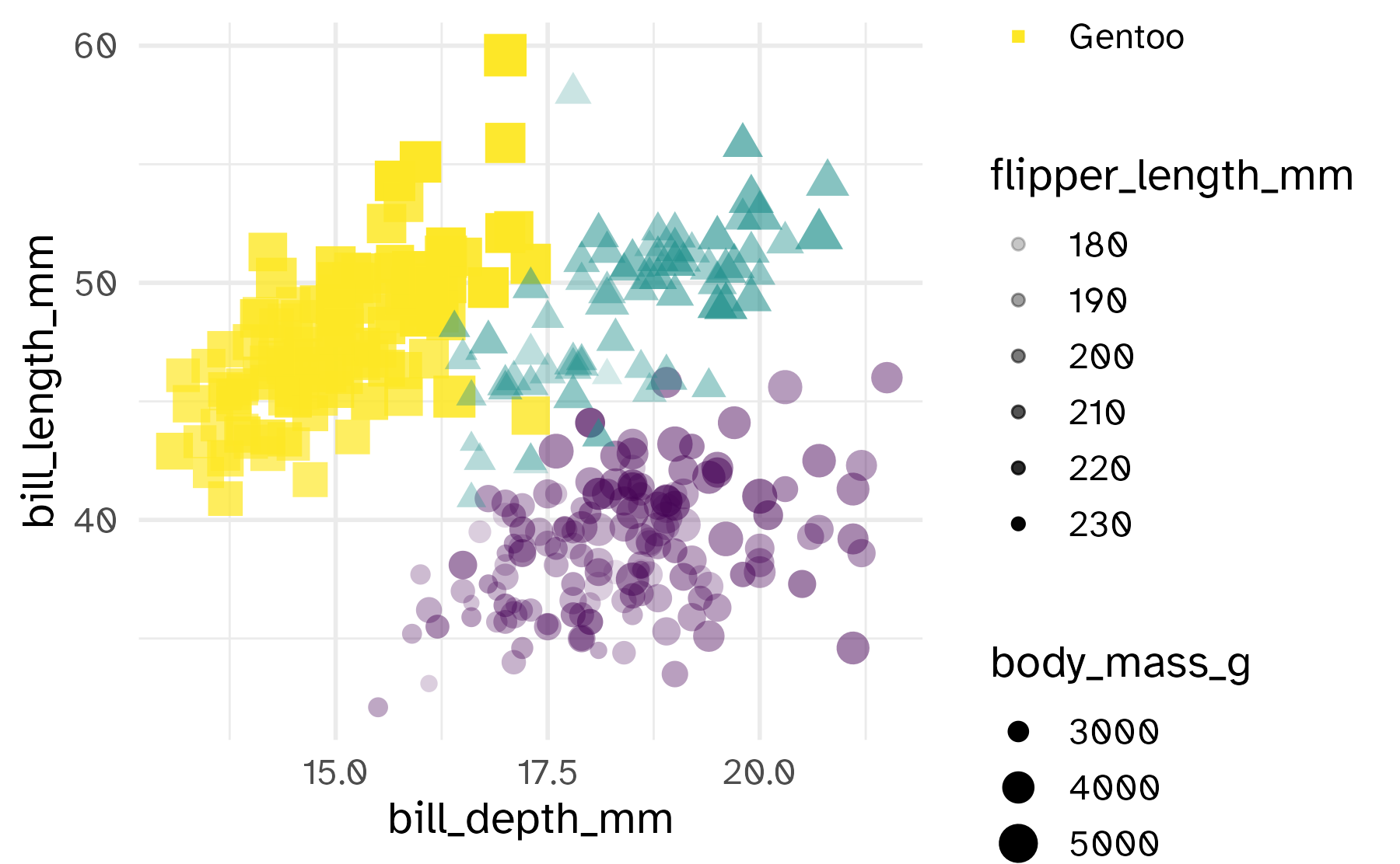
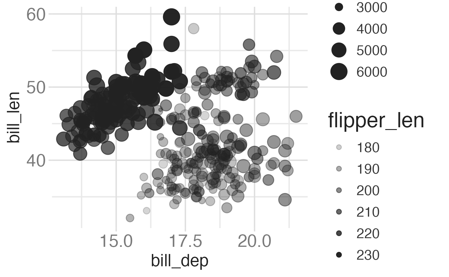
Size
Alpha

