Rows: 344
Columns: 8
$ species     <fct> Adelie, Adelie, Adelie, Adelie, Adelie…
$ island      <fct> Torgersen, Torgersen, Torgersen, Torge…
$ bill_len    <dbl> 39.1, 39.5, 40.3, NA, 36.7, 39.3, 38.9…
$ bill_dep    <dbl> 18.7, 17.4, 18.0, NA, 19.3, 20.6, 17.8…
$ flipper_len <int> 181, 186, 195, NA, 193, 190, 181, 195,…
$ body_mass   <int> 3750, 3800, 3250, NA, 3450, 3650, 3625…
$ sex         <fct> male, female, female, NA, female, male…
$ year <int> 2007, 2007, 2007, 2007, 2007, 2007, 20…Welcome to INFO 3312/5312
Lecture 1
January 20, 2026
Meet the instructor
Dr. Benjamin Soltoff
Associate Teaching Professor in Information Science
CIS Building 284

Meet the course team
| Name | Role(s) | |
|---|---|---|
| Xinyue He | GTRS | |

|
Catherine (Tianhong) Yu | PhD TA |
| Celina Jang | Undergraduate TA | |
| Evan Wu | Undergraduate TA |
No matching items
{ggplot2} \(\in\) {tidyverse}
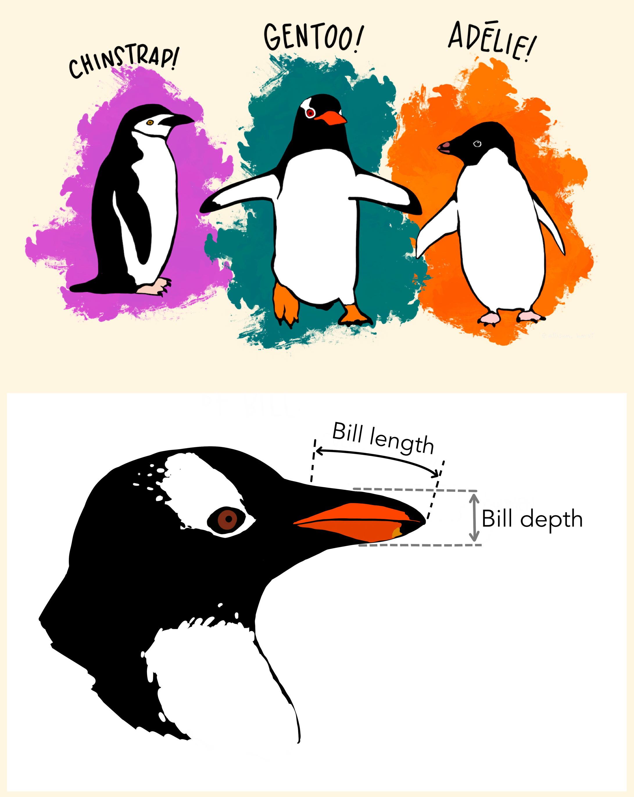
Data: Palmer Penguins
Measurements for penguin species, island in Palmer Archipelago, size (flipper length, body mass, bill dimensions), and sex.
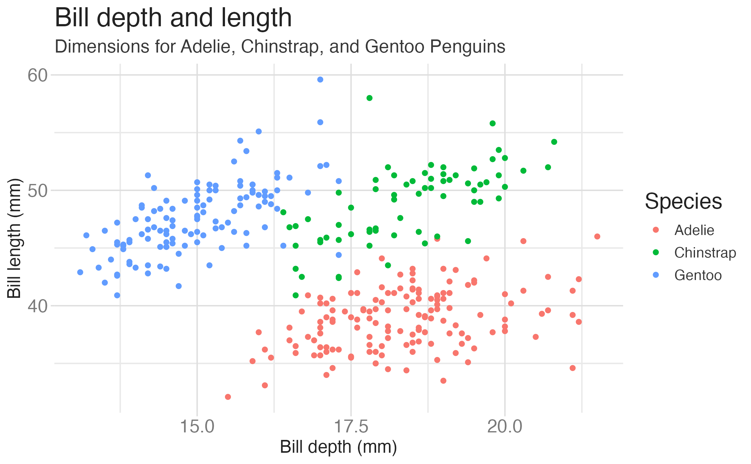

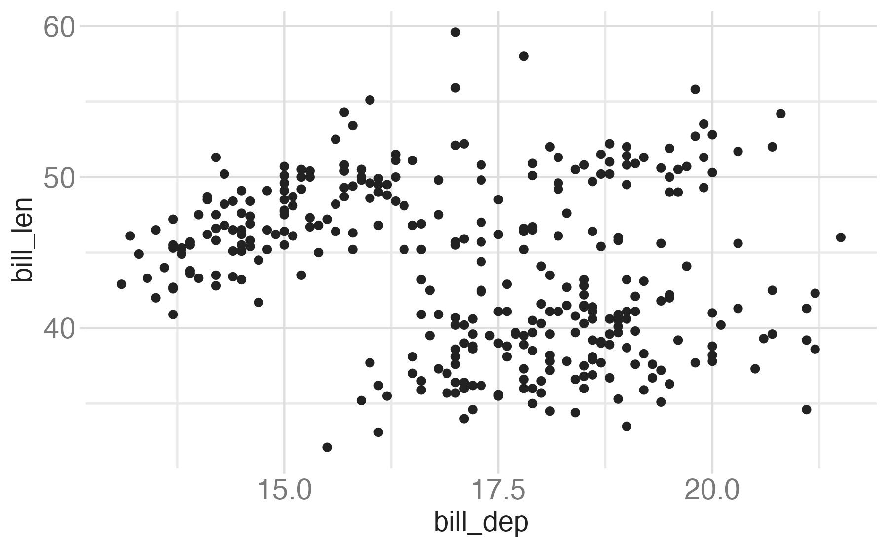
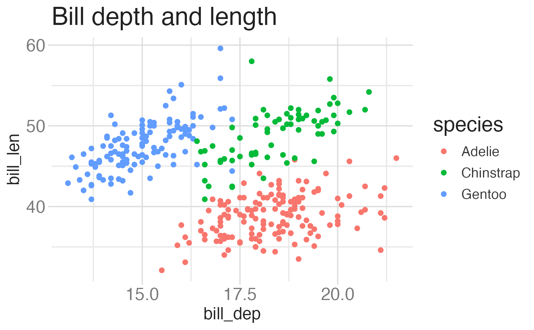
Start with the
penguinsdata frame, map bill depth to the x-axis and map bill length to the y-axis. Represent each observation with a point and map species to the color of each point. Title the plot “Bill depth and length”
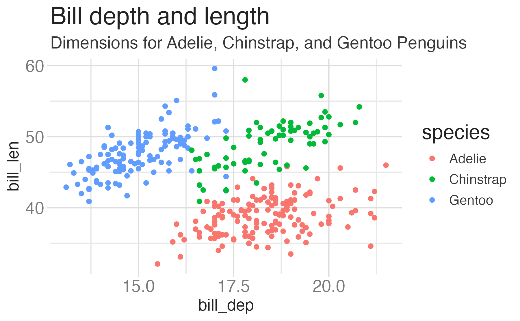
Start with the
penguinsdata frame, map bill depth to the x-axis and map bill length to the y-axis. Represent each observation with a point and map species to the color of each point. Title the plot “Bill depth and length”, add the subtitle “Dimensions for Adelie, Chinstrap, and Gentoo Penguins”
Start with the
penguinsdata frame, map bill depth to the x-axis and map bill length to the y-axis. Represent each observation with a point and map species to the color of each point. Title the plot “Bill depth and length”, add the subtitle “Dimensions for Adelie, Chinstrap, and Gentoo Penguins”, label the x and y axes as “Bill depth (mm)” and “Bill length (mm)”, respectively
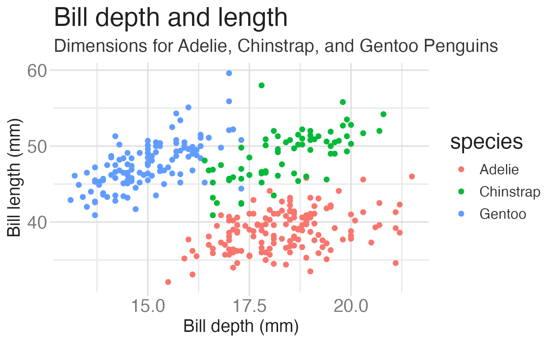
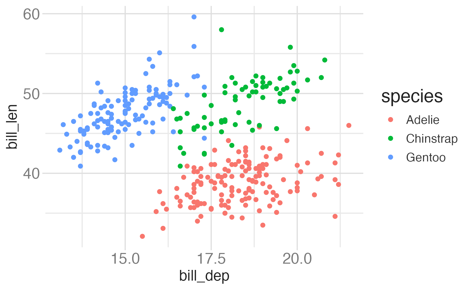
Start with the
penguinsdata frame, map bill depth to the x-axis and map bill length to the y-axis. Represent each observation with a point and map species to the color of each point. Title the plot “Bill depth and length”, add the subtitle “Dimensions for Adelie, Chinstrap, and Gentoo Penguins”, label the x and y axes as “Bill depth (mm)” and “Bill length (mm)”, respectively, label the legend “Species”

Start with the
penguinsdata frame, map bill depth to the x-axis and map bill length to the y-axis. Represent each observation with a point and map species to the color of each point. Title the plot “Bill depth and length”, add the subtitle “Dimensions for Adelie, Chinstrap, and Gentoo Penguins”, label the x and y axes as “Bill depth (mm)” and “Bill length (mm)”, respectively, label the legend “Species”, and add a caption for the data source.
ggplot(data = penguins,
       mapping = aes(x = bill_dep,
                     y = bill_len,
                     color = species)) +
geom_point() +
labs(title = "Bill depth and length",
subtitle = "Dimensions for Adelie, Chinstrap, and Gentoo Penguins",
x = "Bill depth (mm)", y = "Bill length (mm)",
color = "Species",
caption = "Source: Palmer Station LTER / palmerpenguins package")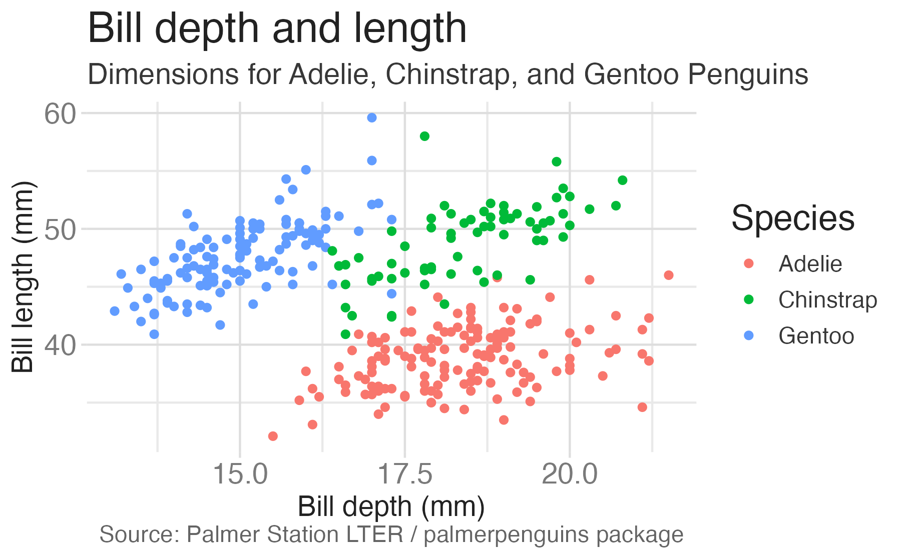
Start with the
penguinsdata frame, map bill depth to the x-axis and map bill length to the y-axis. Represent each observation with a point and map species to the color of each point. Title the plot “Bill depth and length”, add the subtitle “Dimensions for Adelie, Chinstrap, and Gentoo Penguins”, label the x and y axes as “Bill depth (mm)” and “Bill length (mm)”, respectively, label the legend “Species”, and add a caption for the data source. Finally, use a discrete color scale that is designed to be perceived by viewers with common forms of color blindness.
ggplot(data = penguins,
       mapping = aes(x = bill_dep,
                     y = bill_len,
                     color = species)) +
  geom_point() +
  labs(title = "Bill depth and length",
       subtitle = "Dimensions for Adelie, Chinstrap, and Gentoo Penguins",
       x = "Bill depth (mm)", y = "Bill length (mm)",
       color = "Species",
caption = "Source: Palmer Station LTER / palmerpenguins package") +
scale_color_viridis_d()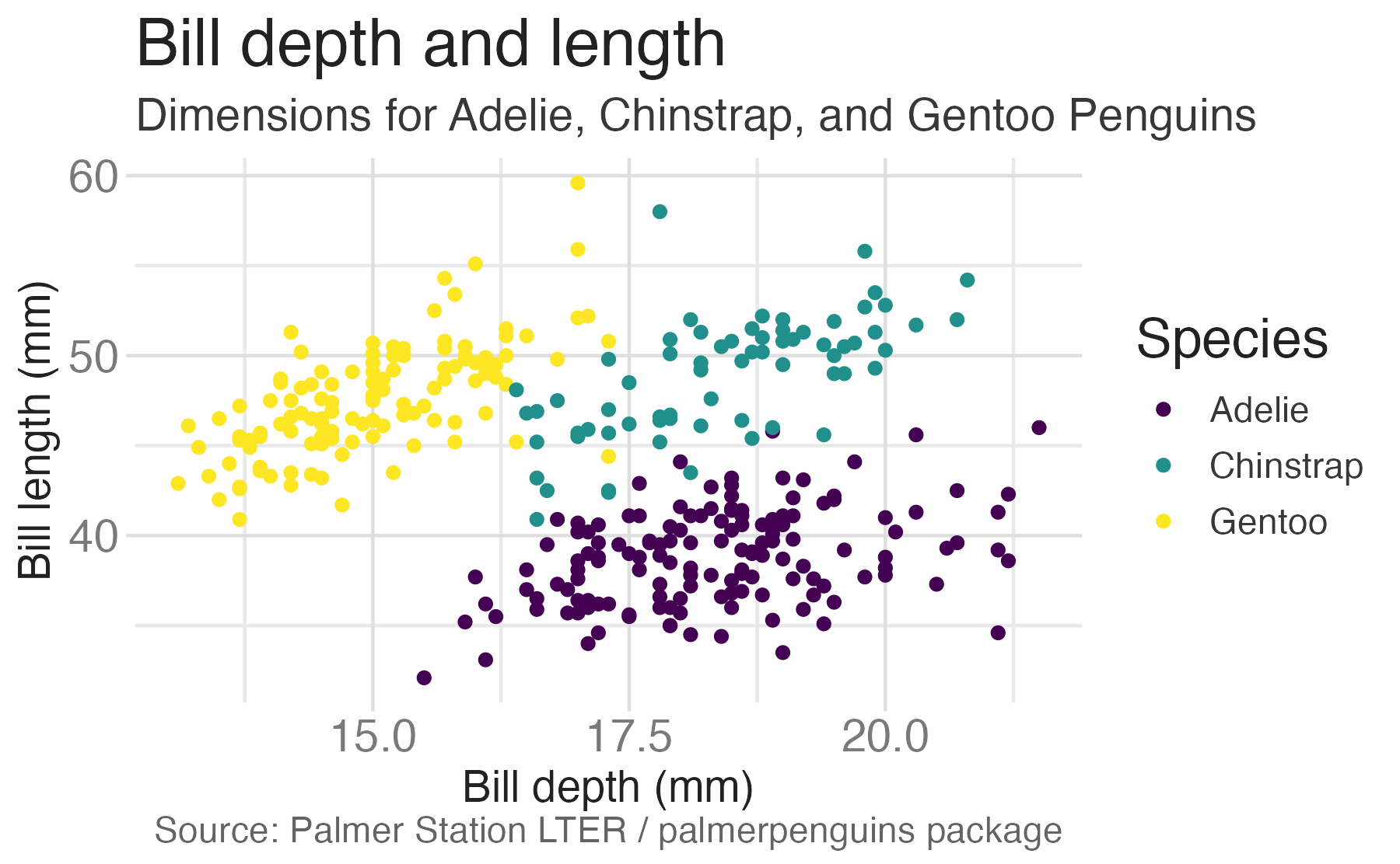
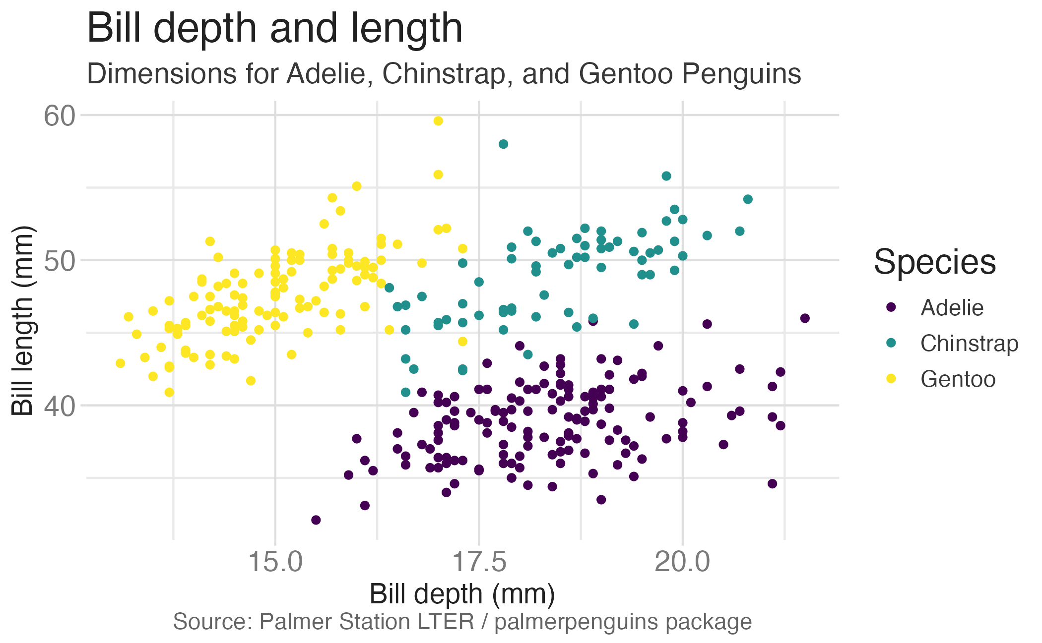
ggplot(data = penguins,
       mapping = aes(x = bill_dep,
                     y = bill_len,
                     color = species)) +
  geom_point() +
  labs(title = "Bill depth and length",
       subtitle = "Dimensions for Adelie, Chinstrap, and Gentoo Penguins",
       x = "Bill depth (mm)", y = "Bill length (mm)",
       color = "Species",
       caption = "Source: Palmer Station LTER / palmerpenguins package") +
scale_color_viridis_d()Start with the penguins data frame, map bill depth to the x-axis and map bill length to the y-axis.
Represent each observation with a point and map species to the color of each point.
Title the plot “Bill depth and length”, add the subtitle “Dimensions for Adelie, Chinstrap, and Gentoo Penguins”, label the x and y axes as “Bill depth (mm)” and “Bill length (mm)”, respectively, label the legend “Species”, and add a caption for the data source.
Finally, use a discrete color scale that is designed to be perceived by viewers with common forms of color blindness.
